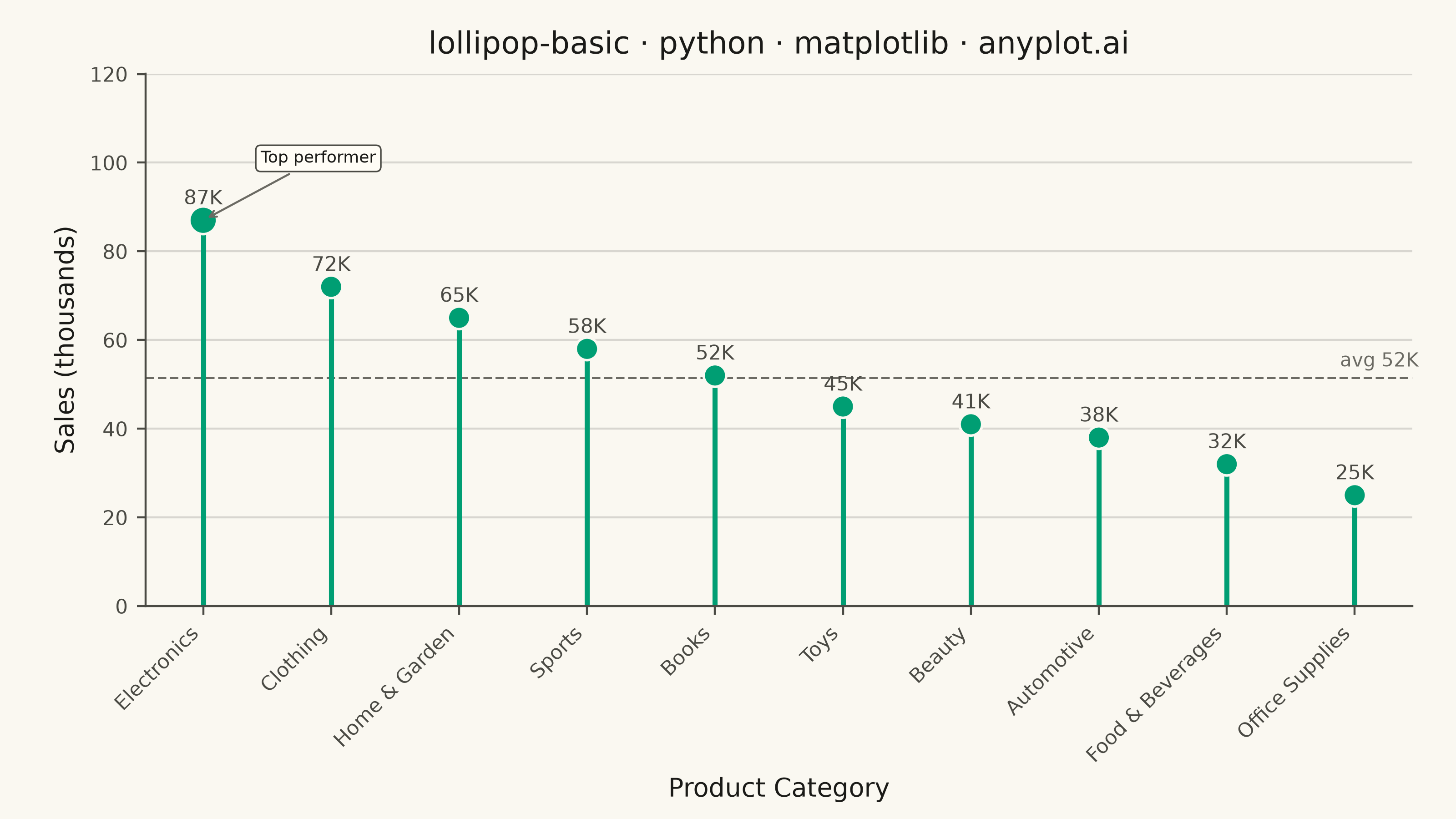
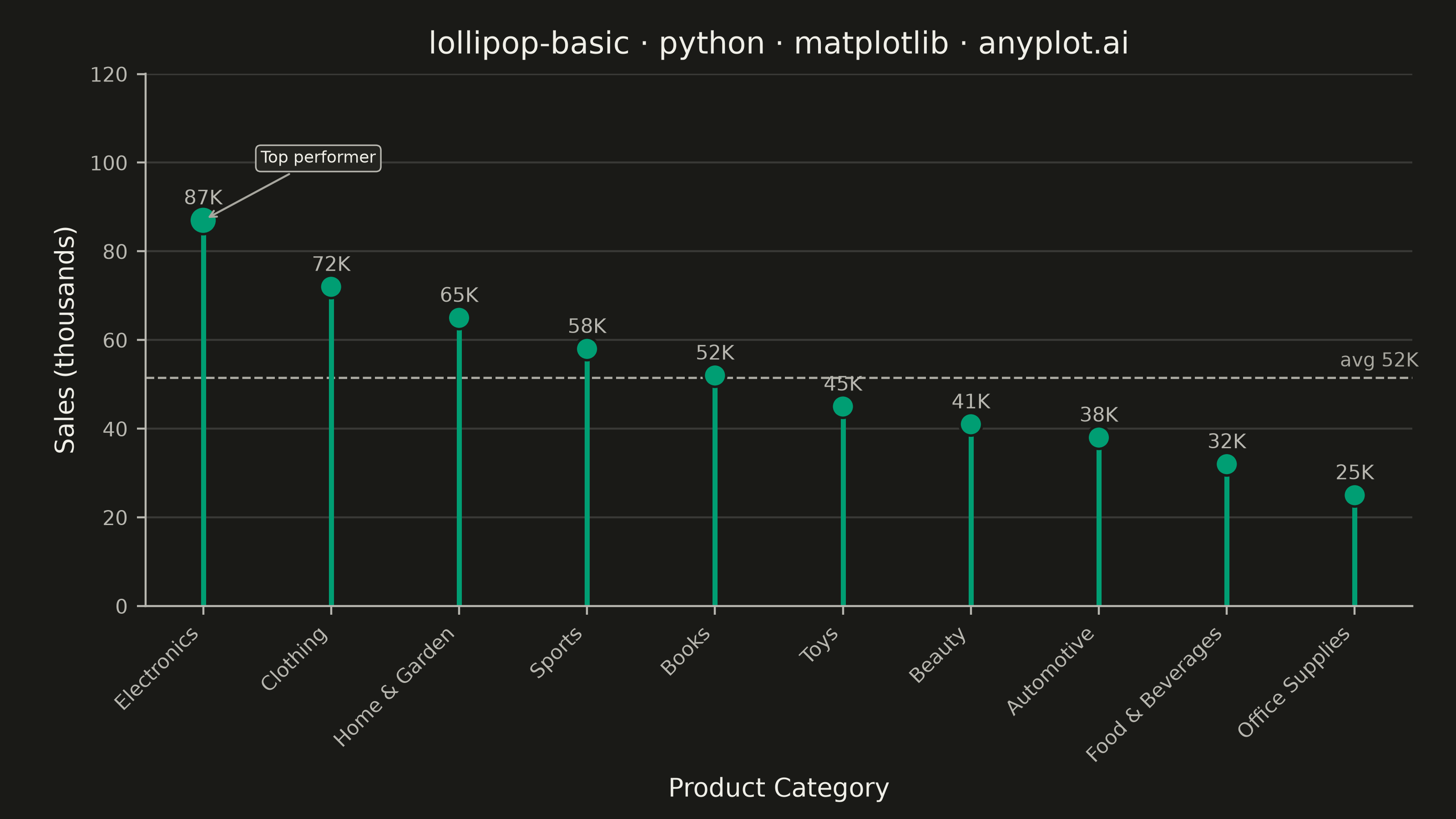
A lollipop chart displays categorical data with thin lines (stems) extending from a baseline to circular markers (dots) at each data point. It presents the same information as a bar chart but with a cleaner, more minimalist aesthetic that reduces visual clutter while maintaining clear value comparisons.
""" anyplot.ai
lollipop-basic: Basic Lollipop Chart
Library: matplotlib 3.11.0 | Python 3.13.14
Quality: 87/100 | Updated: 2026-07-01
"""

import os

import matplotlib.pyplot as plt
import matplotlib.ticker as mticker
import numpy as np


THEME = os.getenv("ANYPLOT_THEME", "light")
PAGE_BG = "#FAF8F1" if THEME == "light" else "#1A1A17"
ELEVATED_BG = "#FFFDF6" if THEME == "light" else "#242420"
INK = "#1A1A17" if THEME == "light" else "#F0EFE8"
INK_SOFT = "#4A4A44" if THEME == "light" else "#B8B7B0"
INK_MUTED = "#6B6A63" if THEME == "light" else "#A8A79F"

# Imprint palette — first series always brand green
BRAND_GREEN = "#009E73"

# Data: retail category sales (thousands)
categories = [
    "Electronics",
    "Clothing",
    "Home & Garden",
    "Sports",
    "Books",
    "Toys",
    "Beauty",
    "Automotive",
    "Food & Beverages",
    "Office Supplies",
]
values = [87, 72, 65, 58, 52, 45, 41, 38, 32, 25]

# Sort descending for clear ranking story
order = np.argsort(values)[::-1]
categories = [categories[i] for i in order]
values = np.array([values[i] for i in order])

avg_val = values.mean()

fig, ax = plt.subplots(figsize=(8, 4.5), dpi=400, facecolor=PAGE_BG)
ax.set_facecolor(PAGE_BG)

x = np.arange(len(categories))

# Stems
ax.vlines(x, ymin=0, ymax=values, color=BRAND_GREEN, linewidth=2.0, zorder=2)

# Markers — slightly larger for the top performer to create focal point
marker_sizes = np.where(x == 0, 120, 80)
ax.scatter(x, values, color=BRAND_GREEN, s=marker_sizes, zorder=3, edgecolors=PAGE_BG, linewidths=1.0)

# Value labels above each marker
for xi, v in zip(x, values, strict=False):
    ax.text(xi, v + 2.5, f"{v}K", ha="center", va="bottom", fontsize=8, color=INK_SOFT, fontweight="medium")

# Average reference line — structural anchor for context
ax.axhline(avg_val, color=INK_MUTED, linewidth=0.9, linestyle="--", zorder=1)
ax.text(len(x) - 0.5, avg_val + 1.5, f"avg {avg_val:.0f}K", ha="right", va="bottom", fontsize=7.5, color=INK_MUTED)

# Callout annotation on the top performer using matplotlib's annotation API
ax.annotate(
    "Top performer",
    xy=(x[0], values[0]),
    xytext=(x[0] + 0.9, values[0] + 13),
    fontsize=6.5,
    color=INK,
    ha="center",
    arrowprops={"arrowstyle": "->", "color": INK_MUTED, "lw": 0.8},
    bbox={"facecolor": ELEVATED_BG, "edgecolor": INK_SOFT, "boxstyle": "round,pad=0.3", "linewidth": 0.6},
)

title = "lollipop-basic · python · matplotlib · anyplot.ai"
ax.set_title(title, fontsize=12, fontweight="medium", color=INK, pad=8)
ax.set_xlabel("Product Category", fontsize=10, color=INK)
ax.set_ylabel("Sales (thousands)", fontsize=10, color=INK)

ax.set_xticks(x)
ax.set_xticklabels(categories, rotation=45, ha="right", fontsize=8)
ax.tick_params(axis="both", labelsize=8, colors=INK_SOFT, labelcolor=INK_SOFT)

ax.set_ylim(0, max(values) * 1.38)

# Tidy y-axis numeric labels via FuncFormatter
ax.yaxis.set_major_formatter(mticker.FuncFormatter(lambda v, _: f"{v:.0f}"))

ax.spines["top"].set_visible(False)
ax.spines["right"].set_visible(False)
for s in ("left", "bottom"):
    ax.spines[s].set_color(INK_SOFT)

ax.yaxis.grid(True, alpha=0.15, color=INK, linewidth=0.8)
ax.set_axisbelow(True)

# Manual margins — bbox_inches must stay None (default) to preserve exact canvas size
fig.subplots_adjust(left=0.10, right=0.97, top=0.91, bottom=0.26)
plt.savefig(f"plot-{THEME}.png", dpi=400, facecolor=PAGE_BG)
Runnable source as JSON, for any HTTP client: https://api.anyplot.ai/specs/lollipop-basic/matplotlib/code. Any spec id and library id listed in llms-full.txt fit the same URL shape; every URL below is complete and callable.
{
  "spec_id": "lollipop-basic",
  "language": "python",
  "library": "matplotlib",
  "page": "https://anyplot.ai/lollipop-basic/python/matplotlib",
  "hub": "https://anyplot.ai/lollipop-basic",
  "code_json": "https://api.anyplot.ai/specs/lollipop-basic/matplotlib/code",
  "spec_json": "https://api.anyplot.ai/specs/lollipop-basic",
  "render_light_png": "https://storage.googleapis.com/anyplot-images/plots/lollipop-basic/python/matplotlib/plot-light.png",
  "render_dark_png": "https://storage.googleapis.com/anyplot-images/plots/lollipop-basic/python/matplotlib/plot-dark.png",
  "quality_score": 87.0,
  "license": "MIT",
  "guide": "https://anyplot.ai/llms.txt"
}
Part of Basic Lollipop Chart on anyplot.ai.