The same plot in 14 other libraries — JavaScript: Chart.js, D3.js, Apache ECharts, MUI X Charts; Python: Altair, Bokeh, lets-plot, Matplotlib, Plotly, plotnine, Pygal, Seaborn; R: ggplot2; Julia: Makie.jl. Compare all 15 side by side: Mosaic Plot for Categorical Association Analysis in Python, R, Julia and JavaScript.
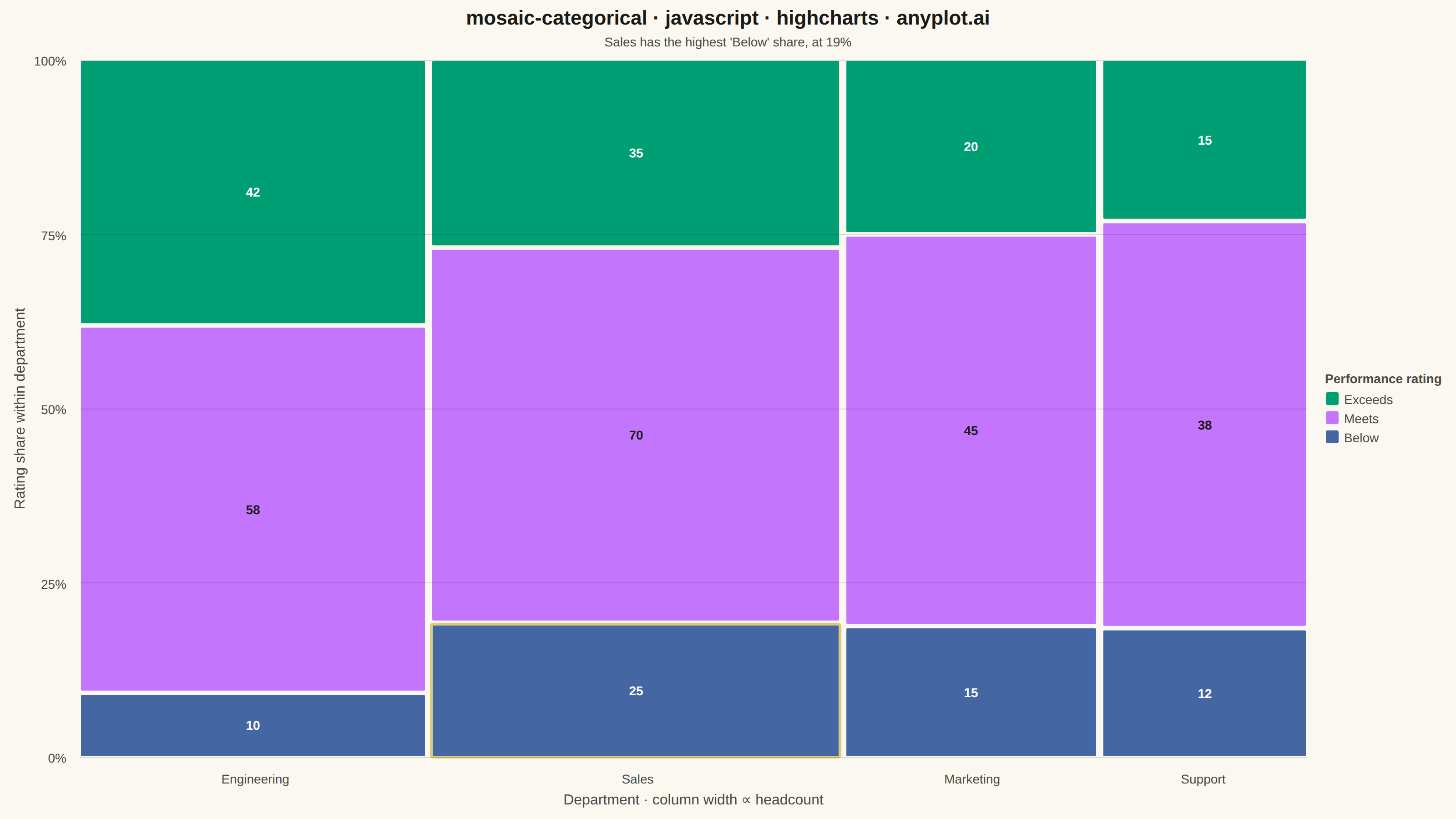
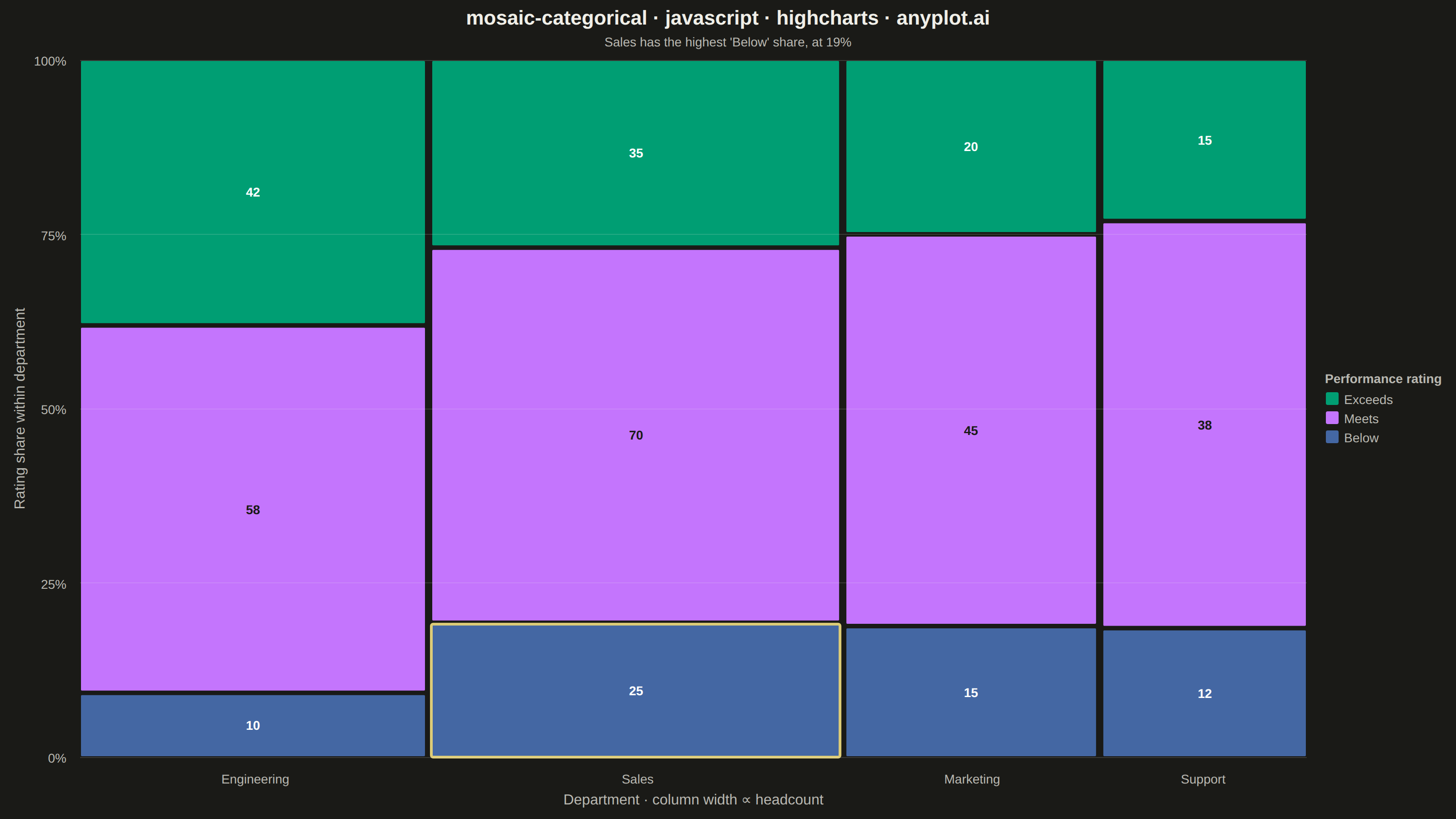
A mosaic plot visualizes contingency tables by dividing a rectangular area into smaller rectangles whose areas are proportional to cell frequencies. This statistical visualization technique effectively shows relationships and associations between two categorical variables, making it easy to identify patterns, dependencies, and deviations from expected frequencies in cross-tabulated data.
// anyplot.ai
// mosaic-categorical: Mosaic Plot for Categorical Association Analysis
// Library: highcharts 12.6.0 | JavaScript 22.23.2
// Quality: 92/100 | Created: 2026-09-02

const t = window.ANYPLOT_TOKENS;

// --- Data (in-memory, deterministic) ----------------------------------------
// Contingency table: performance rating counts by department.
const departments = ["Engineering", "Sales", "Marketing", "Support"];
const ratings = ["Exceeds", "Meets", "Below"];
const counts = [
  [42, 58, 10], // Engineering
  [35, 70, 25], // Sales
  [20, 45, 15], // Marketing
  [15, 38, 12], // Support
];

const colTotals = counts.map((row) => row.reduce((a, b) => a + b, 0));
const grandTotal = colTotals.reduce((a, b) => a + b, 0);

// Column boundaries in raw-count data units — these back the real xAxis scale
// (0..grandTotal) so tick centers and column widths both derive from it.
let cum = 0;
const colStart = [];
const colEnd = [];
colTotals.forEach((ct) => {
  colStart.push(cum);
  cum += ct;
  colEnd.push(cum);
});
const colCenters = colStart.map((s, i) => (s + colEnd[i]) / 2);

// Precomputed luminance-based text color per rating (a lookup, not a per-cell helper call).
function luminance(hex) {
  const r = parseInt(hex.slice(1, 3), 16);
  const g = parseInt(hex.slice(3, 5), 16);
  const b = parseInt(hex.slice(5, 7), 16);
  return (0.299 * r + 0.587 * g + 0.114 * b) / 255;
}
const textColors = ratings.map((_, j) => (luminance(t.palette[j]) > 0.6 ? "#1A1A17" : "#FFFFFF"));

// Standout cell for storytelling emphasis: department with the highest "Below" share.
const belowIdx = ratings.length - 1;
let standoutIdx = 0;
let standoutRatio = -1;
counts.forEach((row, i) => {
  const ratio = row[belowIdx] / colTotals[i];
  if (ratio > standoutRatio) {
    standoutRatio = ratio;
    standoutIdx = i;
  }
});

const colGap = 6;
const rowGap = 3;

// --- Chart -------------------------------------------------------------------
Highcharts.chart("container", {
  chart: {
    backgroundColor: "transparent",
    animation: false,
    style: { fontFamily: "inherit" },
    events: {
      load() {
        const r = this.renderer;

        // Draw on top of the real xAxis/yAxis coordinate system: Highcharts has
        // already reserved space for the title, subtitle, axis titles/labels and
        // legend, so this box is the actual plot area, not a hand-picked margin.
        const plotLeftPx = this.plotLeft;
        const plotTopPx = this.plotTop;
        const plotWidthPx = this.plotWidth;
        const plotHeightPx = this.plotHeight;

        // Column x-boundaries: width proportional to department headcount share.
        const availableWidth = plotWidthPx - (departments.length - 1) * colGap;
        let cursorX = plotLeftPx;
        const colX = [];
        const colWidth = [];
        departments.forEach((_, i) => {
          const w = (colTotals[i] / grandTotal) * availableWidth;
          colX.push(cursorX);
          colWidth.push(w);
          cursorX += w + colGap;
        });

        // Mosaic rectangles: column width ∝ department share, row height ∝ rating share.
        departments.forEach((dept, i) => {
          const availableHeight = plotHeightPx - (ratings.length - 1) * rowGap;
          let cursorY = plotTopPx;
          ratings.forEach((rating, j) => {
            const cellHeight = (counts[i][j] / colTotals[i]) * availableHeight;
            const isStandout = i === standoutIdx && j === belowIdx;
            r.rect(colX[i], cursorY, colWidth[i], cellHeight, 2)
              .attr({
                fill: t.palette[j],
                stroke: isStandout ? t.amber : t.pageBg,
                "stroke-width": isStandout ? 3 : 2,
              })
              .add();

            if (colWidth[i] > 46 && cellHeight > 28) {
              r.text(String(counts[i][j]), colX[i] + colWidth[i] / 2, cursorY + cellHeight / 2 + 5)
                .attr({ align: "center" })
                .css({ color: textColors[j], fontSize: "14px", fontWeight: "600" })
                .add();
            }
            cursorY += cellHeight + rowGap;
          });
        });
      },
    },
  },
  credits: { enabled: false },
  colors: t.palette,
  title: {
    text: "mosaic-categorical · javascript · highcharts · anyplot.ai",
    style: { color: t.ink, fontSize: "22px", fontWeight: "600" },
  },
  subtitle: {
    text: `${departments[standoutIdx]} has the highest 'Below' share, at ${Math.round(standoutRatio * 100)}%`,
    style: { color: t.inkSoft, fontSize: "14px" },
  },
  xAxis: {
    type: "linear",
    min: 0,
    max: grandTotal,
    tickPositions: colCenters,
    lineWidth: 0,
    tickLength: 0,
    gridLineWidth: 0,
    labels: {
      formatter() {
        return departments[colCenters.indexOf(this.value)] ?? "";
      },
      style: { color: t.inkSoft, fontSize: "14px" },
    },
    title: {
      text: "Department  ·  column width ∝ headcount",
      style: { color: t.inkSoft, fontSize: "16px" },
    },
  },
  yAxis: {
    type: "linear",
    min: 0,
    max: 100,
    tickPositions: [0, 25, 50, 75, 100],
    lineWidth: 0,
    gridLineColor: t.grid,
    labels: {
      formatter() {
        return `${this.value}%`;
      },
      style: { color: t.inkSoft, fontSize: "14px" },
    },
    title: {
      text: "Rating share within department",
      style: { color: t.inkSoft, fontSize: "16px" },
    },
  },
  legend: {
    enabled: true,
    align: "right",
    verticalAlign: "middle",
    layout: "vertical",
    title: { text: "Performance rating", style: { color: t.inkSoft, fontSize: "14px", fontWeight: "600" } },
    itemStyle: { color: t.inkSoft, fontSize: "14px" },
    itemHoverStyle: { color: t.ink },
    symbolRadius: 2,
  },
  tooltip: { enabled: false },
  plotOptions: { series: { animation: false, enableMouseTracking: false } },
  series: ratings.map((rating, j) => ({
    type: "column",
    name: rating,
    data: [],
    color: t.palette[j],
  })),
});
Runnable source as JSON, for any HTTP client: https://api.anyplot.ai/specs/mosaic-categorical/highcharts/code. Any spec id and library id listed in llms-full.txt fit the same URL shape; every URL below is complete and callable.
{
  "spec_id": "mosaic-categorical",
  "language": "javascript",
  "library": "highcharts",
  "page": "https://anyplot.ai/mosaic-categorical/javascript/highcharts",
  "hub": "https://anyplot.ai/mosaic-categorical",
  "code_json": "https://api.anyplot.ai/specs/mosaic-categorical/highcharts/code",
  "spec_json": "https://api.anyplot.ai/specs/mosaic-categorical",
  "render_light_png": "https://storage.googleapis.com/anyplot-images/plots/mosaic-categorical/javascript/highcharts/plot-light.png",
  "render_dark_png": "https://storage.googleapis.com/anyplot-images/plots/mosaic-categorical/javascript/highcharts/plot-dark.png",
  "interactive_light_html": "https://storage.googleapis.com/anyplot-images/plots/mosaic-categorical/javascript/highcharts/plot-light.html",
  "interactive_dark_html": "https://storage.googleapis.com/anyplot-images/plots/mosaic-categorical/javascript/highcharts/plot-dark.html",
  "quality_score": 92.0,
  "license": "MIT",
  "guide": "https://anyplot.ai/llms.txt"
}
Part of Mosaic Plot for Categorical Association Analysis on anyplot.ai.