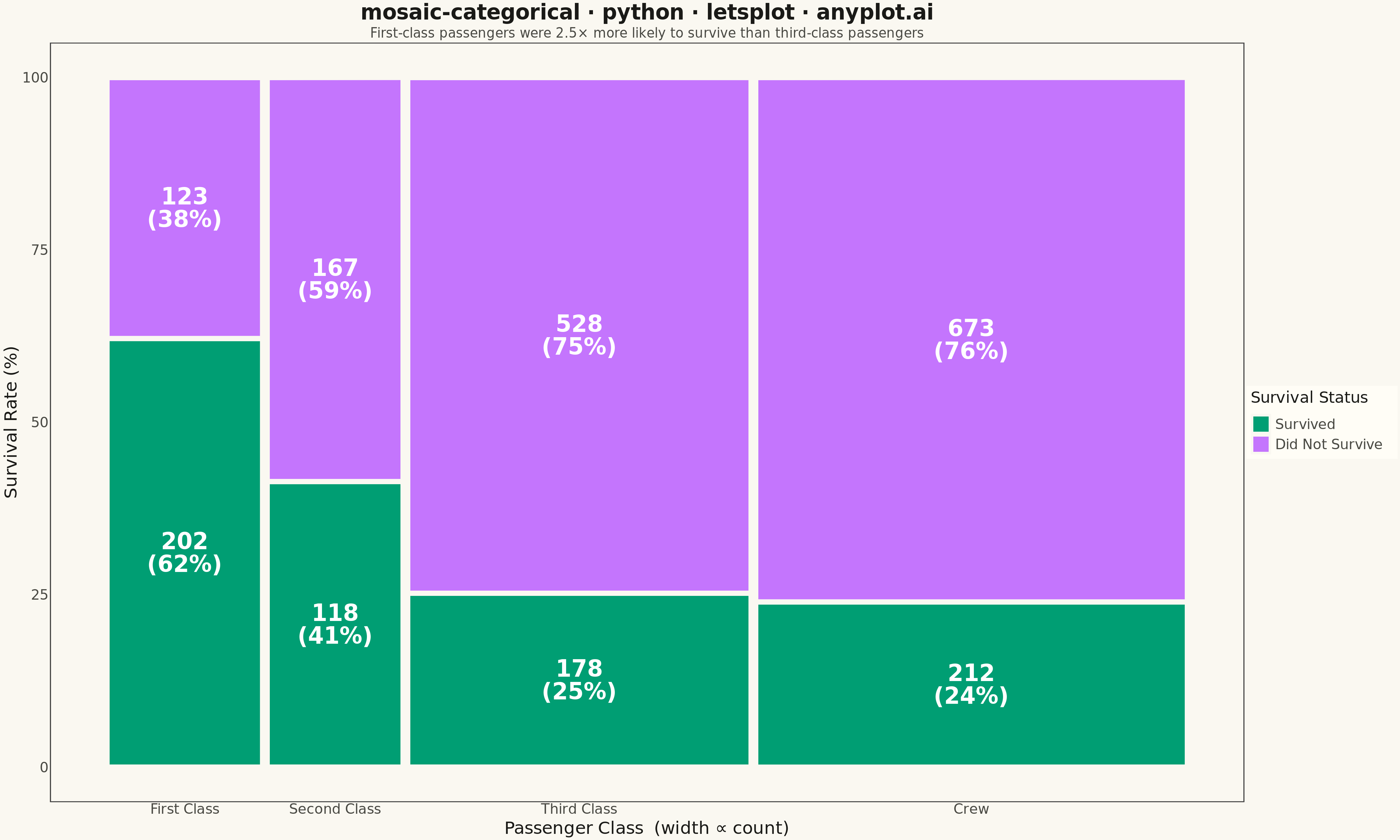
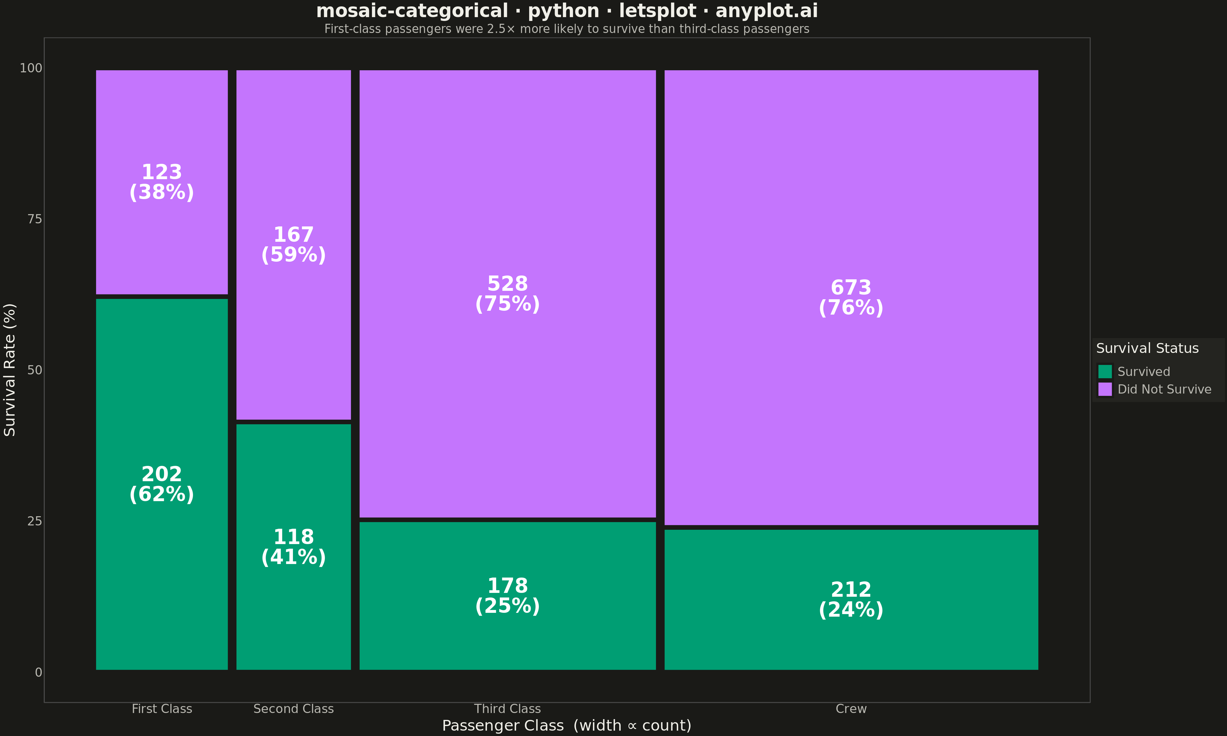
A mosaic plot visualizes contingency tables by dividing a rectangular area into smaller rectangles whose areas are proportional to cell frequencies. This statistical visualization technique effectively shows relationships and associations between two or more categorical variables, making it easy to identify patterns, dependencies, and deviations from expected frequencies in cross-tabulated data.
""" anyplot.ai
mosaic-categorical: Mosaic Plot for Categorical Association Analysis
Library: letsplot 4.9.0 | Python 3.13.13
Quality: 87/100 | Updated: 2026-05-19
"""

import os

import pandas as pd
from lets_plot import (
    LetsPlot,
    aes,
    element_blank,
    element_line,
    element_rect,
    element_text,
    geom_rect,
    geom_text,
    ggplot,
    ggsize,
    labs,
    layer_tooltips,
    scale_fill_manual,
    scale_x_continuous,
    scale_y_continuous,
    theme,
    theme_minimal,
)
from lets_plot.export import ggsave


LetsPlot.setup_html()

# Theme tokens
THEME = os.getenv("ANYPLOT_THEME", "light")
PAGE_BG = "#FAF8F1" if THEME == "light" else "#1A1A17"
ELEVATED_BG = "#FFFDF6" if THEME == "light" else "#242420"
INK = "#1A1A17" if THEME == "light" else "#F0EFE8"
INK_SOFT = "#4A4A44" if THEME == "light" else "#B8B7B0"

# Okabe-Ito palette — first series always #009E73
IMPRINT = ["#009E73", "#C475FD", "#4467A3", "#BD8233"]

# Data — Titanic survival cross-tabulated by passenger class
categories_1 = ["First Class", "Second Class", "Third Class", "Crew"]
categories_2 = ["Survived", "Did Not Survive"]

frequencies = {"First Class": [202, 123], "Second Class": [118, 167], "Third Class": [178, 528], "Crew": [212, 673]}

# Column widths proportional to category_1 marginals
cat1_totals = {cat: sum(freqs) for cat, freqs in frequencies.items()}
grand_total = sum(cat1_totals.values())
cat1_widths = {cat: total / grand_total * 100 for cat, total in cat1_totals.items()}

# Build rectangle coordinates for the mosaic
rects = []
x_pos = 0
gap = 0.8

for cat1 in categories_1:
    col_width = cat1_widths[cat1] - gap
    col_freqs = frequencies[cat1]
    col_total = cat1_totals[cat1]

    y_pos = 0
    for i, cat2 in enumerate(categories_2):
        freq = col_freqs[i]
        segment_height = (freq / col_total) * 100
        pct = round(freq / col_total * 100)

        rects.append(
            {
                "category_1": cat1,
                "category_2": cat2,
                "frequency": freq,
                "pct": pct,
                "pct_label": f"{pct}%",
                "label": f"{freq}\n({pct}%)",
                "xmin": x_pos + gap / 2,
                "xmax": x_pos + col_width + gap / 2,
                "ymin": y_pos + 0.3,
                "ymax": y_pos + segment_height - 0.3,
                "x_center": x_pos + cat1_widths[cat1] / 2,
                "y_center": y_pos + segment_height / 2,
                "tile_height": segment_height,
            }
        )
        y_pos += segment_height

    x_pos += cat1_widths[cat1]

df = pd.DataFrame(rects)

# X-axis breaks at column centres
x_breaks = []
x_pos = 0
for cat1 in categories_1:
    x_breaks.append(x_pos + cat1_widths[cat1] / 2)
    x_pos += cat1_widths[cat1]

# Interactive tooltips — letsplot-distinctive feature for HTML output
tooltips = (
    layer_tooltips()
    .line("Class|@category_1")
    .line("Status|@category_2")
    .line("Count|@frequency")
    .line("Share|@pct_label")
)

# Plot
anyplot_theme = theme(
    plot_background=element_rect(fill=PAGE_BG, color=PAGE_BG),
    panel_background=element_rect(fill=PAGE_BG),
    panel_border=element_blank(),
    panel_grid_major=element_blank(),
    panel_grid_minor=element_blank(),
    axis_line=element_line(color=INK_SOFT),
    axis_title=element_text(color=INK, size=20),
    axis_text=element_text(color=INK_SOFT, size=16),
    axis_text_x=element_text(color=INK_SOFT, size=16),
    axis_text_y=element_text(color=INK_SOFT, size=16),
    plot_title=element_text(color=INK, size=24, hjust=0.5, face="bold"),
    plot_subtitle=element_text(color=INK_SOFT, size=15, hjust=0.5),
    legend_background=element_rect(fill=ELEVATED_BG, color=INK_SOFT),
    legend_text=element_text(color=INK_SOFT, size=16),
    legend_title=element_text(color=INK, size=18),
    legend_position="right",
)

plot = (
    ggplot(df)
    + geom_rect(
        aes(xmin="xmin", xmax="xmax", ymin="ymin", ymax="ymax", fill="category_2"),
        color=PAGE_BG,
        size=0.5,
        tooltips=tooltips,
    )
    + geom_text(aes(x="x_center", y="y_center", label="label"), size=13, color="white", fontface="bold")
    + scale_fill_manual(values=IMPRINT[:2], name="Survival Status")
    + scale_x_continuous(name="Passenger Class  (width ∝ count)", breaks=x_breaks, labels=categories_1, limits=[0, 100])
    + scale_y_continuous(name="Survival Rate (%)", limits=[0, 100], breaks=[0, 25, 50, 75, 100])
    + labs(
        title="mosaic-categorical · python · letsplot · anyplot.ai",
        subtitle="First-class passengers were 2.5× more likely to survive than third-class passengers",
    )
    + theme_minimal()
    + anyplot_theme
    + ggsize(1600, 960)
)

# Save
ggsave(plot, f"plot-{THEME}.png", path=".", scale=3)
ggsave(plot, f"plot-{THEME}.html", path=".")
Runnable source as JSON, for any HTTP client: https://api.anyplot.ai/specs/mosaic-categorical/letsplot/code. Any spec id and library id listed in llms-full.txt fit the same URL shape; every URL below is complete and callable.
{
  "spec_id": "mosaic-categorical",
  "language": "python",
  "library": "letsplot",
  "page": "https://anyplot.ai/mosaic-categorical/python/letsplot",
  "hub": "https://anyplot.ai/mosaic-categorical",
  "code_json": "https://api.anyplot.ai/specs/mosaic-categorical/letsplot/code",
  "spec_json": "https://api.anyplot.ai/specs/mosaic-categorical",
  "render_light_png": "https://storage.googleapis.com/anyplot-images/plots/mosaic-categorical/python/letsplot/plot-light.png",
  "render_dark_png": "https://storage.googleapis.com/anyplot-images/plots/mosaic-categorical/python/letsplot/plot-dark.png",
  "interactive_light_html": "https://storage.googleapis.com/anyplot-images/plots/mosaic-categorical/python/letsplot/plot-light.html",
  "interactive_dark_html": "https://storage.googleapis.com/anyplot-images/plots/mosaic-categorical/python/letsplot/plot-dark.html",
  "quality_score": 87.0,
  "license": "MIT",
  "guide": "https://anyplot.ai/llms.txt"
}
Part of Mosaic Plot for Categorical Association Analysis on anyplot.ai.