The same plot in 14 other libraries — JavaScript: Chart.js, D3.js, Apache ECharts, Highcharts; Python: Altair, Bokeh, lets-plot, Matplotlib, Plotly, plotnine, Pygal, Seaborn; R: ggplot2; Julia: Makie.jl. Compare all 15 side by side: Mosaic Plot for Categorical Association Analysis in Python, R, Julia and JavaScript.
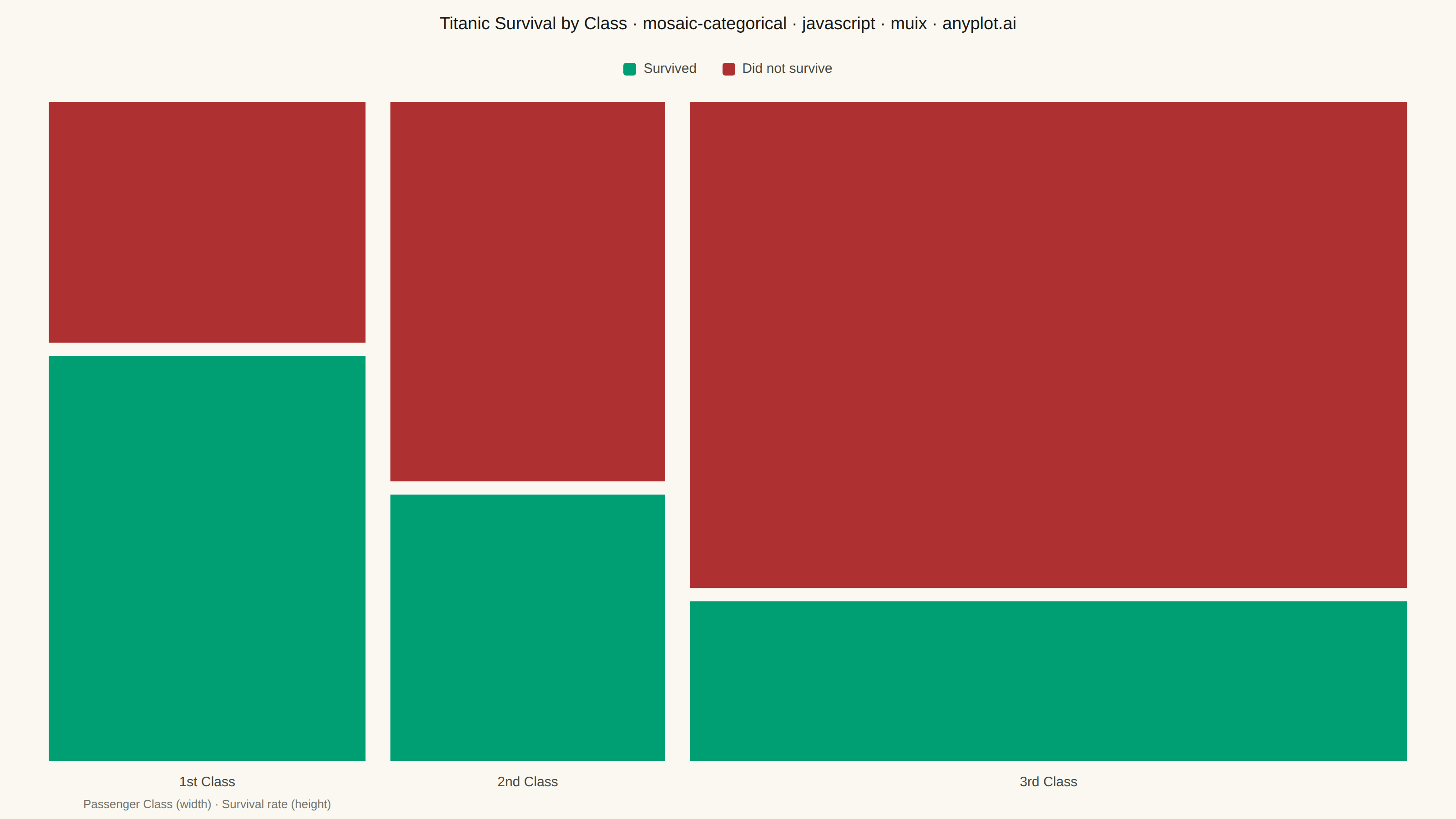
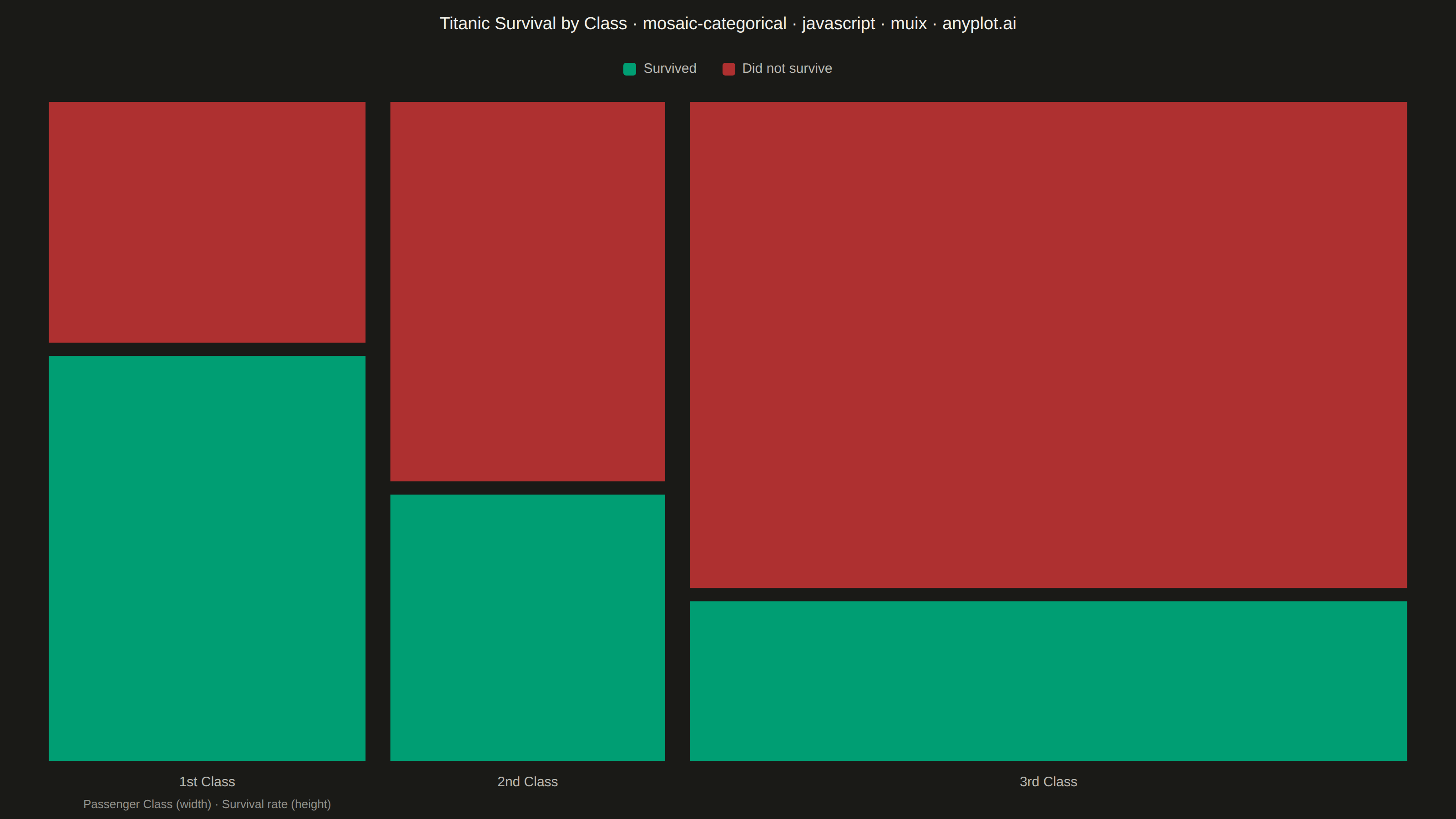
A mosaic plot visualizes contingency tables by dividing a rectangular area into smaller rectangles whose areas are proportional to cell frequencies. This statistical visualization technique effectively shows relationships and associations between two categorical variables, making it easy to identify patterns, dependencies, and deviations from expected frequencies in cross-tabulated data.
// anyplot.ai
// mosaic-categorical: Mosaic Plot for Categorical Association Analysis
// Library: muix 7.29.1 | JavaScript 22.23.2
// Quality: 93/100 | Created: 2026-09-02

import Box from "@mui/material/Box";
import Typography from "@mui/material/Typography";
import { ScatterChart } from "@mui/x-charts/ScatterChart";

const t = window.ANYPLOT_TOKENS;

// --- Data (in-memory, deterministic) ----------------------------------------
// Titanic passengers cross-tabulated by cabin class and survival outcome
// (classic contingency-table example; crew excluded). Column widths encode
// the marginal proportion of each class; cell heights within a column encode
// the conditional survival rate for that class.
const CLASSES = [
  { id: "first", label: "1st Class", survived: 203, died: 122 },
  { id: "second", label: "2nd Class", survived: 118, died: 167 },
  { id: "third", label: "3rd Class", survived: 178, died: 528 },
];

const GAP_X = 0.018; // fraction of total width separating columns
const GAP_Y = 0.02; // fraction of column height separating the two outcome cells

const grandTotal = CLASSES.reduce((sum, c) => sum + c.survived + c.died, 0);

let cursor = 0;
const columns = CLASSES.map((c) => {
  const classTotal = c.survived + c.died;
  const x0raw = cursor;
  const x1raw = cursor + classTotal / grandTotal;
  cursor = x1raw;
  return {
    id: c.id,
    label: c.label,
    x0raw,
    x1raw,
    survivedShare: c.survived / classTotal,
  };
});

// Bottom cell of each column: survived (good outcome -> brand green, the
// mandatory first-series color, which also matches the semantic exception).
const survivedData = columns.map((col) => ({
  id: `${col.id}-survived`,
  x0: col.x0raw + GAP_X / 2,
  x1: col.x1raw - GAP_X / 2,
  y0: 0,
  y1: col.survivedShare - GAP_Y / 2,
  columnLabel: col.label,
  columnMidX: (col.x0raw + col.x1raw) / 2,
}));

// Top cell of each column: did not survive (bad outcome -> semantic matte red).
const diedData = columns.map((col) => ({
  id: `${col.id}-died`,
  x0: col.x0raw + GAP_X / 2,
  x1: col.x1raw - GAP_X / 2,
  y0: col.survivedShare + GAP_Y / 2,
  y1: 1,
}));

// Custom marker: variable-size rectangles positioned from the two linear
// scales (0..1 domains), the composition technique the community
// @mui/x-charts surface exposes for chart types it doesn't ship natively —
// here a mosaic/marimekko plot. Also draws the per-column class label and,
// on the leftmost column only, the "Passenger Class" axis caption.
function MosaicCell(props) {
  const { series, xScale, yScale, color } = props;
  return (
    <g>
      {series.data.map((cell) => {
        const px0 = xScale(cell.x0);
        const px1 = xScale(cell.x1);
        const py0 = yScale(cell.y0);
        const py1 = yScale(cell.y1);
        const baseline = yScale(0);
        return (
          <g key={cell.id}>
            <rect
              x={Math.min(px0, px1)}
              y={Math.min(py0, py1)}
              width={Math.abs(px1 - px0)}
              height={Math.abs(py1 - py0)}
              fill={color}
            />
            {cell.columnLabel ? (
              <text
                x={xScale(cell.columnMidX)}
                y={baseline + 28}
                textAnchor="middle"
                fontSize={15}
                fontWeight={500}
                fontFamily="inherit"
                fill={t.inkSoft}
              >
                {cell.columnLabel}
              </text>
            ) : null}
            {cell.id === "first-survived" ? (
              <text
                x={xScale(cell.columnMidX)}
                y={baseline + 52}
                textAnchor="middle"
                fontSize={13}
                fontFamily="inherit"
                fill={t.inkSoft}
                opacity={0.75}
              >
                Passenger Class (width) · Survival rate (height)
              </text>
            ) : null}
          </g>
        );
      })}
    </g>
  );
}

const TITLE = "Titanic Survival by Class · mosaic-categorical · javascript · muix · anyplot.ai";

export default function Chart() {
  const { width, height } = window.ANYPLOT_SIZE;
  const titleFontSize = Math.round(22 * Math.min(1, 67 / TITLE.length));
  const titleHeight = 56;
  const legendHeight = 40;
  const chartHeight = height - titleHeight - legendHeight;

  return (
    <Box sx={{ width, height, bgcolor: t.pageBg, display: "flex", flexDirection: "column" }}>
      <Typography
        sx={{
          color: t.ink,
          fontSize: titleFontSize,
          fontWeight: 500,
          textAlign: "center",
          lineHeight: 1.2,
          pt: "16px",
          height: titleHeight,
          fontFamily: "inherit",
        }}
      >
        {TITLE}
      </Typography>

      {/* Manual legend row — the two outcome colors, kept clear of the plot
          area so it never overlaps the tallest (rightmost) column. */}
      <Box sx={{ display: "flex", justifyContent: "center", alignItems: "center", gap: "28px", height: legendHeight }}>
        {[
          { label: "Survived", color: t.palette[0] },
          { label: "Did not survive", color: t.palette[4] },
        ].map((item) => (
          <Box key={item.label} sx={{ display: "flex", alignItems: "center", gap: "8px" }}>
            <Box sx={{ width: 14, height: 14, borderRadius: "3px", bgcolor: item.color }} />
            <Typography sx={{ fontSize: 15, color: t.inkSoft, fontFamily: "inherit" }}>{item.label}</Typography>
          </Box>
        ))}
      </Box>

      <Box sx={{ flex: 1 }}>
        <ScatterChart
          width={width}
          height={chartHeight}
          skipAnimation
          disableVoronoi
          series={[
            { id: "survived", type: "scatter", data: survivedData, label: "Survived", color: t.palette[0] },
            { id: "died", type: "scatter", data: diedData, label: "Did not survive", color: t.palette[4] },
          ]}
          xAxis={[{ id: "x", min: 0, max: 1, scaleType: "linear" }]}
          yAxis={[{ id: "y", min: 0, max: 1, scaleType: "linear" }]}
          topAxis={null}
          bottomAxis={null}
          leftAxis={null}
          rightAxis={null}
          margin={{ top: 16, right: 40, bottom: 64, left: 40 }}
          slots={{ scatter: MosaicCell }}
          slotProps={{ legend: { hidden: true } }}
        />
      </Box>
    </Box>
  );
}
Runnable source as JSON, for any HTTP client: https://api.anyplot.ai/specs/mosaic-categorical/muix/code. Any spec id and library id listed in llms-full.txt fit the same URL shape; every URL below is complete and callable.
{
  "spec_id": "mosaic-categorical",
  "language": "javascript",
  "library": "muix",
  "page": "https://anyplot.ai/mosaic-categorical/javascript/muix",
  "hub": "https://anyplot.ai/mosaic-categorical",
  "code_json": "https://api.anyplot.ai/specs/mosaic-categorical/muix/code",
  "spec_json": "https://api.anyplot.ai/specs/mosaic-categorical",
  "render_light_png": "https://storage.googleapis.com/anyplot-images/plots/mosaic-categorical/javascript/muix/plot-light.png",
  "render_dark_png": "https://storage.googleapis.com/anyplot-images/plots/mosaic-categorical/javascript/muix/plot-dark.png",
  "interactive_light_html": "https://storage.googleapis.com/anyplot-images/plots/mosaic-categorical/javascript/muix/plot-light.html",
  "interactive_dark_html": "https://storage.googleapis.com/anyplot-images/plots/mosaic-categorical/javascript/muix/plot-dark.html",
  "quality_score": 93.0,
  "license": "MIT",
  "guide": "https://anyplot.ai/llms.txt"
}
Part of Mosaic Plot for Categorical Association Analysis on anyplot.ai.