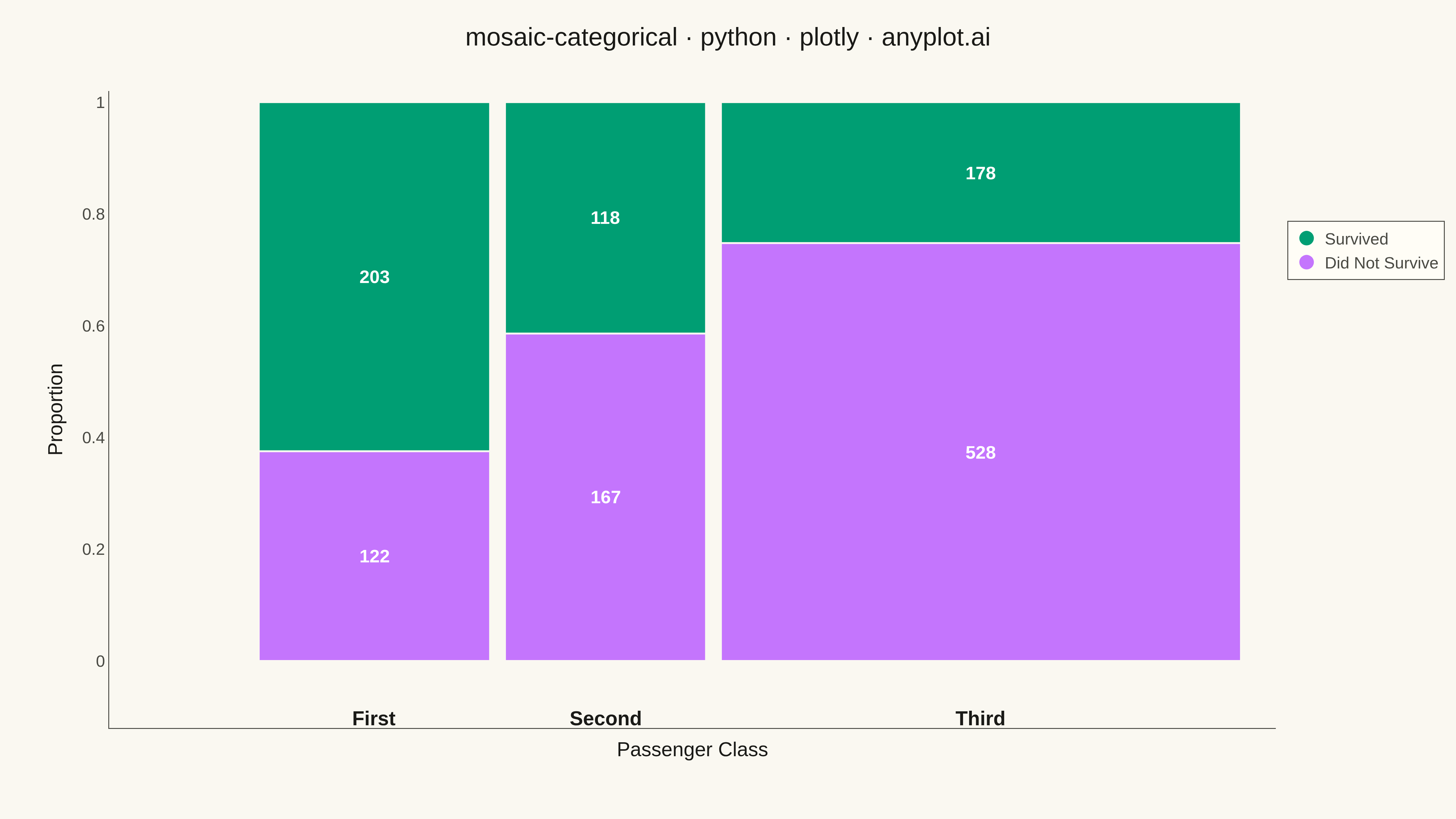
A mosaic plot visualizes contingency tables by dividing a rectangular area into smaller rectangles whose areas are proportional to cell frequencies. This statistical visualization technique effectively shows relationships and associations between two or more categorical variables, making it easy to identify patterns, dependencies, and deviations from expected frequencies in cross-tabulated data.
""" anyplot.ai
mosaic-categorical: Mosaic Plot for Categorical Association Analysis
Library: plotly 6.7.0 | Python 3.13.13
Quality: 90/100 | Updated: 2026-05-19
"""

import os

import pandas as pd
import plotly.graph_objects as go


# Theme tokens
THEME = os.getenv("ANYPLOT_THEME", "light")
PAGE_BG = "#FAF8F1" if THEME == "light" else "#1A1A17"
ELEVATED_BG = "#FFFDF6" if THEME == "light" else "#242420"
INK = "#1A1A17" if THEME == "light" else "#F0EFE8"
INK_SOFT = "#4A4A44" if THEME == "light" else "#B8B7B0"

# Data: Titanic survival data by passenger class
data = {
    "Class": ["First", "First", "Second", "Second", "Third", "Third"],
    "Survival": ["Survived", "Did Not Survive", "Survived", "Did Not Survive", "Survived", "Did Not Survive"],
    "Count": [203, 122, 118, 167, 178, 528],
}
df = pd.DataFrame(data)

# Pivot to create contingency table
contingency = df.pivot(index="Survival", columns="Class", values="Count")
contingency = contingency[["First", "Second", "Third"]]

# "Did Not Survive" at bottom, "Survived" at top
survival_order = ["Did Not Survive", "Survived"]
contingency = contingency.reindex(survival_order)

# Calculate proportions for mosaic layout
class_totals = contingency.sum(axis=0)
total = class_totals.sum()
class_widths = class_totals / total

survival_categories = contingency.index.tolist()
class_categories = contingency.columns.tolist()

# Okabe-Ito palette: Survived = brand green (first series), Did Not Survive = vermillion
colors = {"Survived": "#009E73", "Did Not Survive": "#C475FD"}

# Gap between rectangles
gap = 0.015

# Build shapes, annotations, and hover trace data
shapes = []
annotations = []
hover_xs, hover_ys, hover_texts, hover_colors = [], [], [], []

x_start = 0
for class_name in class_categories:
    width = class_widths[class_name] - gap
    class_total = contingency[class_name].sum()

    y_start = 0
    for survival in survival_categories:
        count = contingency.loc[survival, class_name]
        height = count / class_total
        pct = count / class_total * 100

        # Rectangle shape
        shapes.append(
            {
                "type": "rect",
                "x0": x_start,
                "y0": y_start,
                "x1": x_start + width,
                "y1": y_start + height,
                "fillcolor": colors[survival],
                "line": {"color": PAGE_BG, "width": 2},
                "layer": "below",
            }
        )

        # Count annotation inside rectangle
        if height > 0.08:
            annotations.append(
                {
                    "x": x_start + width / 2,
                    "y": y_start + height / 2,
                    "text": f"<b>{count}</b>",
                    "showarrow": False,
                    "font": {"size": 20, "color": "white"},
                    "xanchor": "center",
                    "yanchor": "middle",
                }
            )

        # Collect hover point data (per cell)
        hover_xs.append(x_start + width / 2)
        hover_ys.append(y_start + height / 2)
        hover_texts.append(
            f"<b>{class_name} Class — {survival}</b><br>"
            f"Count: {count}<br>"
            f"Within-class proportion: {pct:.1f}%<br>"
            f"Share of all passengers: {count / total * 100:.1f}%"
        )
        hover_colors.append(colors[survival])

        y_start += height

    # Class label below column
    annotations.append(
        {
            "x": x_start + width / 2,
            "y": -0.08,
            "text": f"<b>{class_name}</b>",
            "showarrow": False,
            "font": {"size": 22, "color": INK},
            "xanchor": "center",
            "yanchor": "top",
        }
    )

    x_start += width + gap

# Create figure
fig = go.Figure()

# Legend traces (invisible markers shown only in legend)
for survival_name in ["Survived", "Did Not Survive"]:
    fig.add_trace(
        go.Scatter(
            x=[None],
            y=[None],
            mode="markers",
            marker={"size": 20, "color": colors[survival_name]},
            name=survival_name,
            showlegend=True,
        )
    )

# Per-cell invisible scatter for interactive hover tooltips
fig.add_trace(
    go.Scatter(
        x=hover_xs,
        y=hover_ys,
        mode="markers",
        marker={"size": 1, "color": hover_colors, "opacity": 0},
        hovertemplate="%{text}<extra></extra>",
        text=hover_texts,
        showlegend=False,
    )
)

fig.update_layout(
    title={
        "text": "mosaic-categorical · python · plotly · anyplot.ai",
        "font": {"size": 28, "color": INK},
        "x": 0.5,
        "xanchor": "center",
    },
    shapes=shapes,
    annotations=annotations,
    xaxis={
        "title": {"text": "Passenger Class", "font": {"size": 22, "color": INK}},
        "tickfont": {"size": 18, "color": INK_SOFT},
        "showgrid": False,
        "zeroline": False,
        "showticklabels": False,
        "range": [-0.15, 1.02],
        "linecolor": INK_SOFT,
    },
    yaxis={
        "title": {"text": "Proportion", "font": {"size": 22, "color": INK}},
        "tickfont": {"size": 18, "color": INK_SOFT},
        "showgrid": False,
        "zeroline": False,
        "range": [-0.12, 1.02],
        "linecolor": INK_SOFT,
    },
    legend={
        "font": {"size": 18, "color": INK_SOFT},
        "x": 1.01,
        "y": 0.75,
        "xanchor": "left",
        "yanchor": "middle",
        "bgcolor": ELEVATED_BG,
        "bordercolor": INK_SOFT,
        "borderwidth": 1,
    },
    paper_bgcolor=PAGE_BG,
    plot_bgcolor=PAGE_BG,
    font={"color": INK},
    margin={"l": 120, "r": 160, "t": 100, "b": 100},
)

# Save
fig.write_image(f"plot-{THEME}.png", width=1600, height=900, scale=3)
fig.write_html(f"plot-{THEME}.html", include_plotlyjs="cdn")
Runnable source as JSON, for any HTTP client: https://api.anyplot.ai/specs/mosaic-categorical/plotly/code. Any spec id and library id listed in llms-full.txt fit the same URL shape; every URL below is complete and callable.
{
  "spec_id": "mosaic-categorical",
  "language": "python",
  "library": "plotly",
  "page": "https://anyplot.ai/mosaic-categorical/python/plotly",
  "hub": "https://anyplot.ai/mosaic-categorical",
  "code_json": "https://api.anyplot.ai/specs/mosaic-categorical/plotly/code",
  "spec_json": "https://api.anyplot.ai/specs/mosaic-categorical",
  "render_light_png": "https://storage.googleapis.com/anyplot-images/plots/mosaic-categorical/python/plotly/plot-light.png",
  "render_dark_png": "https://storage.googleapis.com/anyplot-images/plots/mosaic-categorical/python/plotly/plot-dark.png",
  "interactive_light_html": "https://storage.googleapis.com/anyplot-images/plots/mosaic-categorical/python/plotly/plot-light.html",
  "interactive_dark_html": "https://storage.googleapis.com/anyplot-images/plots/mosaic-categorical/python/plotly/plot-dark.html",
  "quality_score": 90.0,
  "license": "MIT",
  "guide": "https://anyplot.ai/llms.txt"
}
Part of Mosaic Plot for Categorical Association Analysis on anyplot.ai.