The same plot in 14 other libraries — Python: Altair, Bokeh, lets-plot, Matplotlib, Plotly, plotnine, Pygal, Seaborn; R: ggplot2; JavaScript: Chart.js, D3.js, Apache ECharts, Highcharts, MUI X Charts. Compare all 15 side by side: Mosaic Plot for Categorical Association Analysis in Python, R, Julia and JavaScript.
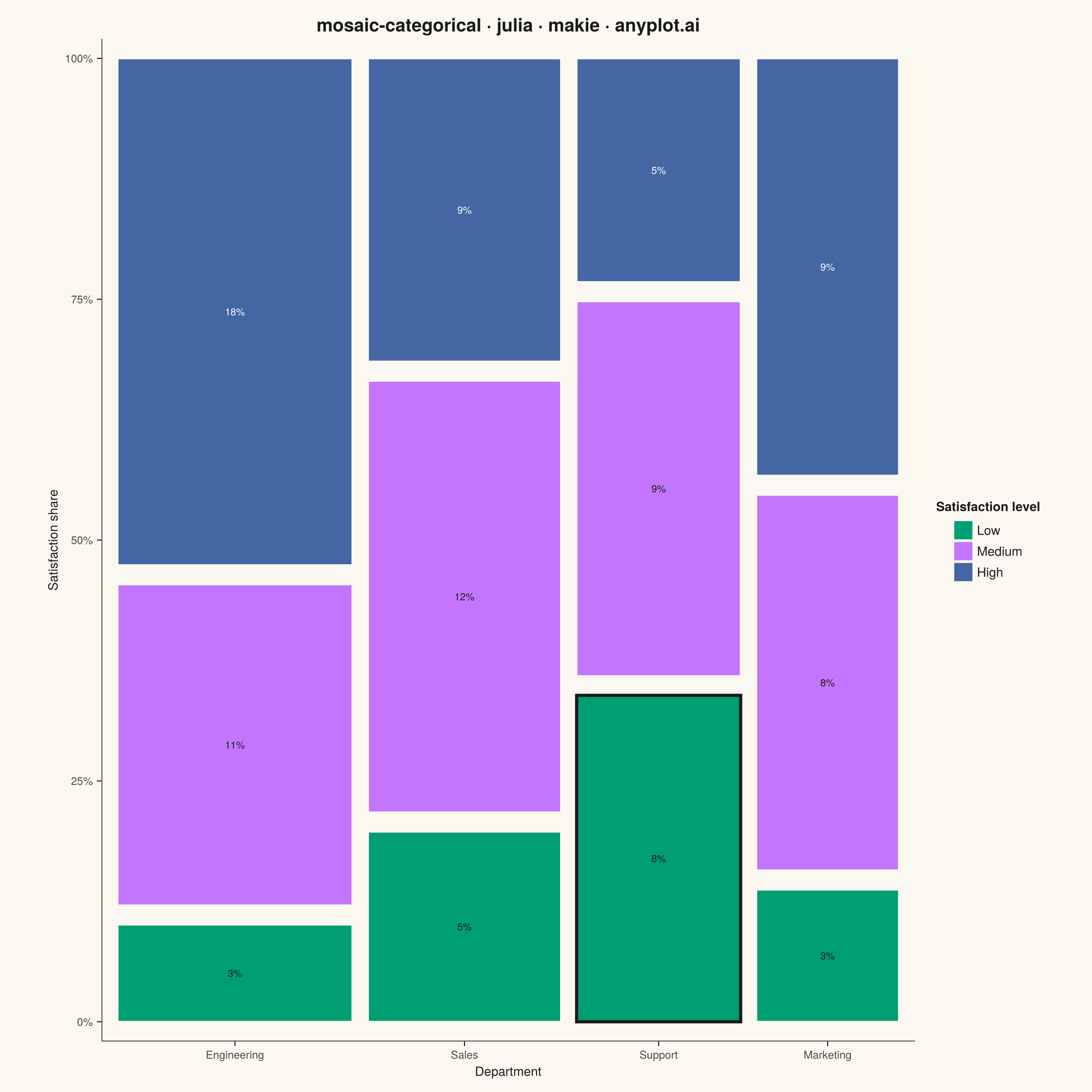
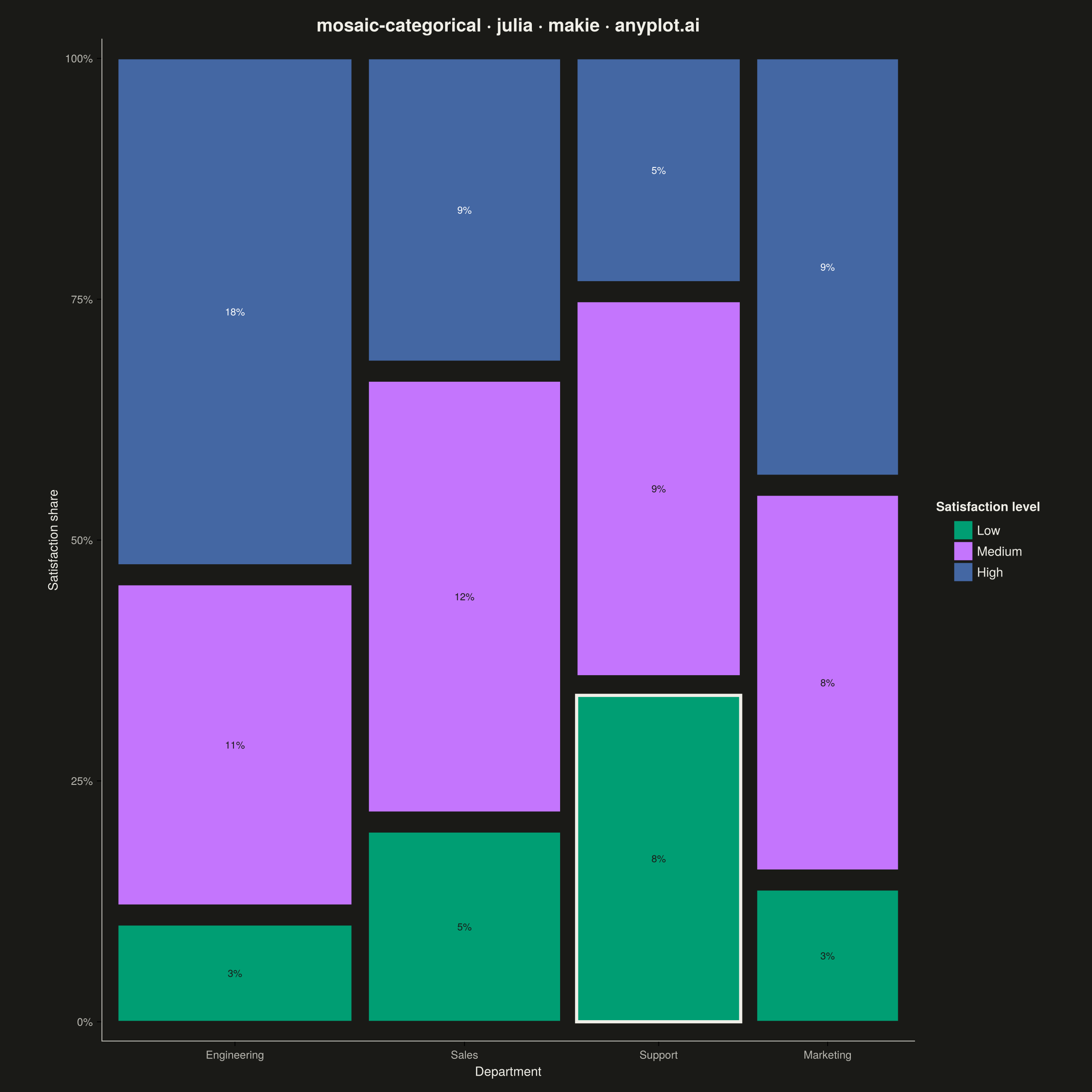
A mosaic plot visualizes contingency tables by dividing a rectangular area into smaller rectangles whose areas are proportional to cell frequencies. This statistical visualization technique effectively shows relationships and associations between two categorical variables, making it easy to identify patterns, dependencies, and deviations from expected frequencies in cross-tabulated data.
# anyplot.ai
# mosaic-categorical: Mosaic Plot for Categorical Association Analysis
# Library: makie 0.21.9 | Julia 1.11.9
# Quality: 87/100 | Created: 2026-09-02

using CairoMakie
using Colors
using Random

Random.seed!(42)

# --- Theme tokens -----------------------------------------------------------
const THEME    = get(ENV, "ANYPLOT_THEME", "light")
const PAGE_BG  = THEME == "light" ? colorant"#FAF8F1" : colorant"#1A1A17"
const INK      = THEME == "light" ? colorant"#1A1A17" : colorant"#F0EFE8"
const INK_SOFT = THEME == "light" ? colorant"#4A4A44" : colorant"#B8B7B0"
const IMPRINT_PALETTE = [
    colorant"#009E73", colorant"#C475FD", colorant"#4467A3", colorant"#BD8233",
    colorant"#AE3030", colorant"#2ABCCD", colorant"#954477", colorant"#99B314",
]
# Per-segment label ink chosen for contrast against each fixed data color
# (green/lavender read best with dark text, blue reads best with light text).
const CELL_LABEL_INK = [colorant"#1A1A17", colorant"#1A1A17", colorant"#FFFFFF"]

# --- Data ---------------------------------------------------------------------
# Employee satisfaction survey cross-tabulated by department and satisfaction level.
departments = ["Engineering", "Sales", "Support", "Marketing"]
satisfaction_levels = ["Low", "Medium", "High"]
department_sizes = [220, 180, 150, 130]
satisfaction_shares = [
    0.10 0.35 0.55
    0.20 0.45 0.35
    0.35 0.40 0.25
    0.15 0.40 0.45
]

n_rows = length(departments)
n_cols = length(satisfaction_levels)
counts = zeros(Int, n_rows, n_cols)
for i in 1:n_rows, j in 1:n_cols
    counts[i, j] = round(Int, department_sizes[i] * satisfaction_shares[i, j] * (0.9 + 0.2 * rand()))
end

row_totals = vec(sum(counts; dims = 2))
total = sum(counts)

# Most notable cell: the department with the highest conditional share of
# "Low" satisfaction, called out below with a bolder tile outline.
low_col = findfirst(==("Low"), satisfaction_levels)
notable_row = argmax(satisfaction_shares[:, low_col])

# --- Mosaic geometry ------------------------------------------------------------
# Column widths encode marginal proportions of department; segment heights within
# each column encode the conditional proportion of satisfaction level.
gap_x = 0.02
gap_y = 0.02
usable_width = 1.0 - gap_x * (n_rows - 1)
usable_height = 1.0 - gap_y * (n_cols - 1)
column_widths = row_totals ./ total .* usable_width

x_starts = zeros(n_rows)
for i in 2:n_rows
    x_starts[i] = x_starts[i - 1] + column_widths[i - 1] + gap_x
end

# --- Plot -----------------------------------------------------------------------
fig = Figure(
    size            = (1200, 1200),
    fontsize        = 14,
    backgroundcolor = PAGE_BG,
)

ax = Axis(
    fig[1, 1];
    title              = "mosaic-categorical · julia · makie · anyplot.ai",
    titlesize          = 20,
    titlecolor         = INK,
    xlabel             = "Department",
    ylabel             = "Satisfaction share",
    xlabelcolor        = INK,
    ylabelcolor        = INK,
    xlabelsize         = 14,
    ylabelsize         = 14,
    xticklabelcolor    = INK_SOFT,
    yticklabelcolor    = INK_SOFT,
    xticklabelsize     = 12,
    yticklabelsize     = 12,
    backgroundcolor    = PAGE_BG,
    topspinevisible    = false,
    rightspinevisible  = false,
    leftspinecolor     = INK_SOFT,
    bottomspinecolor   = INK_SOFT,
    xgridvisible       = false,
    ygridvisible       = false,
)

for i in 1:n_rows
    y_start = 0.0
    for j in 1:n_cols
        height = counts[i, j] / row_totals[i] * usable_height
        rect = Rect2f(x_starts[i], y_start, column_widths[i], height)
        is_notable = i == notable_row && j == low_col
        stroke_color = is_notable ? INK : PAGE_BG
        stroke_width = is_notable ? 3.5 : 2
        poly!(ax, rect; color = IMPRINT_PALETTE[j], strokecolor = stroke_color, strokewidth = stroke_width)

        if height > 0.05
            pct = round(Int, counts[i, j] / total * 100)
            text!(
                ax, x_starts[i] + column_widths[i] / 2, y_start + height / 2;
                text = "$(pct)%", color = CELL_LABEL_INK[j], fontsize = 11,
                align = (:center, :center),
            )
        end

        y_start += height + gap_y
    end
end

ax.xticks = (x_starts .+ column_widths ./ 2, departments)
ax.yticks = (0:0.25:1, ["0%", "25%", "50%", "75%", "100%"])
xlims!(ax, -0.02, 1.02)
ylims!(ax, -0.02, 1.02)

legend_elements = [PolyElement(color = IMPRINT_PALETTE[j]) for j in 1:n_cols]
Legend(
    fig[1, 2], legend_elements, satisfaction_levels, "Satisfaction level";
    framevisible = false, labelcolor = INK, titlecolor = INK, tellheight = false,
)
colsize!(fig.layout, 1, Relative(0.82))

# --- Save -------------------------------------------------------------------
save("plot-$(THEME).png", fig; px_per_unit = 2)
Runnable source as JSON, for any HTTP client: https://api.anyplot.ai/specs/mosaic-categorical/makie/code. Any spec id and library id listed in llms-full.txt fit the same URL shape; every URL below is complete and callable.
{
  "spec_id": "mosaic-categorical",
  "language": "julia",
  "library": "makie",
  "page": "https://anyplot.ai/mosaic-categorical/julia/makie",
  "hub": "https://anyplot.ai/mosaic-categorical",
  "code_json": "https://api.anyplot.ai/specs/mosaic-categorical/makie/code",
  "spec_json": "https://api.anyplot.ai/specs/mosaic-categorical",
  "render_light_png": "https://storage.googleapis.com/anyplot-images/plots/mosaic-categorical/julia/makie/plot-light.png",
  "render_dark_png": "https://storage.googleapis.com/anyplot-images/plots/mosaic-categorical/julia/makie/plot-dark.png",
  "quality_score": 87.0,
  "license": "MIT",
  "guide": "https://anyplot.ai/llms.txt"
}
Part of Mosaic Plot for Categorical Association Analysis on anyplot.ai.