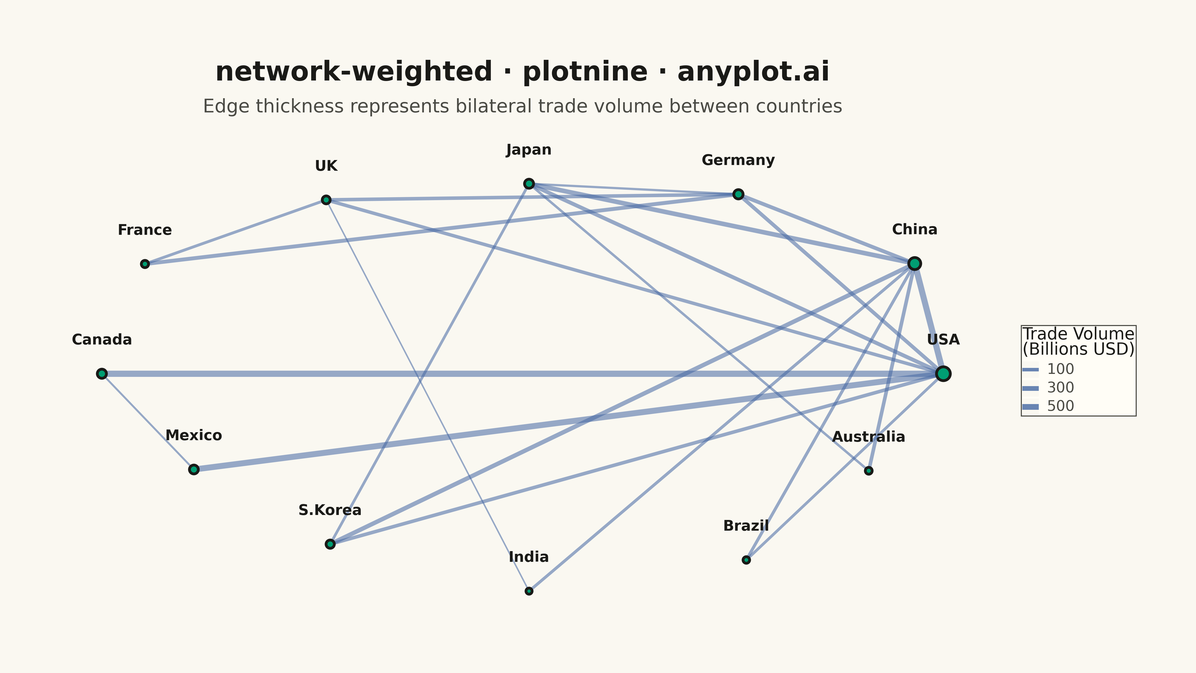
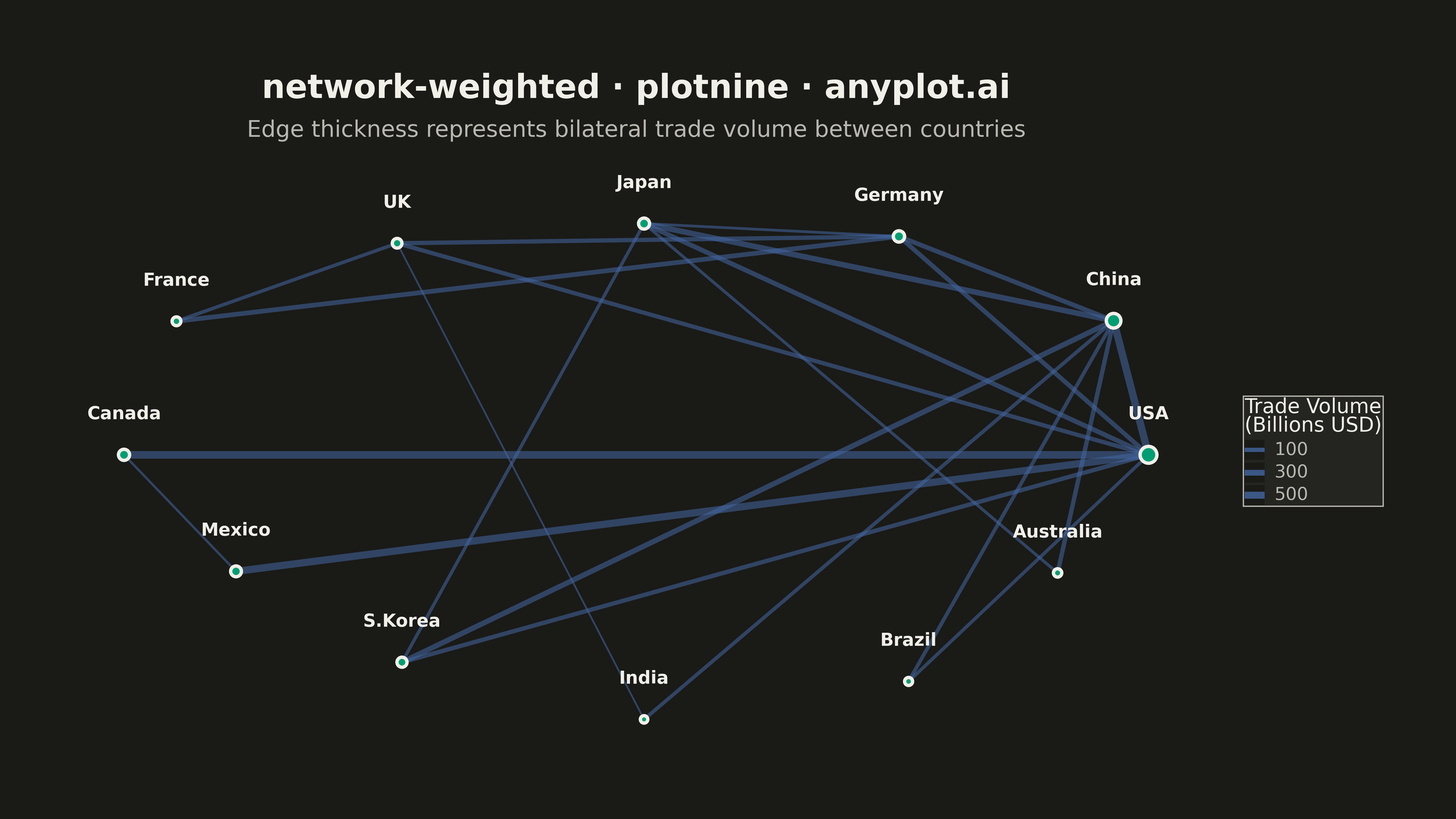
A weighted network graph displays relationships between entities using edge thickness to represent connection strength or weight. Unlike basic network graphs where edges are uniform, the varying line widths immediately communicate the relative importance of each relationship. This visualization makes it easy to identify strong vs weak connections, central hubs with many heavy links, and structural patterns in weighted relational data.
""" anyplot.ai
network-weighted: Weighted Network Graph with Edge Thickness
Library: plotnine 0.15.4 | Python 3.13.13
Quality: 93/100 | Updated: 2026-05-17
"""

import os

import numpy as np
import pandas as pd
from plotnine import (
    aes,
    element_rect,
    element_text,
    geom_point,
    geom_segment,
    geom_text,
    ggplot,
    guide_legend,
    guides,
    labs,
    scale_size_continuous,
    theme,
    theme_void,
)


# Theme tokens (see prompts/default-style-guide.md)
THEME = os.getenv("ANYPLOT_THEME", "light")
PAGE_BG = "#FAF8F1" if THEME == "light" else "#1A1A17"
ELEVATED_BG = "#FFFDF6" if THEME == "light" else "#242420"
INK = "#1A1A17" if THEME == "light" else "#F0EFE8"
INK_SOFT = "#4A4A44" if THEME == "light" else "#B8B7B0"

# Data - Trade network between countries (billions USD annual trade volume)
np.random.seed(42)

# Define nodes (countries)
nodes = pd.DataFrame(
    {
        "id": [
            "USA",
            "China",
            "Germany",
            "Japan",
            "UK",
            "France",
            "Canada",
            "Mexico",
            "S.Korea",
            "India",
            "Brazil",
            "Australia",
        ],
        "group": [
            "Americas",
            "Asia",
            "Europe",
            "Asia",
            "Europe",
            "Europe",
            "Americas",
            "Americas",
            "Asia",
            "Asia",
            "Americas",
            "Oceania",
        ],
    }
)

# Define edges (trade relationships with weights in billions USD)
edges_data = [
    ("USA", "China", 580),
    ("USA", "Canada", 620),
    ("USA", "Mexico", 550),
    ("USA", "Japan", 180),
    ("USA", "Germany", 160),
    ("USA", "UK", 130),
    ("USA", "S.Korea", 140),
    ("China", "Japan", 280),
    ("China", "S.Korea", 240),
    ("China", "Germany", 170),
    ("China", "Australia", 150),
    ("China", "India", 90),
    ("Germany", "France", 180),
    ("Germany", "UK", 140),
    ("Germany", "Japan", 45),
    ("France", "UK", 80),
    ("Japan", "S.Korea", 70),
    ("Canada", "Mexico", 35),
    ("India", "UK", 30),
    ("Brazil", "USA", 75),
    ("Brazil", "China", 95),
    ("Australia", "Japan", 55),
]

edges = pd.DataFrame(edges_data, columns=["source", "target", "weight"])

# Create node positions using circular layout
n_nodes = len(nodes)
angles = np.linspace(0, 2 * np.pi, n_nodes, endpoint=False)

# Arrange nodes in circular pattern with slight variation
node_positions = {}
for i, node_id in enumerate(nodes["id"]):
    radius = 4.0 + 0.3 * np.sin(i * 1.5)
    node_positions[node_id] = (radius * np.cos(angles[i]), radius * np.sin(angles[i]))

# Calculate weighted degree for node sizing (sum of connected edge weights)
weighted_degree = {}
for node_id in nodes["id"]:
    total_weight = edges[(edges["source"] == node_id) | (edges["target"] == node_id)]["weight"].sum()
    weighted_degree[node_id] = total_weight

# Add positions and weighted degree to nodes DataFrame
nodes["x"] = nodes["id"].map(lambda n: node_positions[n][0])
nodes["y"] = nodes["id"].map(lambda n: node_positions[n][1])
nodes["weighted_degree"] = nodes["id"].map(weighted_degree)

# Create edges DataFrame with coordinates
edges["x"] = edges["source"].map(lambda n: node_positions[n][0])
edges["y"] = edges["source"].map(lambda n: node_positions[n][1])
edges["xend"] = edges["target"].map(lambda n: node_positions[n][0])
edges["yend"] = edges["target"].map(lambda n: node_positions[n][1])

# Scale edge thickness for better visibility (1-6 range)
weight_min, weight_max = edges["weight"].min(), edges["weight"].max()
edges["thickness"] = 1.0 + (edges["weight"] - weight_min) / (weight_max - weight_min) * 5

# Scale node size based on weighted degree (5-16 range for better visibility)
degree_min = nodes["weighted_degree"].min()
degree_max = nodes["weighted_degree"].max()
nodes["node_size"] = 5 + (nodes["weighted_degree"] - degree_min) / (degree_max - degree_min) * 11

# Create plot
plot = (
    ggplot()
    # Draw edges with thickness mapped to trade weight
    + geom_segment(
        data=edges, mapping=aes(x="x", y="y", xend="xend", yend="yend", size="weight"), color="#4467A3", alpha=0.55
    )
    # Draw nodes with size mapped to weighted degree - larger for better visibility
    + geom_point(
        data=nodes,
        mapping=aes(x="x", y="y", size="weighted_degree"),
        color=INK,
        stroke=1.5,
        fill="#009E73",
        show_legend=False,
    )
    # Add node labels with offset - larger size for better legibility
    + geom_text(data=nodes, mapping=aes(x="x", y="y", label="id"), size=14, color=INK, fontweight="bold", nudge_y=0.65)
    # Scale edge thickness
    + scale_size_continuous(range=(0.8, 6), name="Trade Volume\n(Billions USD)", breaks=[100, 300, 500])
    # Labels and title - format: {spec-id} · {library} · anyplot.ai
    + labs(
        title="network-weighted · plotnine · anyplot.ai",
        subtitle="Edge thickness represents bilateral trade volume between countries",
    )
    # Clean theme with no axes
    + theme_void()
    + theme(
        figure_size=(16, 9),
        plot_background=element_rect(fill=PAGE_BG, color=PAGE_BG),
        panel_background=element_rect(fill=PAGE_BG),
        plot_title=element_text(size=26, ha="center", weight="bold", color=INK),
        plot_subtitle=element_text(size=18, ha="center", color=INK_SOFT),
        legend_title=element_text(size=16, color=INK),
        legend_text=element_text(size=14, color=INK_SOFT),
        legend_background=element_rect(fill=ELEVATED_BG, color=INK_SOFT),
        legend_position="right",
        plot_margin=0.05,
    )
    + guides(size=guide_legend(override_aes={"alpha": 0.8}))
)

# Save plot
plot.save(f"plot-{THEME}.png", dpi=300, width=16, height=9, verbose=False)
Runnable source as JSON, for any HTTP client: https://api.anyplot.ai/specs/network-weighted/plotnine/code. Any spec id and library id listed in llms-full.txt fit the same URL shape; every URL below is complete and callable.
{
  "spec_id": "network-weighted",
  "language": "python",
  "library": "plotnine",
  "page": "https://anyplot.ai/network-weighted/python/plotnine",
  "hub": "https://anyplot.ai/network-weighted",
  "code_json": "https://api.anyplot.ai/specs/network-weighted/plotnine/code",
  "spec_json": "https://api.anyplot.ai/specs/network-weighted",
  "render_light_png": "https://storage.googleapis.com/anyplot-images/plots/network-weighted/python/plotnine/plot-light.png",
  "render_dark_png": "https://storage.googleapis.com/anyplot-images/plots/network-weighted/python/plotnine/plot-dark.png",
  "quality_score": 93.0,
  "license": "MIT",
  "guide": "https://anyplot.ai/llms.txt"
}
Part of Weighted Network Graph with Edge Thickness on anyplot.ai.