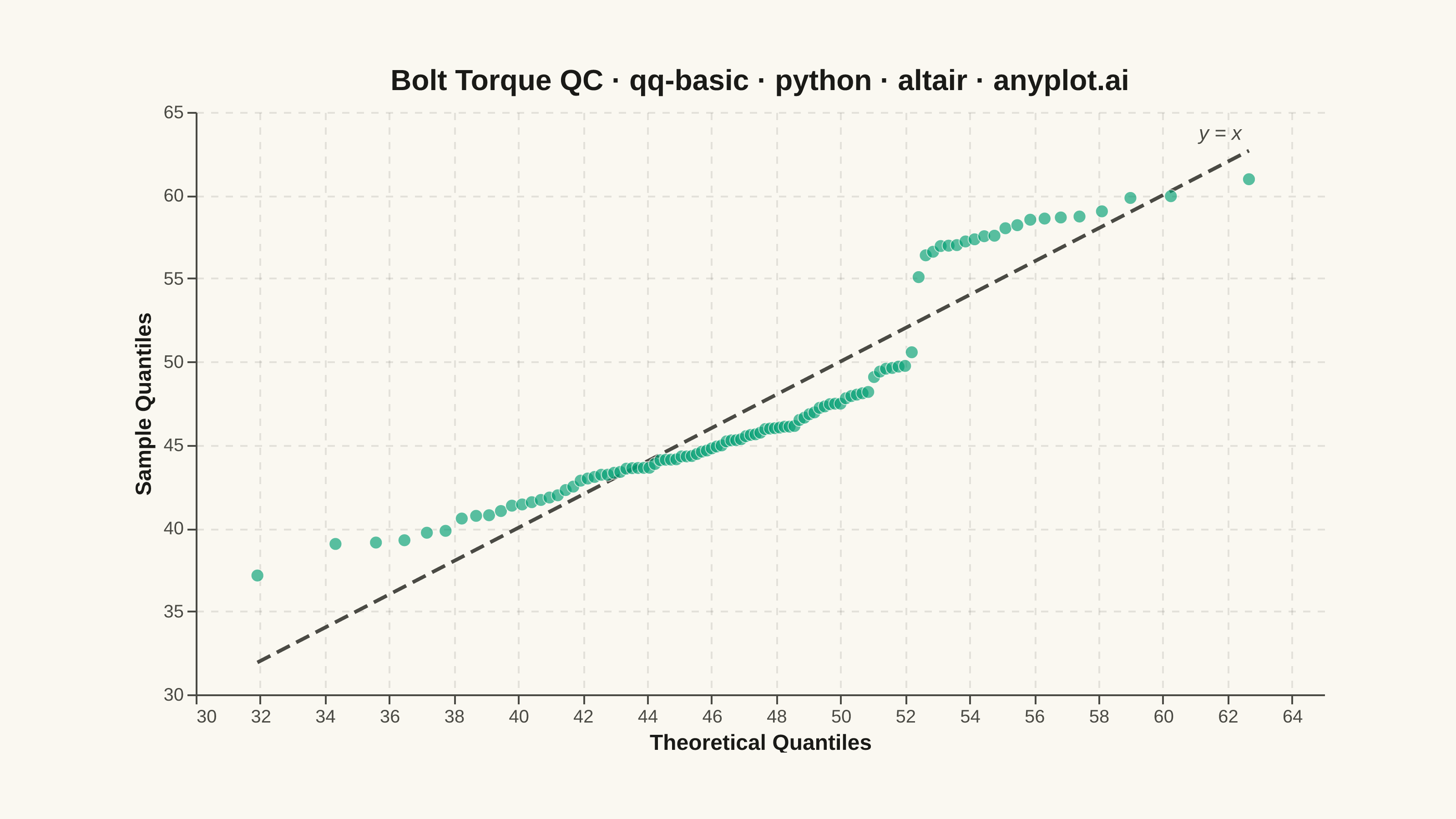
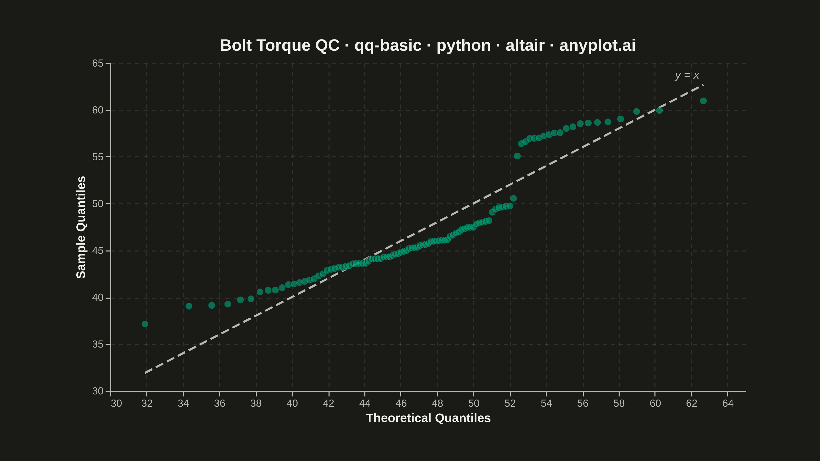
A Q-Q (Quantile-Quantile) plot compares the distribution of a dataset against a theoretical distribution (typically normal) or another dataset. Points are plotted by matching sample quantiles to theoretical quantiles, with a diagonal reference line indicating perfect distribution match. Deviations from the line reveal distribution characteristics such as skewness, heavy tails, and outliers.
""" anyplot.ai
qq-basic: Basic Q-Q Plot
Library: altair 6.2.2 | Python 3.13.14
Quality: 90/100 | Updated: 2026-07-24
"""

import os
import sys


# The file is named altair.py; remove its own directory from sys.path so
# `import altair` resolves to the library, not this script.
_HERE = os.path.dirname(os.path.abspath(__file__))
sys.path = [p for p in sys.path if not p or os.path.abspath(p) != _HERE]

import altair as alt
import numpy as np
import pandas as pd
from PIL import Image
from scipy.stats import norm


THEME = os.getenv("ANYPLOT_THEME", "light")
PAGE_BG = "#FAF8F1" if THEME == "light" else "#1A1A17"
INK = "#1A1A17" if THEME == "light" else "#F0EFE8"
INK_SOFT = "#4A4A44" if THEME == "light" else "#B8B7B0"
BRAND = "#009E73"  # Imprint palette, position 1

# Bolt torque QC readings (N·m) from two assembly-line stations: most bolts
# come from a well-calibrated station, a smaller batch from a drifting
# station running hot, producing a bimodal mixture that departs from
# normality in an S-curve.
np.random.seed(42)
sample = np.concatenate([np.random.normal(45, 3, 80), np.random.normal(58, 2, 20)])

n = len(sample)
sorted_sample = np.sort(sample)
p = (np.arange(1, n + 1) - 0.5) / n
sample_mean, sample_std = np.mean(sample), np.std(sample, ddof=1)
theoretical_scaled = norm.ppf(p) * sample_std + sample_mean

df = pd.DataFrame({"Theoretical Quantiles": theoretical_scaled, "Sample Quantiles": sorted_sample})

line_min = min(theoretical_scaled.min(), sorted_sample.min())
line_max = max(theoretical_scaled.max(), sorted_sample.max())
line_df = pd.DataFrame({"x": [line_min, line_max], "y": [line_min, line_max]})
label_df = pd.DataFrame({"x": [line_max], "y": [line_max], "label": ["y = x"]})

# Distinctive Altair feature: a pointer-hover selection that enlarges the
# nearest marker, giving overlapping mid-quantile points an interactive way
# to be told apart (beyond the static tooltip already on the layer).
hover = alt.selection_point(on="pointerover", nearest=True, empty=False)

points = (
    alt.Chart(df)
    .mark_point(size=50, color=BRAND, filled=True, opacity=0.65, stroke=PAGE_BG, strokeWidth=0.5)
    .encode(
        x=alt.X("Theoretical Quantiles:Q", title="Theoretical Quantiles", scale=alt.Scale(zero=False)),
        y=alt.Y("Sample Quantiles:Q", title="Sample Quantiles", scale=alt.Scale(zero=False)),
        tooltip=["Theoretical Quantiles:Q", "Sample Quantiles:Q"],
        size=alt.condition(hover, alt.value(160), alt.value(50)),
    )
    .add_params(hover)
)

reference_line = alt.Chart(line_df).mark_line(color=INK_SOFT, strokeWidth=2, strokeDash=[8, 4]).encode(x="x:Q", y="y:Q")

line_label = (
    alt.Chart(label_df)
    .mark_text(align="right", baseline="bottom", dx=-4, dy=-4, fontSize=11, color=INK_SOFT, fontStyle="italic")
    .encode(x="x:Q", y="y:Q", text="label:N")
)

chart = (
    (reference_line + line_label + points)
    .properties(
        background=PAGE_BG,
        width=620,
        height=320,
        padding={"left": 0, "right": 0, "top": 0, "bottom": 0},
        title=alt.Title("Bolt Torque QC · qq-basic · python · altair · anyplot.ai", fontSize=16),
    )
    .configure_view(fill=PAGE_BG, strokeWidth=0)
    .configure_axis(
        domainColor=INK_SOFT,
        tickColor=INK_SOFT,
        gridColor=INK,
        gridOpacity=0.10,
        gridDash=[4, 4],
        labelColor=INK_SOFT,
        labelFontSize=10,
        titleColor=INK,
        titleFontSize=12,
    )
    .configure_title(color=INK)
)

chart.save(f"plot-{THEME}.png", scale_factor=4.0)
chart.save(f"plot-{THEME}.html")

# Canvas contract: pad (never crop) up to the exact 3200x1800 target — vl-convert's
# title/axis-label padding lands short of the target more often than over it.
TW, TH = 3200, 1800
_img = Image.open(f"plot-{THEME}.png").convert("RGB")
_w, _h = _img.size
if _w > TW or _h > TH:
    raise SystemExit(
        f"altair vl-convert produced {_w}x{_h}, exceeds target {TW}x{TH}. "
        f"Shrink chart .properties(width=, height=) values and re-render."
    )
if _w < TW or _h < TH:
    _canvas = Image.new("RGB", (TW, TH), PAGE_BG)
    _canvas.paste(_img, ((TW - _w) // 2, (TH - _h) // 2))
    _canvas.save(f"plot-{THEME}.png")
Runnable source as JSON, for any HTTP client: https://api.anyplot.ai/specs/qq-basic/altair/code. Any spec id and library id listed in llms-full.txt fit the same URL shape; every URL below is complete and callable.
{
  "spec_id": "qq-basic",
  "language": "python",
  "library": "altair",
  "page": "https://anyplot.ai/qq-basic/python/altair",
  "hub": "https://anyplot.ai/qq-basic",
  "code_json": "https://api.anyplot.ai/specs/qq-basic/altair/code",
  "spec_json": "https://api.anyplot.ai/specs/qq-basic",
  "render_light_png": "https://storage.googleapis.com/anyplot-images/plots/qq-basic/python/altair/plot-light.png",
  "render_dark_png": "https://storage.googleapis.com/anyplot-images/plots/qq-basic/python/altair/plot-dark.png",
  "interactive_light_html": "https://storage.googleapis.com/anyplot-images/plots/qq-basic/python/altair/plot-light.html",
  "interactive_dark_html": "https://storage.googleapis.com/anyplot-images/plots/qq-basic/python/altair/plot-dark.html",
  "quality_score": 90.0,
  "license": "MIT",
  "guide": "https://anyplot.ai/llms.txt"
}
Part of Basic Q-Q Plot on anyplot.ai.