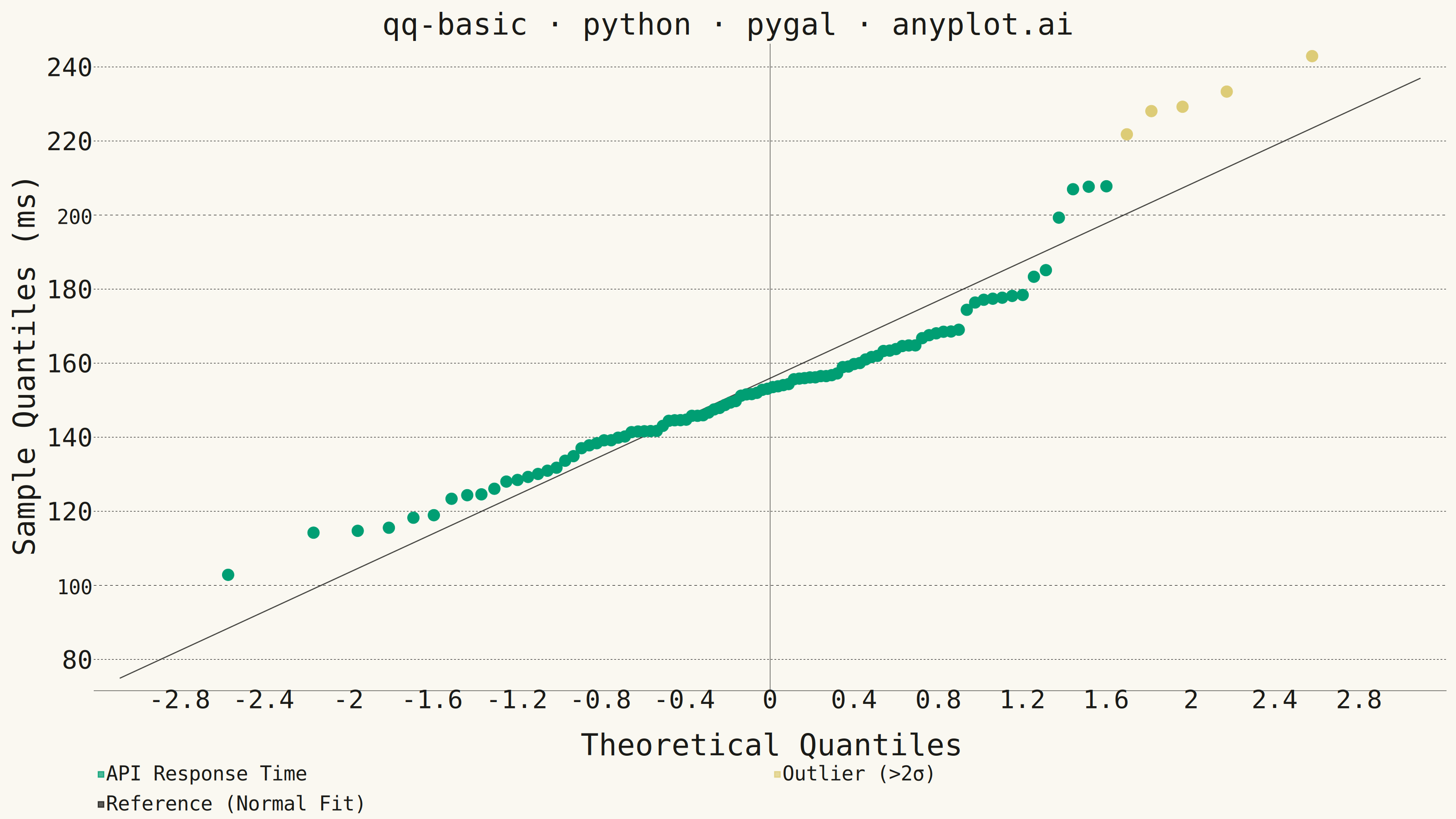
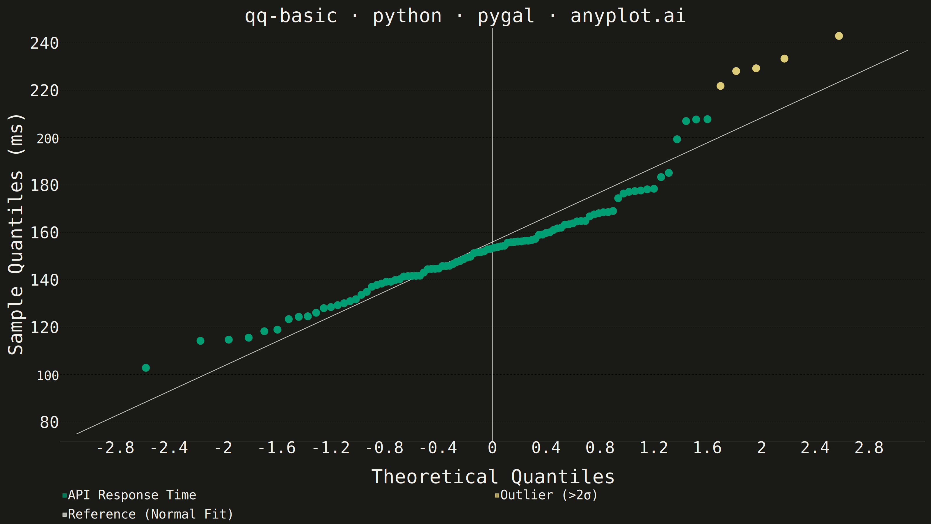
A Q-Q (Quantile-Quantile) plot compares the distribution of a dataset against a theoretical distribution (typically normal) or another dataset. Points are plotted by matching sample quantiles to theoretical quantiles, with a diagonal reference line indicating perfect distribution match. Deviations from the line reveal distribution characteristics such as skewness, heavy tails, and outliers.
""" anyplot.ai
qq-basic: Basic Q-Q Plot
Library: pygal 3.1.3 | Python 3.13.14
Quality: 92/100 | Updated: 2026-07-24
"""

import sys


sys.path.pop(0)  # prevent this file from shadowing the installed pygal package

import os
from statistics import NormalDist

import numpy as np
import pygal
from pygal.style import Style


THEME = os.getenv("ANYPLOT_THEME", "light")
PAGE_BG = "#FAF8F1" if THEME == "light" else "#1A1A17"
INK = "#1A1A17" if THEME == "light" else "#F0EFE8"
INK_MUTED = "#6B6A63" if THEME == "light" else "#A8A79F"

BRAND = "#009E73"  # Imprint palette position 1 — always first series
AMBER = "#DDCC77"  # Imprint semantic anchor — warning / caution, flags the slow-response tail

# Data - API response times (ms): a fast, tightly-clustered core plus an
# occasional slow request, producing the right-skewed tail that QQ plots
# are commonly used to surface before assuming normality in latency analysis.
np.random.seed(42)
baseline = np.random.normal(150, 18, 80)
slow_tail = 150 + np.random.exponential(35, 20)
sample = np.sort(np.concatenate([baseline, slow_tail]))
n = len(sample)

# Calculate theoretical quantiles using standard library
_nd = NormalDist()
probabilities = (np.arange(1, n + 1) - 0.5) / n
theoretical_quantiles = np.array([_nd.inv_cdf(float(p)) for p in probabilities])

# Theoretical quantiles are unitless z-scores while the sample is in ms, so
# the fitted reference line uses the sample's own mean/std (y = mean + std*x)
# rather than y=x — the standard QQ convention when axes are in different units
# (matches scipy.stats.probplot / statsmodels qqplot). The legend label spells
# this out explicitly so it doesn't read as a spec deviation.
theo_margin = (theoretical_quantiles.max() - theoretical_quantiles.min()) * 0.1
line_x_min = theoretical_quantiles.min() - theo_margin
line_x_max = theoretical_quantiles.max() + theo_margin

sample_mean = sample.mean()
sample_std = sample.std()

# Flag the slow-response tail (>2 std above the mean) so the deviation this
# QQ plot exists to reveal is visually called out, not just implied by shape.
# Split into two series (rather than per-point color overrides) so the
# outliers get their own legend swatch — self-explanatory in the static PNG.
outlier_threshold = sample_mean + 2 * sample_std
paired = list(zip(theoretical_quantiles, sample, strict=True))
normal_points = [(tq, s) for tq, s in paired if s <= outlier_threshold]
outlier_points = [(tq, s) for tq, s in paired if s > outlier_threshold]

custom_style = Style(
    background=PAGE_BG,
    plot_background=PAGE_BG,
    foreground=INK,
    foreground_strong=INK,
    foreground_subtle=INK_MUTED,
    # series 1 = brand green, series 2 = amber outlier anchor, series 3 (reference line) = neutral ink
    colors=(BRAND, AMBER, INK),
    title_font_size=66,
    label_font_size=56,
    major_label_font_size=44,
    legend_font_size=44,
    value_font_size=36,
    stroke_width=2.5,
)

chart = pygal.XY(
    width=3200,
    height=1800,
    style=custom_style,
    title="qq-basic · python · pygal · anyplot.ai",
    x_title="Theoretical Quantiles",
    y_title="Sample Quantiles (ms)",
    show_legend=True,
    legend_at_bottom=True,
    dots_size=13,
    stroke=False,
    show_x_guides=False,
    show_y_guides=True,
)

chart.add("API Response Time", normal_points)
chart.add("Outlier (>2σ)", outlier_points)

reference_line = [
    (line_x_min, sample_mean + sample_std * line_x_min),
    (line_x_max, sample_mean + sample_std * line_x_max),
]
chart.add("Reference (Normal Fit)", reference_line, stroke=True, show_dots=False, dots_size=0)

chart.render_to_png(f"plot-{THEME}.png")
with open(f"plot-{THEME}.html", "wb") as f:
    f.write(chart.render())
Runnable source as JSON, for any HTTP client: https://api.anyplot.ai/specs/qq-basic/pygal/code. Any spec id and library id listed in llms-full.txt fit the same URL shape; every URL below is complete and callable.
{
  "spec_id": "qq-basic",
  "language": "python",
  "library": "pygal",
  "page": "https://anyplot.ai/qq-basic/python/pygal",
  "hub": "https://anyplot.ai/qq-basic",
  "code_json": "https://api.anyplot.ai/specs/qq-basic/pygal/code",
  "spec_json": "https://api.anyplot.ai/specs/qq-basic",
  "render_light_png": "https://storage.googleapis.com/anyplot-images/plots/qq-basic/python/pygal/plot-light.png",
  "render_dark_png": "https://storage.googleapis.com/anyplot-images/plots/qq-basic/python/pygal/plot-dark.png",
  "interactive_light_html": "https://storage.googleapis.com/anyplot-images/plots/qq-basic/python/pygal/plot-light.html",
  "interactive_dark_html": "https://storage.googleapis.com/anyplot-images/plots/qq-basic/python/pygal/plot-dark.html",
  "quality_score": 92.0,
  "license": "MIT",
  "guide": "https://anyplot.ai/llms.txt"
}
Part of Basic Q-Q Plot on anyplot.ai.