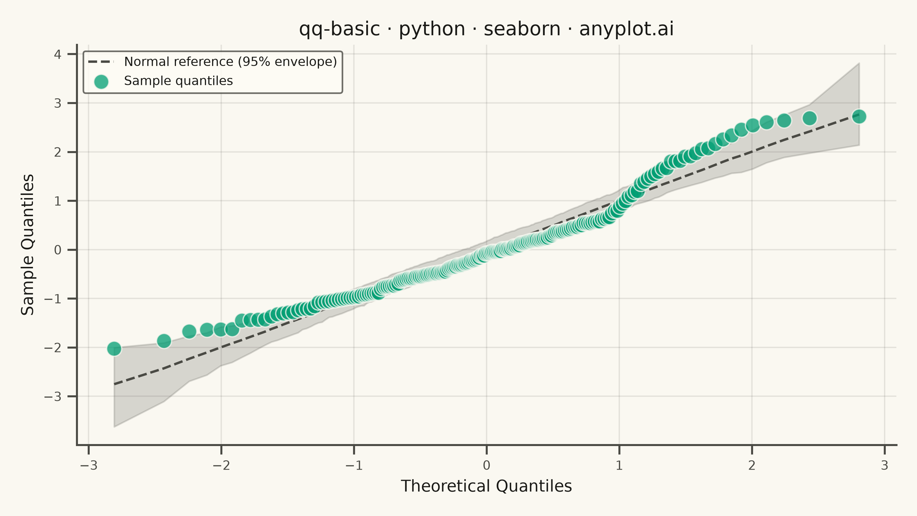
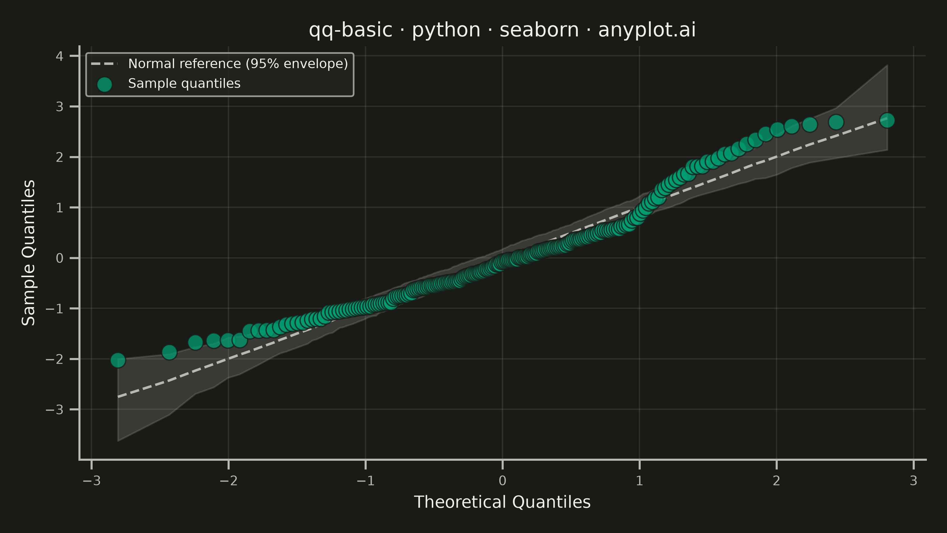
A Q-Q (Quantile-Quantile) plot compares the distribution of a dataset against a theoretical distribution (typically normal) or another dataset. Points are plotted by matching sample quantiles to theoretical quantiles, with a diagonal reference line indicating perfect distribution match. Deviations from the line reveal distribution characteristics such as skewness, heavy tails, and outliers.
""" anyplot.ai
qq-basic: Basic Q-Q Plot
Library: seaborn 0.13.2 | Python 3.13.14
Quality: 92/100 | Updated: 2026-07-24
"""

import os

import matplotlib.pyplot as plt
import numpy as np
import pandas as pd
import seaborn as sns


# Theme tokens
THEME = os.getenv("ANYPLOT_THEME", "light")
PAGE_BG = "#FAF8F1" if THEME == "light" else "#1A1A17"
ELEVATED_BG = "#FFFDF6" if THEME == "light" else "#242420"
INK = "#1A1A17" if THEME == "light" else "#F0EFE8"
INK_SOFT = "#4A4A44" if THEME == "light" else "#B8B7B0"
BRAND = "#009E73"  # Imprint palette position 1

sns.set_theme(
    style="ticks",
    rc={
        "figure.facecolor": PAGE_BG,
        "axes.facecolor": PAGE_BG,
        "axes.edgecolor": INK_SOFT,
        "axes.labelcolor": INK,
        "text.color": INK,
        "xtick.color": INK_SOFT,
        "ytick.color": INK_SOFT,
        "grid.color": INK,
        "grid.alpha": 0.10,
        "legend.facecolor": ELEVATED_BG,
        "legend.edgecolor": INK_SOFT,
    },
)

# Data - mixture distribution with right-skewed tail to demonstrate Q-Q deviation
rng = np.random.default_rng(42)
sample = np.concatenate([rng.normal(loc=50, scale=10, size=180), rng.normal(loc=75, scale=5, size=20)])
n = len(sample)

# Theoretical quantiles via Abramowitz & Stegun 26.2.17 rational approximation
p = (np.arange(1, n + 1) - 0.5) / n
t = np.where(p < 0.5, np.sqrt(-2 * np.log(p)), np.sqrt(-2 * np.log(1 - p)))
num = 2.515517 + 0.802853 * t + 0.010328 * t**2
den = 1 + 1.432788 * t + 0.189269 * t**2 + 0.001308 * t**3
theoretical_q = np.where(p < 0.5, -(t - num / den), t - num / den)
sample_q = np.sort((sample - sample.mean()) / sample.std(ddof=1))

# Simulation envelope: draw many perfectly-normal replicates of size n and let
# seaborn's lineplot bootstrap a 95% percentile interval around their order
# statistics. This gives the reference guide real statistical depth (the
# natural sampling variability a truly normal sample would show) instead of a
# bare y=x line, and leverages seaborn's own error-bar estimation.
n_replicates = 300
replicates = np.sort(rng.standard_normal(size=(n_replicates, n)), axis=1)
envelope_df = pd.DataFrame({"theoretical": np.tile(theoretical_q, n_replicates), "simulated": replicates.ravel()})

# Plot
fig, ax = plt.subplots(figsize=(8, 4.5), dpi=400, facecolor=PAGE_BG)
ax.set_facecolor(PAGE_BG)

sns.lineplot(
    data=envelope_df,
    x="theoretical",
    y="simulated",
    ax=ax,
    estimator="mean",
    errorbar=("pi", 95),
    color=INK_SOFT,
    linewidth=1.5,
    linestyle="--",
    label="Normal reference (95% envelope)",
    zorder=1,
)

sns.scatterplot(
    x=theoretical_q,
    y=sample_q,
    ax=ax,
    s=90,
    color=BRAND,
    alpha=0.75,
    edgecolor=PAGE_BG,
    linewidth=0.8,
    label="Sample quantiles",
    zorder=2,
)

# Style
ax.set_xlabel("Theoretical Quantiles", fontsize=10, color=INK)
ax.set_ylabel("Sample Quantiles", fontsize=10, color=INK)
ax.set_title("qq-basic · python · seaborn · anyplot.ai", fontsize=12, fontweight="medium", color=INK)
ax.tick_params(axis="both", labelsize=8, colors=INK_SOFT)
ax.legend(fontsize=8, loc="upper left")
ax.spines["top"].set_visible(False)
ax.spines["right"].set_visible(False)
for s in ("left", "bottom"):
    ax.spines[s].set_color(INK_SOFT)
ax.grid(True, alpha=0.10, linewidth=0.8, color=INK)

plt.tight_layout()
plt.savefig(f"plot-{THEME}.png", dpi=400, facecolor=PAGE_BG)
Runnable source as JSON, for any HTTP client: https://api.anyplot.ai/specs/qq-basic/seaborn/code. Any spec id and library id listed in llms-full.txt fit the same URL shape; every URL below is complete and callable.
{
  "spec_id": "qq-basic",
  "language": "python",
  "library": "seaborn",
  "page": "https://anyplot.ai/qq-basic/python/seaborn",
  "hub": "https://anyplot.ai/qq-basic",
  "code_json": "https://api.anyplot.ai/specs/qq-basic/seaborn/code",
  "spec_json": "https://api.anyplot.ai/specs/qq-basic",
  "render_light_png": "https://storage.googleapis.com/anyplot-images/plots/qq-basic/python/seaborn/plot-light.png",
  "render_dark_png": "https://storage.googleapis.com/anyplot-images/plots/qq-basic/python/seaborn/plot-dark.png",
  "quality_score": 92.0,
  "license": "MIT",
  "guide": "https://anyplot.ai/llms.txt"
}
Part of Basic Q-Q Plot on anyplot.ai.