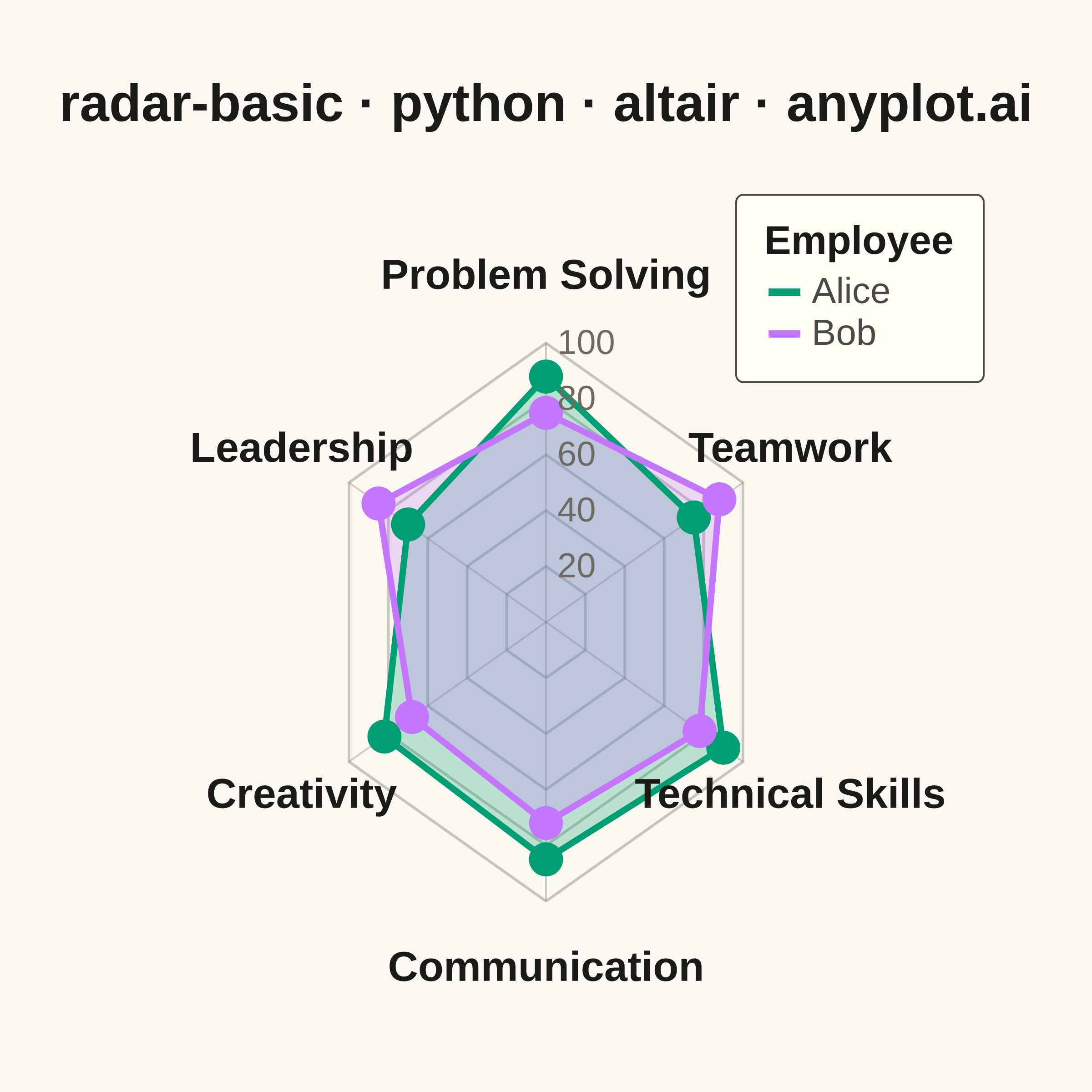
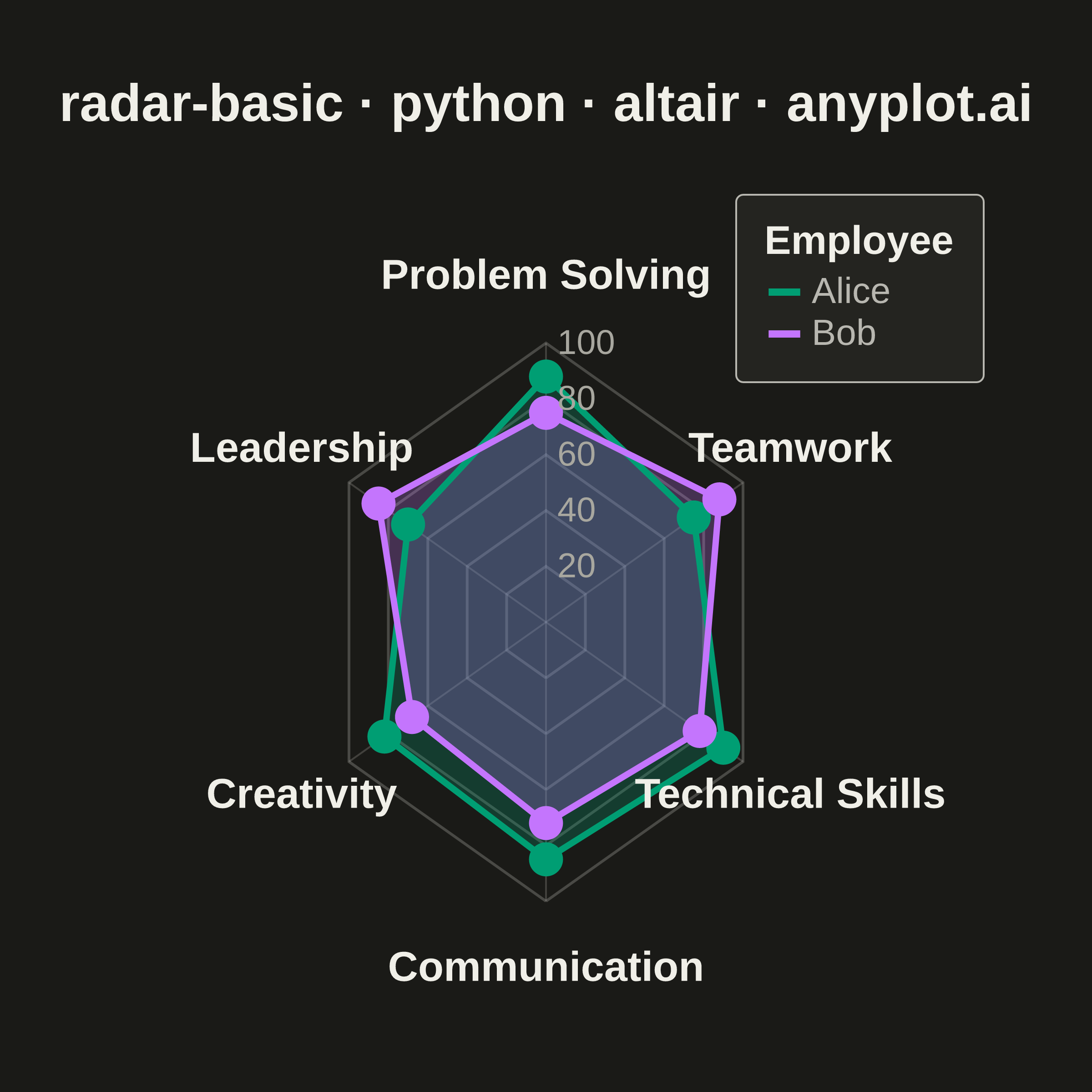
A radar chart (also known as spider or web chart) displays multivariate data on axes starting from a common center point, with values connected to form a polygon. Each axis represents a different variable, making it ideal for comparing multiple quantitative variables at once or visualizing strengths and weaknesses across categories.
""" anyplot.ai
radar-basic: Basic Radar Chart
Library: altair 6.2.2 | Python 3.13.14
Quality: 91/100 | Updated: 2026-07-24
"""

import importlib
import os
import sys


# Prevent this file (altair.py) from shadowing the installed altair package
_here = os.path.realpath(os.path.dirname(__file__))
sys.path = [p for p in sys.path if not (p and os.path.realpath(p) == _here)]
del _here

alt = importlib.import_module("altair")
np = importlib.import_module("numpy")
pd = importlib.import_module("pandas")


THEME = os.getenv("ANYPLOT_THEME", "light")
PAGE_BG = "#FAF8F1" if THEME == "light" else "#1A1A17"
ELEVATED_BG = "#FFFDF6" if THEME == "light" else "#242420"
INK = "#1A1A17" if THEME == "light" else "#F0EFE8"
INK_SOFT = "#4A4A44" if THEME == "light" else "#B8B7B0"
INK_MUTED = "#6B6A63" if THEME == "light" else "#A8A79F"

IMPRINT = ["#009E73", "#C475FD", "#4467A3", "#BD8233", "#AE3030", "#2ABCCD", "#954477"]

# Square canonical inner view (see prompts/library/altair.md "Canvas"). Width and
# height differ (unlike the data domain, which is symmetric), so the x domain is
# widened by the same ratio to keep the polar grid circular instead of elliptical.
VIEW_W, VIEW_H = 500, 460
TARGET_W, TARGET_H = 2400, 2400

categories = ["Communication", "Technical Skills", "Teamwork", "Problem Solving", "Leadership", "Creativity"]
n = len(categories)
MAX_VAL = 100

alice_vals = [85, 90, 75, 88, 70, 82]
bob_vals = [72, 78, 88, 75, 85, 68]

angles = np.linspace(0, 2 * np.pi, n, endpoint=False).tolist()


def to_xy(values):
    scaled = [v / MAX_VAL for v in values]
    return (
        [s * np.cos(a - np.pi / 2) for s, a in zip(scaled, angles, strict=True)],
        [s * np.sin(a - np.pi / 2) for s, a in zip(scaled, angles, strict=True)],
    )


def to_xy_closed(values):
    x, y = to_xy(values)
    return x + [x[0]], y + [y[0]]


# Grid rings (hexagonal at 5 levels)
grid_data = []
for level in [20, 40, 60, 80, 100]:
    ls = level / MAX_VAL
    for i, angle in enumerate(angles):
        grid_data.append(
            {"x": ls * np.cos(angle - np.pi / 2), "y": ls * np.sin(angle - np.pi / 2), "level": level, "order": i}
        )
    grid_data.append(
        {"x": ls * np.cos(angles[0] - np.pi / 2), "y": ls * np.sin(angles[0] - np.pi / 2), "level": level, "order": n}
    )
df_grid = pd.DataFrame(grid_data)

# Spokes from center to outer edge
spokes_data = []
for cat, angle in zip(categories, angles, strict=True):
    spokes_data.extend(
        [
            {"x": 0.0, "y": 0.0, "cat": cat, "ord": 0},
            {"x": np.cos(angle - np.pi / 2), "y": np.sin(angle - np.pi / 2), "cat": cat, "ord": 1},
        ]
    )
df_spokes = pd.DataFrame(spokes_data)

# Outer axis labels
label_off = 1.24
df_labels = pd.DataFrame(
    [
        {"x": label_off * np.cos(a - np.pi / 2), "y": label_off * np.sin(a - np.pi / 2), "label": c}
        for c, a in zip(categories, angles, strict=True)
    ]
)

# Grid ring value annotations along the top (vertical) spoke
df_ring_labels = pd.DataFrame(
    [{"x": 0.05, "y": level / MAX_VAL, "label": str(level)} for level in [20, 40, 60, 80, 100]]
)

# Series line data (closed polygons for outlines)
series_line_rows = []
for name, vals in [("Alice", alice_vals), ("Bob", bob_vals)]:
    x_c, y_c = to_xy_closed(vals)
    for i, (x, y) in enumerate(zip(x_c, y_c, strict=True)):
        series_line_rows.append({"Employee": name, "x": x, "y": y, "order": i})
df_series_line = pd.DataFrame(series_line_rows)

# Series point data (unclosed, for tooltips and click selection)
pts_rows = []
for name, vals in [("Alice", alice_vals), ("Bob", bob_vals)]:
    x_p, y_p = to_xy(vals)
    for x, y, v, cat in zip(x_p, y_p, vals, categories, strict=True):
        pts_rows.append({"Employee": name, "x": x, "y": y, "value": v, "category": cat})
df_pts = pd.DataFrame(pts_rows)

# Click-based interactive selection: click a vertex point to highlight its series
selection = alt.selection_point(fields=["Employee"])

color_scale = alt.Scale(domain=["Alice", "Bob"], range=[IMPRINT[0], IMPRINT[1]])

# y domain is shifted +0.10 (not centered on 0) to tighten the margin below the
# lowest label and ease the margin above the highest one — the title sits above
# the view (not mirrored below it), so a symmetric domain left more empty
# canvas below the grid than above it once the PNG was padded to a square.
domain_y = [-1.35, 1.55]
domain_x = [-1.45 * VIEW_W / VIEW_H, 1.45 * VIEW_W / VIEW_H]

# Static grid rings
grid_lines = (
    alt.Chart(df_grid)
    .mark_line(strokeWidth=1.5, color=INK_SOFT, opacity=0.3)
    .encode(
        x=alt.X("x:Q", axis=None, scale=alt.Scale(domain=domain_x)),
        y=alt.Y("y:Q", axis=None, scale=alt.Scale(domain=domain_y)),
        detail="level:N",
        order="order:O",
    )
)

# Static spokes
spokes = (
    alt.Chart(df_spokes)
    .mark_line(strokeWidth=1, color=INK_SOFT, opacity=0.25)
    .encode(x=alt.X("x:Q", axis=None), y=alt.Y("y:Q", axis=None), detail="cat:N", order="ord:O")
)

# Filled polygons — mark_line with interpolate="linear-closed" draws a closed fill
# from the same df_series_line data and quantitative x/y scale as the outline layer
# below, so fill and outline are always coordinate-identical (a prior mark_geoshape +
# identity-projection approach fit its own bounding box independently of the shared
# scale, causing the fill to render oversized relative to the outline). fill/fillOpacity
# are static mark properties (not data-driven encodings) so they cannot collide with
# the Employee color legend defined on the series_lines layer below.
alice_fill = (
    alt.Chart(df_series_line[df_series_line["Employee"] == "Alice"])
    .mark_line(interpolate="linear-closed", fill=IMPRINT[0], fillOpacity=0.25, stroke=None)
    .encode(x=alt.X("x:Q", axis=None), y=alt.Y("y:Q", axis=None), order="order:O")
)

bob_fill = (
    alt.Chart(df_series_line[df_series_line["Employee"] == "Bob"])
    .mark_line(interpolate="linear-closed", fill=IMPRINT[1], fillOpacity=0.25, stroke=None)
    .encode(x=alt.X("x:Q", axis=None), y=alt.Y("y:Q", axis=None), order="order:O")
)

# Interactive polygon outlines — click a series to highlight it (dims the other)
series_lines = (
    alt.Chart(df_series_line)
    .mark_line(strokeWidth=3.5)
    .encode(
        x=alt.X("x:Q", axis=None),
        y=alt.Y("y:Q", axis=None),
        color=alt.Color(
            "Employee:N",
            scale=color_scale,
            legend=alt.Legend(
                title="Employee",
                titleFontSize=22,
                titleFontWeight="bold",
                labelFontSize=20,
                symbolSize=300,
                symbolStrokeWidth=4,
                symbolOpacity=1.0,
                orient="top-right",
                offset=10,
            ),
        ),
        detail="Employee:N",
        order="order:O",
        opacity=alt.condition(selection, alt.value(1.0), alt.value(0.15)),
    )
)

# Interactive vertex points with hover tooltips — click to select series
points = (
    alt.Chart(df_pts)
    .mark_point(filled=True, size=350)
    .encode(
        x=alt.X("x:Q"),
        y=alt.Y("y:Q"),
        color=alt.Color("Employee:N", scale=color_scale, legend=None),
        opacity=alt.condition(selection, alt.value(1.0), alt.value(0.10)),
        tooltip=[
            alt.Tooltip("Employee:N", title="Employee"),
            alt.Tooltip("category:N", title="Competency"),
            alt.Tooltip("value:Q", title="Score"),
        ],
    )
    .add_params(selection)
)

# Outer axis category labels
axis_labels = (
    alt.Chart(df_labels)
    .mark_text(fontSize=23, fontWeight="bold")
    .encode(x=alt.X("x:Q"), y=alt.Y("y:Q"), text="label:N", color=alt.value(INK))
)

# Grid ring value annotations (20, 40, 60, 80, 100) along the top spoke
ring_labels = (
    alt.Chart(df_ring_labels)
    .mark_text(fontSize=19, align="left")
    .encode(x=alt.X("x:Q"), y=alt.Y("y:Q"), text="label:N", color=alt.value(INK_MUTED))
)

chart = (
    alt.layer(grid_lines, spokes, alice_fill, bob_fill, series_lines, points, axis_labels, ring_labels)
    .properties(
        width=VIEW_W,
        height=VIEW_H,
        background=PAGE_BG,
        title=alt.Title(
            text="radar-basic · python · altair · anyplot.ai", fontSize=29, color=INK, fontWeight="bold", offset=24
        ),
    )
    .configure_view(strokeWidth=0, fill=PAGE_BG)
    .configure_legend(
        fillColor=ELEVATED_BG,
        strokeColor=INK_SOFT,
        labelColor=INK_SOFT,
        titleColor=INK,
        labelFontSize=20,
        titleFontSize=22,
        padding=16,
        cornerRadius=4,
    )
)

chart.save(f"plot-{THEME}.png", scale_factor=4.0)

# PAD-only to the canonical (2400, 2400) target — never crop (see prompts/library/altair.md "Canvas").
from PIL import Image


_img = Image.open(f"plot-{THEME}.png").convert("RGB")
_w, _h = _img.size
if _w > TARGET_W or _h > TARGET_H:
    raise SystemExit(
        f"altair vl-convert produced {_w}x{_h}, exceeds target {TARGET_W}x{TARGET_H}. "
        f"Shrink chart .properties(width=, height=) values and re-render."
    )
if _w < TARGET_W or _h < TARGET_H:
    _canvas = Image.new("RGB", (TARGET_W, TARGET_H), PAGE_BG)
    _canvas.paste(_img, ((TARGET_W - _w) // 2, (TARGET_H - _h) // 2))
    _canvas.save(f"plot-{THEME}.png")

chart.save(f"plot-{THEME}.html")
Runnable source as JSON, for any HTTP client: https://api.anyplot.ai/specs/radar-basic/altair/code. Any spec id and library id listed in llms-full.txt fit the same URL shape; every URL below is complete and callable.
{
  "spec_id": "radar-basic",
  "language": "python",
  "library": "altair",
  "page": "https://anyplot.ai/radar-basic/python/altair",
  "hub": "https://anyplot.ai/radar-basic",
  "code_json": "https://api.anyplot.ai/specs/radar-basic/altair/code",
  "spec_json": "https://api.anyplot.ai/specs/radar-basic",
  "render_light_png": "https://storage.googleapis.com/anyplot-images/plots/radar-basic/python/altair/plot-light.png",
  "render_dark_png": "https://storage.googleapis.com/anyplot-images/plots/radar-basic/python/altair/plot-dark.png",
  "interactive_light_html": "https://storage.googleapis.com/anyplot-images/plots/radar-basic/python/altair/plot-light.html",
  "interactive_dark_html": "https://storage.googleapis.com/anyplot-images/plots/radar-basic/python/altair/plot-dark.html",
  "quality_score": 91.0,
  "license": "MIT",
  "guide": "https://anyplot.ai/llms.txt"
}
Part of Basic Radar Chart on anyplot.ai.