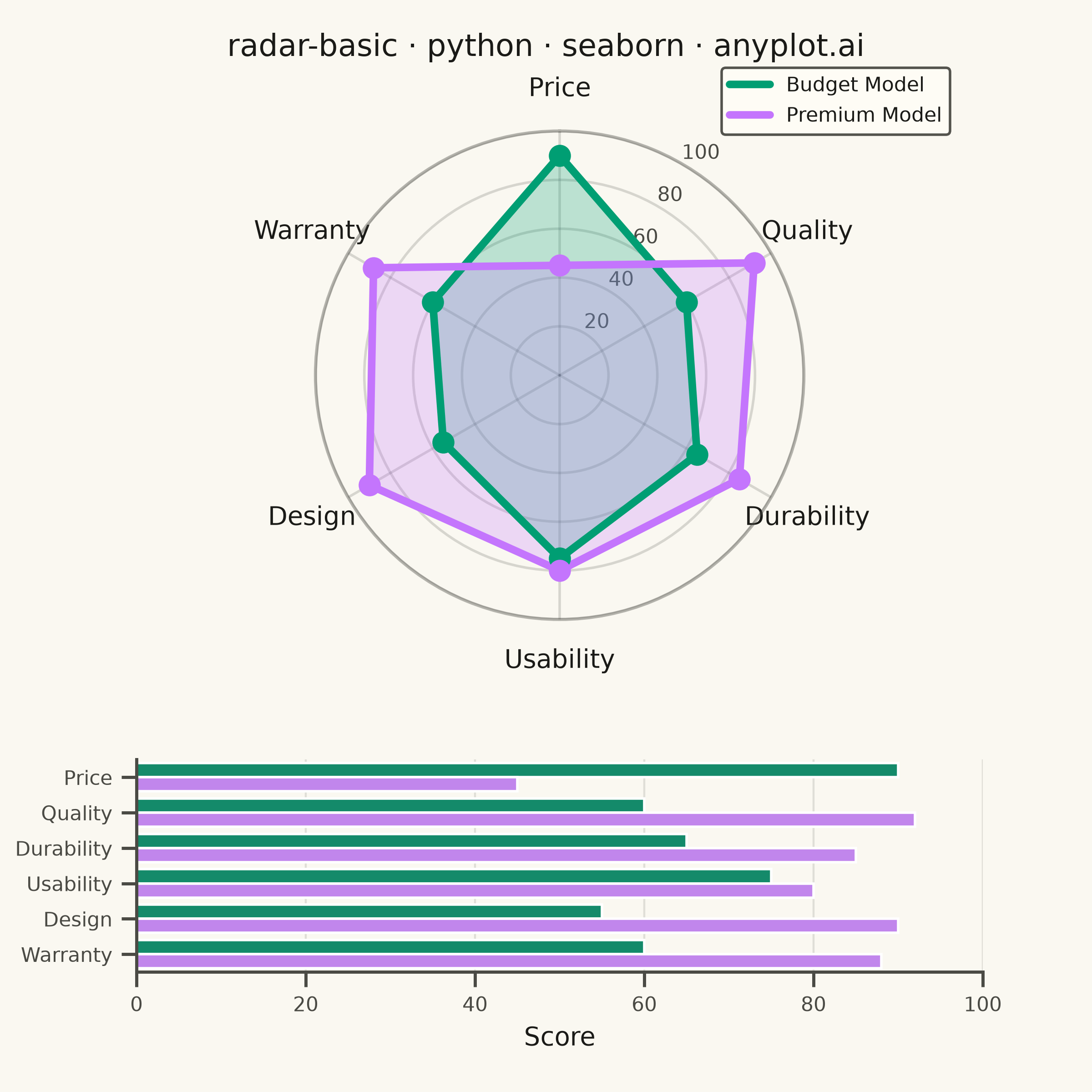
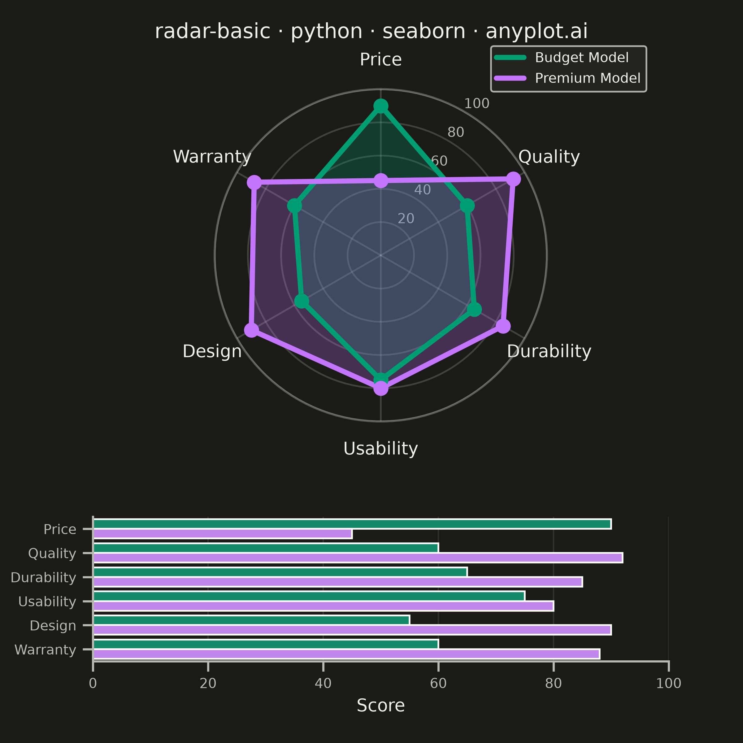
A radar chart (also known as spider or web chart) displays multivariate data on axes starting from a common center point, with values connected to form a polygon. Each axis represents a different variable, making it ideal for comparing multiple quantitative variables at once or visualizing strengths and weaknesses across categories.
""" anyplot.ai
radar-basic: Basic Radar Chart
Library: seaborn 0.13.2 | Python 3.13.14
Quality: 90/100 | Updated: 2026-07-24
"""

import os

import matplotlib.pyplot as plt
import numpy as np
import pandas as pd
import seaborn as sns


# Theme tokens
THEME = os.getenv("ANYPLOT_THEME", "light")
PAGE_BG = "#FAF8F1" if THEME == "light" else "#1A1A17"
ELEVATED_BG = "#FFFDF6" if THEME == "light" else "#242420"
INK = "#1A1A17" if THEME == "light" else "#F0EFE8"
INK_SOFT = "#4A4A44" if THEME == "light" else "#B8B7B0"

IMPRINT = ["#009E73", "#C475FD", "#4467A3", "#BD8233", "#AE3030", "#2ABCCD", "#954477"]

sns.set_theme(
    style="ticks",
    rc={
        "figure.facecolor": PAGE_BG,
        "axes.facecolor": PAGE_BG,
        "axes.edgecolor": INK_SOFT,
        "axes.labelcolor": INK,
        "text.color": INK,
        "xtick.color": INK_SOFT,
        "ytick.color": INK_SOFT,
        "grid.color": INK_SOFT,
        "grid.alpha": 0.15,
        "legend.facecolor": ELEVATED_BG,
        "legend.edgecolor": INK_SOFT,
    },
)

# Data - product attribute comparison (0-100 scale, higher is better on every axis)
categories = ["Price", "Quality", "Durability", "Usability", "Design", "Warranty"]
budget_values = [90, 60, 65, 75, 55, 60]  # Budget Model
premium_values = [45, 92, 85, 80, 90, 88]  # Premium Model

n_vars = len(categories)
angles = np.linspace(0, 2 * np.pi, n_vars, endpoint=False).tolist()
angles += angles[:1]  # Close the polygon

budget_closed = budget_values + budget_values[:1]
premium_closed = premium_values + premium_values[:1]

color_budget = IMPRINT[0]  # #009E73 - Budget Model (first series)
color_premium = IMPRINT[1]  # #C475FD - Premium Model

# Plot - square canvas for symmetric radar chart (2400x2400 at 400 dpi)
fig = plt.figure(figsize=(6, 6), dpi=400, facecolor=PAGE_BG)
grid = fig.add_gridspec(2, 1, height_ratios=[2.3, 1], hspace=0.4)
ax_radar = fig.add_subplot(grid[0], projection="polar")
ax_bar = fig.add_subplot(grid[1])
ax_radar.set_facecolor(PAGE_BG)
ax_bar.set_facecolor(PAGE_BG)

ax_radar.set_theta_offset(np.pi / 2)
ax_radar.set_theta_direction(-1)

ax_radar.fill(angles, budget_closed, alpha=0.25, color=color_budget)
ax_radar.plot(angles, budget_closed, color=color_budget, linewidth=3, label="Budget Model")
ax_radar.scatter(angles[:-1], budget_values, color=color_budget, s=60, zorder=5)

ax_radar.fill(angles, premium_closed, alpha=0.25, color=color_premium)
ax_radar.plot(angles, premium_closed, color=color_premium, linewidth=3, label="Premium Model")
ax_radar.scatter(angles[:-1], premium_values, color=color_premium, s=60, zorder=5)

# Style radar axes
ax_radar.set_xticks(angles[:-1])
ax_radar.set_xticklabels(categories, fontsize=10, color=INK, fontweight="medium")
ax_radar.set_ylim(0, 100)
ax_radar.set_yticks([20, 40, 60, 80, 100])
ax_radar.set_yticklabels(["20", "40", "60", "80", "100"], fontsize=8, color=INK_SOFT)
ax_radar.set_rlabel_position(180 / n_vars)  # move radial ticks into a gap between two spokes

grid_alpha = 0.20 if THEME == "light" else 0.25
ax_radar.grid(True, alpha=grid_alpha, linestyle="-", linewidth=1, color=INK_SOFT)
ax_radar.spines["polar"].set_color(INK_SOFT)
ax_radar.spines["polar"].set_alpha(0.4)

legend = ax_radar.legend(
    loc="upper right",
    bbox_to_anchor=(1.32, 1.15),
    fontsize=8,
    framealpha=0.95,
    facecolor=ELEVATED_BG,
    edgecolor=INK_SOFT,
)
for text in legend.get_texts():
    text.set_color(INK)

# Companion score breakdown - grouped horizontal bars via seaborn's high-level API
scores = pd.DataFrame(
    {
        "category": categories * 2,
        "value": budget_values + premium_values,
        "product": ["Budget Model"] * n_vars + ["Premium Model"] * n_vars,
    }
)
sns.barplot(
    data=scores, x="value", y="category", hue="product", palette=[color_budget, color_premium], legend=False, ax=ax_bar
)
ax_bar.set_xlabel("Score", fontsize=10, color=INK)
ax_bar.set_ylabel("")
ax_bar.tick_params(axis="both", labelsize=8, colors=INK_SOFT)
ax_bar.set_xlim(0, 100)
ax_bar.xaxis.grid(True, alpha=0.15, linewidth=0.8, color=INK_SOFT)
ax_bar.set_axisbelow(True)
sns.despine(ax=ax_bar)

# Title
fig.suptitle("radar-basic · python · seaborn · anyplot.ai", fontsize=12, fontweight="medium", color=INK, y=0.97)

# Save
plt.savefig(f"plot-{THEME}.png", dpi=400, facecolor=PAGE_BG)
Runnable source as JSON, for any HTTP client: https://api.anyplot.ai/specs/radar-basic/seaborn/code. Any spec id and library id listed in llms-full.txt fit the same URL shape; every URL below is complete and callable.
{
  "spec_id": "radar-basic",
  "language": "python",
  "library": "seaborn",
  "page": "https://anyplot.ai/radar-basic/python/seaborn",
  "hub": "https://anyplot.ai/radar-basic",
  "code_json": "https://api.anyplot.ai/specs/radar-basic/seaborn/code",
  "spec_json": "https://api.anyplot.ai/specs/radar-basic",
  "render_light_png": "https://storage.googleapis.com/anyplot-images/plots/radar-basic/python/seaborn/plot-light.png",
  "render_dark_png": "https://storage.googleapis.com/anyplot-images/plots/radar-basic/python/seaborn/plot-dark.png",
  "quality_score": 90.0,
  "license": "MIT",
  "guide": "https://anyplot.ai/llms.txt"
}
Part of Basic Radar Chart on anyplot.ai.