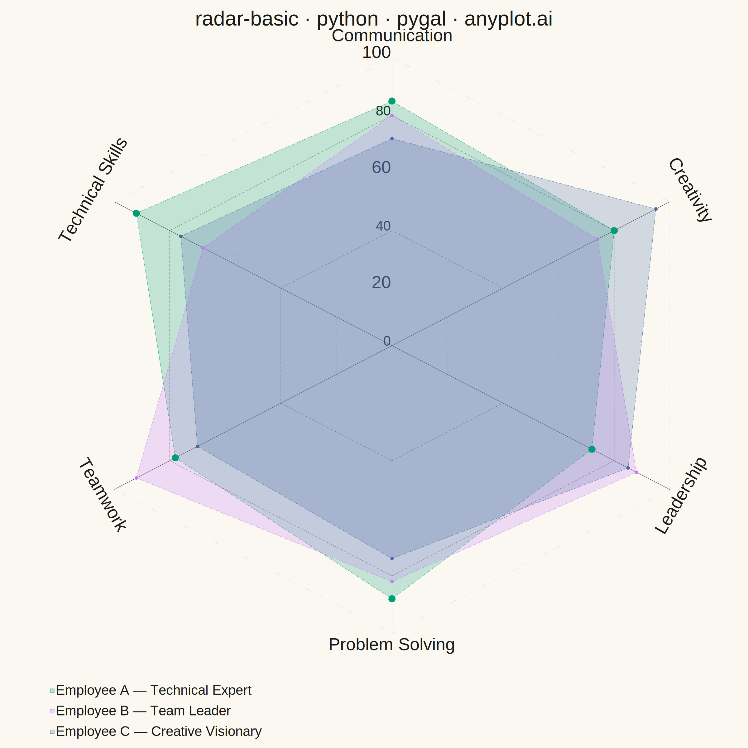
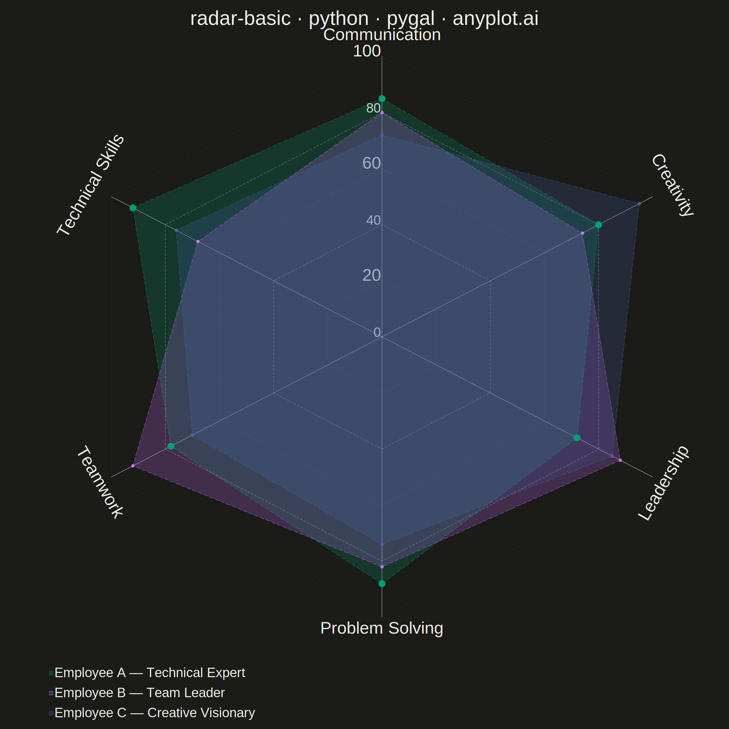
A radar chart (also known as spider or web chart) displays multivariate data on axes starting from a common center point, with values connected to form a polygon. Each axis represents a different variable, making it ideal for comparing multiple quantitative variables at once or visualizing strengths and weaknesses across categories.
""" anyplot.ai
radar-basic: Basic Radar Chart
Library: pygal 3.1.3 | Python 3.13.14
Quality: 93/100 | Updated: 2026-07-24
"""

import importlib
import os
import sys


# Prevent this file (pygal.py) from shadowing the installed pygal package
_here = os.path.dirname(os.path.abspath(__file__))
sys.path = [p for p in sys.path if os.path.abspath(p) != _here]

pygal = importlib.import_module("pygal")
Style = importlib.import_module("pygal.style").Style

THEME = os.getenv("ANYPLOT_THEME", "light")
PAGE_BG = "#FAF8F1" if THEME == "light" else "#1A1A17"
INK = "#1A1A17" if THEME == "light" else "#F0EFE8"
INK_MUTED = "#6B6A63" if THEME == "light" else "#A8A79F"
INK_FAINT = "rgba(107, 106, 99, 0.35)" if THEME == "light" else "rgba(168, 167, 159, 0.35)"

IMPRINT = ("#009E73", "#C475FD", "#4467A3", "#BD8233", "#AE3030", "#2ABCCD", "#954477")

# Data: three employees with distinct competency profiles — technical expert,
# collaborative leader, and creative visionary — to highlight trade-offs.
categories = ["Communication", "Technical Skills", "Teamwork", "Problem Solving", "Leadership", "Creativity"]

employee_a = [85, 92, 78, 88, 72, 80]  # Technical Expert: peaks at Technical Skills
employee_b = [80, 68, 92, 82, 88, 74]  # Team Leader: peaks at Teamwork & Leadership
employee_c = [72, 76, 70, 74, 85, 95]  # Creative Visionary: peaks at Creativity & Leadership

# Highest overall average becomes the visual "hero" series — bolder stroke and
# larger dots build a focal point so the viewer immediately spots the top
# all-round performer, while the other two stay legible but recede slightly.
series = [
    ("Employee A — Technical Expert", employee_a),
    ("Employee B — Team Leader", employee_b),
    ("Employee C — Creative Visionary", employee_c),
]
hero_label, _ = max(series, key=lambda s: sum(s[1]) / len(s[1]))

title = "radar-basic · python · pygal · anyplot.ai"

# Style — native-pixel font sizes targeting ~67 source-px title height at the
# canonical 2400x2400 square canvas (see default-style-guide.md "Proportional
# Sizing"); title is well under the 67-char baseline so no length scaling needed.
# Radial gridlines get a two-tier treatment (faint dotted minor rings, slightly
# firmer dashed major rings every 2nd label) instead of pygal's flat default —
# a subtler ring rhythm beyond the mandated style-guide baseline.
custom_style = Style(
    font_family='"Liberation Sans", "DejaVu Sans", Arial, sans-serif',
    background=PAGE_BG,
    plot_background=PAGE_BG,
    foreground=INK,
    foreground_strong=INK,
    foreground_subtle=INK_MUTED,
    colors=IMPRINT,
    title_font_size=66,
    label_font_size=56,
    major_label_font_size=44,
    legend_font_size=44,
    value_font_size=36,
    opacity=0.22,
    opacity_hover=0.55,
    stroke_opacity=0.9,
    guide_stroke_color=INK_FAINT,
    guide_stroke_dasharray="2,6",
    major_guide_stroke_color=INK_MUTED,
    major_guide_stroke_dasharray="9,4",
)

# Plot
chart = pygal.Radar(
    width=2400,
    height=2400,
    style=custom_style,
    title=title,
    show_legend=True,
    legend_at_bottom=True,
    legend_at_bottom_columns=1,
    fill=True,
    dots_size=5,
    stroke_style={"width": 3, "linecap": "round", "linejoin": "round", "dasharray": "14,6"},
    show_y_guides=True,
    y_labels_major_every=2,
    range=(0, 100),
    margin=30,
    spacing=16,
)

chart.x_labels = categories
for label, values in series:
    is_hero = label == hero_label
    # Hero series reads as a bold, solid focal line; supporting series recede
    # behind a thinner dashed stroke and smaller dots — a wider gap than a flat
    # stroke-width bump alone so the top performer reads at a glance.
    chart.add(
        label,
        values,
        dots_size=11 if is_hero else 5,
        stroke_style={"width": 7.5, "linecap": "round", "linejoin": "round"}
        if is_hero
        else {"width": 3, "linecap": "round", "linejoin": "round", "dasharray": "14,6"},
    )

# Save
chart.render_to_png(f"plot-{THEME}.png")
with open(f"plot-{THEME}.html", "wb") as f:
    f.write(chart.render())
Runnable source as JSON, for any HTTP client: https://api.anyplot.ai/specs/radar-basic/pygal/code. Any spec id and library id listed in llms-full.txt fit the same URL shape; every URL below is complete and callable.
{
  "spec_id": "radar-basic",
  "language": "python",
  "library": "pygal",
  "page": "https://anyplot.ai/radar-basic/python/pygal",
  "hub": "https://anyplot.ai/radar-basic",
  "code_json": "https://api.anyplot.ai/specs/radar-basic/pygal/code",
  "spec_json": "https://api.anyplot.ai/specs/radar-basic",
  "render_light_png": "https://storage.googleapis.com/anyplot-images/plots/radar-basic/python/pygal/plot-light.png",
  "render_dark_png": "https://storage.googleapis.com/anyplot-images/plots/radar-basic/python/pygal/plot-dark.png",
  "interactive_light_html": "https://storage.googleapis.com/anyplot-images/plots/radar-basic/python/pygal/plot-light.html",
  "interactive_dark_html": "https://storage.googleapis.com/anyplot-images/plots/radar-basic/python/pygal/plot-dark.html",
  "quality_score": 93.0,
  "license": "MIT",
  "guide": "https://anyplot.ai/llms.txt"
}
Part of Basic Radar Chart on anyplot.ai.