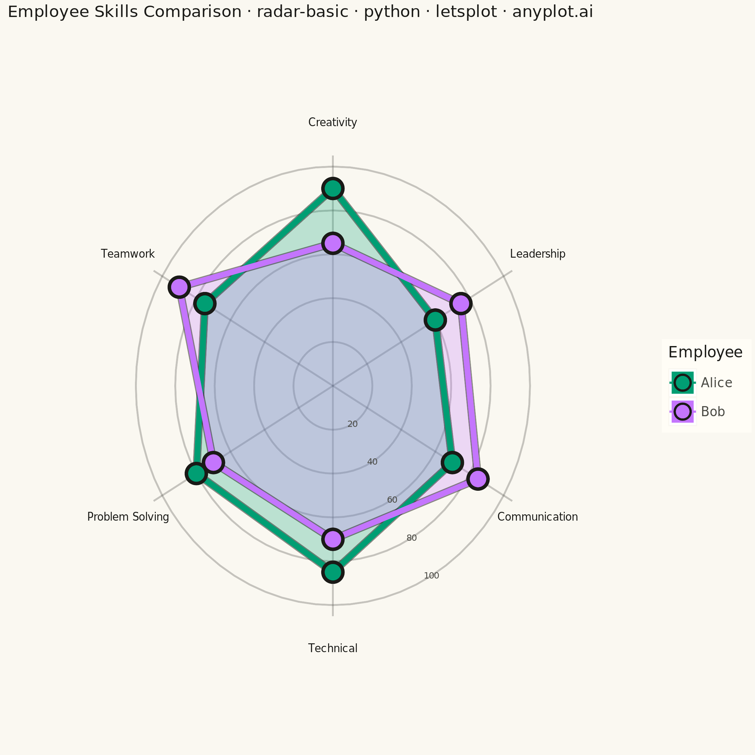
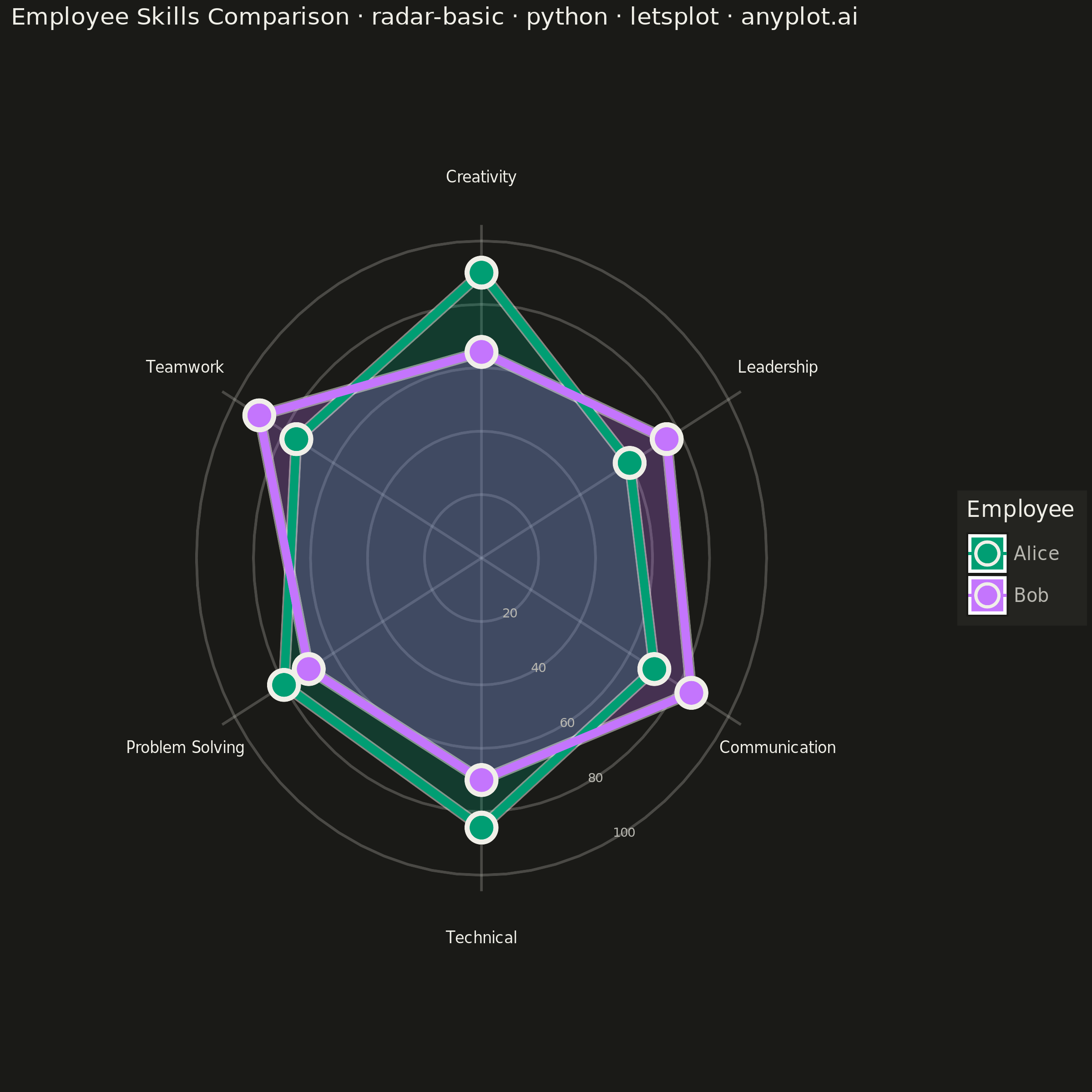
A radar chart (also known as spider or web chart) displays multivariate data on axes starting from a common center point, with values connected to form a polygon. Each axis represents a different variable, making it ideal for comparing multiple quantitative variables at once or visualizing strengths and weaknesses across categories.
""" anyplot.ai
radar-basic: Basic Radar Chart
Library: letsplot 4.11.0 | Python 3.13.14
Quality: 89/100 | Updated: 2026-07-24
"""

import math
import os

import pandas as pd
from lets_plot import (
    LetsPlot,
    aes,
    element_blank,
    element_rect,
    element_text,
    geom_path,
    geom_point,
    geom_polygon,
    geom_text,
    ggplot,
    ggsave,
    ggsize,
    labs,
    scale_color_manual,
    scale_fill_manual,
    scale_x_continuous,
    scale_y_continuous,
    theme,
)


LetsPlot.setup_html()

# Theme-adaptive chrome (Imprint palette data colors stay constant across themes)
THEME = os.getenv("ANYPLOT_THEME", "light")
PAGE_BG = "#FAF8F1" if THEME == "light" else "#1A1A17"
ELEVATED_BG = "#FFFDF6" if THEME == "light" else "#242420"
INK = "#1A1A17" if THEME == "light" else "#F0EFE8"
INK_SOFT = "#4A4A44" if THEME == "light" else "#B8B7B0"

IMPRINT_PALETTE = ["#009E73", "#C475FD"]

# Data - Employee performance metrics (6 categories, 2 employees)
categories = ["Technical", "Communication", "Leadership", "Creativity", "Teamwork", "Problem Solving"]
values_alice = [85, 70, 60, 90, 75, 80]
values_bob = [70, 85, 75, 65, 90, 70]

n = len(categories)

# Create angles for each category (evenly spaced, starting from top)
angles = [i * 2 * math.pi / n for i in range(n)]

# Build dataframe with cartesian coordinates for each series
data_rows = []
for i, (cat, val_a, val_b, angle) in enumerate(zip(categories, values_alice, values_bob, angles, strict=True)):
    # Convert polar to cartesian (0 degrees at top, clockwise)
    x_a = val_a * math.cos(angle - math.pi / 2)
    y_a = val_a * math.sin(angle - math.pi / 2)
    x_b = val_b * math.cos(angle - math.pi / 2)
    y_b = val_b * math.sin(angle - math.pi / 2)
    data_rows.append({"category": cat, "value": val_a, "x": x_a, "y": y_a, "series": "Alice", "order": i})
    data_rows.append({"category": cat, "value": val_b, "x": x_b, "y": y_b, "series": "Bob", "order": i})

# Close the polygon by repeating first point
x_a = values_alice[0] * math.cos(angles[0] - math.pi / 2)
y_a = values_alice[0] * math.sin(angles[0] - math.pi / 2)
x_b = values_bob[0] * math.cos(angles[0] - math.pi / 2)
y_b = values_bob[0] * math.sin(angles[0] - math.pi / 2)
data_rows.append(
    {"category": categories[0], "value": values_alice[0], "x": x_a, "y": y_a, "series": "Alice", "order": n}
)
data_rows.append({"category": categories[0], "value": values_bob[0], "x": x_b, "y": y_b, "series": "Bob", "order": n})

df = pd.DataFrame(data_rows)

# Create gridlines data (circles at 20, 40, 60, 80, 100)
grid_rows = []
grid_values = [20, 40, 60, 80, 100]
grid_angles = [i * 2 * math.pi / 72 for i in range(73)]  # 73 points for smooth circles
for radius in grid_values:
    for angle in grid_angles:
        x = radius * math.cos(angle - math.pi / 2)
        y = radius * math.sin(angle - math.pi / 2)
        grid_rows.append({"x": x, "y": y, "radius": radius})

grid_df = pd.DataFrame(grid_rows)

# Create axis lines (spokes from center to edge)
spoke_rows = []
for i, angle in enumerate(angles):
    x = 105 * math.cos(angle - math.pi / 2)
    y = 105 * math.sin(angle - math.pi / 2)
    spoke_rows.append({"x": 0, "y": 0, "group": i})
    spoke_rows.append({"x": x, "y": y, "group": i})

spoke_df = pd.DataFrame(spoke_rows)

# Create axis labels (category names at outer edge)
label_rows = []
for cat, angle in zip(categories, angles, strict=True):
    x = 120 * math.cos(angle - math.pi / 2)
    y = 120 * math.sin(angle - math.pi / 2)
    label_rows.append({"label": cat, "x": x, "y": y})

label_df = pd.DataFrame(label_rows)

# Create grid value labels - placed on the angular bisector between the first
# two category spokes (a gap with no data) rather than on a data-bearing spoke,
# so they never overlap a series' marker/line
value_label_angle = (angles[0] + angles[1]) / 2 - math.pi / 2
value_label_rows = []
for val in grid_values:
    x = val * math.cos(value_label_angle)
    y = val * math.sin(value_label_angle)
    value_label_rows.append({"label": str(val), "x": x, "y": y})

value_label_df = pd.DataFrame(value_label_rows)

# Descriptive prefix clarifies this instance is an employee comparison, giving
# the reader an immediate frame for the two complementary skill profiles
title = "Employee Skills Comparison · radar-basic · python · letsplot · anyplot.ai"
title_fontsize = round(16 * (60 / len(title) if len(title) > 60 else 1.0))
title_fontsize = max(title_fontsize, 11)

# Build the plot
plot = (
    ggplot()
    # Gridlines (concentric circles) - geom_path preserves point order (geom_line
    # sorts by x, which breaks a circle traced by angle into a star pattern)
    + geom_path(aes(x="x", y="y", group="radius"), data=grid_df, color=INK_SOFT, size=0.6, alpha=0.3)
    # Spokes (radial lines)
    + geom_path(aes(x="x", y="y", group="group"), data=spoke_df, color=INK_SOFT, size=0.6, alpha=0.3)
    # Filled polygons for each series
    + geom_polygon(aes(x="x", y="y", fill="series", group="series"), data=df, alpha=0.25)
    # Ink-color outline behind each line, peeking out a touch on either side, so the
    # lower-contrast lavender series still reads clearly against the page background
    + geom_path(aes(x="x", y="y", group="series"), data=df, color=INK, size=2.8, alpha=0.5)
    # Lines connecting points, in category order (geom_path, not geom_line)
    + geom_path(aes(x="x", y="y", color="series", group="series"), data=df, size=2)
    # Points at each vertex (exclude the closing point to avoid double dot) - shape 21
    # gives a filled marker with an ink-color border stroke for the same contrast boost
    + geom_point(aes(x="x", y="y", fill="series"), data=df[df["order"] < n], shape=21, color=INK, size=6, stroke=1.2)
    # Imprint palette - brand green first, lavender second
    + scale_fill_manual(values=IMPRINT_PALETTE)
    + scale_color_manual(values=IMPRINT_PALETTE)
    # Axis limits for square plot
    + scale_x_continuous(limits=(-150, 150))
    + scale_y_continuous(limits=(-150, 150))
    # Title and legend
    + labs(title=title, fill="Employee", color="Employee")
    # Square format for symmetric radar chart
    + ggsize(600, 600)
    + theme(
        plot_background=element_rect(fill=PAGE_BG, color=PAGE_BG),
        panel_background=element_rect(fill=PAGE_BG, color=PAGE_BG),
        plot_title=element_text(size=title_fontsize, color=INK),
        legend_title=element_text(size=12, color=INK),
        legend_text=element_text(size=10, color=INK_SOFT),
        legend_background=element_rect(fill=ELEVATED_BG, color=INK_SOFT),
        legend_position="right",
        axis_title=element_blank(),
        axis_text=element_blank(),
        axis_ticks=element_blank(),
        axis_line=element_blank(),
        panel_grid=element_blank(),
        panel_border=element_blank(),
    )
)

# Add category labels as text (theme-adaptive ink)
plot = plot + geom_text(aes(x="x", y="y", label="label"), data=label_df, size=4.2, color=INK)

# Add grid value labels (theme-adaptive soft ink)
plot = plot + geom_text(aes(x="x", y="y", label="label"), data=value_label_df, size=3.5, color=INK_SOFT)

# Save outputs (PNG scaled 4x to 2400x2400, plus interactive HTML)
ggsave(plot, f"plot-{THEME}.png", path=".", scale=4)
ggsave(plot, f"plot-{THEME}.html", path=".")
Runnable source as JSON, for any HTTP client: https://api.anyplot.ai/specs/radar-basic/letsplot/code. Any spec id and library id listed in llms-full.txt fit the same URL shape; every URL below is complete and callable.
{
  "spec_id": "radar-basic",
  "language": "python",
  "library": "letsplot",
  "page": "https://anyplot.ai/radar-basic/python/letsplot",
  "hub": "https://anyplot.ai/radar-basic",
  "code_json": "https://api.anyplot.ai/specs/radar-basic/letsplot/code",
  "spec_json": "https://api.anyplot.ai/specs/radar-basic",
  "render_light_png": "https://storage.googleapis.com/anyplot-images/plots/radar-basic/python/letsplot/plot-light.png",
  "render_dark_png": "https://storage.googleapis.com/anyplot-images/plots/radar-basic/python/letsplot/plot-dark.png",
  "interactive_light_html": "https://storage.googleapis.com/anyplot-images/plots/radar-basic/python/letsplot/plot-light.html",
  "interactive_dark_html": "https://storage.googleapis.com/anyplot-images/plots/radar-basic/python/letsplot/plot-dark.html",
  "quality_score": 89.0,
  "license": "MIT",
  "guide": "https://anyplot.ai/llms.txt"
}
Part of Basic Radar Chart on anyplot.ai.