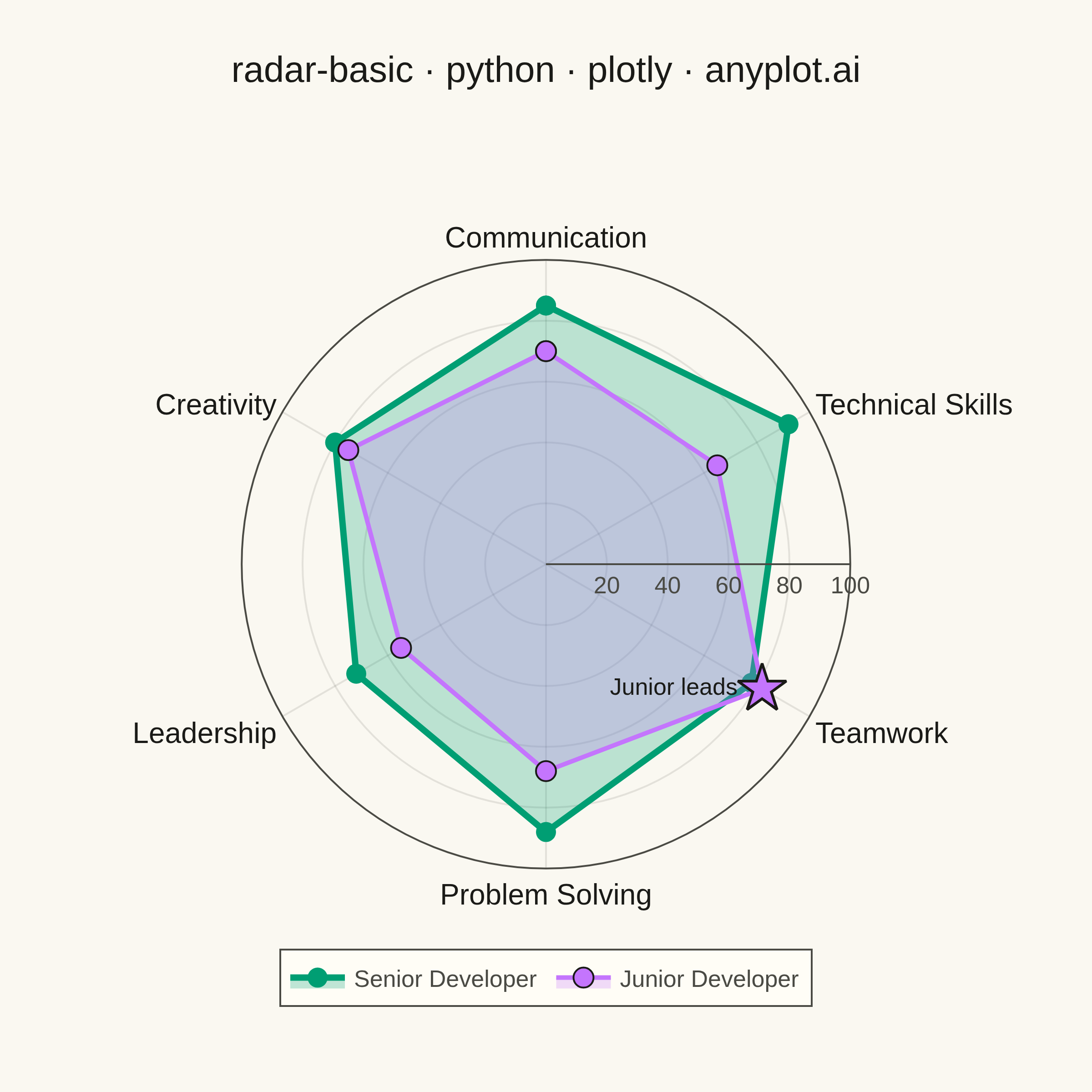
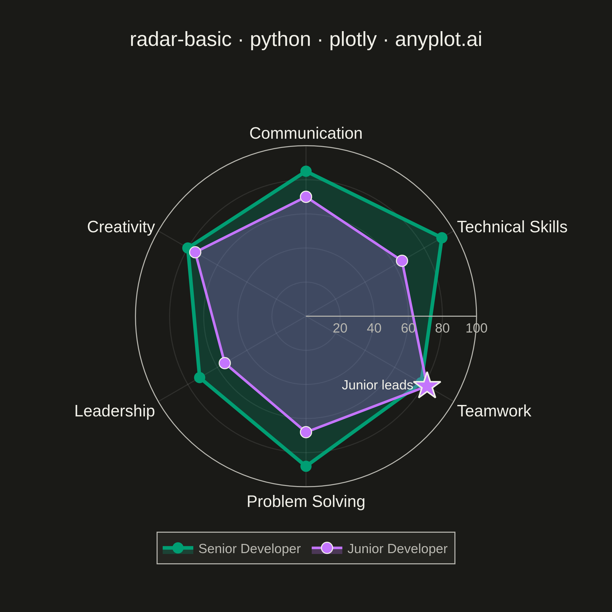
A radar chart (also known as spider or web chart) displays multivariate data on axes starting from a common center point, with values connected to form a polygon. Each axis represents a different variable, making it ideal for comparing multiple quantitative variables at once or visualizing strengths and weaknesses across categories.
""" anyplot.ai
radar-basic: Basic Radar Chart
Library: plotly 6.9.0 | Python 3.13.14
Quality: 92/100 | Updated: 2026-07-24
"""

import os

import plotly.graph_objects as go


THEME = os.getenv("ANYPLOT_THEME", "light")

PAGE_BG = "#FAF8F1" if THEME == "light" else "#1A1A17"
ELEVATED_BG = "#FFFDF6" if THEME == "light" else "#242420"
INK = "#1A1A17" if THEME == "light" else "#F0EFE8"
INK_SOFT = "#4A4A44" if THEME == "light" else "#B8B7B0"
GRID = "rgba(26, 26, 23, 0.10)" if THEME == "light" else "rgba(240, 239, 232, 0.10)"

# Imprint categorical palette — first series always brand green
IMPRINT = ["#009E73", "#C475FD", "#4467A3", "#BD8233", "#AE3030", "#2ABCCD", "#954477"]

# Derive translucent fill colors from the Imprint hexes (no hardcoded rgba)
r0, g0, b0 = bytes.fromhex(IMPRINT[0][1:])
r1, g1, b1 = bytes.fromhex(IMPRINT[1][1:])
FILL_SENIOR = f"rgba({r0}, {g0}, {b0}, 0.25)"
FILL_JUNIOR = f"rgba({r1}, {g1}, {b1}, 0.25)"

# Data - Employee performance comparison across competencies
categories = ["Communication", "Technical Skills", "Teamwork", "Problem Solving", "Leadership", "Creativity"]

senior_values = [85, 92, 78, 88, 72, 80]
junior_values = [70, 65, 82, 68, 55, 75]

# Close the polygon by repeating the first point
categories_closed = categories + [categories[0]]
senior_closed = senior_values + [senior_values[0]]
junior_closed = junior_values + [junior_values[0]]

fig = go.Figure()

fig.add_trace(
    go.Scatterpolar(
        r=senior_closed,
        theta=categories_closed,
        fill="toself",
        fillcolor=FILL_SENIOR,
        line={"color": IMPRINT[0], "width": 3.5},
        marker={"size": 11, "color": IMPRINT[0]},
        name="Senior Developer",
        hovertemplate="<b>Senior Developer</b><br>%{theta}: %{r}<extra></extra>",
    )
)

fig.add_trace(
    go.Scatterpolar(
        r=junior_closed,
        theta=categories_closed,
        fill="toself",
        fillcolor=FILL_JUNIOR,
        line={"color": IMPRINT[1], "width": 2.5},
        marker={"size": 11, "color": IMPRINT[1], "line": {"width": 1, "color": INK}},
        name="Junior Developer",
        hovertemplate="<b>Junior Developer</b><br>%{theta}: %{r}<extra></extra>",
    )
)

# Distinctive plotly-native callout: a starred point + inline text label, placed
# directly in polar coordinates (no paper-space annotation math needed) to draw
# the eye to the one axis where Junior overtakes Senior.
fig.add_trace(
    go.Scatterpolar(
        r=[junior_values[2]],
        theta=[categories[2]],
        mode="markers+text",
        marker={"size": 20, "symbol": "star", "color": IMPRINT[1], "line": {"width": 1.5, "color": INK}},
        text=["Junior leads"],
        textposition="middle left",
        textfont={"size": 13, "color": INK},
        showlegend=False,
        hoverinfo="skip",
    )
)

fig.update_layout(
    autosize=False,
    width=600,
    height=600,
    title={
        "text": "radar-basic · python · plotly · anyplot.ai",
        "font": {"size": 20, "color": INK},
        "x": 0.5,
        "xanchor": "center",
    },
    polar={
        "bgcolor": PAGE_BG,
        "domain": {"x": [0.08, 0.92], "y": [0.12, 0.88]},
        "radialaxis": {
            "visible": True,
            "range": [0, 100],
            "tickvals": [20, 40, 60, 80, 100],
            "tickfont": {"size": 13, "color": INK_SOFT},
            "gridcolor": GRID,
            "linecolor": INK_SOFT,
            # Offset into the gap between the "Technical Skills" and "Teamwork"
            # spokes so the tick values don't collide with any axis label.
            "angle": 0,
        },
        "angularaxis": {
            "rotation": 90,
            "direction": "clockwise",
            "tickfont": {"size": 16, "color": INK},
            "gridcolor": GRID,
            "linecolor": INK_SOFT,
        },
    },
    paper_bgcolor=PAGE_BG,
    font={"color": INK},
    showlegend=True,
    legend={
        "orientation": "h",
        "font": {"size": 13, "color": INK_SOFT},
        "bgcolor": ELEVATED_BG,
        "bordercolor": INK_SOFT,
        "borderwidth": 1,
        "x": 0.5,
        "y": 0.02,
        "xanchor": "center",
        "yanchor": "top",
    },
    margin={"l": 70, "r": 70, "t": 90, "b": 70},
)

# Square format — ideal for symmetric polar charts. Canonical 2400×2400 px.
fig.write_image(f"plot-{THEME}.png", width=600, height=600, scale=4)
fig.write_html(f"plot-{THEME}.html", include_plotlyjs="cdn")
Runnable source as JSON, for any HTTP client: https://api.anyplot.ai/specs/radar-basic/plotly/code. Any spec id and library id listed in llms-full.txt fit the same URL shape; every URL below is complete and callable.
{
  "spec_id": "radar-basic",
  "language": "python",
  "library": "plotly",
  "page": "https://anyplot.ai/radar-basic/python/plotly",
  "hub": "https://anyplot.ai/radar-basic",
  "code_json": "https://api.anyplot.ai/specs/radar-basic/plotly/code",
  "spec_json": "https://api.anyplot.ai/specs/radar-basic",
  "render_light_png": "https://storage.googleapis.com/anyplot-images/plots/radar-basic/python/plotly/plot-light.png",
  "render_dark_png": "https://storage.googleapis.com/anyplot-images/plots/radar-basic/python/plotly/plot-dark.png",
  "interactive_light_html": "https://storage.googleapis.com/anyplot-images/plots/radar-basic/python/plotly/plot-light.html",
  "interactive_dark_html": "https://storage.googleapis.com/anyplot-images/plots/radar-basic/python/plotly/plot-dark.html",
  "quality_score": 92.0,
  "license": "MIT",
  "guide": "https://anyplot.ai/llms.txt"
}
Part of Basic Radar Chart on anyplot.ai.