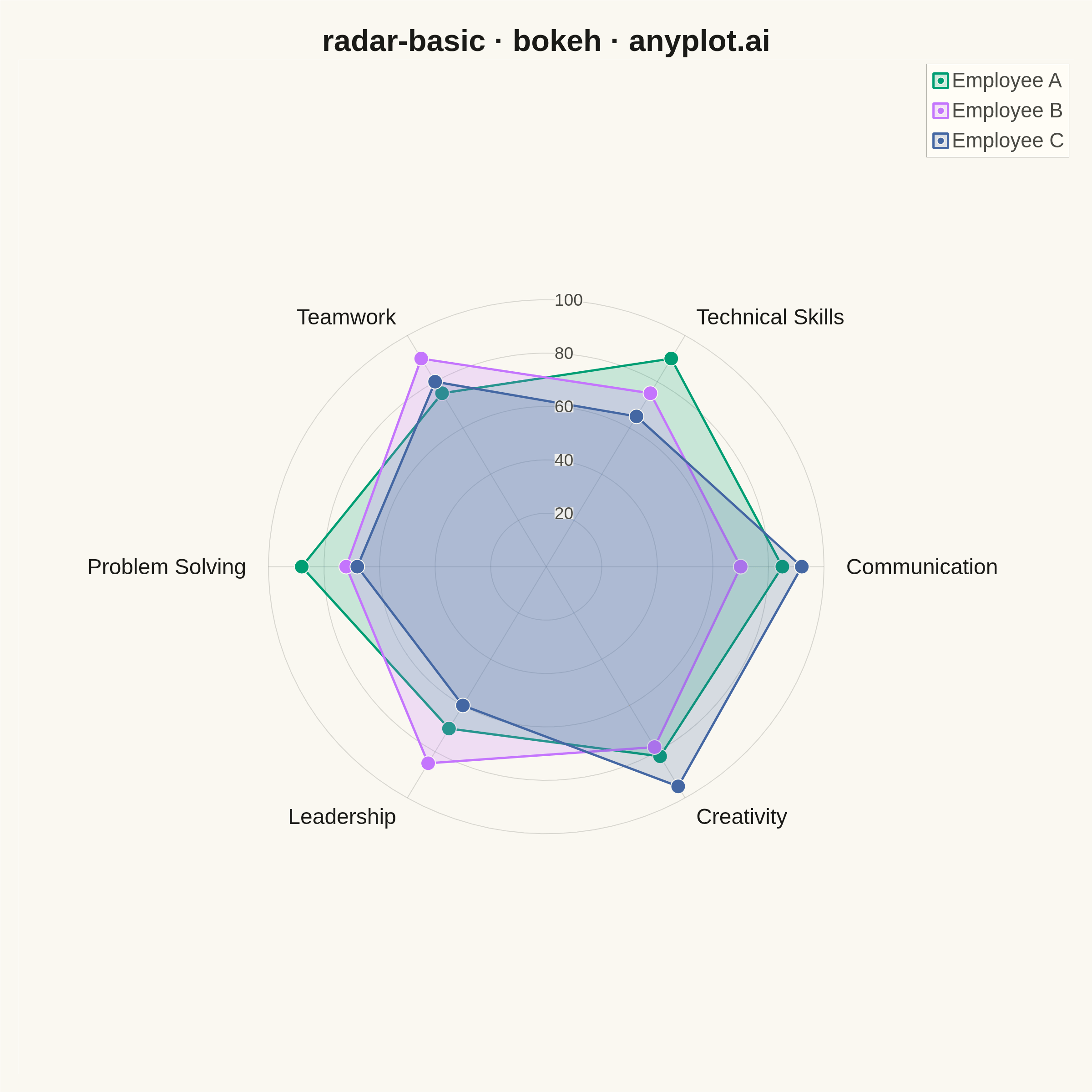
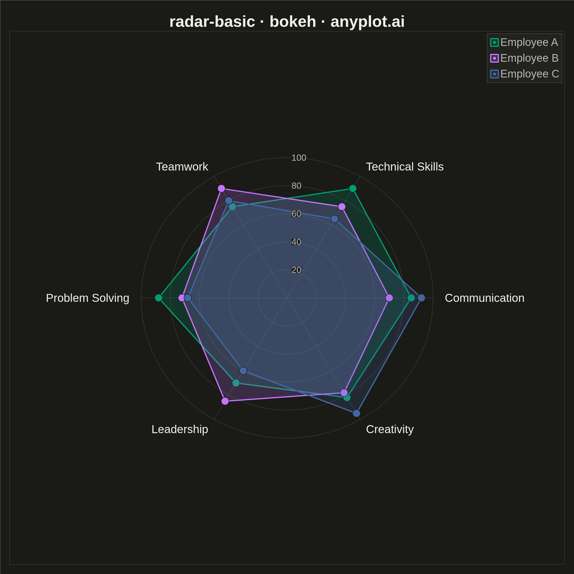
A radar chart (also known as spider or web chart) displays multivariate data on axes starting from a common center point, with values connected to form a polygon. Each axis represents a different variable, making it ideal for comparing multiple quantitative variables at once or visualizing strengths and weaknesses across categories.
""" anyplot.ai
radar-basic: Basic Radar Chart
Library: bokeh 3.9.1 | Python 3.13.14
Quality: 90/100 | Updated: 2026-07-24
"""

import os
import time
from pathlib import Path

import numpy as np
from bokeh.io import output_file, save
from bokeh.models import ColumnDataSource, HoverTool, LabelSet, Legend, LegendItem
from bokeh.plotting import figure
from selenium import webdriver
from selenium.webdriver.chrome.options import Options


THEME = os.getenv("ANYPLOT_THEME", "light")
PAGE_BG = "#FAF8F1" if THEME == "light" else "#1A1A17"
ELEVATED_BG = "#FFFDF6" if THEME == "light" else "#242420"
INK = "#1A1A17" if THEME == "light" else "#F0EFE8"
INK_SOFT = "#4A4A44" if THEME == "light" else "#B8B7B0"

# Imprint categorical palette (canonical order) - theme-independent
IMPRINT_PALETTE = ["#009E73", "#C475FD", "#4467A3", "#BD8233", "#AE3030", "#2ABCCD", "#954477", "#99B314"]

# Data - employee performance review across core competencies (0-100 scale)
categories = ["Communication", "Technical Skills", "Teamwork", "Problem Solving", "Leadership", "Creativity"]
employees = {
    "Employee A": [85, 90, 75, 88, 70, 82],
    "Employee B": [70, 75, 90, 72, 85, 78],
    "Employee C": [92, 65, 80, 68, 60, 95],
}

n_categories = len(categories)
angles = np.linspace(0, 2 * np.pi, n_categories, endpoint=False).tolist()
angles_closed = angles + [angles[0]]

R_MAX = 100  # outer gridline radius
LABEL_R = 108  # category label radius (just outside the outer gridline)
AXIS_LIM = 190  # equal x/y domain so gridline circles render as true circles

W = H = 2400
p = figure(
    width=W,
    height=H,
    title="radar-basic · bokeh · anyplot.ai",
    x_range=(-AXIS_LIM, AXIS_LIM),
    y_range=(-AXIS_LIM, AXIS_LIM),
    tools="",
    toolbar_location=None,  # avoids the ~30-50px toolbar row shrinking the saved PNG
    min_border_top=130,
    min_border_bottom=40,
    min_border_left=40,
    min_border_right=40,
)

# Concentric gridlines at 20/40/60/80/100 with radius labels along the top spoke
theta = np.linspace(0, 2 * np.pi, 100)
for r in [20, 40, 60, 80, 100]:
    p.line(r * np.cos(theta), r * np.sin(theta), line_color=INK, line_alpha=0.15, line_width=2)
scale_source = ColumnDataSource(
    data={"x": [3] * 5, "y": [20, 40, 60, 80, 100], "text": [str(r) for r in [20, 40, 60, 80, 100]]}
)
scale_labels = LabelSet(
    x="x",
    y="y",
    text="text",
    source=scale_source,
    text_font_size="28pt",
    text_align="left",
    text_baseline="middle",
    text_color=INK_SOFT,
    background_fill_color=PAGE_BG,
    background_fill_alpha=0.85,
)
p.add_layout(scale_labels)

# Axis spokes from center to each category
for angle in angles:
    p.line([0, R_MAX * np.cos(angle)], [0, R_MAX * np.sin(angle)], line_color=INK, line_alpha=0.15, line_width=2)

# Category labels at the outer edge
for angle, cat in zip(angles, categories, strict=True):
    x_label = LABEL_R * np.cos(angle)
    y_label = LABEL_R * np.sin(angle)
    if abs(np.cos(angle)) < 0.15:
        text_align = "center"
    elif np.cos(angle) > 0:
        text_align = "left"
    else:
        text_align = "right"
    p.text(
        x=[x_label],
        y=[y_label],
        text=[cat],
        text_font_size="36pt",
        text_align=text_align,
        text_baseline="middle",
        text_color=INK,
    )

# Filled polygons for each employee
legend_items = []
hover_renderers = []
for i, (name, values) in enumerate(employees.items()):
    values_closed = values + [values[0]]
    x = [v * np.cos(a) for v, a in zip(values_closed, angles_closed, strict=True)]
    y = [v * np.sin(a) for v, a in zip(values_closed, angles_closed, strict=True)]
    color = IMPRINT_PALETTE[i]
    source = ColumnDataSource(
        data={
            "x": x,
            "y": y,
            "employee": [name] * len(x),
            "category": [*categories, categories[0]],
            "value": values_closed,
        }
    )
    patch = p.patch("x", "y", source=source, fill_color=color, fill_alpha=0.2, line_color=color, line_width=5)
    scatter = p.scatter("x", "y", source=source, size=32, color=color, line_color=PAGE_BG, line_width=2)
    legend_items.append(LegendItem(label=name, renderers=[patch, scatter]))
    hover_renderers.append(scatter)

# Hover tooltips - the interactive HTML surfaces exact scores per vertex
hover = HoverTool(
    renderers=hover_renderers, tooltips=[("Employee", "@employee"), ("Category", "@category"), ("Score", "@value")]
)
p.add_tools(hover)

legend = Legend(items=legend_items, location="top_right")
legend.label_text_font_size = "34pt"
legend.glyph_height = 40
legend.glyph_width = 40
legend.spacing = 14
legend.background_fill_color = ELEVATED_BG
legend.border_line_color = INK_SOFT
legend.label_text_color = INK_SOFT
legend.background_fill_alpha = 0.9
p.add_layout(legend)

# Style the plot
p.title.text_font_size = "50pt"
p.title.text_color = INK
p.title.align = "center"
p.xaxis.visible = False
p.yaxis.visible = False
p.xgrid.visible = False
p.ygrid.visible = False
p.outline_line_color = None
p.background_fill_color = PAGE_BG
p.border_fill_color = PAGE_BG

# Write the interactive HTML (required catalog artifact)
output_file(f"plot-{THEME}.html")
save(p)

# Screenshot it with headless Chrome - export_png's chromedriver probe is
# unreliable in this environment, so render via Selenium instead.
opts = Options()
for arg in (
    "--headless=new",
    "--no-sandbox",
    "--disable-dev-shm-usage",
    "--disable-gpu",
    f"--window-size={W},{H}",
    "--hide-scrollbars",
):
    opts.add_argument(arg)
driver = webdriver.Chrome(options=opts)
driver.set_window_size(W, H)
driver.get(f"file://{Path(f'plot-{THEME}.html').resolve()}")
# Headless Chrome's --window-size sets the OUTER window; pin the viewport
# exactly via CDP so the screenshot matches W x H precisely.
driver.execute_cdp_cmd(
    "Emulation.setDeviceMetricsOverride", {"width": W, "height": H, "deviceScaleFactor": 1, "mobile": False}
)
time.sleep(3)  # let bokeh's JS render the canvas
driver.save_screenshot(f"plot-{THEME}.png")
driver.quit()
Runnable source as JSON, for any HTTP client: https://api.anyplot.ai/specs/radar-basic/bokeh/code. Any spec id and library id listed in llms-full.txt fit the same URL shape; every URL below is complete and callable.
{
  "spec_id": "radar-basic",
  "language": "python",
  "library": "bokeh",
  "page": "https://anyplot.ai/radar-basic/python/bokeh",
  "hub": "https://anyplot.ai/radar-basic",
  "code_json": "https://api.anyplot.ai/specs/radar-basic/bokeh/code",
  "spec_json": "https://api.anyplot.ai/specs/radar-basic",
  "render_light_png": "https://storage.googleapis.com/anyplot-images/plots/radar-basic/python/bokeh/plot-light.png",
  "render_dark_png": "https://storage.googleapis.com/anyplot-images/plots/radar-basic/python/bokeh/plot-dark.png",
  "interactive_light_html": "https://storage.googleapis.com/anyplot-images/plots/radar-basic/python/bokeh/plot-light.html",
  "interactive_dark_html": "https://storage.googleapis.com/anyplot-images/plots/radar-basic/python/bokeh/plot-dark.html",
  "quality_score": 90.0,
  "license": "MIT",
  "guide": "https://anyplot.ai/llms.txt"
}
Part of Basic Radar Chart on anyplot.ai.