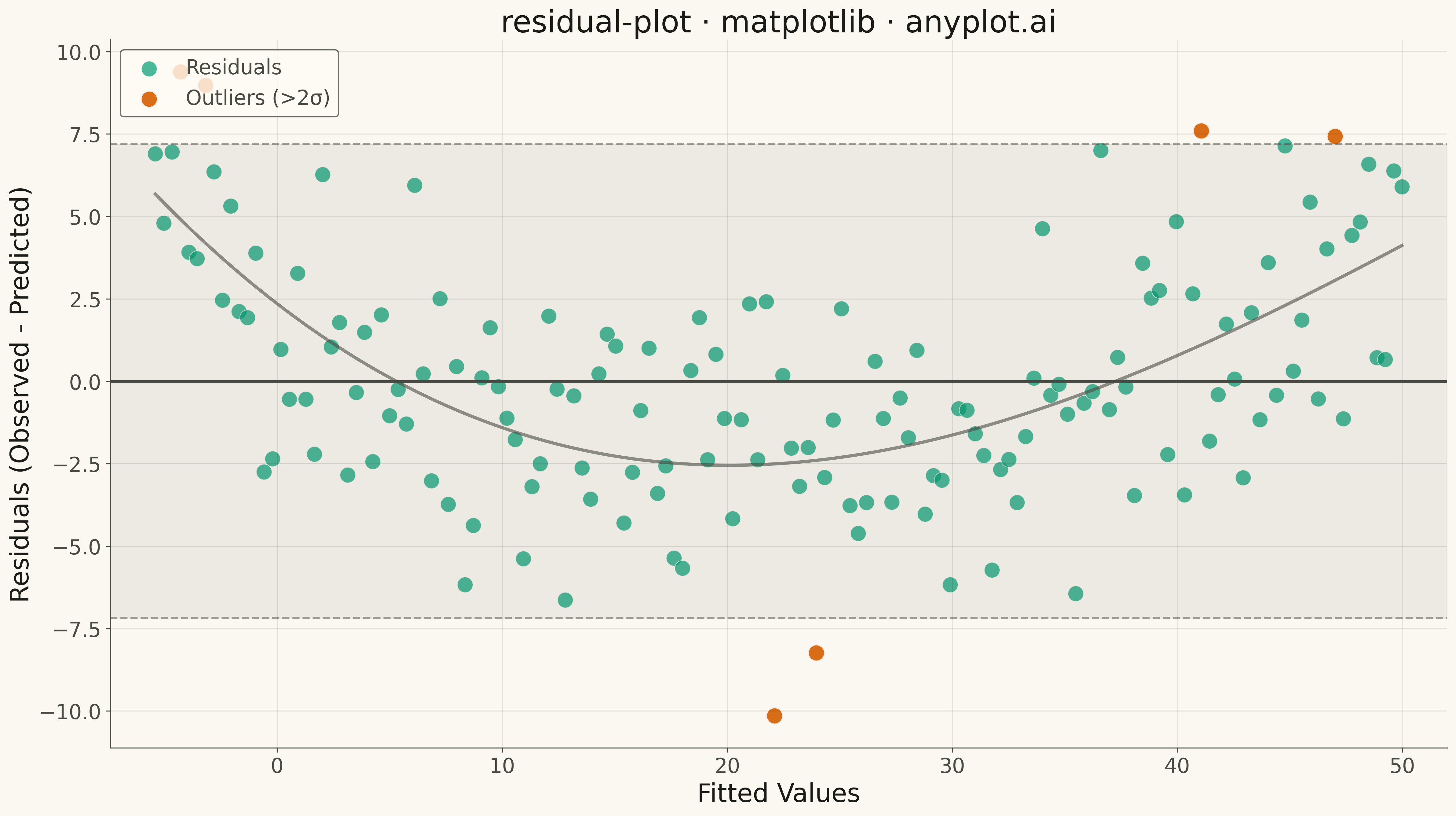
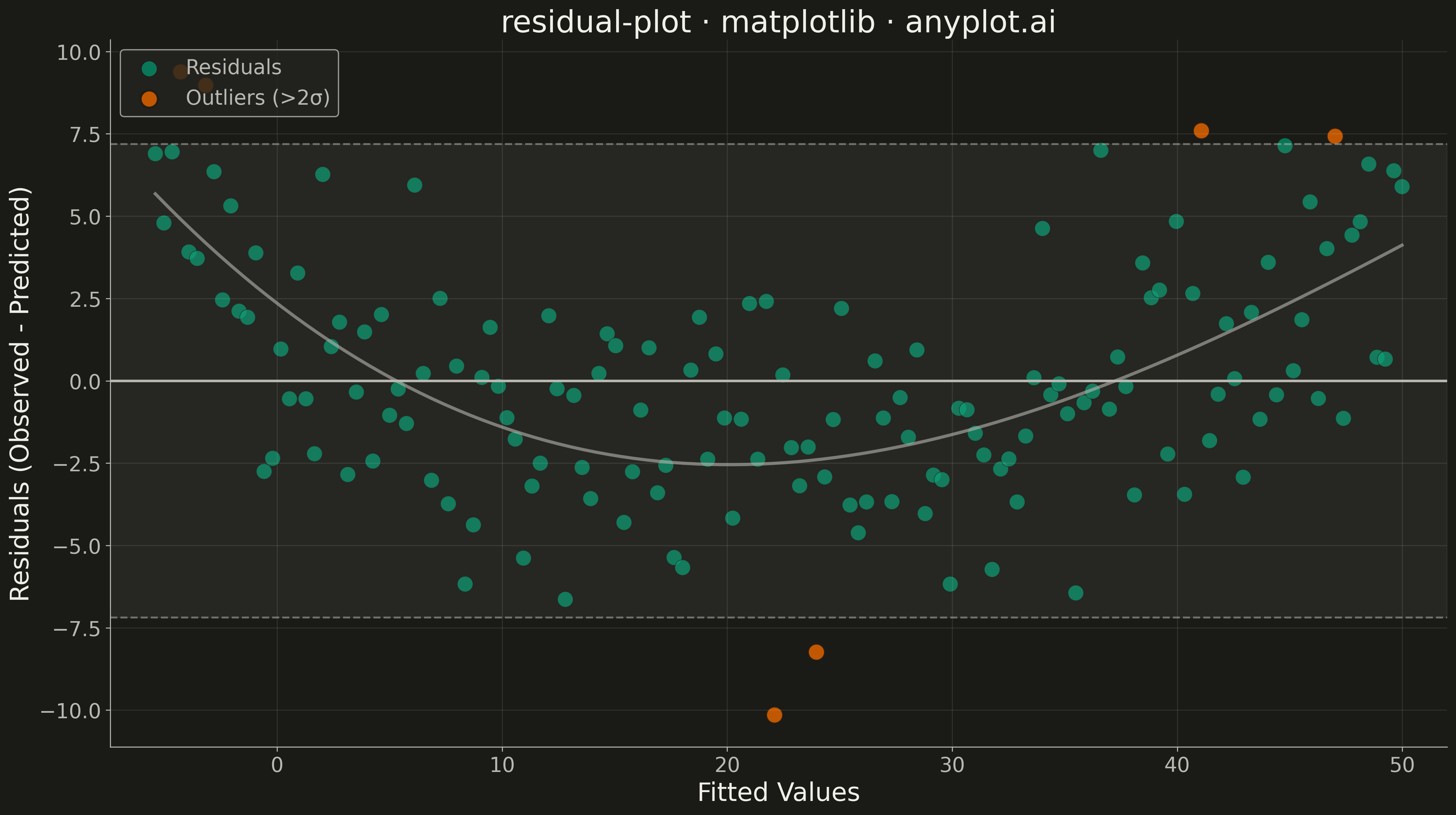
A residual plot displays the difference between observed and predicted values (residuals) against fitted values or an independent variable in regression analysis. This diagnostic visualization helps identify violations of regression assumptions including non-linearity, heteroscedasticity (non-constant variance), and outliers. A well-fitting model shows residuals randomly scattered around zero with no discernible pattern.
""" anyplot.ai
residual-plot: Residual Plot
Library: matplotlib 3.10.9 | Python 3.13.13
Quality: 84/100 | Updated: 2026-05-10
"""

import matplotlib.pyplot as plt
import numpy as np


# Data - Generate realistic regression scenario
np.random.seed(42)

# Independent variable with some structure
X = np.linspace(0, 10, 150)

# True relationship with some non-linearity to make residuals interesting
# (quadratic component makes linear model show patterns in residuals)
y_true = 2.5 * X + 0.3 * X**2 + np.random.randn(150) * 3

# Fit linear regression manually: y = a + b*x
# Using least squares formulas
x_mean = np.mean(X)
y_mean = np.mean(y_true)
b = np.sum((X - x_mean) * (y_true - y_mean)) / np.sum((X - x_mean) ** 2)
a = y_mean - b * x_mean
y_pred = a + b * X

# Calculate residuals
residuals = y_true - y_pred

# Identify outliers (beyond 2 standard deviations)
std_residuals = np.std(residuals)
outlier_mask = np.abs(residuals) > 2 * std_residuals

# Create plot
fig, ax = plt.subplots(figsize=(16, 9))

# Plot normal points
ax.scatter(
    y_pred[~outlier_mask],
    residuals[~outlier_mask],
    s=150,
    alpha=0.7,
    color="#306998",
    edgecolors="white",
    linewidth=0.5,
    label="Residuals",
)

# Plot outliers with different color
ax.scatter(
    y_pred[outlier_mask],
    residuals[outlier_mask],
    s=180,
    alpha=0.9,
    color="#FFD43B",
    edgecolors="#306998",
    linewidth=1.5,
    label="Outliers (>2σ)",
)

# Reference line at y=0
ax.axhline(y=0, color="#333333", linewidth=2, linestyle="-", label="Perfect fit (y=0)")

# Add ±2 standard deviation bands
ax.axhline(y=2 * std_residuals, color="#888888", linewidth=1.5, linestyle="--", alpha=0.7)
ax.axhline(y=-2 * std_residuals, color="#888888", linewidth=1.5, linestyle="--", alpha=0.7)

# Get x limits for the band
xlim = (y_pred.min() - 2, y_pred.max() + 2)
ax.fill_between(xlim, -2 * std_residuals, 2 * std_residuals, alpha=0.1, color="#306998", label="±2σ band")

# Add trend line using polynomial fit to detect patterns
z = np.polyfit(y_pred, residuals, 3)
p = np.poly1d(z)
x_smooth = np.linspace(y_pred.min(), y_pred.max(), 100)
ax.plot(x_smooth, p(x_smooth), color="#D62728", linewidth=2.5, linestyle="-", alpha=0.8, label="Trend line")

# Labels and styling
ax.set_xlabel("Fitted Values", fontsize=20)
ax.set_ylabel("Residuals (Observed - Predicted)", fontsize=20)
ax.set_title("residual-plot · matplotlib · pyplots.ai", fontsize=24)
ax.tick_params(axis="both", labelsize=16)
ax.legend(fontsize=14, loc="upper left", framealpha=0.9)
ax.grid(True, alpha=0.3, linestyle="--")
ax.set_xlim(xlim)

plt.tight_layout()
plt.savefig("plot.png", dpi=300, bbox_inches="tight")
Runnable source as JSON, for any HTTP client: https://api.anyplot.ai/specs/residual-plot/matplotlib/code. Any spec id and library id listed in llms-full.txt fit the same URL shape; every URL below is complete and callable.
{
  "spec_id": "residual-plot",
  "language": "python",
  "library": "matplotlib",
  "page": "https://anyplot.ai/residual-plot/python/matplotlib",
  "hub": "https://anyplot.ai/residual-plot",
  "code_json": "https://api.anyplot.ai/specs/residual-plot/matplotlib/code",
  "spec_json": "https://api.anyplot.ai/specs/residual-plot",
  "render_light_png": "https://storage.googleapis.com/anyplot-images/plots/residual-plot/python/matplotlib/plot-light.png",
  "render_dark_png": "https://storage.googleapis.com/anyplot-images/plots/residual-plot/python/matplotlib/plot-dark.png",
  "quality_score": 84.0,
  "license": "MIT",
  "guide": "https://anyplot.ai/llms.txt"
}
Part of Residual Plot on anyplot.ai.