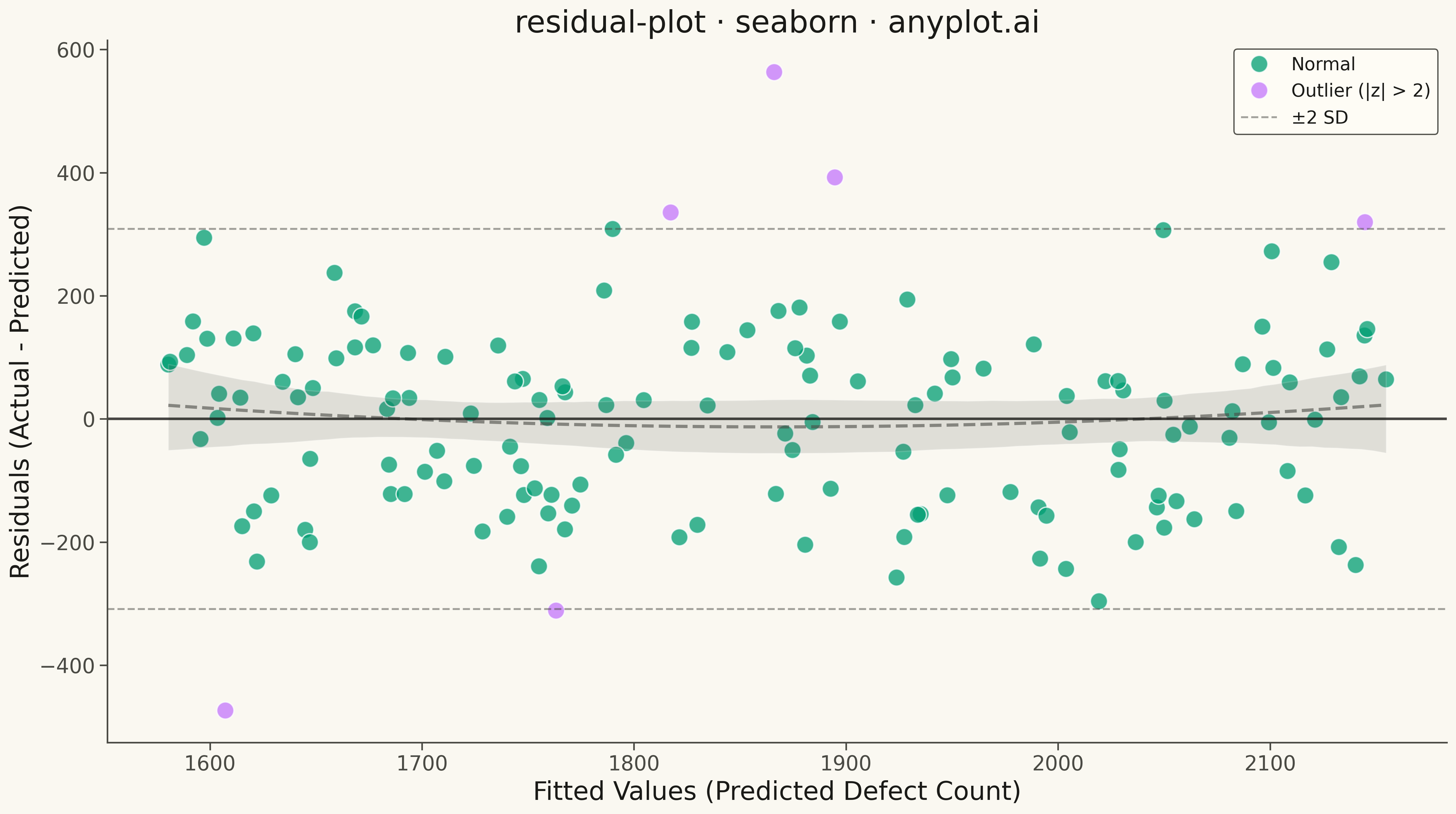
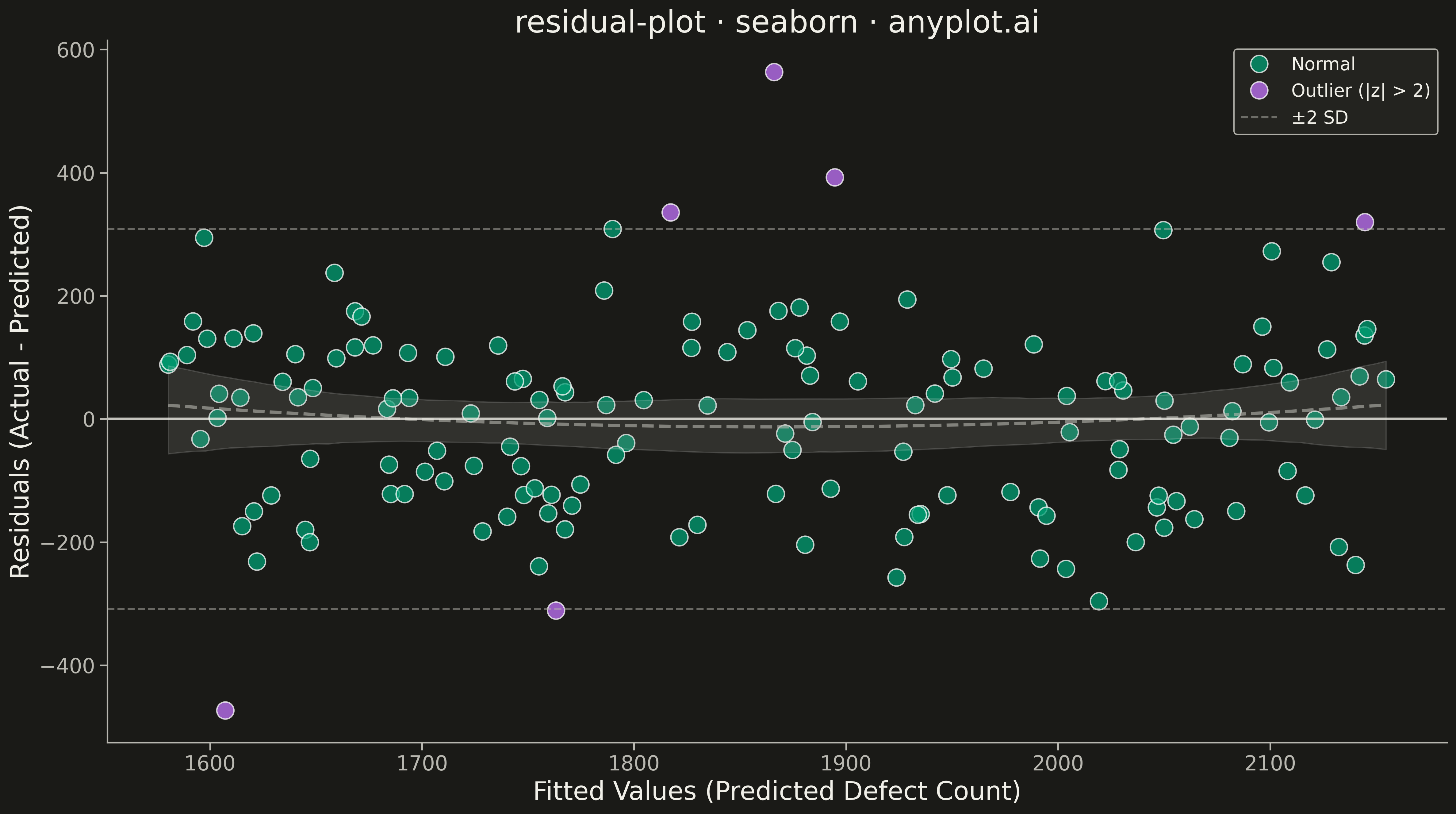
A residual plot displays the difference between observed and predicted values (residuals) against fitted values or an independent variable in regression analysis. This diagnostic visualization helps identify violations of regression assumptions including non-linearity, heteroscedasticity (non-constant variance), and outliers. A well-fitting model shows residuals randomly scattered around zero with no discernible pattern.
""" anyplot.ai
residual-plot: Residual Plot
Library: seaborn 0.13.2 | Python 3.13.13
Quality: 94/100 | Updated: 2026-05-10
"""

import os

import matplotlib.pyplot as plt
import numpy as np
import pandas as pd
import seaborn as sns


# Theme tokens
THEME = os.getenv("ANYPLOT_THEME", "light")
PAGE_BG = "#FAF8F1" if THEME == "light" else "#1A1A17"
ELEVATED_BG = "#FFFDF6" if THEME == "light" else "#242420"
INK = "#1A1A17" if THEME == "light" else "#F0EFE8"
INK_SOFT = "#4A4A44" if THEME == "light" else "#B8B7B0"
BRAND = "#009E73"  # Okabe-Ito position 1
ACCENT_RED = "#C475FD"  # Okabe-Ito position 2 for trend/outliers

# Data - manufacturing quality control (wafer defect prediction)
np.random.seed(42)
n_samples = 150

# Feature: process temperature (°C)
temperature = np.random.uniform(700, 1100, n_samples)

# True relationship: exponential relationship (will show non-linearity in residuals)
y_true = 1000 + 0.5 * temperature + 0.0005 * temperature**2 + np.random.normal(0, 150, n_samples)

# Fit linear model (will miss the quadratic component)
slope, intercept = np.polyfit(temperature, y_true, 1)
y_pred = slope * temperature + intercept

# Calculate residuals
residuals = y_true - y_pred

# Identify outliers (beyond 2 standard deviations)
residual_std = np.std(residuals)
outlier_mask = np.abs(residuals) > 2 * residual_std

# Create DataFrame for seaborn
df = pd.DataFrame(
    {"Fitted Values": y_pred, "Residuals": residuals, "Type": np.where(outlier_mask, "Outlier (|z| > 2)", "Normal")}
)

# Configure seaborn theme
sns.set_theme(
    style="ticks",
    rc={
        "figure.facecolor": PAGE_BG,
        "axes.facecolor": PAGE_BG,
        "axes.edgecolor": INK_SOFT,
        "axes.labelcolor": INK,
        "text.color": INK,
        "xtick.color": INK_SOFT,
        "ytick.color": INK_SOFT,
        "grid.color": INK,
        "grid.alpha": 0.10,
        "legend.facecolor": ELEVATED_BG,
        "legend.edgecolor": INK_SOFT,
    },
)

# Create plot
fig, ax = plt.subplots(figsize=(16, 9), facecolor=PAGE_BG)
ax.set_facecolor(PAGE_BG)

# Plot using seaborn scatterplot with hue for outliers
sns.scatterplot(
    data=df,
    x="Fitted Values",
    y="Residuals",
    hue="Type",
    palette={"Normal": BRAND, "Outlier (|z| > 2)": ACCENT_RED},
    s=180,
    alpha=0.75,
    ax=ax,
)

# Add polynomial trend line (order=2) to show non-linear pattern
sns.regplot(
    data=df,
    x="Fitted Values",
    y="Residuals",
    scatter=False,
    order=2,
    line_kws={"color": INK_SOFT, "linewidth": 2.5, "linestyle": "--", "alpha": 0.6, "label": "Trend (2nd order)"},
    ax=ax,
)

# Reference line at y=0 (perfect prediction)
ax.axhline(y=0, color=INK, linestyle="-", linewidth=2, zorder=2, alpha=0.8)

# Add ±2 standard deviation bands
ax.axhline(y=2 * residual_std, color=INK_SOFT, linestyle="--", linewidth=1.5, alpha=0.5, label="±2 SD")
ax.axhline(y=-2 * residual_std, color=INK_SOFT, linestyle="--", linewidth=1.5, alpha=0.5)

# Styling
ax.set_xlabel("Fitted Values (Predicted Defect Count)", fontsize=20, color=INK)
ax.set_ylabel("Residuals (Actual - Predicted)", fontsize=20, color=INK)
ax.set_title("residual-plot · seaborn · anyplot.ai", fontsize=24, fontweight="medium", color=INK)
ax.tick_params(axis="both", labelsize=16, colors=INK_SOFT)

# Remove top and right spines
ax.spines["top"].set_visible(False)
ax.spines["right"].set_visible(False)
ax.spines["left"].set_color(INK_SOFT)
ax.spines["bottom"].set_color(INK_SOFT)

# Custom legend with better positioning
handles, labels = ax.get_legend_handles_labels()
ax.legend(handles, labels, fontsize=14, loc="upper right", framealpha=0.95, edgecolor=INK_SOFT)

plt.tight_layout()
plt.savefig(f"plot-{THEME}.png", dpi=300, bbox_inches="tight", facecolor=PAGE_BG)
Runnable source as JSON, for any HTTP client: https://api.anyplot.ai/specs/residual-plot/seaborn/code. Any spec id and library id listed in llms-full.txt fit the same URL shape; every URL below is complete and callable.
{
  "spec_id": "residual-plot",
  "language": "python",
  "library": "seaborn",
  "page": "https://anyplot.ai/residual-plot/python/seaborn",
  "hub": "https://anyplot.ai/residual-plot",
  "code_json": "https://api.anyplot.ai/specs/residual-plot/seaborn/code",
  "spec_json": "https://api.anyplot.ai/specs/residual-plot",
  "render_light_png": "https://storage.googleapis.com/anyplot-images/plots/residual-plot/python/seaborn/plot-light.png",
  "render_dark_png": "https://storage.googleapis.com/anyplot-images/plots/residual-plot/python/seaborn/plot-dark.png",
  "quality_score": 94.0,
  "license": "MIT",
  "guide": "https://anyplot.ai/llms.txt"
}
Part of Residual Plot on anyplot.ai.