The same plot in 14 other libraries — JavaScript: Chart.js, D3.js, Apache ECharts, MUI X Charts; Python: Altair, Bokeh, lets-plot, Matplotlib, Plotly, plotnine, Pygal, Seaborn; R: ggplot2; Julia: Makie.jl. Compare all 15 side by side: ROC Curve with AUC in Python, R, Julia and JavaScript.
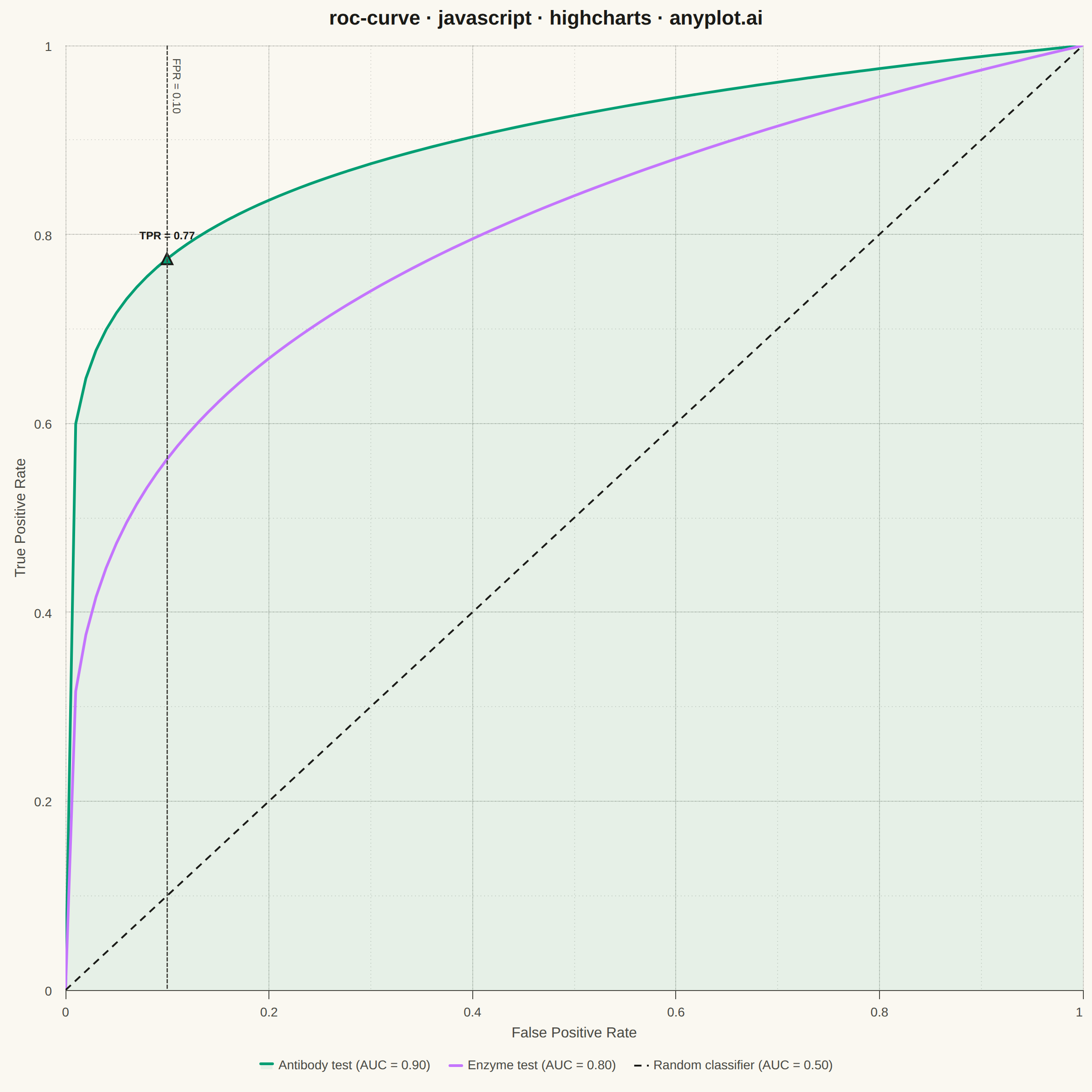
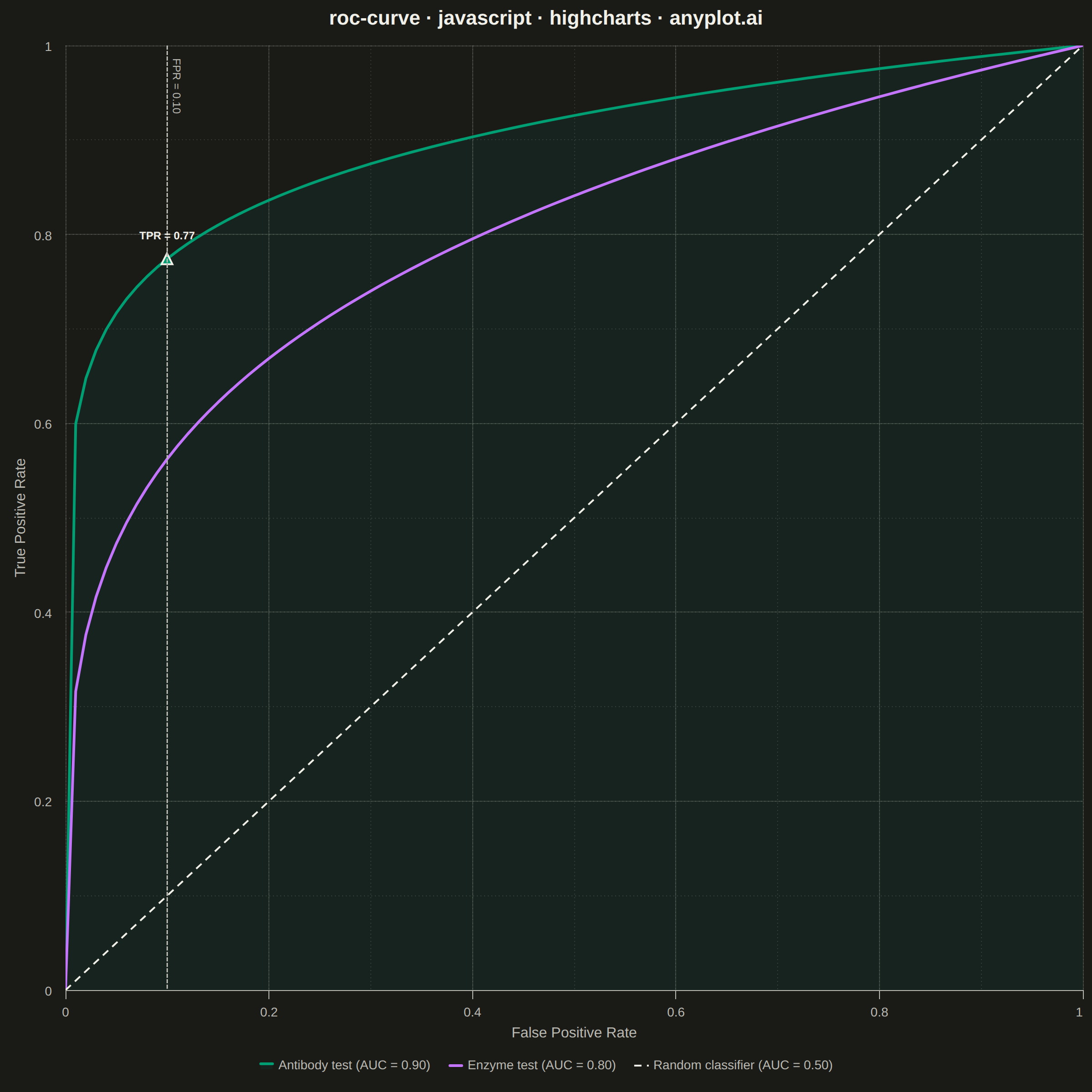
A Receiver Operating Characteristic (ROC) curve visualizes the performance of a binary classifier by plotting the True Positive Rate (TPR) against the False Positive Rate (FPR) at various classification thresholds. The Area Under the Curve (AUC) provides a single metric summarizing model performance, where 1.0 indicates perfect classification and 0.5 represents random guessing.
// anyplot.ai
// roc-curve: ROC Curve with AUC
// Library: highcharts 12.6.0 | JavaScript 22.23.2
// Quality: 91/100 | Created: 2026-09-05

//# anyplot-orientation: square
const t = window.ANYPLOT_TOKENS;

// --- Data (in-memory, deterministic) ----------------------------------------
// Two diagnostic tests for detecting a disease, evaluated across classifier
// thresholds. tpr = fpr^(1/power) is concave and bows toward the top-left
// corner for power > 1, mimicking a real ROC curve shape.
const numPoints = 101;
const falsePositiveRates = Array.from({ length: numPoints }, (_, i) => i / (numPoints - 1));

const rocCurve = (power) => falsePositiveRates.map((fpr) => Math.pow(fpr, 1 / power));

const areaUnderCurve = (tprValues) => {
  let area = 0;
  for (let i = 1; i < falsePositiveRates.length; i += 1) {
    const dx = falsePositiveRates[i] - falsePositiveRates[i - 1];
    area += (dx * (tprValues[i] + tprValues[i - 1])) / 2;
  }
  return area;
};

const antibodyTestTpr = rocCurve(9);
const enzymeTestTpr = rocCurve(4);
const antibodyTestAuc = areaUnderCurve(antibodyTestTpr);
const enzymeTestAuc = areaUnderCurve(enzymeTestTpr);

const toPoints = (tprValues) =>
  falsePositiveRates.map((fpr, i) => [fpr, tprValues[i]]);

// Example decision threshold called out on the best-performing curve, so the
// chart tells a concrete "if you accept 10% false positives, you get this
// sensitivity" story instead of stopping at the raw curve shapes.
const thresholdIndex = 10; // falsePositiveRates[10] === 0.10 exactly
const thresholdFpr = falsePositiveRates[thresholdIndex];
const thresholdTpr = antibodyTestTpr[thresholdIndex];

// --- Chart -------------------------------------------------------------------
Highcharts.chart("container", {
  chart: {
    type: "line",
    backgroundColor: "transparent",
    animation: false,
    style: { fontFamily: "inherit" },
  },
  credits: { enabled: false },
  colors: t.palette,
  title: {
    text: "roc-curve · javascript · highcharts · anyplot.ai",
    style: { color: t.ink, fontSize: "22px", fontWeight: "600" },
  },
  xAxis: {
    title: { text: "False Positive Rate", style: { color: t.inkSoft, fontSize: "16px" } },
    min: 0,
    max: 1,
    tickInterval: 0.2,
    minorTickInterval: 0.1,
    lineColor: t.inkSoft,
    tickColor: t.inkSoft,
    gridLineColor: t.grid,
    gridLineWidth: 1,
    minorGridLineColor: t.grid,
    minorGridLineWidth: 1,
    minorGridLineDashStyle: "Dot",
    labels: { style: { color: t.inkSoft, fontSize: "14px" } },
    plotLines: [
      {
        value: thresholdFpr,
        color: t.inkSoft,
        dashStyle: "ShortDash",
        width: 1.5,
        zIndex: 5,
        label: {
          text: `FPR = ${thresholdFpr.toFixed(2)}`,
          style: { color: t.inkSoft, fontSize: "12px" },
          align: "left",
          x: 6,
          y: 14,
        },
      },
    ],
  },
  yAxis: {
    title: { text: "True Positive Rate", style: { color: t.inkSoft, fontSize: "16px" } },
    min: 0,
    max: 1,
    tickInterval: 0.2,
    minorTickInterval: 0.1,
    gridLineColor: t.grid,
    minorGridLineColor: t.grid,
    minorGridLineWidth: 1,
    minorGridLineDashStyle: "Dot",
    labels: { style: { color: t.inkSoft, fontSize: "14px" } },
  },
  legend: {
    itemStyle: { color: t.inkSoft, fontSize: "14px" },
    itemHoverStyle: { color: t.ink },
    verticalAlign: "bottom",
  },
  tooltip: {
    valueDecimals: 2,
  },
  plotOptions: {
    series: { animation: false, marker: { enabled: false } },
  },
  series: [
    {
      // Area fill turns "AUC" from a legend number into a visible shape: the
      // filled region under the top curve literally is the area it names.
      type: "area",
      name: `Antibody test (AUC = ${antibodyTestAuc.toFixed(2)})`,
      data: toPoints(antibodyTestTpr),
      color: t.palette[0],
      fillOpacity: 0.08,
      threshold: 0,
      lineWidth: 3,
    },
    {
      name: `Enzyme test (AUC = ${enzymeTestAuc.toFixed(2)})`,
      data: toPoints(enzymeTestTpr),
      color: t.palette[1],
      lineWidth: 3,
    },
    {
      name: "Random classifier (AUC = 0.50)",
      data: [
        [0, 0],
        [1, 1],
      ],
      color: t.ink,
      dashStyle: "Dash",
      lineWidth: 2,
      enableMouseTracking: false,
    },
    {
      // Callout marker for the example operating threshold above.
      type: "scatter",
      name: "Example threshold",
      data: [[thresholdFpr, thresholdTpr]],
      color: t.palette[0],
      marker: { enabled: true, radius: 6, lineWidth: 2, lineColor: t.ink },
      dataLabels: {
        enabled: true,
        format: `TPR = ${thresholdTpr.toFixed(2)}`,
        style: { color: t.ink, fontSize: "12px", fontWeight: "600", textOutline: "none" },
        y: -14,
      },
      showInLegend: false,
      enableMouseTracking: false,
    },
  ],
});
Runnable source as JSON, for any HTTP client: https://api.anyplot.ai/specs/roc-curve/highcharts/code. Any spec id and library id listed in llms-full.txt fit the same URL shape; every URL below is complete and callable.
{
  "spec_id": "roc-curve",
  "language": "javascript",
  "library": "highcharts",
  "page": "https://anyplot.ai/roc-curve/javascript/highcharts",
  "hub": "https://anyplot.ai/roc-curve",
  "code_json": "https://api.anyplot.ai/specs/roc-curve/highcharts/code",
  "spec_json": "https://api.anyplot.ai/specs/roc-curve",
  "render_light_png": "https://storage.googleapis.com/anyplot-images/plots/roc-curve/javascript/highcharts/plot-light.png",
  "render_dark_png": "https://storage.googleapis.com/anyplot-images/plots/roc-curve/javascript/highcharts/plot-dark.png",
  "interactive_light_html": "https://storage.googleapis.com/anyplot-images/plots/roc-curve/javascript/highcharts/plot-light.html",
  "interactive_dark_html": "https://storage.googleapis.com/anyplot-images/plots/roc-curve/javascript/highcharts/plot-dark.html",
  "quality_score": 91.0,
  "license": "MIT",
  "guide": "https://anyplot.ai/llms.txt"
}
Part of ROC Curve with AUC on anyplot.ai.