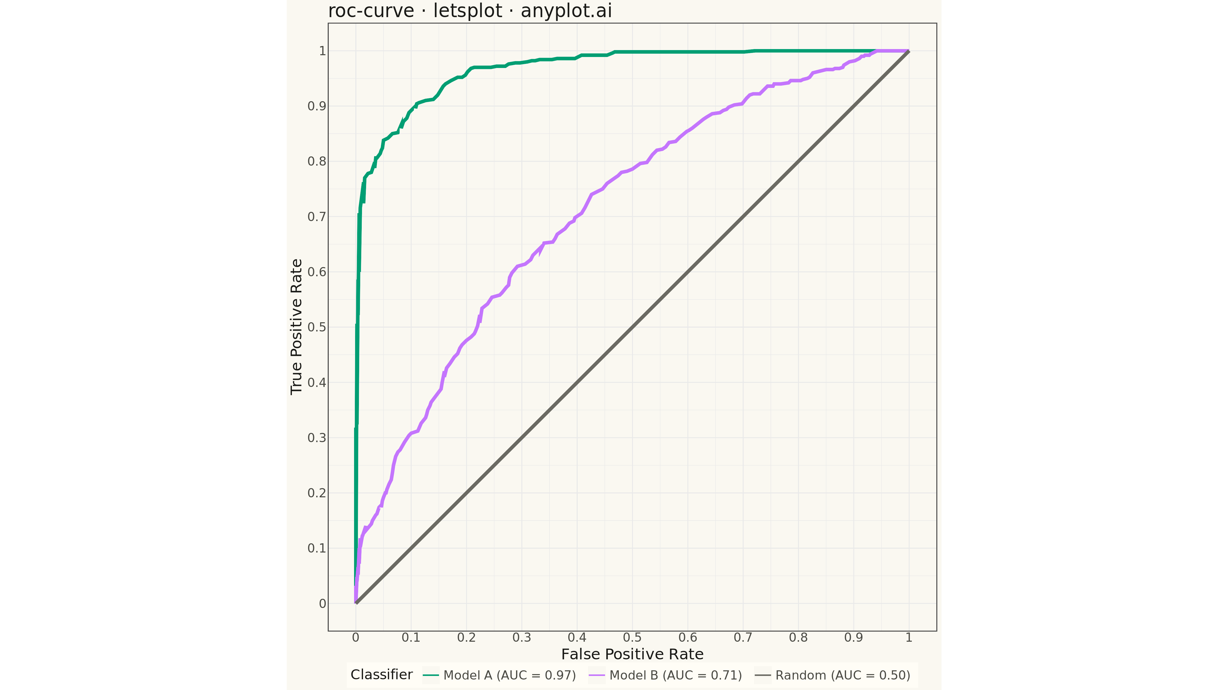
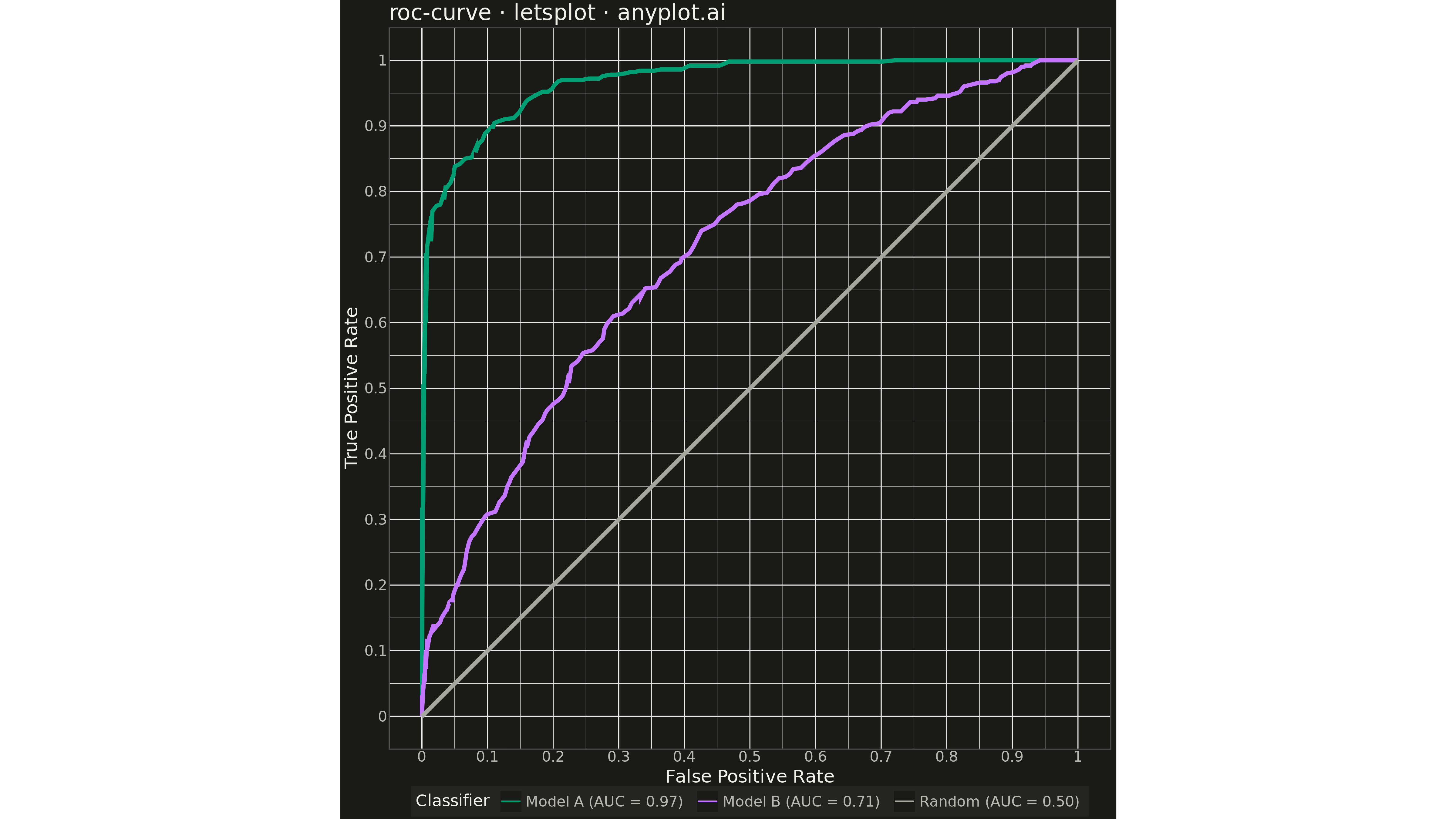
A Receiver Operating Characteristic (ROC) curve visualizes the performance of a binary classifier by plotting the True Positive Rate (TPR) against the False Positive Rate (FPR) at various classification thresholds. The Area Under the Curve (AUC) provides a single metric summarizing model performance, where 1.0 indicates perfect classification and 0.5 represents random guessing.
""" anyplot.ai
roc-curve: ROC Curve with AUC
Library: letsplot 4.9.0 | Python 3.13.13
Quality: 94/100 | Updated: 2026-05-09
"""

import os

import numpy as np
import pandas as pd
from lets_plot import *
from lets_plot import ggsave


LetsPlot.setup_html()

# Theme tokens
THEME = os.getenv("ANYPLOT_THEME", "light")
PAGE_BG = "#FAF8F1" if THEME == "light" else "#1A1A17"
ELEVATED_BG = "#FFFDF6" if THEME == "light" else "#242420"
INK = "#1A1A17" if THEME == "light" else "#F0EFE8"
INK_SOFT = "#4A4A44" if THEME == "light" else "#B8B7B0"

# Okabe-Ito palette
IMPRINT = ["#009E73", "#C475FD", "#4467A3"]

# Data - Generate ROC curve data for multiple classifiers
np.random.seed(42)

# Generate synthetic classification scores
n_samples = 1000
y_true = np.concatenate([np.zeros(500), np.ones(500)])

# Model A - Good classifier (AUC ~0.92)
scores_a = np.concatenate(
    [
        np.random.beta(2, 5, 500),  # Negative class
        np.random.beta(5, 2, 500),  # Positive class
    ]
)

# Model B - Moderate classifier (AUC ~0.78)
scores_b = np.concatenate(
    [
        np.random.beta(2, 3, 500),  # Negative class
        np.random.beta(3, 2, 500),  # Positive class
    ]
)


# Calculate ROC curve points
def compute_roc(y_true, scores):
    thresholds = np.linspace(0, 1, 200)
    tpr_list = []
    fpr_list = []
    for thresh in thresholds:
        predictions = (scores >= thresh).astype(int)
        tp = np.sum((predictions == 1) & (y_true == 1))
        fn = np.sum((predictions == 0) & (y_true == 1))
        fp = np.sum((predictions == 1) & (y_true == 0))
        tn = np.sum((predictions == 0) & (y_true == 0))
        tpr = tp / (tp + fn) if (tp + fn) > 0 else 0
        fpr = fp / (fp + tn) if (fp + tn) > 0 else 0
        tpr_list.append(tpr)
        fpr_list.append(fpr)
    return np.array(fpr_list), np.array(tpr_list)


# Compute ROC curves
fpr_a, tpr_a = compute_roc(y_true, scores_a)
fpr_b, tpr_b = compute_roc(y_true, scores_b)

# Calculate AUC using trapezoidal rule
auc_a = -np.trapezoid(tpr_a, fpr_a)
auc_b = -np.trapezoid(tpr_b, fpr_b)

# Create DataFrames for plotting
df_model_a = pd.DataFrame({"fpr": fpr_a, "tpr": tpr_a, "model": f"Model A (AUC = {auc_a:.2f})"})

df_model_b = pd.DataFrame({"fpr": fpr_b, "tpr": tpr_b, "model": f"Model B (AUC = {auc_b:.2f})"})

# Random classifier reference line
df_random = pd.DataFrame({"fpr": [0, 1], "tpr": [0, 1], "model": "Random (AUC = 0.50)"})

# Combine all data
df = pd.concat([df_model_a, df_model_b, df_random], ignore_index=True)

# Theme-adaptive color for reference line
ref_color = "#6B6A63" if THEME == "light" else "#A8A79F"
colors = [IMPRINT[0], IMPRINT[1], ref_color]

# Plot
plot = (
    ggplot(df, aes(x="fpr", y="tpr", color="model"))
    + geom_line(size=2)
    + scale_color_manual(values=colors)
    + scale_x_continuous(limits=[0, 1])
    + scale_y_continuous(limits=[0, 1])
    + coord_fixed(ratio=1)
    + labs(
        x="False Positive Rate", y="True Positive Rate", title="roc-curve · letsplot · anyplot.ai", color="Classifier"
    )
    + theme_minimal()
    + theme(
        plot_background=element_rect(fill=PAGE_BG, color=PAGE_BG),
        panel_background=element_rect(fill=PAGE_BG),
        plot_title=element_text(size=24, color=INK),
        axis_title=element_text(size=20, color=INK),
        axis_text=element_text(size=16, color=INK_SOFT),
        axis_line=element_line(color=INK_SOFT),
        legend_background=element_rect(fill=ELEVATED_BG, color=INK_SOFT),
        legend_text=element_text(size=16, color=INK_SOFT),
        legend_title=element_text(size=18, color=INK),
        legend_position="bottom",
    )
    + ggsize(1600, 900)
)

# Save as PNG (scale 3x = 4800 x 2700 px) and HTML
ggsave(plot, f"plot-{THEME}.png", path=".", scale=3)
ggsave(plot, f"plot-{THEME}.html", path=".")
Runnable source as JSON, for any HTTP client: https://api.anyplot.ai/specs/roc-curve/letsplot/code. Any spec id and library id listed in llms-full.txt fit the same URL shape; every URL below is complete and callable.
{
  "spec_id": "roc-curve",
  "language": "python",
  "library": "letsplot",
  "page": "https://anyplot.ai/roc-curve/python/letsplot",
  "hub": "https://anyplot.ai/roc-curve",
  "code_json": "https://api.anyplot.ai/specs/roc-curve/letsplot/code",
  "spec_json": "https://api.anyplot.ai/specs/roc-curve",
  "render_light_png": "https://storage.googleapis.com/anyplot-images/plots/roc-curve/python/letsplot/plot-light.png",
  "render_dark_png": "https://storage.googleapis.com/anyplot-images/plots/roc-curve/python/letsplot/plot-dark.png",
  "interactive_light_html": "https://storage.googleapis.com/anyplot-images/plots/roc-curve/python/letsplot/plot-light.html",
  "interactive_dark_html": "https://storage.googleapis.com/anyplot-images/plots/roc-curve/python/letsplot/plot-dark.html",
  "quality_score": 94.0,
  "license": "MIT",
  "guide": "https://anyplot.ai/llms.txt"
}
Part of ROC Curve with AUC on anyplot.ai.