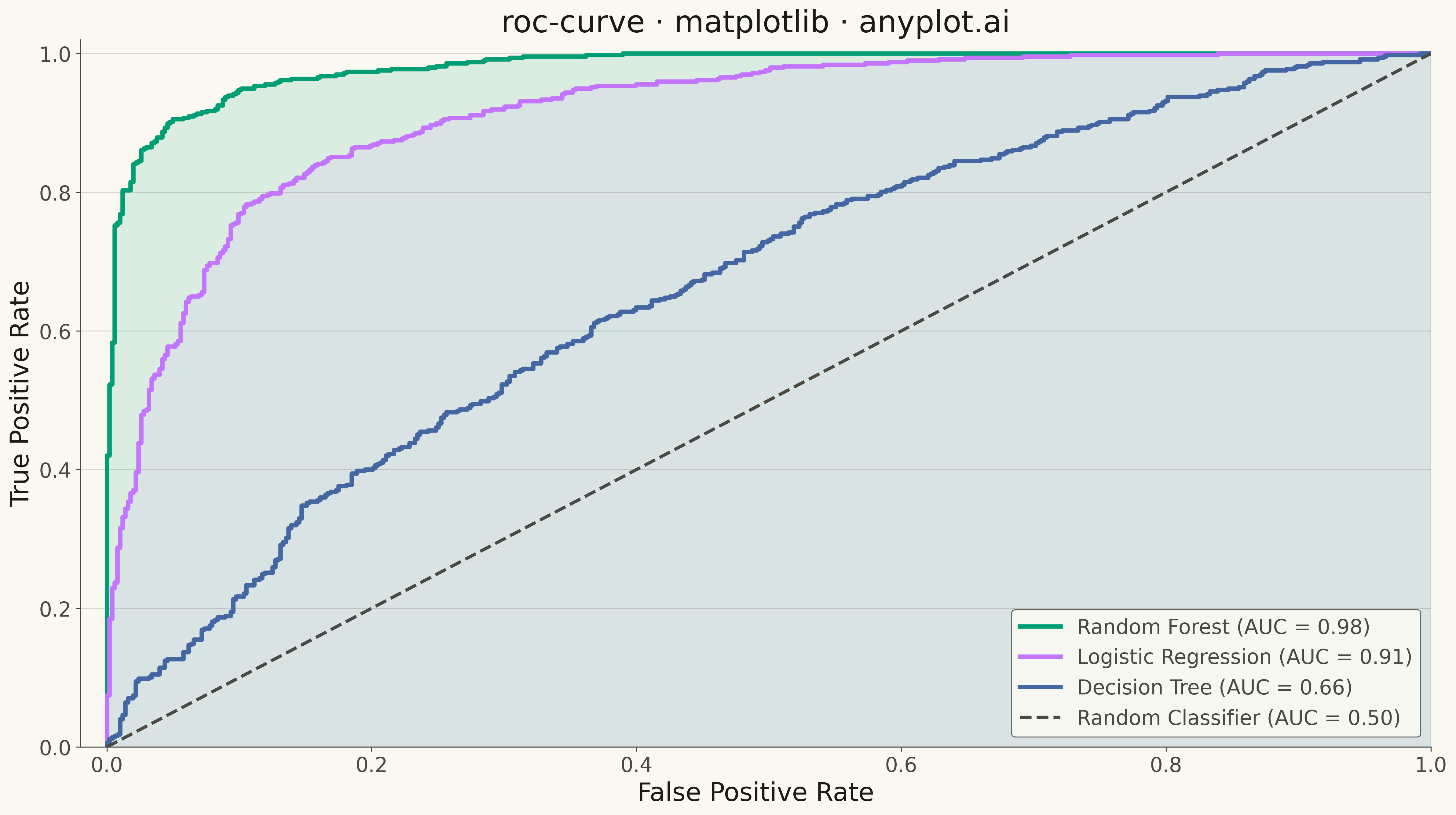
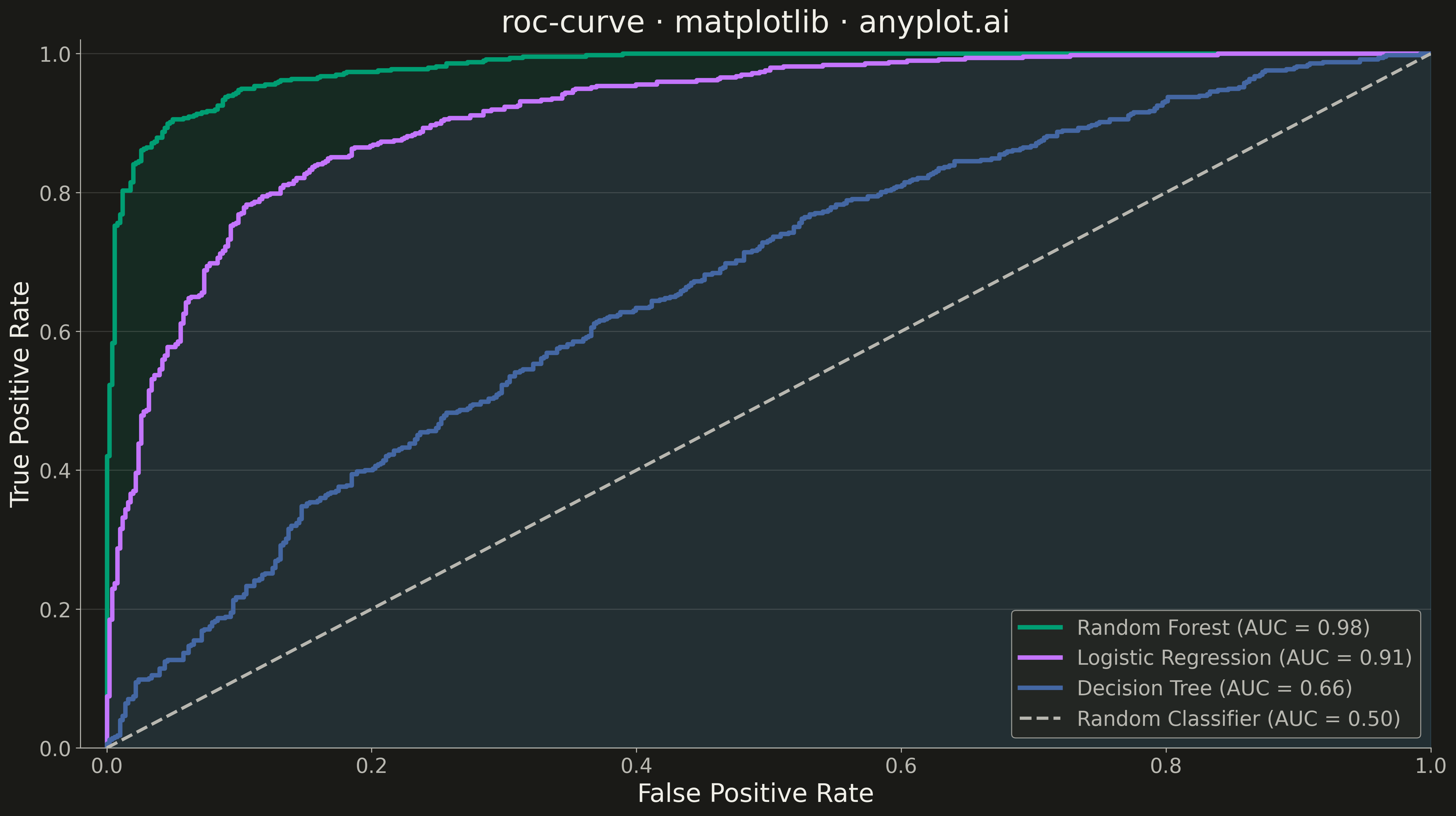
A Receiver Operating Characteristic (ROC) curve visualizes the performance of a binary classifier by plotting the True Positive Rate (TPR) against the False Positive Rate (FPR) at various classification thresholds. The Area Under the Curve (AUC) provides a single metric summarizing model performance, where 1.0 indicates perfect classification and 0.5 represents random guessing.
""" anyplot.ai
roc-curve: ROC Curve with AUC
Library: matplotlib 3.10.9 | Python 3.13.13
Quality: 93/100 | Updated: 2026-05-09
"""

import os

import matplotlib.pyplot as plt
import numpy as np
from sklearn.metrics import auc, roc_curve


# Theme tokens
THEME = os.getenv("ANYPLOT_THEME", "light")
PAGE_BG = "#FAF8F1" if THEME == "light" else "#1A1A17"
ELEVATED_BG = "#FFFDF6" if THEME == "light" else "#242420"
INK = "#1A1A17" if THEME == "light" else "#F0EFE8"
INK_SOFT = "#4A4A44" if THEME == "light" else "#B8B7B0"

# Okabe-Ito palette
IMPRINT = ["#009E73", "#C475FD", "#4467A3", "#BD8233", "#AE3030", "#2ABCCD", "#954477"]

# Data
np.random.seed(42)
n_samples = 1000

# Generate classification data with three models of different quality
y_true = np.random.binomial(1, 0.5, n_samples)
y_scores_1 = y_true * np.random.beta(5, 2, n_samples) + (1 - y_true) * np.random.beta(2, 6, n_samples)
y_scores_2 = y_true * np.random.beta(4, 2, n_samples) + (1 - y_true) * np.random.beta(2, 4, n_samples)
y_scores_3 = y_true * np.random.beta(2.5, 2, n_samples) + (1 - y_true) * np.random.beta(2, 2.5, n_samples)

# Compute ROC curves using sklearn
fpr1, tpr1, _ = roc_curve(y_true, y_scores_1)
auc1 = auc(fpr1, tpr1)

fpr2, tpr2, _ = roc_curve(y_true, y_scores_2)
auc2 = auc(fpr2, tpr2)

fpr3, tpr3, _ = roc_curve(y_true, y_scores_3)
auc3 = auc(fpr3, tpr3)

# Plot
fig, ax = plt.subplots(figsize=(16, 9), facecolor=PAGE_BG)
ax.set_facecolor(PAGE_BG)

ax.plot(fpr1, tpr1, color=IMPRINT[0], linewidth=3.5, label=f"Random Forest (AUC = {auc1:.2f})")
ax.plot(fpr2, tpr2, color=IMPRINT[1], linewidth=3.5, label=f"Logistic Regression (AUC = {auc2:.2f})")
ax.plot(fpr3, tpr3, color=IMPRINT[2], linewidth=3.5, label=f"Decision Tree (AUC = {auc3:.2f})")

ax.plot([0, 1], [0, 1], color=INK_SOFT, linewidth=2.5, linestyle="--", label="Random Classifier (AUC = 0.50)")

ax.fill_between(fpr1, tpr1, alpha=0.12, color=IMPRINT[0])
ax.fill_between(fpr2, tpr2, alpha=0.08, color=IMPRINT[1])

# Style
ax.set_xlabel("False Positive Rate", fontsize=20, color=INK)
ax.set_ylabel("True Positive Rate", fontsize=20, color=INK)
ax.set_title("roc-curve · matplotlib · anyplot.ai", fontsize=24, fontweight="medium", color=INK)
ax.tick_params(axis="both", labelsize=16, colors=INK_SOFT)
ax.set_xlim([-0.02, 1.0])
ax.set_ylim([0.0, 1.02])

for s in ("left", "bottom"):
    ax.spines[s].set_color(INK_SOFT)
ax.spines["top"].set_visible(False)
ax.spines["right"].set_visible(False)

ax.grid(True, alpha=0.15, linewidth=0.8, color=INK, axis="y")

leg = ax.legend(loc="lower right", fontsize=16)
if leg:
    leg.get_frame().set_facecolor(ELEVATED_BG)
    leg.get_frame().set_edgecolor(INK_SOFT)
    leg.get_frame().set_linewidth(0.8)
    plt.setp(leg.get_texts(), color=INK_SOFT)

plt.tight_layout()
plt.savefig(f"plot-{THEME}.png", dpi=300, bbox_inches="tight", facecolor=PAGE_BG)
Runnable source as JSON, for any HTTP client: https://api.anyplot.ai/specs/roc-curve/matplotlib/code. Any spec id and library id listed in llms-full.txt fit the same URL shape; every URL below is complete and callable.
{
  "spec_id": "roc-curve",
  "language": "python",
  "library": "matplotlib",
  "page": "https://anyplot.ai/roc-curve/python/matplotlib",
  "hub": "https://anyplot.ai/roc-curve",
  "code_json": "https://api.anyplot.ai/specs/roc-curve/matplotlib/code",
  "spec_json": "https://api.anyplot.ai/specs/roc-curve",
  "render_light_png": "https://storage.googleapis.com/anyplot-images/plots/roc-curve/python/matplotlib/plot-light.png",
  "render_dark_png": "https://storage.googleapis.com/anyplot-images/plots/roc-curve/python/matplotlib/plot-dark.png",
  "quality_score": 93.0,
  "license": "MIT",
  "guide": "https://anyplot.ai/llms.txt"
}
Part of ROC Curve with AUC on anyplot.ai.