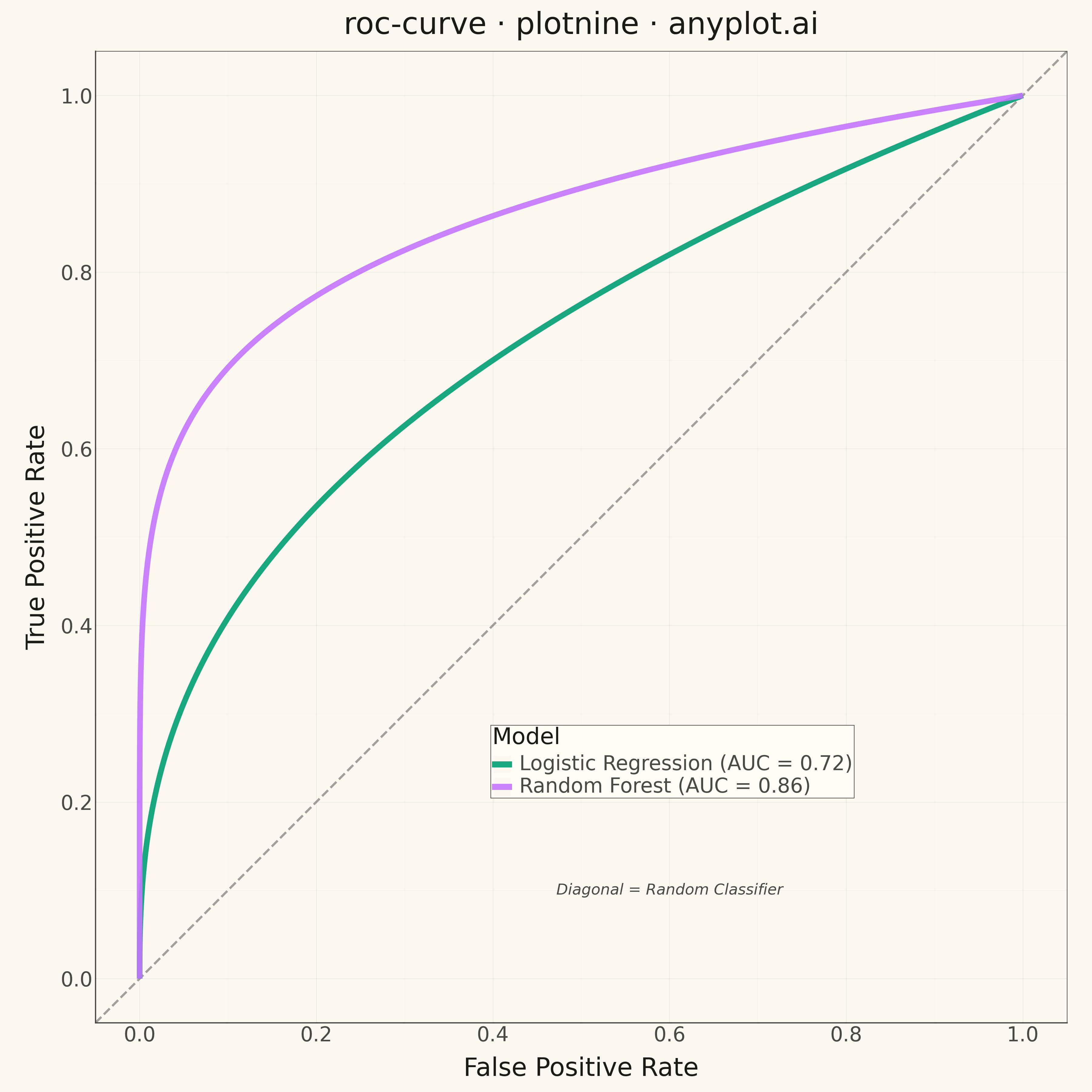
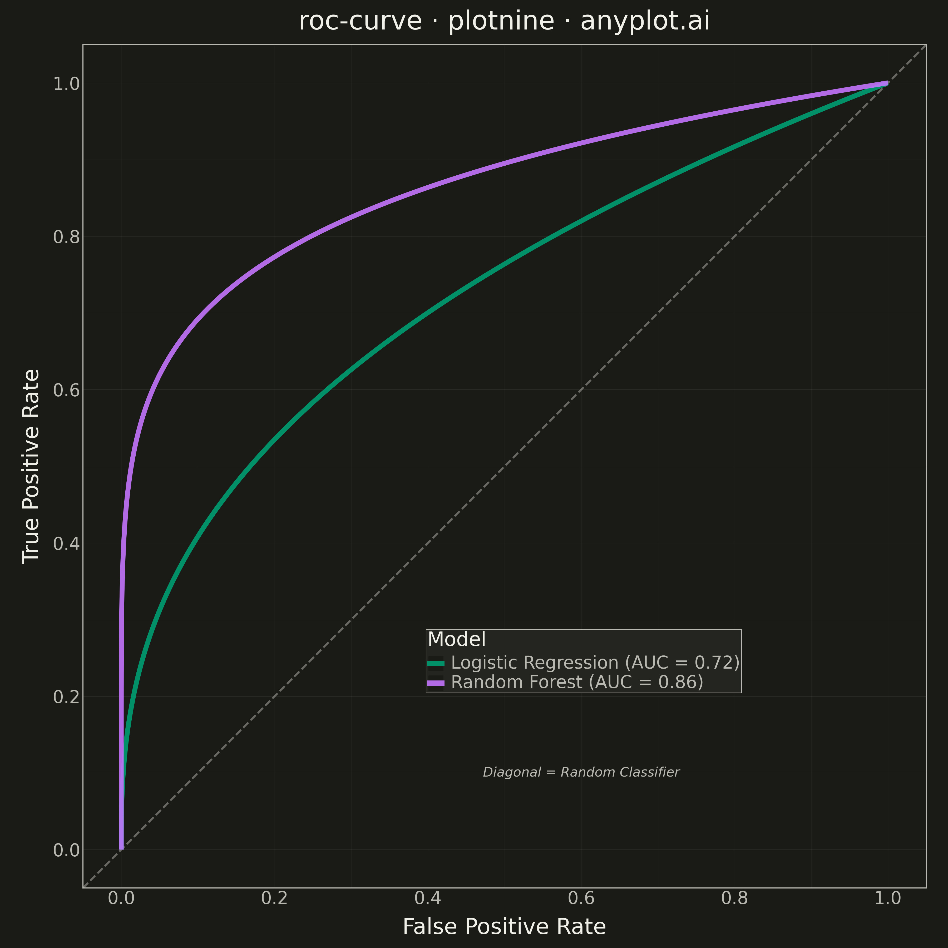
A Receiver Operating Characteristic (ROC) curve visualizes the performance of a binary classifier by plotting the True Positive Rate (TPR) against the False Positive Rate (FPR) at various classification thresholds. The Area Under the Curve (AUC) provides a single metric summarizing model performance, where 1.0 indicates perfect classification and 0.5 represents random guessing.
""" anyplot.ai
roc-curve: ROC Curve with AUC
Library: plotnine 0.15.4 | Python 3.13.13
Quality: 94/100 | Updated: 2026-05-09
"""

import os
import sys

import numpy as np
import pandas as pd


# Prevent import of local file by removing current dir from path
sys.path = [p for p in sys.path if os.path.abspath(p) != os.path.dirname(os.path.abspath(__file__))]

from plotnine import (
    aes,
    annotate,
    coord_fixed,
    element_line,
    element_rect,
    element_text,
    geom_abline,
    geom_line,
    ggplot,
    labs,
    scale_color_manual,
    scale_x_continuous,
    scale_y_continuous,
    theme,
    theme_minimal,
)


# Theme tokens
THEME = os.getenv("ANYPLOT_THEME", "light")
PAGE_BG = "#FAF8F1" if THEME == "light" else "#1A1A17"
ELEVATED_BG = "#FFFDF6" if THEME == "light" else "#242420"
INK = "#1A1A17" if THEME == "light" else "#F0EFE8"
INK_SOFT = "#4A4A44" if THEME == "light" else "#B8B7B0"

# Okabe-Ito palette
IMPRINT = ["#009E73", "#C475FD", "#4467A3", "#BD8233", "#AE3030", "#2ABCCD", "#954477"]

# Data - Simulate ROC curve from good and moderate classifiers
np.random.seed(42)

n_points = 200
thresholds = np.linspace(0, 1, n_points)

# Model 1: Good classifier (AUC ~ 0.92)
fpr_1 = np.sort(np.concatenate([[0], np.power(thresholds[1:-1], 2.5), [1]]))
tpr_1 = np.sort(np.concatenate([[0], np.power(thresholds[1:-1], 0.4), [1]]))

# Model 2: Moderate classifier (AUC ~ 0.78)
fpr_2 = np.sort(np.concatenate([[0], np.power(thresholds[1:-1], 1.8), [1]]))
tpr_2 = np.sort(np.concatenate([[0], np.power(thresholds[1:-1], 0.7), [1]]))

# Calculate AUC using trapezoidal rule
auc_1 = np.trapezoid(tpr_1, fpr_1)
auc_2 = np.trapezoid(tpr_2, fpr_2)

# Create DataFrame for plotting
df = pd.DataFrame(
    {
        "fpr": np.concatenate([fpr_1, fpr_2]),
        "tpr": np.concatenate([tpr_1, tpr_2]),
        "Model": [f"Random Forest (AUC = {auc_1:.2f})"] * len(fpr_1)
        + [f"Logistic Regression (AUC = {auc_2:.2f})"] * len(fpr_2),
    }
)

# Theme-adaptive style
anyplot_theme = theme(
    figure_size=(12, 12),
    plot_background=element_rect(fill=PAGE_BG, color=PAGE_BG),
    panel_background=element_rect(fill=PAGE_BG),
    panel_grid_major=element_line(color=INK, size=0.3, alpha=0.10),
    panel_grid_minor=element_line(color=INK, size=0.2, alpha=0.05),
    panel_border=element_rect(color=INK_SOFT, fill=None, size=0.5),
    axis_title=element_text(size=20, color=INK),
    axis_text=element_text(size=16, color=INK_SOFT),
    axis_line=element_line(color=INK_SOFT),
    plot_title=element_text(size=24, color=INK),
    legend_background=element_rect(fill=ELEVATED_BG, color=INK_SOFT, size=0.5),
    legend_text=element_text(size=16, color=INK_SOFT),
    legend_title=element_text(size=18, color=INK),
    legend_position=(0.65, 0.25),
)

# Create plot
plot = (
    ggplot(df, aes(x="fpr", y="tpr", color="Model"))
    + geom_abline(intercept=0, slope=1, linetype="dashed", color=INK_SOFT, size=1, alpha=0.5)
    + geom_line(size=2.5, alpha=0.9)
    + scale_color_manual(values=IMPRINT[:2])
    + scale_x_continuous(limits=(0, 1), breaks=np.arange(0, 1.1, 0.2))
    + scale_y_continuous(limits=(0, 1), breaks=np.arange(0, 1.1, 0.2))
    + coord_fixed(ratio=1)
    + labs(x="False Positive Rate", y="True Positive Rate", title="roc-curve · plotnine · anyplot.ai", color="Model")
    + theme_minimal()
    + anyplot_theme
    + annotate("text", x=0.6, y=0.1, label="Diagonal = Random Classifier", size=12, color=INK_SOFT, fontstyle="italic")
)

# Save plot
plot.save(f"plot-{THEME}.png", dpi=300, width=12, height=12)
Runnable source as JSON, for any HTTP client: https://api.anyplot.ai/specs/roc-curve/plotnine/code. Any spec id and library id listed in llms-full.txt fit the same URL shape; every URL below is complete and callable.
{
  "spec_id": "roc-curve",
  "language": "python",
  "library": "plotnine",
  "page": "https://anyplot.ai/roc-curve/python/plotnine",
  "hub": "https://anyplot.ai/roc-curve",
  "code_json": "https://api.anyplot.ai/specs/roc-curve/plotnine/code",
  "spec_json": "https://api.anyplot.ai/specs/roc-curve",
  "render_light_png": "https://storage.googleapis.com/anyplot-images/plots/roc-curve/python/plotnine/plot-light.png",
  "render_dark_png": "https://storage.googleapis.com/anyplot-images/plots/roc-curve/python/plotnine/plot-dark.png",
  "quality_score": 94.0,
  "license": "MIT",
  "guide": "https://anyplot.ai/llms.txt"
}
Part of ROC Curve with AUC on anyplot.ai.