The same plot in 14 other libraries — JavaScript: Chart.js, D3.js, Apache ECharts, MUI X Charts; Python: Altair, Bokeh, lets-plot, Matplotlib, Plotly, plotnine, Pygal, Seaborn; R: ggplot2; Julia: Makie.jl. Compare all 15 side by side: Color-Mapped Scatter Plot in Python, R, Julia and JavaScript.
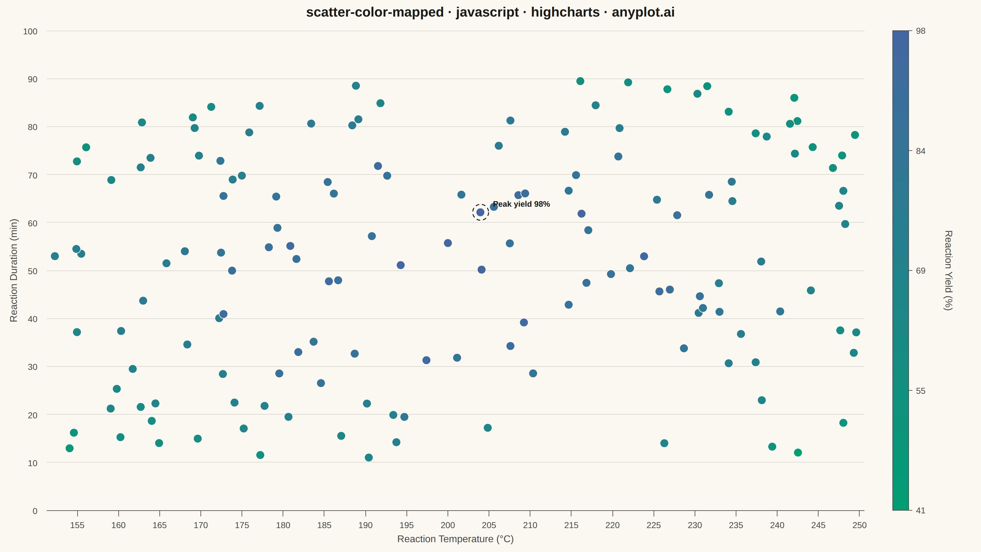
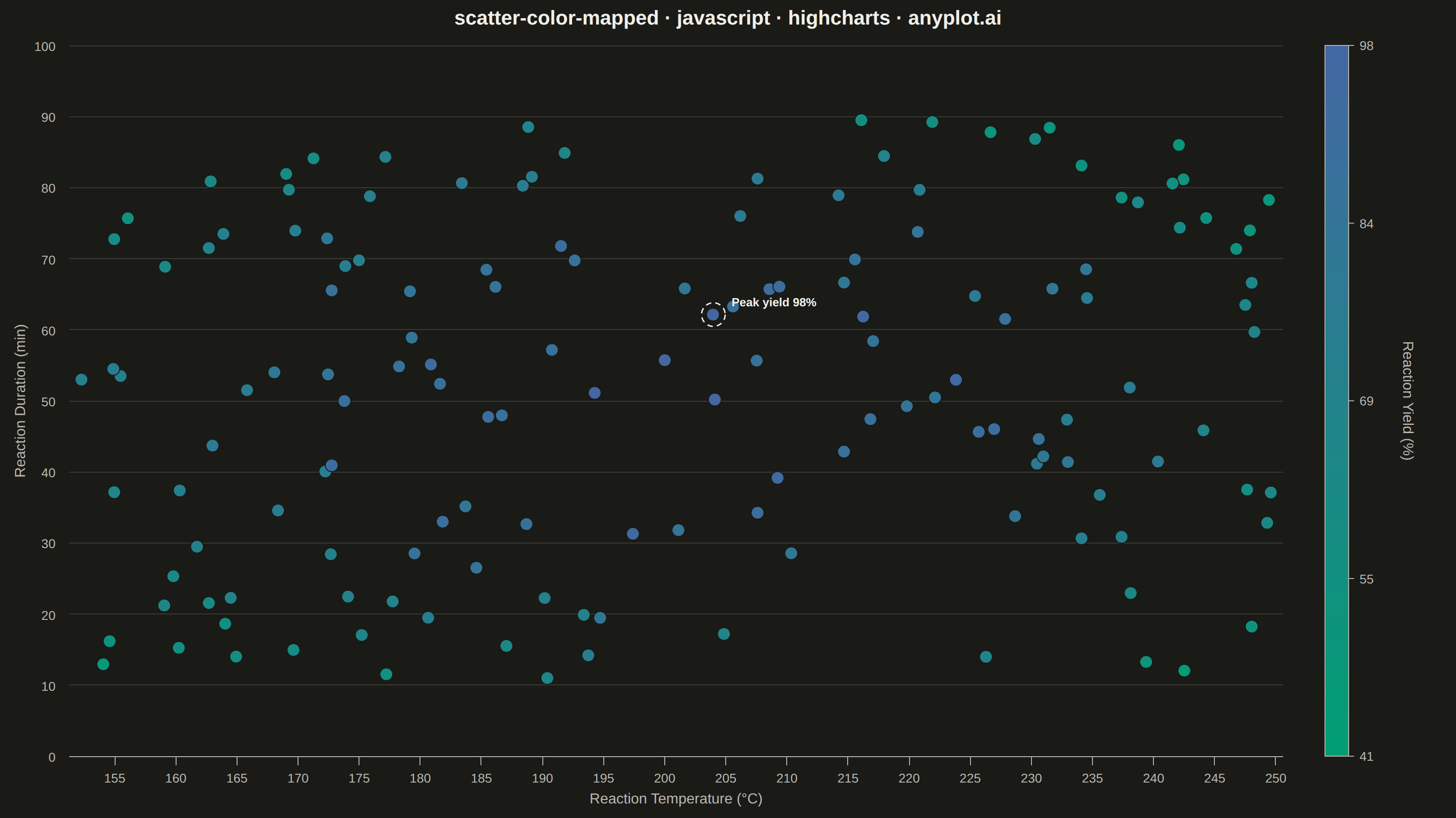
A scatter plot that encodes a third continuous variable using a colormap, allowing visualization of three dimensions on a 2D plane. This visualization is essential for exploring multivariate relationships where the third variable represents intensity, magnitude, or any continuous measurement. A colorbar provides a reference scale for interpreting the color values.
// anyplot.ai
// scatter-color-mapped: Color-Mapped Scatter Plot
// Library: highcharts 12.6.0 | JavaScript 22.23.2
// Quality: 87/100 | Created: 2026-09-05

const t = window.ANYPLOT_TOKENS;

// --- Data (in-memory, deterministic fixed-seed LCG) -------------------------
let seed = 42;
function rand() {
  seed = (1664525 * seed + 1013904223) % 4294967296;
  return seed / 4294967296;
}

const pointCount = 150;
const readings = [];
for (let i = 0; i < pointCount; i++) {
  const temperature = 150 + rand() * 100; // reaction temperature, deg C
  const duration = 10 + rand() * 80; // reaction duration, minutes
  const noise = (rand() - 0.5) * 15;
  let yieldPct =
    95 -
    0.012 * (temperature - 200) ** 2 -
    0.02 * (duration - 50) ** 2 +
    noise;
  yieldPct = Math.max(5, Math.min(98, yieldPct));
  readings.push({ x: temperature, y: duration, yieldPct });
}

const yieldValues = readings.map((r) => r.yieldPct);
const yieldMin = Math.min(...yieldValues);
const yieldMax = Math.max(...yieldValues);

// --- Color mapping ------------------------------------------------------------
// The `coloraxis` module (colorAxis + automatic legend gradient) lives in
// modules/coloraxis.js, which isn't loaded — only the core bundle is. Interpolate
// each point's fill from the Imprint imprint_seq gradient by hand instead, and
// draw a matching colorbar with the core SVG renderer.
function hexToRgb(hex) {
  const v = parseInt(hex.slice(1), 16);
  return [(v >> 16) & 255, (v >> 8) & 255, v & 255];
}
const seqLow = hexToRgb(t.seq[0]);
const seqHigh = hexToRgb(t.seq[1]);
function yieldColor(value) {
  const ratio = (value - yieldMin) / (yieldMax - yieldMin);
  const [r, g, b] = seqLow.map((c, i) => Math.round(c + (seqHigh[i] - c) * ratio));
  return `rgb(${r}, ${g}, ${b})`;
}

const points = readings.map((r) => ({
  x: r.x,
  y: r.y,
  color: yieldColor(r.yieldPct),
  custom: { yieldPct: r.yieldPct },
}));

const peak = readings.reduce((best, r) => (r.yieldPct > best.yieldPct ? r : best));

// --- Chart -------------------------------------------------------------------
Highcharts.chart("container", {
  chart: {
    type: "scatter",
    backgroundColor: "transparent",
    animation: false,
    marginRight: 190,
    style: { fontFamily: "inherit" },
    events: {
      load: function () {
        // Manual colorbar (see "Color mapping" note above) mirroring the
        // imprint_seq gradient used for the point fills.
        const chart = this;
        const barWidth = 26;
        const barX = chart.plotLeft + chart.plotWidth + 46;
        const barY = chart.plotTop;
        const barHeight = chart.plotHeight;

        // Fragment-url paint servers (linearGradient defs) don't resolve on the
        // harness's about:blank document, so the bar is built from many thin
        // interpolated bands instead of a single gradient fill.
        const bandCount = 60;
        const bandHeight = barHeight / bandCount;
        for (let i = 0; i < bandCount; i++) {
          const frac = (i + 0.5) / bandCount;
          const value = yieldMin + frac * (yieldMax - yieldMin);
          chart.renderer
            .rect(barX, barY + barHeight - (i + 1) * bandHeight, barWidth, bandHeight + 0.5)
            .attr({ fill: yieldColor(value) })
            .add();
        }
        chart.renderer
          .rect(barX, barY, barWidth, barHeight)
          .attr({ fill: "none", stroke: t.inkSoft, "stroke-width": 1 })
          .add();

        const tickCount = 5;
        for (let i = 0; i < tickCount; i++) {
          const frac = i / (tickCount - 1);
          const value = yieldMin + frac * (yieldMax - yieldMin);
          const tickY = barY + barHeight * (1 - frac);
          chart.renderer
            .path(["M", barX + barWidth, tickY, "L", barX + barWidth + 6, tickY])
            .attr({ stroke: t.inkSoft, "stroke-width": 1 })
            .add();
          chart.renderer
            .text(value.toFixed(0), barX + barWidth + 12, tickY + 5)
            .css({ color: t.inkSoft, fontSize: "14px" })
            .add();
        }

        chart.renderer
          .text("Reaction Yield (%)", barX + barWidth + 60, barY + barHeight / 2)
          .attr({ rotation: 90, align: "center" })
          .css({ color: t.inkSoft, fontSize: "16px" })
          .add();

        // Storytelling touch: ring the highest-yield point and label it, so the
        // chart guides the viewer to the reaction's sweet spot instead of leaving
        // an undifferentiated point cloud.
        const peakX = chart.xAxis[0].toPixels(peak.x, false);
        const peakY = chart.yAxis[0].toPixels(peak.y, false);
        chart.renderer
          .circle(peakX, peakY, 13)
          .attr({ fill: "none", stroke: t.ink, "stroke-width": 1.5, dashstyle: "Dash" })
          .add();
        chart.renderer
          .label(`Peak yield ${peak.yieldPct.toFixed(0)}%`, peakX + 16, peakY - 26)
          .css({ color: t.ink, fontSize: "13px", fontWeight: "600" })
          .attr({ padding: 4, zIndex: 6 })
          .add();
      },
    },
  },
  credits: { enabled: false },
  accessibility: { enabled: false },
  title: {
    text: "scatter-color-mapped · javascript · highcharts · anyplot.ai",
    style: { color: t.ink, fontSize: "22px", fontWeight: "600" },
  },
  legend: { enabled: false },
  tooltip: {
    pointFormat:
      "Temperature: {point.x:.0f}°C<br/>Duration: {point.y:.0f} min<br/>Yield: {point.custom.yieldPct:.1f}%",
  },
  xAxis: {
    title: {
      text: "Reaction Temperature (°C)",
      style: { color: t.inkSoft, fontSize: "16px" },
    },
    lineColor: t.inkSoft,
    tickColor: t.inkSoft,
    gridLineColor: t.grid,
    labels: { style: { color: t.inkSoft, fontSize: "14px" } },
  },
  yAxis: {
    title: {
      text: "Reaction Duration (min)",
      style: { color: t.inkSoft, fontSize: "16px" },
    },
    lineColor: t.inkSoft,
    tickColor: t.inkSoft,
    gridLineColor: t.grid,
    labels: { style: { color: t.inkSoft, fontSize: "14px" } },
  },
  plotOptions: {
    series: { animation: false },
    scatter: {
      marker: {
        radius: 7,
        lineWidth: 1,
        lineColor: t.pageBg,
        fillOpacity: 0.88,
      },
    },
  },
  series: [
    {
      name: "Yield",
      showInLegend: false,
      data: points,
    },
  ],
});
Runnable source as JSON, for any HTTP client: https://api.anyplot.ai/specs/scatter-color-mapped/highcharts/code. Any spec id and library id listed in llms-full.txt fit the same URL shape; every URL below is complete and callable.
{
  "spec_id": "scatter-color-mapped",
  "language": "javascript",
  "library": "highcharts",
  "page": "https://anyplot.ai/scatter-color-mapped/javascript/highcharts",
  "hub": "https://anyplot.ai/scatter-color-mapped",
  "code_json": "https://api.anyplot.ai/specs/scatter-color-mapped/highcharts/code",
  "spec_json": "https://api.anyplot.ai/specs/scatter-color-mapped",
  "render_light_png": "https://storage.googleapis.com/anyplot-images/plots/scatter-color-mapped/javascript/highcharts/plot-light.png",
  "render_dark_png": "https://storage.googleapis.com/anyplot-images/plots/scatter-color-mapped/javascript/highcharts/plot-dark.png",
  "interactive_light_html": "https://storage.googleapis.com/anyplot-images/plots/scatter-color-mapped/javascript/highcharts/plot-light.html",
  "interactive_dark_html": "https://storage.googleapis.com/anyplot-images/plots/scatter-color-mapped/javascript/highcharts/plot-dark.html",
  "quality_score": 87.0,
  "license": "MIT",
  "guide": "https://anyplot.ai/llms.txt"
}
Part of Color-Mapped Scatter Plot on anyplot.ai.