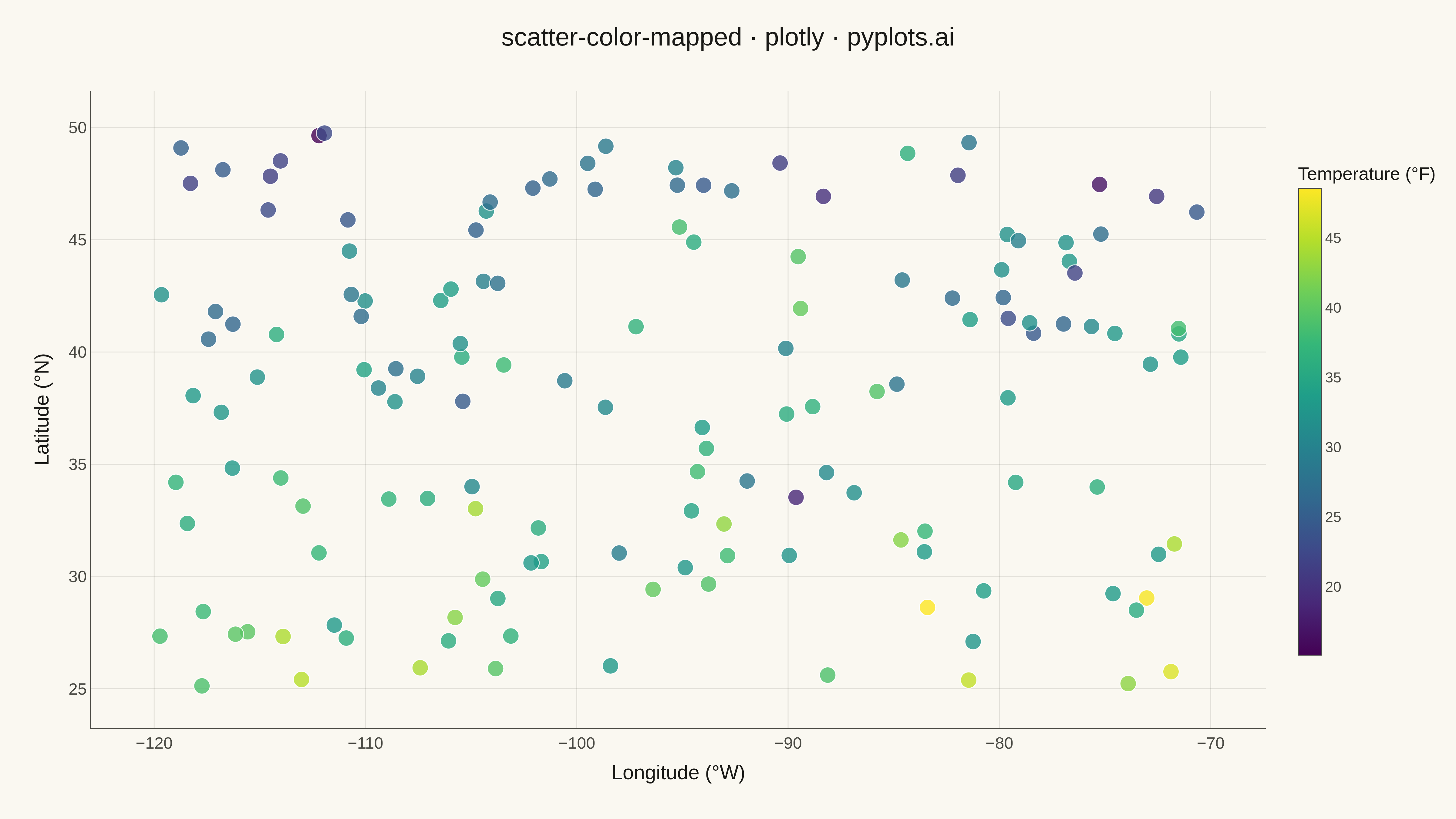
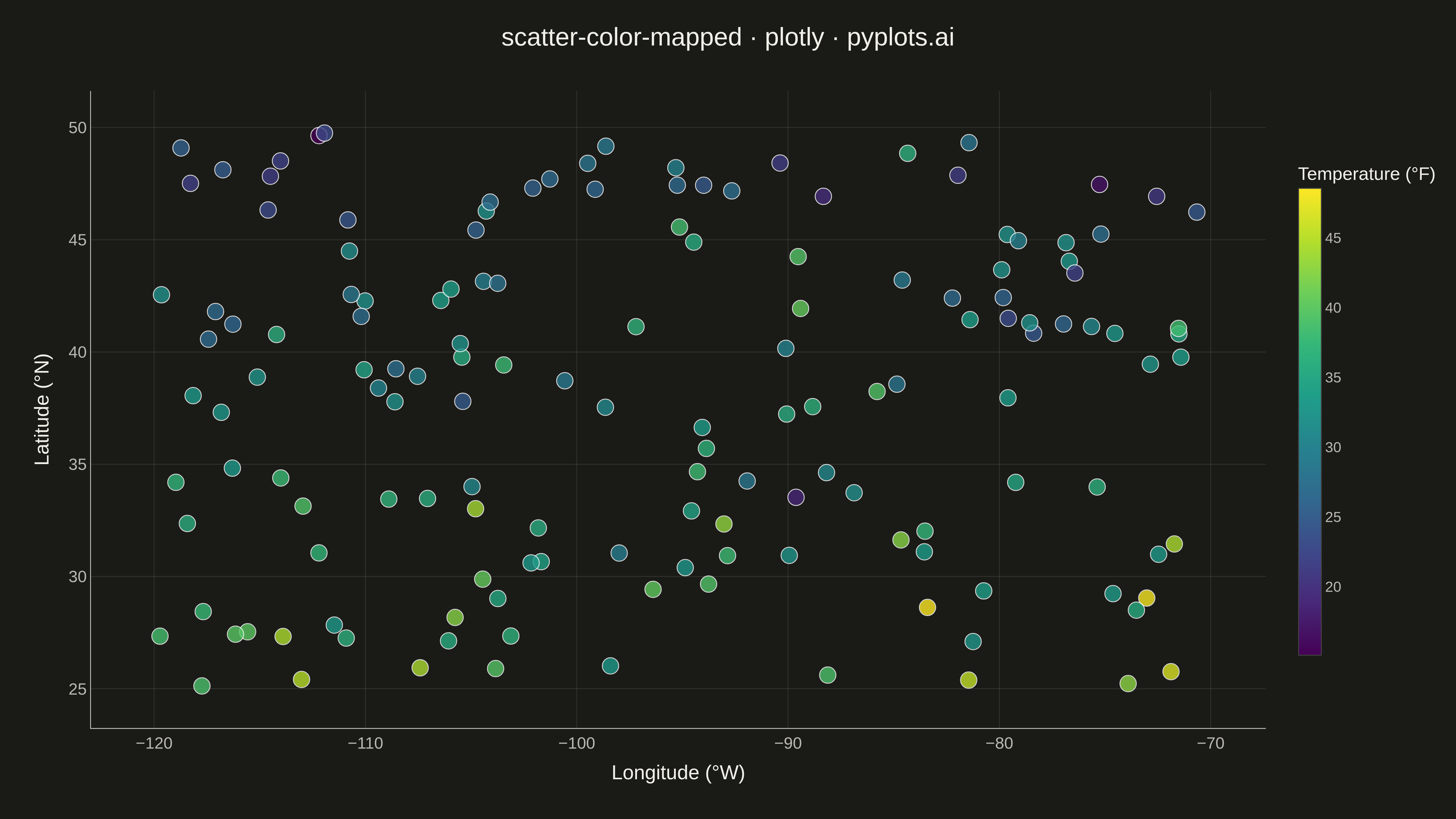
A scatter plot that encodes a third continuous variable using a colormap, allowing visualization of three dimensions on a 2D plane. This visualization is essential for exploring multivariate relationships where the third variable represents intensity, magnitude, or any continuous measurement. A colorbar provides a reference scale for interpreting the color values.
""" anyplot.ai
scatter-color-mapped: Color-Mapped Scatter Plot
Library: plotly 6.7.0 | Python 3.13.13
Quality: 85/100 | Updated: 2026-05-08
"""

import numpy as np
import plotly.graph_objects as go


# Data - Temperature readings across geographic coordinates
np.random.seed(42)
n_points = 150

# Geographic-like coordinates
longitude = np.random.uniform(-120, -70, n_points)
latitude = np.random.uniform(25, 50, n_points)

# Temperature varies with latitude (cooler north, warmer south) plus random variation
temperature = 40 - 0.6 * (latitude - 25) + np.random.randn(n_points) * 5

# Create scatter plot with color mapping
fig = go.Figure()

fig.add_trace(
    go.Scatter(
        x=longitude,
        y=latitude,
        mode="markers",
        marker=dict(
            size=18,
            color=temperature,
            colorscale="Viridis",
            colorbar=dict(
                title=dict(text="Temperature (°F)", font=dict(size=20)), tickfont=dict(size=16), thickness=25, len=0.8
            ),
            opacity=0.8,
            line=dict(width=1, color="white"),
        ),
        hovertemplate="Longitude: %{x:.1f}°<br>Latitude: %{y:.1f}°<br>Temperature: %{marker.color:.1f}°F<extra></extra>",
    )
)

# Update layout for large canvas
fig.update_layout(
    title=dict(text="scatter-color-mapped · plotly · pyplots.ai", font=dict(size=28), x=0.5, xanchor="center"),
    xaxis=dict(
        title=dict(text="Longitude (°W)", font=dict(size=22)),
        tickfont=dict(size=18),
        gridcolor="rgba(128, 128, 128, 0.3)",
        gridwidth=1,
        zeroline=False,
    ),
    yaxis=dict(
        title=dict(text="Latitude (°N)", font=dict(size=22)),
        tickfont=dict(size=18),
        gridcolor="rgba(128, 128, 128, 0.3)",
        gridwidth=1,
        zeroline=False,
    ),
    template="plotly_white",
    plot_bgcolor="white",
    paper_bgcolor="white",
    margin=dict(l=100, r=120, t=100, b=100),
)

# Save as PNG (4800 x 2700 px) and HTML
fig.write_image("plot.png", width=1600, height=900, scale=3)
fig.write_html("plot.html", include_plotlyjs="cdn")
Runnable source as JSON, for any HTTP client: https://api.anyplot.ai/specs/scatter-color-mapped/plotly/code. Any spec id and library id listed in llms-full.txt fit the same URL shape; every URL below is complete and callable.
{
  "spec_id": "scatter-color-mapped",
  "language": "python",
  "library": "plotly",
  "page": "https://anyplot.ai/scatter-color-mapped/python/plotly",
  "hub": "https://anyplot.ai/scatter-color-mapped",
  "code_json": "https://api.anyplot.ai/specs/scatter-color-mapped/plotly/code",
  "spec_json": "https://api.anyplot.ai/specs/scatter-color-mapped",
  "render_light_png": "https://storage.googleapis.com/anyplot-images/plots/scatter-color-mapped/python/plotly/plot-light.png",
  "render_dark_png": "https://storage.googleapis.com/anyplot-images/plots/scatter-color-mapped/python/plotly/plot-dark.png",
  "interactive_light_html": "https://storage.googleapis.com/anyplot-images/plots/scatter-color-mapped/python/plotly/plot-light.html",
  "interactive_dark_html": "https://storage.googleapis.com/anyplot-images/plots/scatter-color-mapped/python/plotly/plot-dark.html",
  "quality_score": 85.0,
  "license": "MIT",
  "guide": "https://anyplot.ai/llms.txt"
}
Part of Color-Mapped Scatter Plot on anyplot.ai.