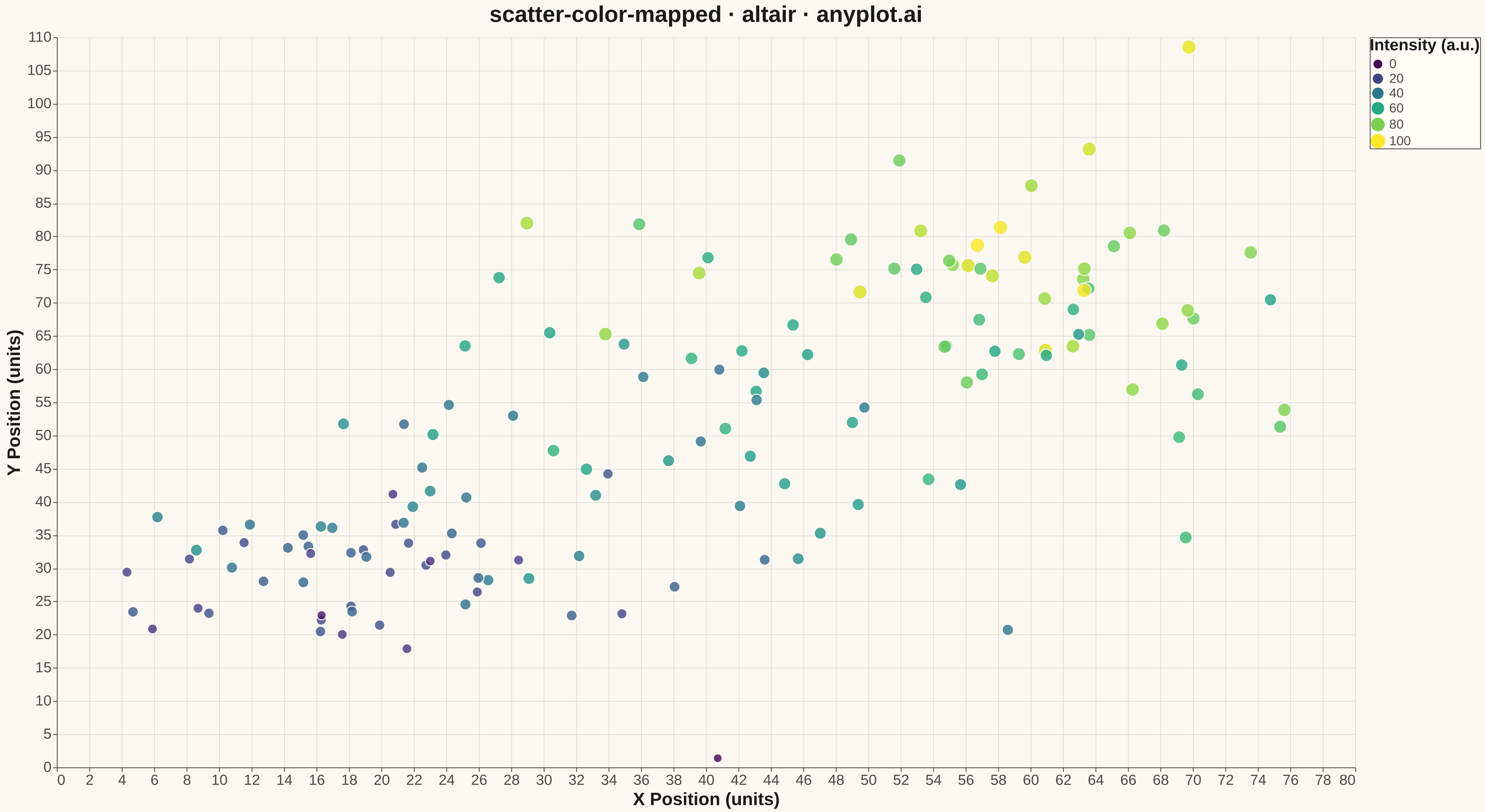
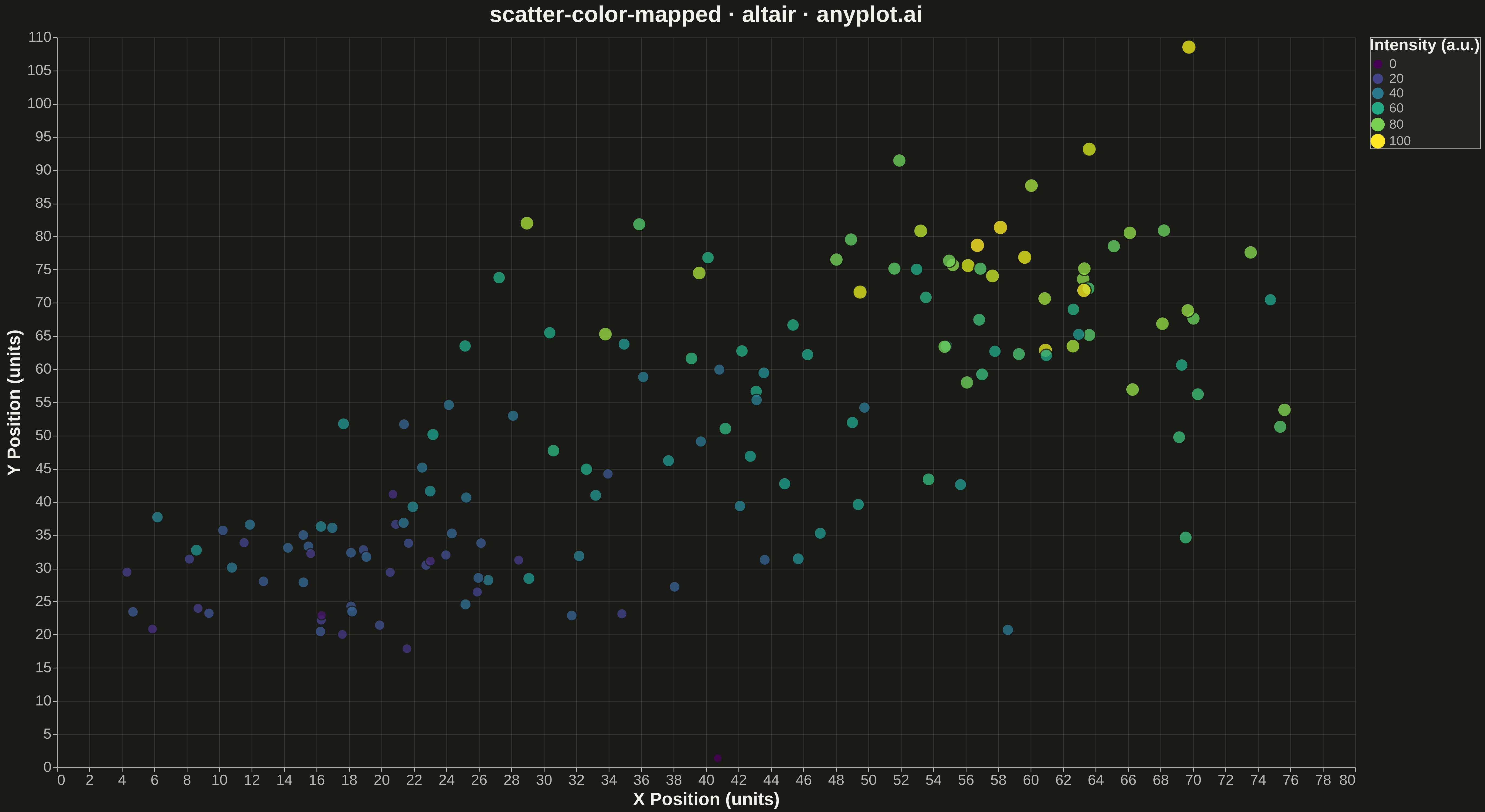
A scatter plot that encodes a third continuous variable using a colormap, allowing visualization of three dimensions on a 2D plane. This visualization is essential for exploring multivariate relationships where the third variable represents intensity, magnitude, or any continuous measurement. A colorbar provides a reference scale for interpreting the color values.
""" anyplot.ai
scatter-color-mapped: Color-Mapped Scatter Plot
Library: altair 6.1.0 | Python 3.13.13
Quality: 95/100 | Updated: 2026-05-08
"""

import os

import altair as alt
import numpy as np
import pandas as pd


# Theme tokens
THEME = os.getenv("ANYPLOT_THEME", "light")
PAGE_BG = "#FAF8F1" if THEME == "light" else "#1A1A17"
INK = "#1A1A17" if THEME == "light" else "#F0EFE8"
INK_SOFT = "#4A4A44" if THEME == "light" else "#B8B7B0"
ELEVATED_BG = "#FFFDF6" if THEME == "light" else "#242420"

# Data - simulate temperature readings at geographic locations
np.random.seed(42)
n_points = 150

# Create spatial coordinates with clustered patterns
x = np.concatenate([np.random.normal(20, 8, 50), np.random.normal(60, 10, 50), np.random.normal(40, 12, 50)])
y = np.concatenate([np.random.normal(30, 8, 50), np.random.normal(70, 10, 50), np.random.normal(50, 15, 50)])

# Third variable: intensity/temperature that correlates with position
intensity = 0.3 * x + 0.5 * y + np.random.normal(0, 8, n_points)
intensity = (intensity - intensity.min()) / (intensity.max() - intensity.min()) * 100

df = pd.DataFrame({"X Position": x, "Y Position": y, "Intensity": intensity})

# Create color-mapped scatter plot
chart = (
    alt.Chart(df)
    .mark_circle(size=200, opacity=0.8, strokeWidth=1.0, stroke=PAGE_BG)
    .encode(
        x=alt.X("X Position:Q", title="X Position (units)", scale=alt.Scale(nice=True)),
        y=alt.Y("Y Position:Q", title="Y Position (units)", scale=alt.Scale(nice=True)),
        color=alt.Color(
            "Intensity:Q",
            title="Intensity (a.u.)",
            scale=alt.Scale(scheme="viridis"),
            legend=alt.Legend(
                titleFontSize=18, labelFontSize=16, symbolSize=200, gradientLength=300, gradientThickness=20
            ),
        ),
        tooltip=["X Position:Q", "Y Position:Q", "Intensity:Q"],
    )
    .properties(
        width=1600,
        height=900,
        title=alt.Title("scatter-color-mapped · altair · anyplot.ai", fontSize=28, anchor="middle"),
        background=PAGE_BG,
    )
    .configure_axis(
        labelFontSize=18,
        titleFontSize=22,
        gridOpacity=0.1,
        domainColor=INK_SOFT,
        tickColor=INK_SOFT,
        gridColor=INK,
        labelColor=INK_SOFT,
        titleColor=INK,
    )
    .configure_view(stroke=INK_SOFT, strokeWidth=0, fill=PAGE_BG)
    .configure_title(color=INK)
    .configure_legend(fillColor=ELEVATED_BG, strokeColor=INK_SOFT, labelColor=INK_SOFT, titleColor=INK)
)

# Save as PNG and HTML (4800 x 2700 px with scale_factor=3)
chart.save(f"plot-{THEME}.png", scale_factor=3.0)
chart.save(f"plot-{THEME}.html")
Runnable source as JSON, for any HTTP client: https://api.anyplot.ai/specs/scatter-color-mapped/altair/code. Any spec id and library id listed in llms-full.txt fit the same URL shape; every URL below is complete and callable.
{
  "spec_id": "scatter-color-mapped",
  "language": "python",
  "library": "altair",
  "page": "https://anyplot.ai/scatter-color-mapped/python/altair",
  "hub": "https://anyplot.ai/scatter-color-mapped",
  "code_json": "https://api.anyplot.ai/specs/scatter-color-mapped/altair/code",
  "spec_json": "https://api.anyplot.ai/specs/scatter-color-mapped",
  "render_light_png": "https://storage.googleapis.com/anyplot-images/plots/scatter-color-mapped/python/altair/plot-light.png",
  "render_dark_png": "https://storage.googleapis.com/anyplot-images/plots/scatter-color-mapped/python/altair/plot-dark.png",
  "interactive_light_html": "https://storage.googleapis.com/anyplot-images/plots/scatter-color-mapped/python/altair/plot-light.html",
  "interactive_dark_html": "https://storage.googleapis.com/anyplot-images/plots/scatter-color-mapped/python/altair/plot-dark.html",
  "quality_score": 95.0,
  "license": "MIT",
  "guide": "https://anyplot.ai/llms.txt"
}
Part of Color-Mapped Scatter Plot on anyplot.ai.