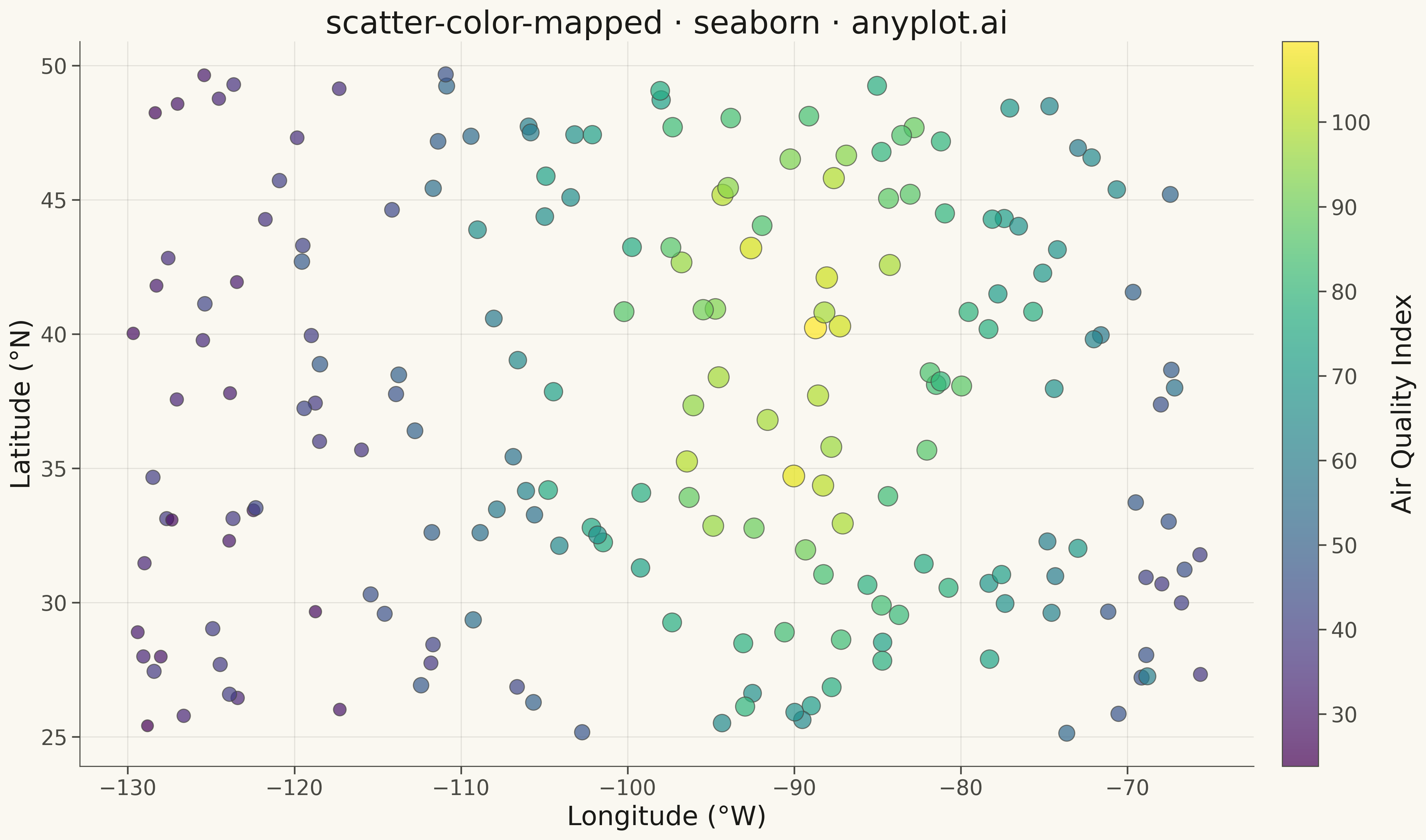
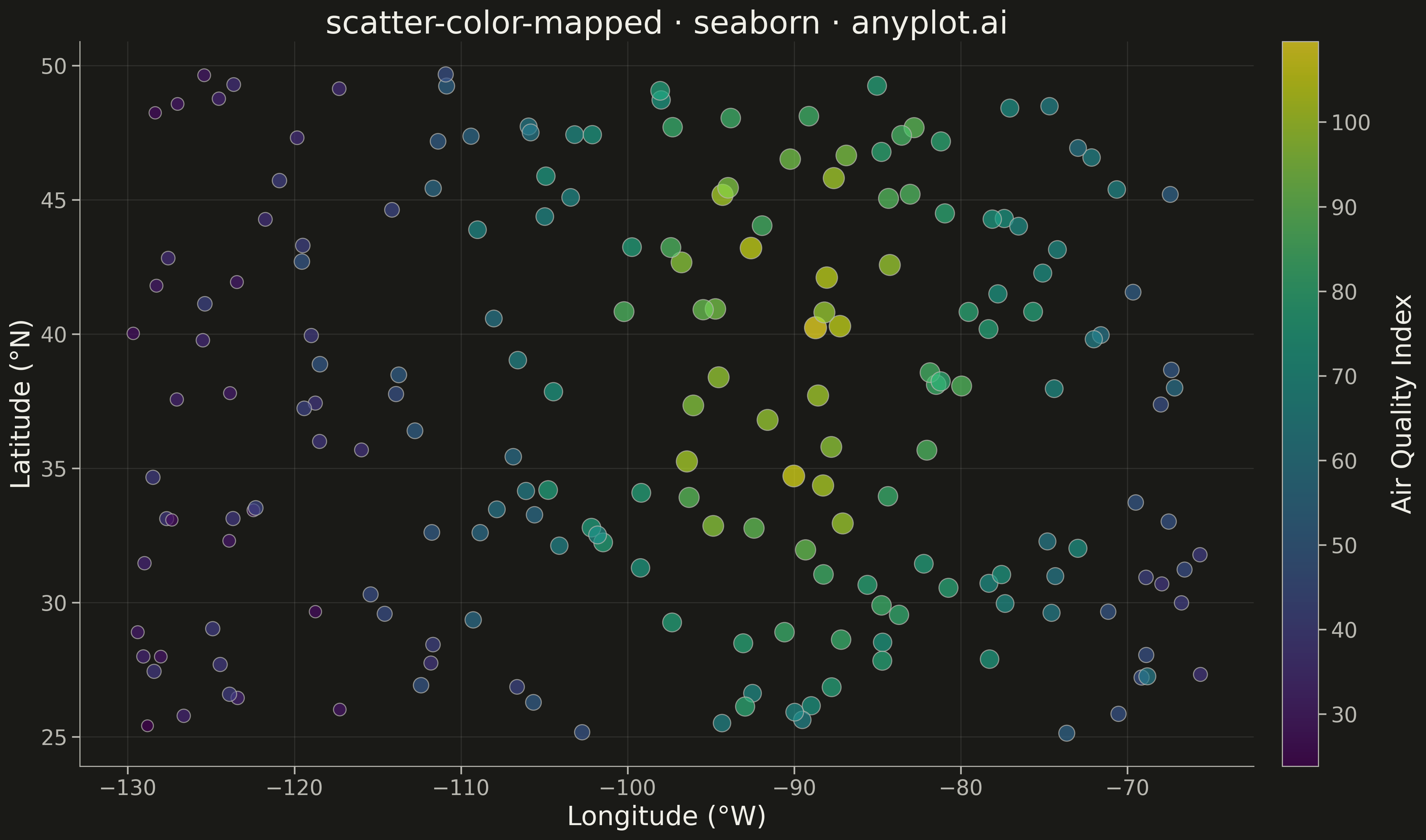
A scatter plot that encodes a third continuous variable using a colormap, allowing visualization of three dimensions on a 2D plane. This visualization is essential for exploring multivariate relationships where the third variable represents intensity, magnitude, or any continuous measurement. A colorbar provides a reference scale for interpreting the color values.
""" anyplot.ai
scatter-color-mapped: Color-Mapped Scatter Plot
Library: seaborn 0.13.2 | Python 3.13.13
Quality: 83/100 | Updated: 2026-05-08
"""

import os
import sys

import matplotlib.pyplot as plt
import numpy as np


sys.path = [p for p in sys.path if p and os.path.abspath(p) != os.path.dirname(__file__)]

# Theme tokens
THEME = os.getenv("ANYPLOT_THEME", "light")
PAGE_BG = "#FAF8F1" if THEME == "light" else "#1A1A17"
INK = "#1A1A17" if THEME == "light" else "#F0EFE8"
INK_SOFT = "#4A4A44" if THEME == "light" else "#B8B7B0"

# Data - Air quality index measurements across cities
np.random.seed(42)
n_cities = 200

# Geographic coordinates (latitude, longitude)
latitude = np.random.uniform(25, 50, n_cities)
longitude = np.random.uniform(-130, -65, n_cities)

# Air quality index as color variable - higher in urban areas
urban_density = np.exp(-((latitude - 40) ** 2 + (longitude + 90) ** 2) / 400)
aqi = 30 + urban_density * 70 + np.random.normal(0, 5, n_cities)
aqi = np.clip(aqi, 10, 150)

# Create figure
fig, ax = plt.subplots(figsize=(16, 9), facecolor=PAGE_BG)
ax.set_facecolor(PAGE_BG)

# Scatter plot with color mapping
scatter = ax.scatter(longitude, latitude, c=aqi, s=150, cmap="viridis", alpha=0.7, edgecolors=PAGE_BG, linewidth=0.5)

# Colorbar with theme-adaptive styling
cbar = fig.colorbar(scatter, ax=ax, pad=0.02)
cbar.set_label("Air Quality Index", fontsize=20, color=INK)
cbar.ax.tick_params(labelsize=16, colors=INK_SOFT)
for spine in cbar.ax.spines.values():
    spine.set_color(INK_SOFT)

# Styling
ax.set_xlabel("Longitude (°W)", fontsize=20, color=INK)
ax.set_ylabel("Latitude (°N)", fontsize=20, color=INK)
ax.set_title("scatter-color-mapped · seaborn · anyplot.ai", fontsize=24, color=INK)
ax.tick_params(axis="both", labelsize=16, colors=INK_SOFT)

ax.spines["top"].set_visible(False)
ax.spines["right"].set_visible(False)
for spine in ("left", "bottom"):
    ax.spines[spine].set_color(INK_SOFT)

ax.yaxis.grid(True, alpha=0.10, linewidth=0.8, color=INK)

plt.tight_layout()
plt.savefig(f"plot-{THEME}.png", dpi=300, bbox_inches="tight", facecolor=PAGE_BG)
Runnable source as JSON, for any HTTP client: https://api.anyplot.ai/specs/scatter-color-mapped/seaborn/code. Any spec id and library id listed in llms-full.txt fit the same URL shape; every URL below is complete and callable.
{
  "spec_id": "scatter-color-mapped",
  "language": "python",
  "library": "seaborn",
  "page": "https://anyplot.ai/scatter-color-mapped/python/seaborn",
  "hub": "https://anyplot.ai/scatter-color-mapped",
  "code_json": "https://api.anyplot.ai/specs/scatter-color-mapped/seaborn/code",
  "spec_json": "https://api.anyplot.ai/specs/scatter-color-mapped",
  "render_light_png": "https://storage.googleapis.com/anyplot-images/plots/scatter-color-mapped/python/seaborn/plot-light.png",
  "render_dark_png": "https://storage.googleapis.com/anyplot-images/plots/scatter-color-mapped/python/seaborn/plot-dark.png",
  "quality_score": 83.0,
  "license": "MIT",
  "guide": "https://anyplot.ai/llms.txt"
}
Part of Color-Mapped Scatter Plot on anyplot.ai.