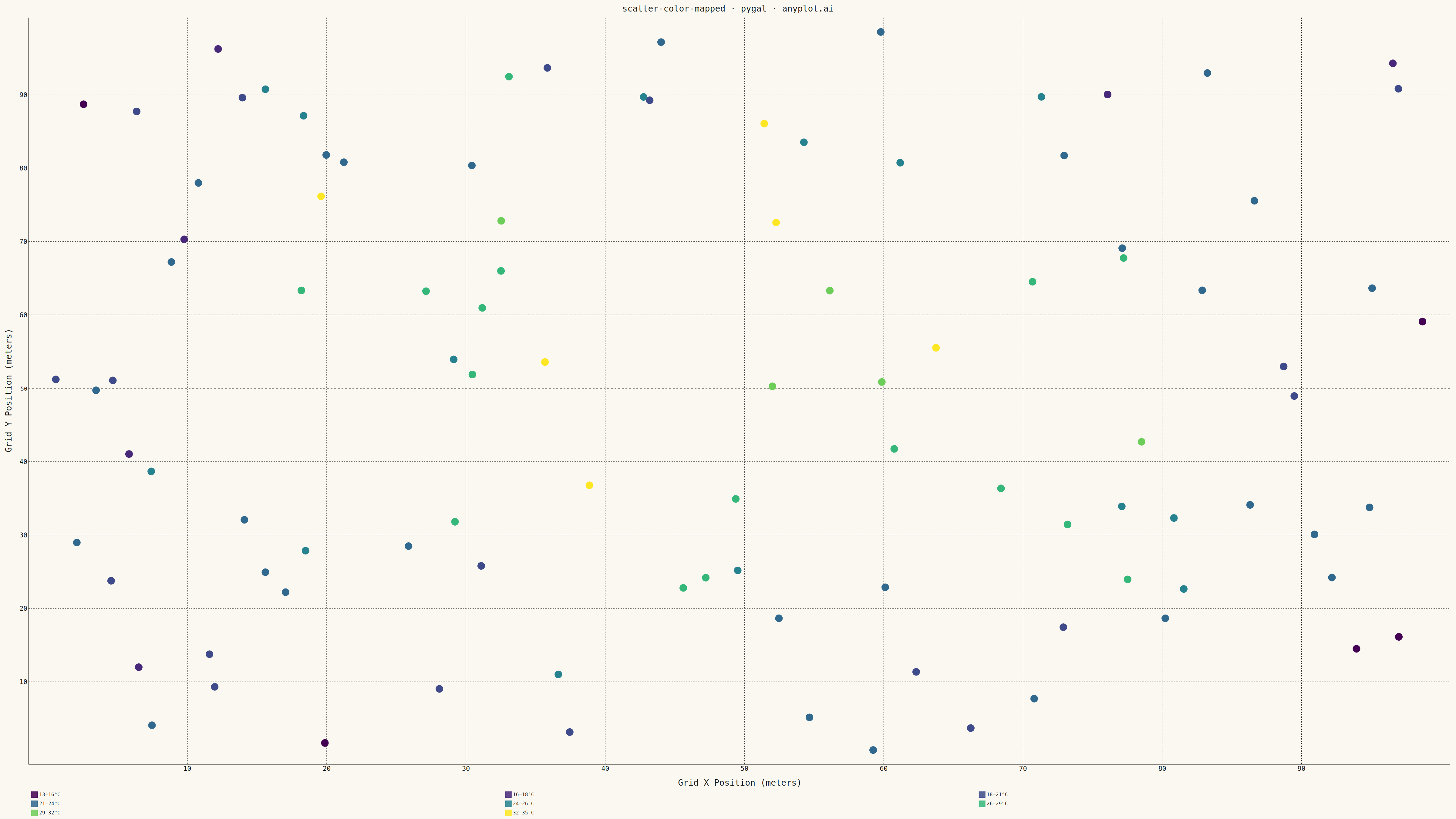
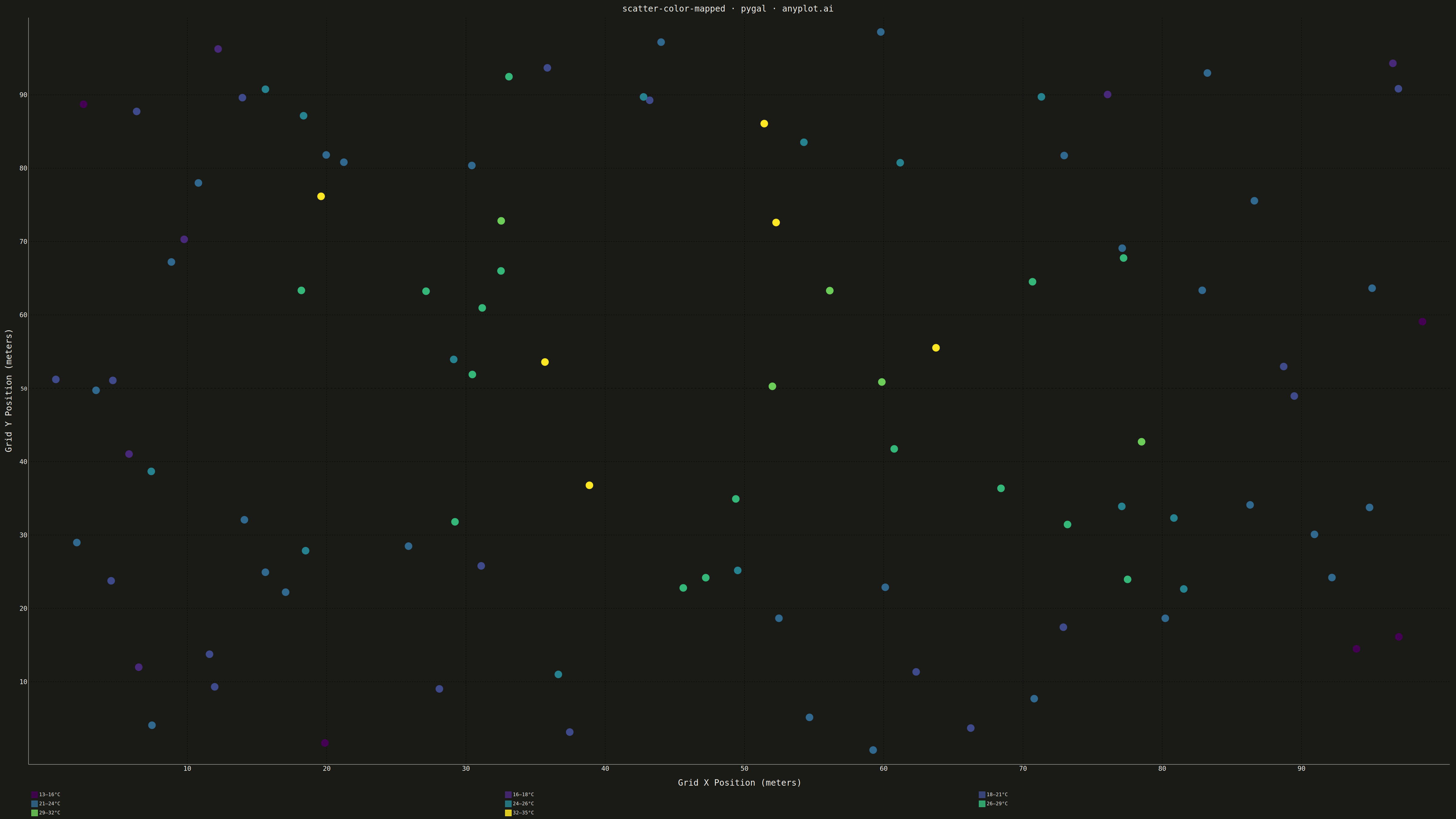
A scatter plot that encodes a third continuous variable using a colormap, allowing visualization of three dimensions on a 2D plane. This visualization is essential for exploring multivariate relationships where the third variable represents intensity, magnitude, or any continuous measurement. A colorbar provides a reference scale for interpreting the color values.
""" anyplot.ai
scatter-color-mapped: Color-Mapped Scatter Plot
Library: pygal 3.1.0 | Python 3.13.13
Quality: 89/100 | Updated: 2026-05-08
"""

import os
import sys


# Prevent importing local pygal.py file
sys.path = [p for p in sys.path if not p.endswith("/implementations/python")]

import numpy as np
import pygal
from pygal.style import Style


# Theme tokens
THEME = os.getenv("ANYPLOT_THEME", "light")
PAGE_BG = "#FAF8F1" if THEME == "light" else "#1A1A17"
INK = "#1A1A17" if THEME == "light" else "#F0EFE8"
INK_MUTED = "#6B6A63" if THEME == "light" else "#A8A79F"

# Okabe-Ito palette (not used here; viridis for continuous data)
IMPRINT = ("#009E73", "#C475FD", "#4467A3", "#BD8233", "#AE3030", "#2ABCCD", "#954477")

# Data - Temperature readings across sensor grid
np.random.seed(42)
n_points = 100
x = np.random.uniform(0, 100, n_points)  # Grid X position (meters)
y = np.random.uniform(0, 100, n_points)  # Grid Y position (meters)
# Temperature increases toward center with some noise
center_dist = np.sqrt((x - 50) ** 2 + (y - 50) ** 2)
temperature = 35 - 0.3 * center_dist + np.random.normal(0, 3, n_points)

# Create color bins for the continuous variable (pygal uses discrete series)
n_bins = 8
temp_min, temp_max = temperature.min(), temperature.max()
bin_edges = np.linspace(temp_min, temp_max, n_bins + 1)
bin_indices = np.digitize(temperature, bin_edges[:-1]) - 1
bin_indices = np.clip(bin_indices, 0, n_bins - 1)

# Viridis-inspired colorblind-safe palette (dark to light)
viridis_colors = (
    "#440154",  # Dark purple
    "#482878",  # Purple
    "#3E4A89",  # Blue-purple
    "#31688E",  # Blue
    "#26828E",  # Teal
    "#35B779",  # Green
    "#6DCD59",  # Light green
    "#FDE725",  # Yellow
)

# Custom style for large canvas with theme support
custom_style = Style(
    background=PAGE_BG,
    plot_background=PAGE_BG,
    foreground=INK,
    foreground_strong=INK,
    foreground_subtle=INK_MUTED,
    colors=viridis_colors,
    title_font_size=28,
    label_font_size=22,
    major_label_font_size=18,
    legend_font_size=16,
    value_font_size=14,
    stroke_width=2,
    opacity=0.85,
)

# Create XY scatter chart
chart = pygal.XY(
    width=4800,
    height=2700,
    style=custom_style,
    title="scatter-color-mapped · pygal · anyplot.ai",
    x_title="Grid X Position (meters)",
    y_title="Grid Y Position (meters)",
    show_dots=True,
    dots_size=12,
    stroke=False,
    show_x_guides=True,
    show_y_guides=True,
    legend_at_bottom=True,
    legend_box_size=20,
    truncate_legend=-1,
)

# Add data as separate series for each color bin (creates color-mapped effect)
for i in range(n_bins):
    mask = bin_indices == i
    if mask.sum() > 0:
        points = [(float(x[j]), float(y[j])) for j in range(n_points) if mask[j]]
        label = f"{bin_edges[i]:.0f}–{bin_edges[i + 1]:.0f}°C"
        chart.add(label, points)

# Save outputs
chart.render_to_png(f"plot-{THEME}.png")
chart.render_to_file(f"plot-{THEME}.html")
Runnable source as JSON, for any HTTP client: https://api.anyplot.ai/specs/scatter-color-mapped/pygal/code. Any spec id and library id listed in llms-full.txt fit the same URL shape; every URL below is complete and callable.
{
  "spec_id": "scatter-color-mapped",
  "language": "python",
  "library": "pygal",
  "page": "https://anyplot.ai/scatter-color-mapped/python/pygal",
  "hub": "https://anyplot.ai/scatter-color-mapped",
  "code_json": "https://api.anyplot.ai/specs/scatter-color-mapped/pygal/code",
  "spec_json": "https://api.anyplot.ai/specs/scatter-color-mapped",
  "render_light_png": "https://storage.googleapis.com/anyplot-images/plots/scatter-color-mapped/python/pygal/plot-light.png",
  "render_dark_png": "https://storage.googleapis.com/anyplot-images/plots/scatter-color-mapped/python/pygal/plot-dark.png",
  "interactive_light_html": "https://storage.googleapis.com/anyplot-images/plots/scatter-color-mapped/python/pygal/plot-light.html",
  "interactive_dark_html": "https://storage.googleapis.com/anyplot-images/plots/scatter-color-mapped/python/pygal/plot-dark.html",
  "quality_score": 89.0,
  "license": "MIT",
  "guide": "https://anyplot.ai/llms.txt"
}
Part of Color-Mapped Scatter Plot on anyplot.ai.