The same plot in 14 other libraries — JavaScript: D3.js, Apache ECharts, Highcharts, MUI X Charts; Python: Altair, Bokeh, lets-plot, Matplotlib, Plotly, plotnine, Pygal, Seaborn; R: ggplot2; Julia: Makie.jl. Compare all 15 side by side: Complex Plane Visualization (Argand Diagram) in Python, R, Julia and JavaScript.
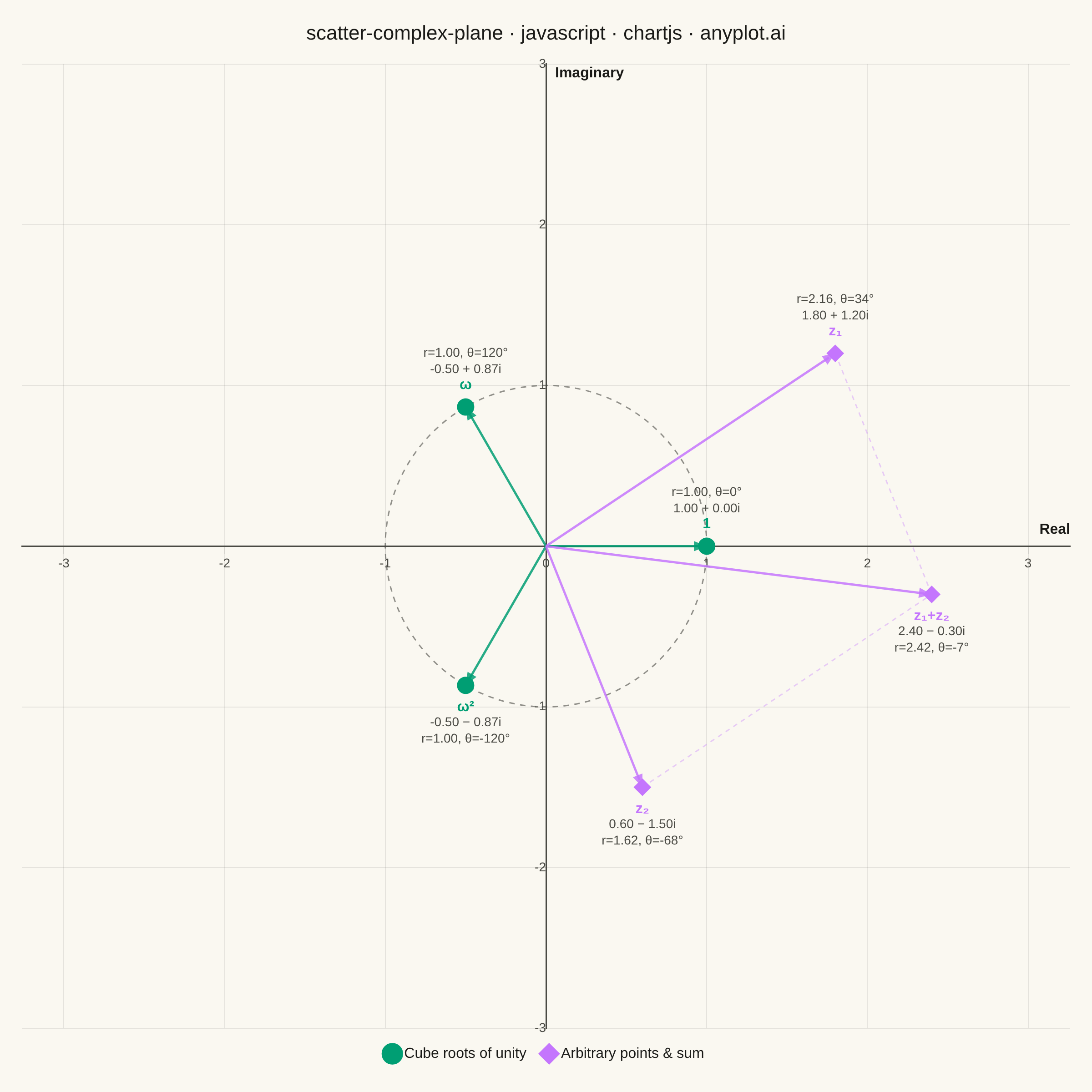
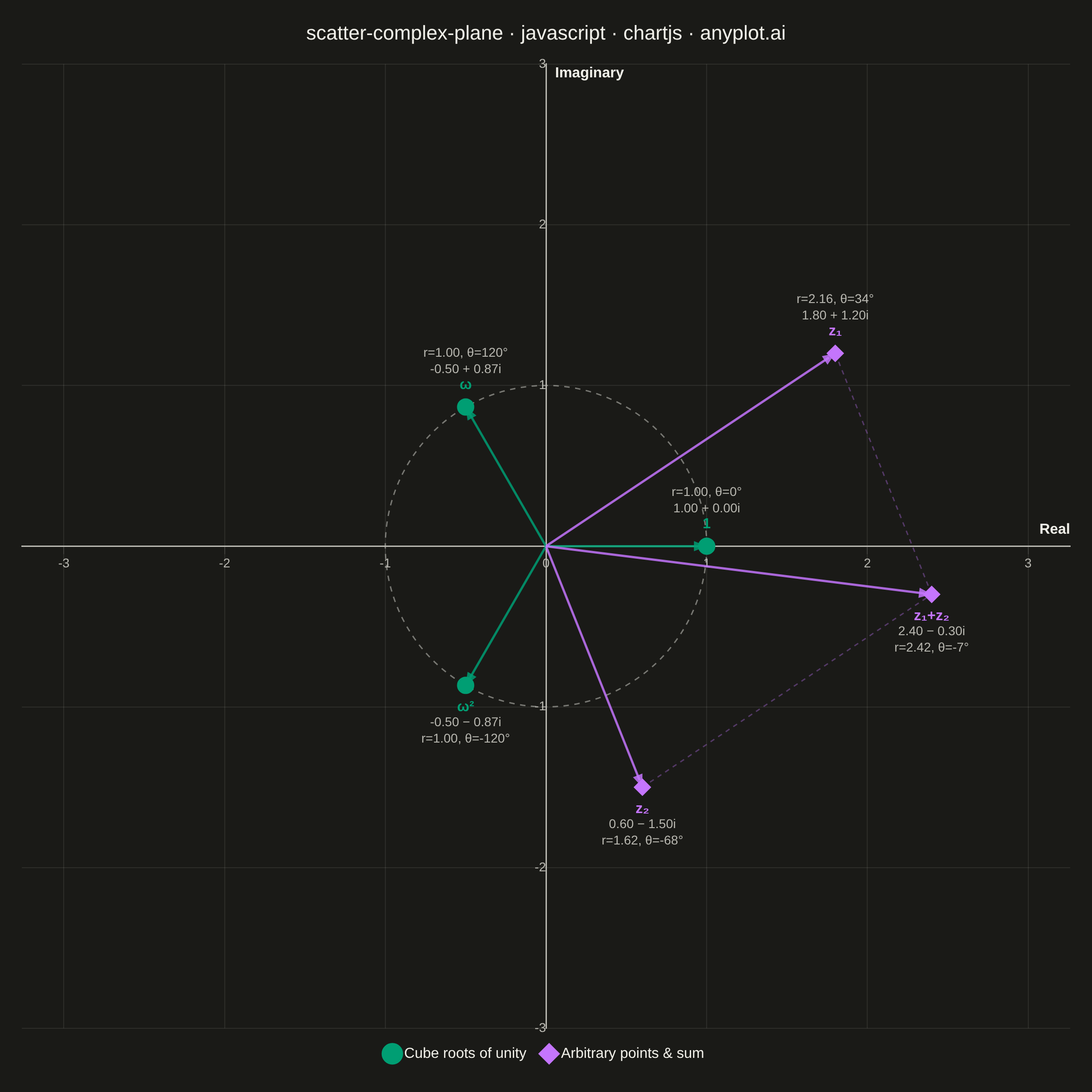
An Argand diagram plots complex numbers as points in the complex plane, with the real part on the x-axis and the imaginary part on the y-axis. Vectors from the origin to each point illustrate magnitude and phase angle, while a unit circle provides a geometric reference. This visualization is foundational for complex analysis, signal processing, and understanding operations like addition, multiplication, and roots of unity geometrically.
// anyplot.ai
// scatter-complex-plane: Complex Plane Visualization (Argand Diagram)
// Library: chartjs 4.4.7 | JavaScript 22.23.2
// Quality: 93/100 | Created: 2026-08-26

//# anyplot-orientation: square
const t = window.ANYPLOT_TOKENS;

// --- Data (in-memory, deterministic) ----------------------------------------
// Cube roots of unity (radius 1, spaced 120° apart) — a classic Argand-plane
// example that ties directly into z^3 = 1 factorization.
const rootsOfUnity = [0, 1, 2].map((k) => {
  const theta = (k * 2 * Math.PI) / 3;
  return { x: Math.cos(theta), y: Math.sin(theta), label: k === 0 ? "1" : k === 1 ? "ω" : "ω²" };
});

// Two arbitrary complex numbers plus their sum, illustrating the
// parallelogram law of complex addition.
const z1 = { x: 1.8, y: 1.2, label: "z₁" };
const z2 = { x: 0.6, y: -1.5, label: "z₂" };
const zSum = { x: z1.x + z2.x, y: z1.y + z2.y, label: "z₁+z₂" };
const arbitraryPoints = [z1, z2, zSum];

const AXIS_LIMIT = 3;

// Grid already sits at 15% alpha (the theme-token ceiling); shave it down a
// touch further so it stays firmly behind the vectors and unit circle.
const softGrid = t.grid.replace(/[\d.]+\)$/, "0.09)");

// --- Formatting helpers ------------------------------------------------------
function formatRectangular(p) {
  const sign = p.y >= 0 ? "+" : "−";
  return `${p.x.toFixed(2)} ${sign} ${Math.abs(p.y).toFixed(2)}i`;
}

function formatPolar(p) {
  const r = Math.hypot(p.x, p.y);
  const theta = (Math.atan2(p.y, p.x) * 180) / Math.PI;
  return `r=${r.toFixed(2)}, θ=${theta.toFixed(0)}°`;
}

// --- Mount --------------------------------------------------------------------
const canvas = document.createElement("canvas");
document.getElementById("container").appendChild(canvas);

// --- Custom plugin: origin vectors, unit circle, point annotations ----------
// Chart.js ships no annotation/arrow plugin, so the Argand-diagram furniture
// (vectors from the origin, the unit-circle reference, rectangular/polar
// labels) is drawn with a small inline plugin using the scatter controller's
// own pixel geometry — the documented way to extend core Chart.js rendering.
const argandFurniture = {
  id: "argandFurniture",
  beforeDatasetsDraw(chart) {
    const { ctx, scales, chartArea } = chart;
    const ox = scales.x.getPixelForValue(0);
    const oy = scales.y.getPixelForValue(0);
    const unitPx = Math.abs(scales.x.getPixelForValue(1) - ox);

    // Unit circle — dashed reference for |z| = 1.
    ctx.save();
    ctx.setLineDash([6, 6]);
    ctx.lineWidth = 1.5;
    ctx.strokeStyle = t.inkSoft;
    ctx.globalAlpha = 0.6;
    ctx.beginPath();
    ctx.arc(ox, oy, unitPx, 0, Math.PI * 2);
    ctx.stroke();
    ctx.restore();

    // Parallelogram guide: dashed edges from z1 to z1+z2 and from z2 to
    // z1+z2 (each edge is a translated copy of the *other* vector, since
    // zSum - z1 = z2 and zSum - z2 = z1) — makes the addition law visible
    // as a shape, not just three separate arrows.
    const sumDataset = chart.data.datasets[1];
    const sumMeta = chart.getDatasetMeta(1);
    if (sumMeta && sumMeta.data.length === 3) {
      const [pz1, pz2, pSum] = sumMeta.data;
      ctx.save();
      ctx.setLineDash([5, 5]);
      ctx.lineWidth = 1.5;
      ctx.strokeStyle = sumDataset.borderColor;
      ctx.globalAlpha = 0.35;
      ctx.beginPath();
      ctx.moveTo(pz1.x, pz1.y);
      ctx.lineTo(pSum.x, pSum.y);
      ctx.moveTo(pz2.x, pz2.y);
      ctx.lineTo(pSum.x, pSum.y);
      ctx.stroke();
      ctx.restore();
    }

    // Vectors from the origin to every point, arrowhead at the tip.
    chart.data.datasets.forEach((dataset, di) => {
      const meta = chart.getDatasetMeta(di);
      meta.data.forEach((point) => {
        const dx = point.x - ox;
        const dy = point.y - oy;
        const len = Math.hypot(dx, dy);
        if (len < 1e-6) return;
        const ux = dx / len;
        const uy = dy / len;
        const head = 14;

        ctx.save();
        ctx.strokeStyle = dataset.borderColor;
        ctx.fillStyle = dataset.borderColor;
        ctx.lineWidth = 2.5;
        ctx.globalAlpha = 0.85;
        ctx.beginPath();
        ctx.moveTo(ox, oy);
        ctx.lineTo(point.x - ux * head * 0.6, point.y - uy * head * 0.6);
        ctx.stroke();

        const perpX = -uy;
        const perpY = ux;
        ctx.beginPath();
        ctx.moveTo(point.x, point.y);
        ctx.lineTo(point.x - ux * head + perpX * head * 0.4, point.y - uy * head + perpY * head * 0.4);
        ctx.lineTo(point.x - ux * head - perpX * head * 0.4, point.y - uy * head - perpY * head * 0.4);
        ctx.closePath();
        ctx.fill();
        ctx.restore();
      });
    });

    // Real / Imaginary axis-end labels, drawn manually near the axis tips.
    // A `scale.title` would work for edge-positioned axes, but these axes are
    // centered on the origin (position: {x:0}/{y:0}) — its title tracks the
    // axis line itself and would land under the chart title at the top edge.
    ctx.save();
    ctx.font = "600 16px -apple-system, Helvetica, Arial, sans-serif";
    ctx.fillStyle = t.ink;
    ctx.textBaseline = "bottom";
    ctx.textAlign = "right";
    ctx.fillText("Real", chartArea.right, oy - 10);
    ctx.textAlign = "left";
    ctx.fillText("Imaginary", ox + 10, chartArea.top + 18);
    ctx.restore();
  },
  afterDatasetsDraw(chart) {
    const { ctx } = chart;
    chart.data.datasets.forEach((dataset, di) => {
      const meta = chart.getDatasetMeta(di);
      meta.data.forEach((point, i) => {
        const raw = dataset.data[i];
        const above = raw.y >= 0;
        const lineHeight = 18;
        const baseY = above ? point.y - 16 : point.y + 16;
        const dir = above ? -1 : 1;

        ctx.save();
        ctx.textAlign = "center";
        ctx.textBaseline = above ? "bottom" : "top";

        ctx.font = "600 16px -apple-system, Helvetica, Arial, sans-serif";
        ctx.fillStyle = dataset.borderColor;
        ctx.fillText(raw.label, point.x, baseY);

        ctx.font = "14px -apple-system, Helvetica, Arial, sans-serif";
        ctx.fillStyle = t.inkSoft;
        ctx.fillText(formatRectangular(raw), point.x, baseY + dir * lineHeight);
        ctx.fillText(formatPolar(raw), point.x, baseY + dir * lineHeight * 2);
        ctx.restore();
      });
    });
  },
  afterRender(chart) {
    // Chart.js lays scales out independently, so an initial pass rarely
    // yields equal pixels-per-unit on x and y. Once real layout pixels are
    // known, tighten one axis' range to match the other's scale exactly (the
    // unit circle must render as a circle, per the spec's equal-aspect rule),
    // then redraw once. A guard flag keeps this to a single extra pass.
    if (chart.$argandAspectFixed) {
      window.__anyplotReady = true;
      return;
    }
    const { chartArea, scales } = chart;
    const { x, y } = scales;
    const xCenter = (x.max + x.min) / 2;
    const yCenter = (y.max + y.min) / 2;
    const pxPerUnitX = chartArea.width / (x.max - x.min);
    const pxPerUnitY = chartArea.height / (y.max - y.min);
    const pxPerUnit = Math.min(pxPerUnitX, pxPerUnitY);
    const halfX = chartArea.width / pxPerUnit / 2;
    const halfY = chartArea.height / pxPerUnit / 2;

    x.options.min = xCenter - halfX;
    x.options.max = xCenter + halfX;
    y.options.min = yCenter - halfY;
    y.options.max = yCenter + halfY;
    chart.$argandAspectFixed = true;
    chart.update("none");
  },
};

// --- Chart --------------------------------------------------------------------
new Chart(canvas, {
  type: "scatter",
  data: {
    datasets: [
      {
        label: "Cube roots of unity",
        data: rootsOfUnity,
        backgroundColor: t.palette[0],
        borderColor: t.palette[0],
        pointStyle: "circle",
        pointRadius: 9,
        pointHoverRadius: 9,
      },
      {
        label: "Arbitrary points & sum",
        data: arbitraryPoints,
        backgroundColor: t.palette[1],
        borderColor: t.palette[1],
        pointStyle: "rectRot",
        pointRadius: 9,
        pointHoverRadius: 9,
      },
    ],
  },
  options: {
    responsive: true,
    maintainAspectRatio: false,
    animation: false,
    layout: { padding: 24 },
    plugins: {
      title: {
        display: true,
        text: "scatter-complex-plane · javascript · chartjs · anyplot.ai",
        color: t.ink,
        font: { size: 22, weight: "500" },
        padding: { bottom: 20 },
      },
      legend: {
        position: "bottom",
        labels: { color: t.ink, font: { size: 16 }, usePointStyle: true, boxWidth: 10, padding: 20 },
      },
      tooltip: { enabled: false },
    },
    scales: {
      x: {
        type: "linear",
        position: { y: 0 },
        min: -AXIS_LIMIT,
        max: AXIS_LIMIT,
        ticks: { stepSize: 1, includeBounds: false, color: t.inkSoft, font: { size: 14 } },
        grid: { color: softGrid },
        border: { color: t.inkSoft, width: 1.5 },
      },
      y: {
        type: "linear",
        position: { x: 0 },
        min: -AXIS_LIMIT,
        max: AXIS_LIMIT,
        // The x-axis already renders the "0" tick at the origin; suppress
        // the y-axis' own "0" so the two labels don't land on the same pixel.
        ticks: {
          stepSize: 1,
          includeBounds: false,
          color: t.inkSoft,
          font: { size: 14 },
          callback: (value) => (value === 0 ? "" : value),
        },
        grid: { color: softGrid },
        border: { color: t.inkSoft, width: 1.5 },
      },
    },
  },
  plugins: [argandFurniture],
});
Runnable source as JSON, for any HTTP client: https://api.anyplot.ai/specs/scatter-complex-plane/chartjs/code. Any spec id and library id listed in llms-full.txt fit the same URL shape; every URL below is complete and callable.
{
  "spec_id": "scatter-complex-plane",
  "language": "javascript",
  "library": "chartjs",
  "page": "https://anyplot.ai/scatter-complex-plane/javascript/chartjs",
  "hub": "https://anyplot.ai/scatter-complex-plane",
  "code_json": "https://api.anyplot.ai/specs/scatter-complex-plane/chartjs/code",
  "spec_json": "https://api.anyplot.ai/specs/scatter-complex-plane",
  "render_light_png": "https://storage.googleapis.com/anyplot-images/plots/scatter-complex-plane/javascript/chartjs/plot-light.png",
  "render_dark_png": "https://storage.googleapis.com/anyplot-images/plots/scatter-complex-plane/javascript/chartjs/plot-dark.png",
  "interactive_light_html": "https://storage.googleapis.com/anyplot-images/plots/scatter-complex-plane/javascript/chartjs/plot-light.html",
  "interactive_dark_html": "https://storage.googleapis.com/anyplot-images/plots/scatter-complex-plane/javascript/chartjs/plot-dark.html",
  "quality_score": 93.0,
  "license": "MIT",
  "guide": "https://anyplot.ai/llms.txt"
}
Part of Complex Plane Visualization (Argand Diagram) on anyplot.ai.