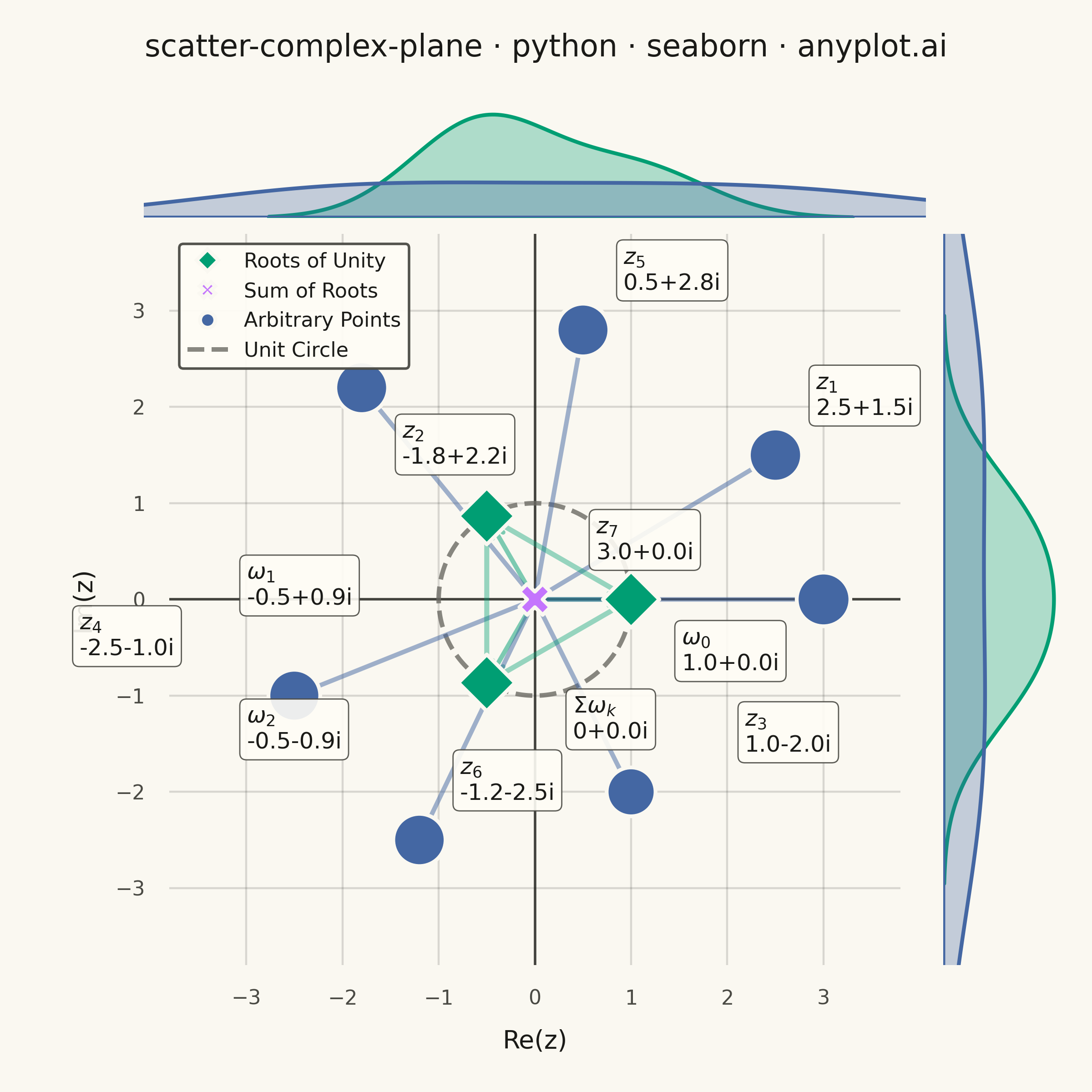
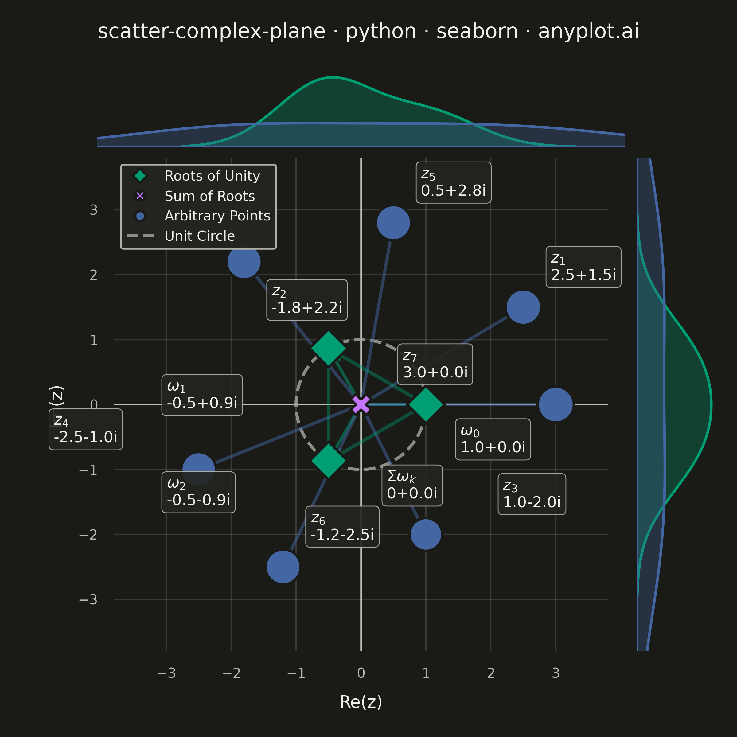
An Argand diagram plots complex numbers as points in the complex plane, with the real part on the x-axis and the imaginary part on the y-axis. Vectors from the origin to each point illustrate magnitude and phase angle, while a unit circle provides a geometric reference. This visualization is foundational for complex analysis, signal processing, and understanding operations like addition, multiplication, and roots of unity geometrically.
""" anyplot.ai
scatter-complex-plane: Complex Plane Visualization (Argand Diagram)
Library: seaborn 0.13.2 | Python 3.13.13
Quality: 89/100 | Updated: 2026-06-02
"""

import os

import matplotlib.pyplot as plt
import numpy as np
import pandas as pd
import seaborn as sns


# Theme tokens (see prompts/default-style-guide.md "Theme-adaptive Chrome")
THEME = os.getenv("ANYPLOT_THEME", "light")
PAGE_BG = "#FAF8F1" if THEME == "light" else "#1A1A17"
ELEVATED_BG = "#FFFDF6" if THEME == "light" else "#242420"
INK = "#1A1A17" if THEME == "light" else "#F0EFE8"
INK_SOFT = "#4A4A44" if THEME == "light" else "#B8B7B0"
INK_MUTED = "#6B6A63" if THEME == "light" else "#A8A79F"

# Imprint palette — first series always #009E73
IMPRINT_PALETTE = ["#009E73", "#C475FD", "#4467A3", "#BD8233", "#AE3030", "#2ABCCD", "#954477", "#99B314"]

sns.set_theme(
    style="white",
    rc={
        "figure.facecolor": PAGE_BG,
        "axes.facecolor": PAGE_BG,
        "axes.edgecolor": INK_SOFT,
        "axes.labelcolor": INK,
        "text.color": INK,
        "xtick.color": INK_SOFT,
        "ytick.color": INK_SOFT,
        "grid.color": INK,
        "grid.alpha": 0.15,
        "legend.facecolor": ELEVATED_BG,
        "legend.edgecolor": INK_SOFT,
    },
)

# Data — 3rd roots of unity, their sum, and arbitrary points across all quadrants
roots_of_unity = [np.exp(2j * np.pi * k / 3) for k in range(3)]
root_sum = sum(roots_of_unity)

arbitrary_points = [2.5 + 1.5j, -1.8 + 2.2j, 1.0 - 2.0j, -2.5 - 1.0j, 0.5 + 2.8j, -1.2 - 2.5j, 3.0 + 0.0j]

all_points = roots_of_unity + [root_sum] + arbitrary_points

labels = (
    [f"$\\omega_{k}$" for k in range(3)]
    + ["$\\Sigma\\omega_k$"]
    + [f"$z_{{{i + 1}}}$" for i in range(len(arbitrary_points))]
)

categories = ["Roots of Unity"] * 3 + ["Sum of Roots"] * 1 + ["Arbitrary Points"] * len(arbitrary_points)
magnitudes = [abs(z) for z in all_points]

df = pd.DataFrame(
    {
        "real": [z.real for z in all_points],
        "imaginary": [z.imag for z in all_points],
        "label": labels,
        "category": categories,
        "magnitude": magnitudes,
    }
)

cat_colors = {
    "Roots of Unity": IMPRINT_PALETTE[0],  # #009E73 green — first series
    "Sum of Roots": IMPRINT_PALETTE[1],  # #C475FD lavender
    "Arbitrary Points": IMPRINT_PALETTE[2],  # #4467A3 blue
}
markers = {"Roots of Unity": "D", "Sum of Roots": "X", "Arbitrary Points": "o"}

# JointGrid — square canvas (2400×2400 px) suits the equal-aspect complex plane
g = sns.JointGrid(data=df, x="real", y="imaginary", height=6, ratio=6, space=0.15)
g.figure.set_dpi(400)
g.figure.patch.set_facecolor(PAGE_BG)

# Main scatter with hue, style, and size encoding
sns.scatterplot(
    data=df,
    x="real",
    y="imaginary",
    hue="category",
    style="category",
    size="magnitude",
    sizes=(150, 450),
    markers=markers,
    palette=cat_colors,
    edgecolor=PAGE_BG,
    linewidth=1.5,
    zorder=5,
    ax=g.ax_joint,
    legend="full",
)

# Marginal KDE plots — distinctively seaborn, adds statistical context
for cat, color in cat_colors.items():
    subset = df[df["category"] == cat]
    sns.kdeplot(
        data=subset, x="real", color=color, fill=True, alpha=0.3, linewidth=1.5, ax=g.ax_marg_x, warn_singular=False
    )
    sns.kdeplot(
        data=subset,
        y="imaginary",
        color=color,
        fill=True,
        alpha=0.3,
        linewidth=1.5,
        ax=g.ax_marg_y,
        warn_singular=False,
    )

# Marginal axes styling
g.ax_marg_x.set_xlabel("")
g.ax_marg_x.set_ylabel("")
g.ax_marg_y.set_xlabel("")
g.ax_marg_y.set_ylabel("")
g.ax_marg_x.tick_params(left=False, labelleft=False)
g.ax_marg_y.tick_params(bottom=False, labelbottom=False)
g.ax_marg_x.set_facecolor(PAGE_BG)
g.ax_marg_y.set_facecolor(PAGE_BG)

ax = g.ax_joint
ax.set_facecolor(PAGE_BG)

# Vectors from origin to each point
for _, row in df.iterrows():
    color = cat_colors[row["category"]]
    ax.annotate(
        "",
        xy=(row["real"], row["imaginary"]),
        xytext=(0, 0),
        arrowprops={"arrowstyle": "->", "color": color, "lw": 1.8, "alpha": 0.5},
    )

# Annotations with rectangular form — offsets in points from the data point
offsets = {
    "$\\omega_0$": (20, -28),
    "$\\omega_1$": (-95, -35),  # lowered to clear the upper-left legend
    "$\\omega_2$": (-95, -26),
    "$\\Sigma\\omega_k$": (15, -55),  # lower-right of origin, away from z3
    "$z_{2}$": (16, -30),  # below data point to avoid upper-left legend
    "$z_{3}$": (45, 16),  # shifted right to separate from Σωₖ annotation
    "$z_{4}$": (-85, 16),  # above-left to avoid ω₂ annotation in lower-left
    "$z_{7}$": (-90, 16),  # rightmost point — move label left to avoid right marginal
}

for _, row in df.iterrows():
    r = row["real"]
    i_val = row["imaginary"]
    r_str = "0" if abs(r) < 0.01 else f"{r:.1f}"
    if abs(i_val) < 0.01:
        rect_form = f"{r_str}+0.0i"
    elif i_val >= 0:
        rect_form = f"{r_str}+{i_val:.1f}i"
    else:
        rect_form = f"{r_str}{i_val:.1f}i"

    offset = offsets.get(row["label"], (16, 16))
    ax.annotate(
        f"{row['label']}\n{rect_form}",
        xy=(r, i_val),
        xytext=offset,
        textcoords="offset points",
        fontsize=9,
        color=INK,
        fontweight="medium",
        bbox={
            "boxstyle": "round,pad=0.3",
            "facecolor": ELEVATED_BG,
            "edgecolor": INK_SOFT,
            "alpha": 0.9,
            "linewidth": 0.5,
        },
        zorder=6,
    )

# Equilateral triangle connecting roots of unity
root_reals = [z.real for z in roots_of_unity] + [roots_of_unity[0].real]
root_imags = [z.imag for z in roots_of_unity] + [roots_of_unity[0].imag]
ax.plot(root_reals, root_imags, ls="-", color=IMPRINT_PALETTE[0], lw=2.0, alpha=0.4, zorder=3)

# Unit circle — dashed reference at r=1
theta = np.linspace(0, 2 * np.pi, 200)
ax.plot(np.cos(theta), np.sin(theta), ls="--", color=INK_MUTED, lw=1.8, alpha=0.8, label="Unit Circle")

# Style
ax.set_aspect("equal")

title = "scatter-complex-plane · python · seaborn · anyplot.ai"
n = len(title)
title_fontsize = max(8, round(12 * (67 / n if n > 67 else 1.0)))
# Reserve top margin so suptitle sits above the top marginal without clipping
g.figure.subplots_adjust(top=0.90)
g.figure.suptitle(title, fontsize=title_fontsize, fontweight="medium", color=INK, y=0.97)
ax.tick_params(axis="both", labelsize=8, colors=INK_SOFT)

ax.axhline(0, color=INK_SOFT, lw=1.0, zorder=0)
ax.axvline(0, color=INK_SOFT, lw=1.0, zorder=0)

sns.despine(ax=ax, left=True, bottom=True)
sns.despine(ax=g.ax_marg_x, left=True, bottom=True)
sns.despine(ax=g.ax_marg_y, left=True, bottom=True)

ax.xaxis.grid(True, alpha=0.15, linewidth=0.8, color=INK)
ax.yaxis.grid(True, alpha=0.15, linewidth=0.8, color=INK)

limit = 3.8
ax.set_xlim(-limit, limit)
ax.set_ylim(-limit, limit)

ax.set_xlabel("Re(z)", fontsize=10, labelpad=8, color=INK)
ax.set_ylabel("Im(z)", fontsize=10, labelpad=8, color=INK)

# Legend — keep category + unit circle entries, remove magnitude size entries
handles, leg_labels = ax.get_legend_handles_labels()
keep = []
for handle, lbl in zip(handles, leg_labels, strict=False):
    if lbl not in {"magnitude", "", "category"}:
        try:
            float(lbl)
        except ValueError:
            keep.append((handle, lbl))
filtered_handles, filtered_labels = zip(*keep, strict=False) if keep else ([], [])
ax.legend(
    filtered_handles,
    filtered_labels,
    fontsize=8,
    loc="upper left",
    framealpha=0.95,
    edgecolor=INK_SOFT,
    fancybox=True,
    labelcolor=INK,
)

# Save — bbox_inches must stay default (None) to preserve exact 2400×2400 canvas
plt.savefig(f"plot-{THEME}.png", dpi=400)
Runnable source as JSON, for any HTTP client: https://api.anyplot.ai/specs/scatter-complex-plane/seaborn/code. Any spec id and library id listed in llms-full.txt fit the same URL shape; every URL below is complete and callable.
{
  "spec_id": "scatter-complex-plane",
  "language": "python",
  "library": "seaborn",
  "page": "https://anyplot.ai/scatter-complex-plane/python/seaborn",
  "hub": "https://anyplot.ai/scatter-complex-plane",
  "code_json": "https://api.anyplot.ai/specs/scatter-complex-plane/seaborn/code",
  "spec_json": "https://api.anyplot.ai/specs/scatter-complex-plane",
  "render_light_png": "https://storage.googleapis.com/anyplot-images/plots/scatter-complex-plane/python/seaborn/plot-light.png",
  "render_dark_png": "https://storage.googleapis.com/anyplot-images/plots/scatter-complex-plane/python/seaborn/plot-dark.png",
  "quality_score": 89.0,
  "license": "MIT",
  "guide": "https://anyplot.ai/llms.txt"
}
Part of Complex Plane Visualization (Argand Diagram) on anyplot.ai.