The same plot in 14 other libraries — JavaScript: Chart.js, D3.js, Apache ECharts, MUI X Charts; Python: Altair, Bokeh, lets-plot, Matplotlib, Plotly, plotnine, Pygal, Seaborn; R: ggplot2; Julia: Makie.jl. Compare all 15 side by side: Scatter Plot with Marginal Distributions in Python, R, Julia and JavaScript.
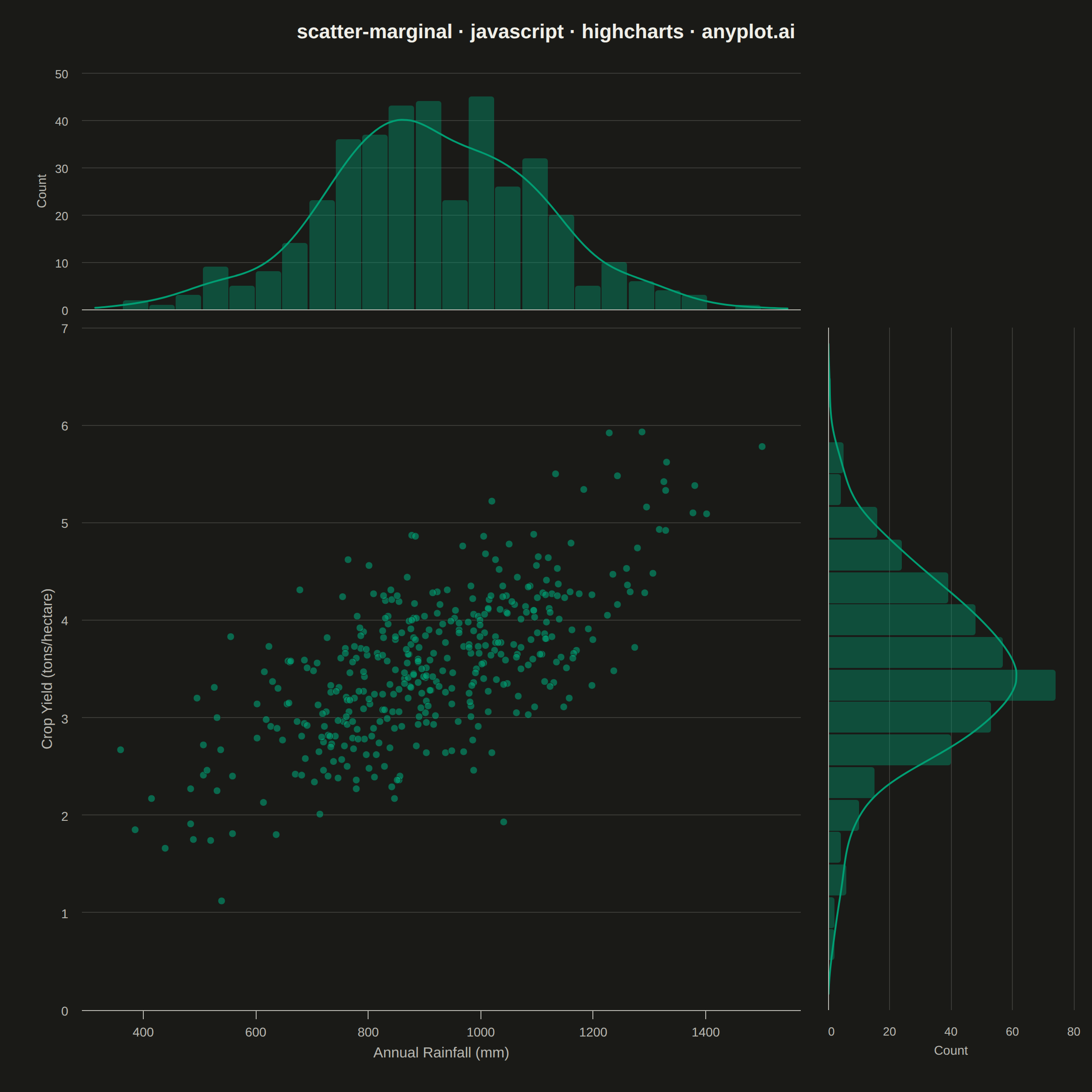
A scatter plot enhanced with marginal distribution plots (histograms or kernel density estimates) on the top and right axes. This composite visualization simultaneously shows the bivariate relationship between two variables in the central scatter plot while displaying each variable's univariate distribution along its respective axis. It provides a comprehensive view of both the joint and marginal distributions in a single figure.
// anyplot.ai
// scatter-marginal: Scatter Plot with Marginal Distributions
// Library: highcharts 12.6.0 | JavaScript 22.23.2
// Quality: 89/100 | Created: 2026-09-09
//# anyplot-orientation: square

const t = window.ANYPLOT_TOKENS;

// --- Data (in-memory, deterministic LCG) ------------------------------------
// Annual rainfall vs. crop yield across 400 farm plots — positively correlated
// measurement data, a classic marginal-distribution use case (skew + outliers
// visible on each axis alongside the joint relationship).
function makeRng(seed) {
  let state = seed >>> 0;
  return function () {
    state = (1103515245 * state + 12345) >>> 0;
    return state / 4294967296;
  };
}
const rng = makeRng(20260909);
function randNormal() {
  const u1 = Math.max(rng(), 1e-12);
  const u2 = rng();
  return Math.sqrt(-2 * Math.log(u1)) * Math.cos(2 * Math.PI * u2);
}

const N = 400;
const rainfallMm = [];
const yieldTonsPerHa = [];
for (let i = 0; i < N; i++) {
  const rainfall = Math.min(1500, Math.max(300, 900 + randNormal() * 190));
  const yieldTons = Math.min(8.5, Math.max(0.3, 0.0028 * rainfall + randNormal() * 0.55 + 1.0));
  rainfallMm.push(Math.round(rainfall));
  yieldTonsPerHa.push(Math.round(yieldTons * 100) / 100);
}

const xDataMin = Math.min(...rainfallMm);
const xDataMax = Math.max(...rainfallMm);
const yDataMin = Math.min(...yieldTonsPerHa);
const yDataMax = Math.max(...yieldTonsPerHa);
const xPad = (xDataMax - xDataMin) * 0.06;
const yPad = (yDataMax - yDataMin) * 0.08;
const xAxisMin = Math.floor(xDataMin - xPad);
const xAxisMax = Math.ceil(xDataMax + xPad);
const yAxisMin = Math.max(0, Math.floor((yDataMin - yPad) * 10) / 10);
const yAxisMax = Math.ceil((yDataMax + yPad) * 10) / 10;

// --- Marginal histograms -----------------------------------------------------
function histogram(values, min, max, bins) {
  const width = (max - min) / bins;
  const counts = new Array(bins).fill(0);
  values.forEach((v) => {
    let idx = Math.floor((v - min) / width);
    if (idx < 0) idx = 0;
    if (idx >= bins) idx = bins - 1;
    counts[idx]++;
  });
  return { counts, width };
}

const xHist = histogram(rainfallMm, xAxisMin, xAxisMax, 26);
const yHist = histogram(yieldTonsPerHa, yAxisMin, yAxisMax, 20);

const scatterData = rainfallMm.map((r, i) => [r, yieldTonsPerHa[i]]);
const topHistData = xHist.counts.map((c, i) => [xAxisMin + xHist.width * (i + 0.5), c]);
const rightHistData = yHist.counts.map((c, i) => [yAxisMin + yHist.width * (i + 0.5), c]);

// Gaussian KDE overlay (Silverman bandwidth) on each marginal, scaled to the
// histogram's count axis (density * N * binWidth) so the curve reads directly
// against the bars behind it — adds distributional shape beyond raw bin counts.
function stdDev(values) {
  const mean = values.reduce((a, b) => a + b, 0) / values.length;
  const variance = values.reduce((a, b) => a + (b - mean) * (b - mean), 0) / values.length;
  return Math.sqrt(variance);
}
function kdeCurve(values, min, max, binWidth, gridPoints) {
  const n = values.length;
  const bandwidth = Math.max(1e-6, 1.06 * stdDev(values) * Math.pow(n, -0.2));
  const step = (max - min) / (gridPoints - 1);
  const points = [];
  for (let i = 0; i < gridPoints; i++) {
    const x = min + step * i;
    let sum = 0;
    for (const v of values) {
      const u = (x - v) / bandwidth;
      sum += Math.exp(-0.5 * u * u);
    }
    const density = sum / (n * bandwidth * Math.sqrt(2 * Math.PI));
    points.push([x, density * n * binWidth]);
  }
  return points;
}
const xKde = kdeCurve(rainfallMm, xAxisMin, xAxisMax, xHist.width, 80);
const yKde = kdeCurve(yieldTonsPerHa, yAxisMin, yAxisMax, yHist.width, 80);

const scatterColor = Highcharts.color(t.palette[0]).setOpacity(0.6).get();
const marginalColor = Highcharts.color(t.palette[0]).setOpacity(0.4).get();
const kdeLineColor = t.palette[0];

// --- Mount layout: title strip + top marginal + main scatter + right marginal
const container = document.getElementById("container");
container.style.display = "grid";
container.style.gridTemplateColumns = "900px 300px";
container.style.gridTemplateRows = "70px 280px 850px";

const titleEl = document.createElement("div");
titleEl.style.gridColumn = "1 / 3";
titleEl.style.gridRow = "1";
titleEl.style.display = "flex";
titleEl.style.alignItems = "center";
titleEl.style.justifyContent = "center";
titleEl.style.color = t.ink;
titleEl.style.fontSize = "22px";
titleEl.style.fontWeight = "600";
titleEl.textContent = "scatter-marginal · javascript · highcharts · anyplot.ai";
container.appendChild(titleEl);

const topEl = document.createElement("div");
topEl.style.gridColumn = "1";
topEl.style.gridRow = "2";
container.appendChild(topEl);

const mainEl = document.createElement("div");
mainEl.style.gridColumn = "1";
mainEl.style.gridRow = "3";
container.appendChild(mainEl);

const rightEl = document.createElement("div");
rightEl.style.gridColumn = "2";
rightEl.style.gridRow = "3";
container.appendChild(rightEl);

// Shared margins so the value axes line up pixel-for-pixel across panels:
// topEl/mainEl share marginLeft+marginRight (x alignment); mainEl/rightEl
// share marginTop+marginBottom (y alignment).
const MARGIN_TOP = 10;
const MARGIN_BOTTOM = 90;
const MARGIN_LEFT = 90;
const MARGIN_RIGHT = 20;

const baseChart = {
  backgroundColor: "transparent",
  animation: false,
  style: { fontFamily: "inherit" },
};

Highcharts.chart(topEl, {
  chart: { ...baseChart, type: "column", marginTop: 10, marginBottom: 10, marginLeft: MARGIN_LEFT, marginRight: MARGIN_RIGHT },
  credits: { enabled: false },
  title: { text: null },
  xAxis: {
    min: xAxisMin,
    max: xAxisMax,
    lineColor: t.inkSoft,
    tickLength: 0,
    gridLineColor: t.grid,
    labels: { enabled: false },
    title: { text: null },
  },
  yAxis: {
    min: 0,
    gridLineColor: t.grid,
    lineColor: t.inkSoft,
    tickColor: t.inkSoft,
    labels: { style: { color: t.inkSoft, fontSize: "13px" } },
    title: { text: "Count", style: { color: t.inkSoft, fontSize: "14px" } },
  },
  legend: { enabled: false },
  plotOptions: {
    series: { animation: false },
    column: { pointPadding: 0.03, groupPadding: 0, borderWidth: 0, pointRange: xHist.width, color: marginalColor },
  },
  series: [
    { name: "Rainfall distribution", data: topHistData },
    {
      name: "Density estimate",
      type: "spline",
      data: xKde,
      color: kdeLineColor,
      lineWidth: 2,
      marker: { enabled: false },
      enableMouseTracking: false,
    },
  ],
});

Highcharts.chart(mainEl, {
  chart: { ...baseChart, type: "scatter", marginTop: MARGIN_TOP, marginBottom: MARGIN_BOTTOM, marginLeft: MARGIN_LEFT, marginRight: MARGIN_RIGHT },
  credits: { enabled: false },
  title: { text: null },
  xAxis: {
    min: xAxisMin,
    max: xAxisMax,
    lineColor: t.inkSoft,
    tickColor: t.inkSoft,
    gridLineColor: t.grid,
    labels: { style: { color: t.inkSoft, fontSize: "14px" } },
    title: { text: "Annual Rainfall (mm)", style: { color: t.inkSoft, fontSize: "16px" } },
  },
  yAxis: {
    min: yAxisMin,
    max: yAxisMax,
    gridLineColor: t.grid,
    lineColor: t.inkSoft,
    tickColor: t.inkSoft,
    labels: { style: { color: t.inkSoft, fontSize: "14px" } },
    title: { text: "Crop Yield (tons/hectare)", style: { color: t.inkSoft, fontSize: "16px" } },
  },
  legend: { enabled: false },
  plotOptions: { series: { animation: false } },
  series: [
    {
      name: "Farm plots",
      data: scatterData,
      color: scatterColor,
      marker: { radius: 4, symbol: "circle", lineColor: t.pageBg, lineWidth: 0.5 },
    },
  ],
});

Highcharts.chart(rightEl, {
  chart: { ...baseChart, type: "bar", marginTop: MARGIN_TOP, marginBottom: MARGIN_BOTTOM, marginLeft: 10, marginRight: 20 },
  credits: { enabled: false },
  title: { text: null },
  xAxis: {
    min: yAxisMin,
    max: yAxisMax,
    lineColor: t.inkSoft,
    tickLength: 0,
    gridLineColor: t.grid,
    labels: { enabled: false },
    title: { text: null },
  },
  yAxis: {
    min: 0,
    gridLineColor: t.grid,
    lineColor: t.inkSoft,
    tickColor: t.inkSoft,
    labels: { style: { color: t.inkSoft, fontSize: "13px" } },
    title: { text: "Count", style: { color: t.inkSoft, fontSize: "14px" } },
  },
  legend: { enabled: false },
  plotOptions: {
    series: { animation: false },
    bar: { pointPadding: 0.03, groupPadding: 0, borderWidth: 0, pointRange: yHist.width, color: marginalColor },
  },
  series: [
    { name: "Yield distribution", data: rightHistData },
    {
      name: "Density estimate",
      type: "spline",
      data: yKde,
      color: kdeLineColor,
      lineWidth: 2,
      marker: { enabled: false },
      enableMouseTracking: false,
    },
  ],
});
Runnable source as JSON, for any HTTP client: https://api.anyplot.ai/specs/scatter-marginal/highcharts/code. Any spec id and library id listed in llms-full.txt fit the same URL shape; every URL below is complete and callable.
{
  "spec_id": "scatter-marginal",
  "language": "javascript",
  "library": "highcharts",
  "page": "https://anyplot.ai/scatter-marginal/javascript/highcharts",
  "hub": "https://anyplot.ai/scatter-marginal",
  "code_json": "https://api.anyplot.ai/specs/scatter-marginal/highcharts/code",
  "spec_json": "https://api.anyplot.ai/specs/scatter-marginal",
  "render_light_png": "https://storage.googleapis.com/anyplot-images/plots/scatter-marginal/javascript/highcharts/plot-light.png",
  "render_dark_png": "https://storage.googleapis.com/anyplot-images/plots/scatter-marginal/javascript/highcharts/plot-dark.png",
  "interactive_light_html": "https://storage.googleapis.com/anyplot-images/plots/scatter-marginal/javascript/highcharts/plot-light.html",
  "interactive_dark_html": "https://storage.googleapis.com/anyplot-images/plots/scatter-marginal/javascript/highcharts/plot-dark.html",
  "quality_score": 89.0,
  "license": "MIT",
  "guide": "https://anyplot.ai/llms.txt"
}
Part of Scatter Plot with Marginal Distributions on anyplot.ai.