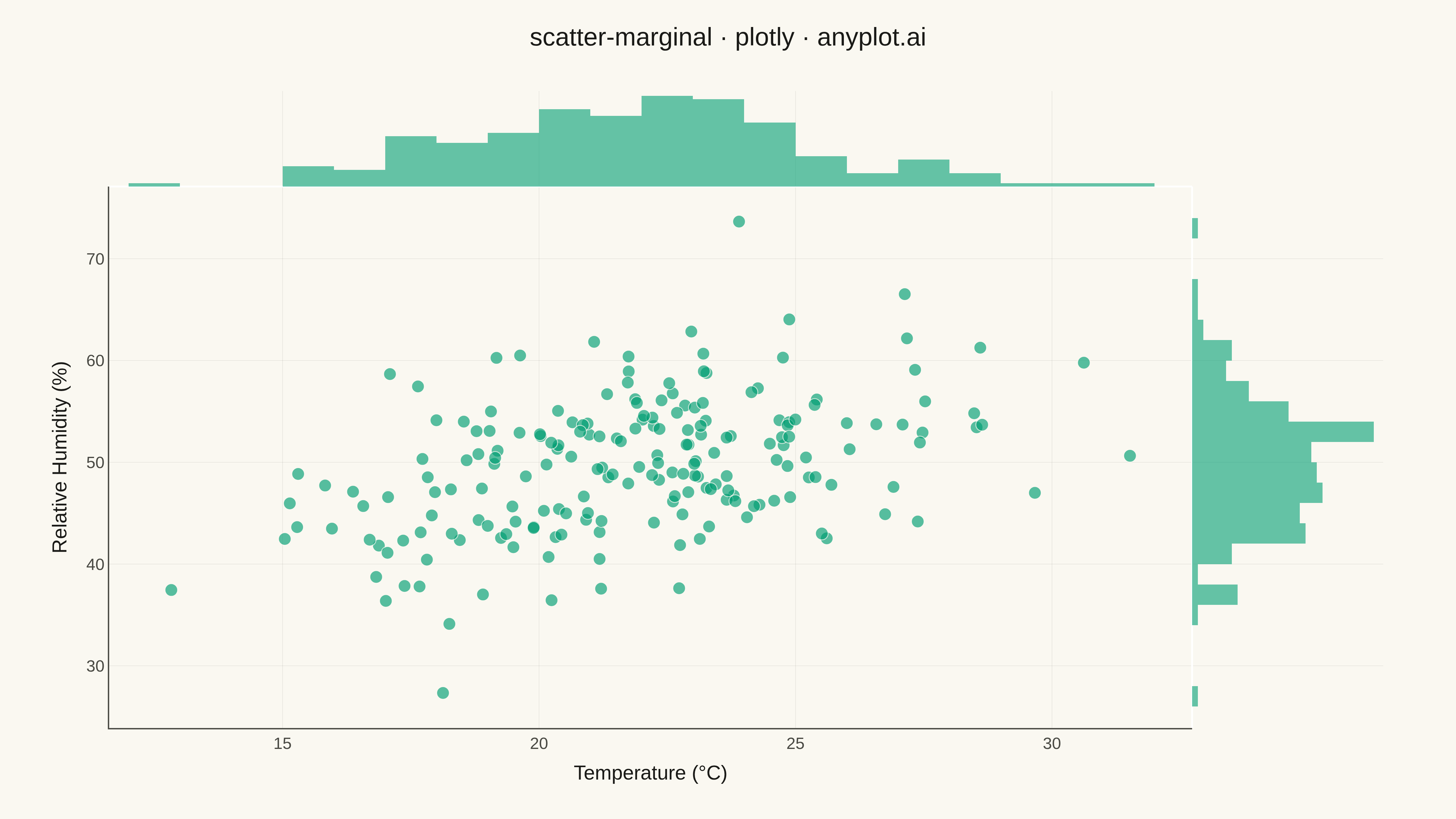
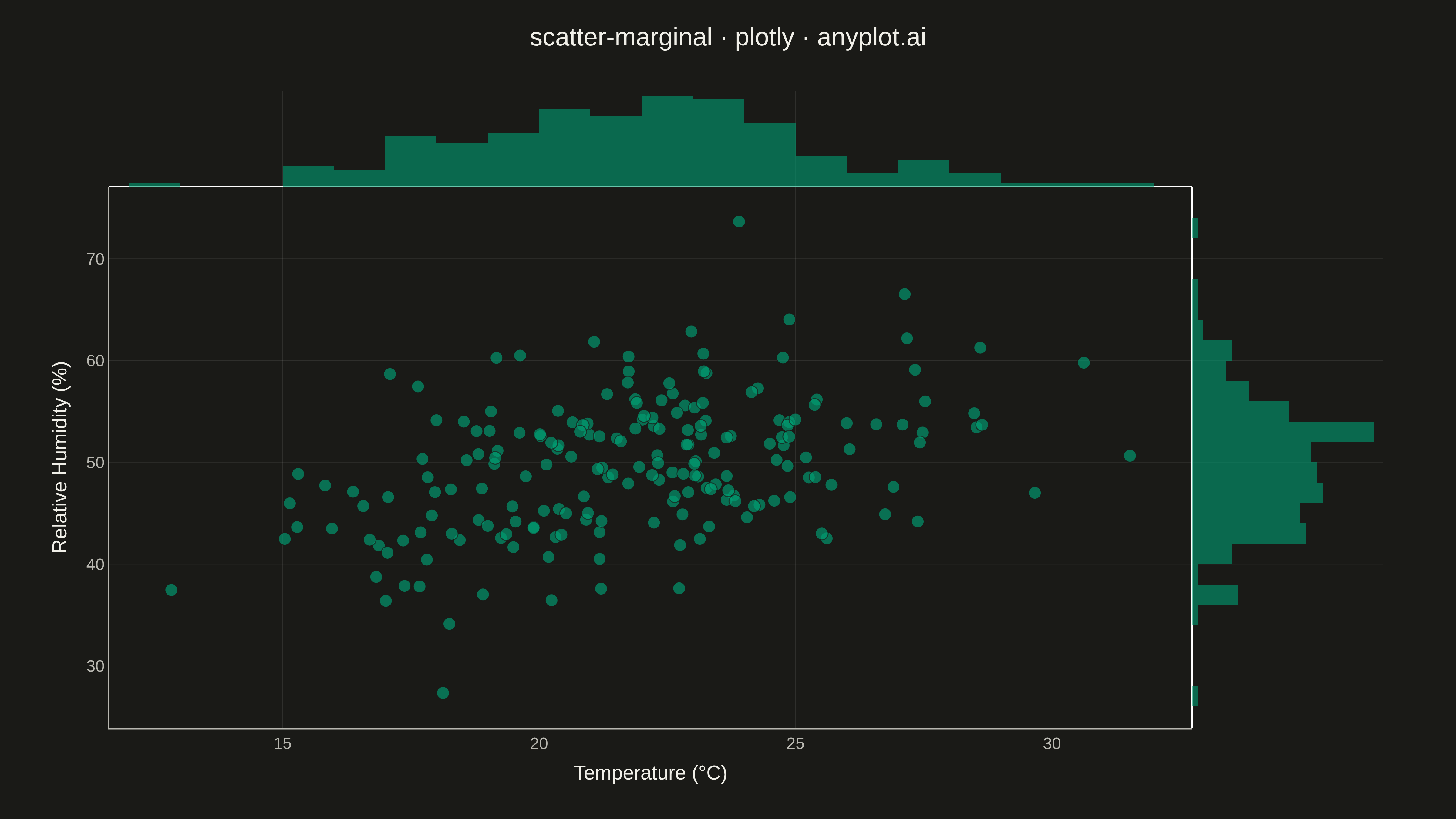
A scatter plot enhanced with marginal distribution plots (histograms or kernel density estimates) on the top and right axes. This composite visualization simultaneously shows the bivariate relationship between two variables in the central scatter plot while displaying each variable's univariate distribution along its respective axis. It provides a comprehensive view of both the joint and marginal distributions in a single figure.
""" anyplot.ai
scatter-marginal: Scatter Plot with Marginal Distributions
Library: plotly 6.7.0 | Python 3.13.13
Quality: 92/100 | Updated: 2026-05-09
"""

import os
import sys

import numpy as np


try:
    import plotly.graph_objects as go
except ImportError:
    __file__ = os.path.abspath(__file__)
    __dir__ = os.path.dirname(__file__)
    if __dir__ in sys.path:
        sys.path.remove(__dir__)
    import plotly.graph_objects as go

# Theme tokens
THEME = os.getenv("ANYPLOT_THEME", "light")
PAGE_BG = "#FAF8F1" if THEME == "light" else "#1A1A17"
ELEVATED_BG = "#FFFDF6" if THEME == "light" else "#242420"
INK = "#1A1A17" if THEME == "light" else "#F0EFE8"
INK_SOFT = "#4A4A44" if THEME == "light" else "#B8B7B0"
GRID = "rgba(26,26,23,0.10)" if THEME == "light" else "rgba(240,239,232,0.10)"
BRAND = "#009E73"

# Data - Bivariate normal with correlation (scientific measurement scenario)
np.random.seed(42)
n = 200
# Temperature (°C) and relative humidity (%)
temperature = np.random.randn(n) * 3.5 + 22
humidity = 0.65 * temperature + np.random.randn(n) * 6 + 35

# Create scatter plot with marginal histograms using go (for full control)
fig = go.Figure()

# Add scatter trace
fig.add_trace(
    go.Scatter(
        x=temperature,
        y=humidity,
        mode="markers",
        marker=dict(size=14, color=BRAND, opacity=0.65, line=dict(width=1, color=PAGE_BG)),
        name="Measurements",
        showlegend=False,
    )
)

# Add marginal histogram for X (temperature)
fig.add_trace(
    go.Histogram(
        x=temperature,
        name="Temp Distribution",
        marker=dict(color=BRAND, opacity=0.6),
        yaxis="y2",
        xaxis="x",
        showlegend=False,
        nbinsx=25,
    )
)

# Add marginal histogram for Y (humidity)
fig.add_trace(
    go.Histogram(
        y=humidity,
        name="Humidity Distribution",
        marker=dict(color=BRAND, opacity=0.6),
        xaxis="x2",
        yaxis="y",
        showlegend=False,
        nbinsy=25,
        orientation="h",
    )
)

# Enhanced hover tooltips for better data storytelling
fig.update_traces(
    hovertemplate="<b>Measurement</b><br>Temperature: %{x:.1f}°C<br>Humidity: %{y:.1f}%<extra></extra>",
    selector=dict(mode="markers"),
)

# Update layout with refined design: spine removal, subtle grid, publication-grade styling
fig.update_layout(
    title=dict(text="scatter-marginal · plotly · anyplot.ai", font=dict(size=28, color=INK), x=0.5, xanchor="center"),
    xaxis=dict(
        domain=[0, 0.85],
        title=dict(text="Temperature (°C)", font=dict(size=22, color=INK)),
        tickfont=dict(size=18, color=INK_SOFT),
        gridcolor=GRID,
        linecolor=INK_SOFT,
        showgrid=True,
        gridwidth=0.5,
        showline=True,
        linewidth=1.5,
        mirror=False,
        side="bottom",
    ),
    yaxis=dict(
        domain=[0, 0.85],
        title=dict(text="Relative Humidity (%)", font=dict(size=22, color=INK)),
        tickfont=dict(size=18, color=INK_SOFT),
        gridcolor=GRID,
        linecolor=INK_SOFT,
        showgrid=True,
        gridwidth=0.5,
        showline=True,
        linewidth=1.5,
        mirror=False,
        side="left",
    ),
    xaxis2=dict(
        domain=[0.85, 1], showticklabels=False, gridcolor=GRID, linecolor=INK_SOFT, showgrid=False, showline=False
    ),
    yaxis2=dict(
        domain=[0.85, 1], showticklabels=False, gridcolor=GRID, linecolor=INK_SOFT, showgrid=False, showline=False
    ),
    paper_bgcolor=PAGE_BG,
    plot_bgcolor=PAGE_BG,
    font=dict(family="Arial, sans-serif", color=INK),
    showlegend=False,
    margin=dict(l=120, r=80, t=100, b=100),
    height=900,
    width=1600,
    hovermode="closest",
)

# Save
fig.write_image(f"plot-{THEME}.png", width=1600, height=900, scale=3)
fig.write_html(f"plot-{THEME}.html", include_plotlyjs="cdn")
Runnable source as JSON, for any HTTP client: https://api.anyplot.ai/specs/scatter-marginal/plotly/code. Any spec id and library id listed in llms-full.txt fit the same URL shape; every URL below is complete and callable.
{
  "spec_id": "scatter-marginal",
  "language": "python",
  "library": "plotly",
  "page": "https://anyplot.ai/scatter-marginal/python/plotly",
  "hub": "https://anyplot.ai/scatter-marginal",
  "code_json": "https://api.anyplot.ai/specs/scatter-marginal/plotly/code",
  "spec_json": "https://api.anyplot.ai/specs/scatter-marginal",
  "render_light_png": "https://storage.googleapis.com/anyplot-images/plots/scatter-marginal/python/plotly/plot-light.png",
  "render_dark_png": "https://storage.googleapis.com/anyplot-images/plots/scatter-marginal/python/plotly/plot-dark.png",
  "interactive_light_html": "https://storage.googleapis.com/anyplot-images/plots/scatter-marginal/python/plotly/plot-light.html",
  "interactive_dark_html": "https://storage.googleapis.com/anyplot-images/plots/scatter-marginal/python/plotly/plot-dark.html",
  "quality_score": 92.0,
  "license": "MIT",
  "guide": "https://anyplot.ai/llms.txt"
}
Part of Scatter Plot with Marginal Distributions on anyplot.ai.