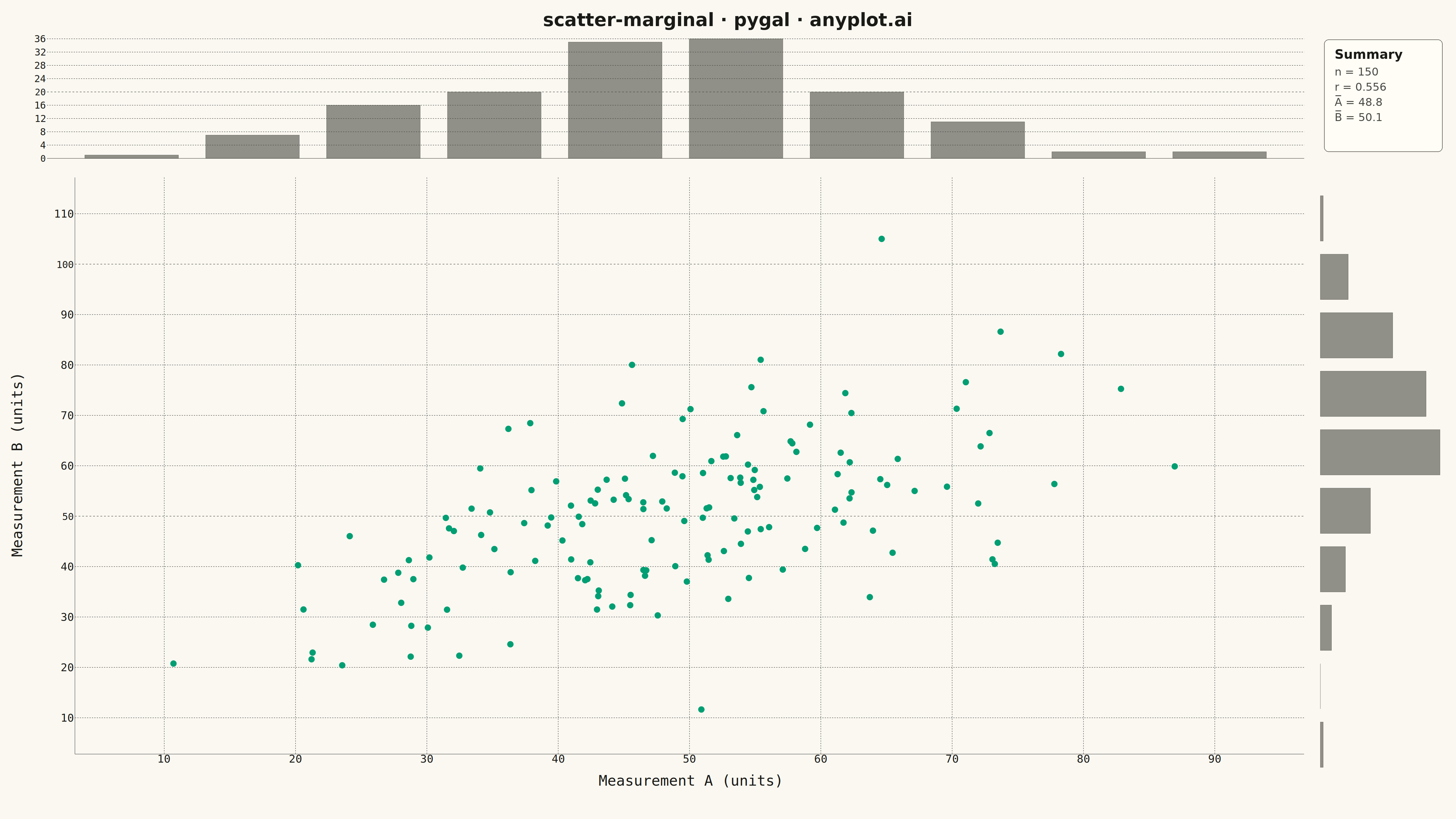
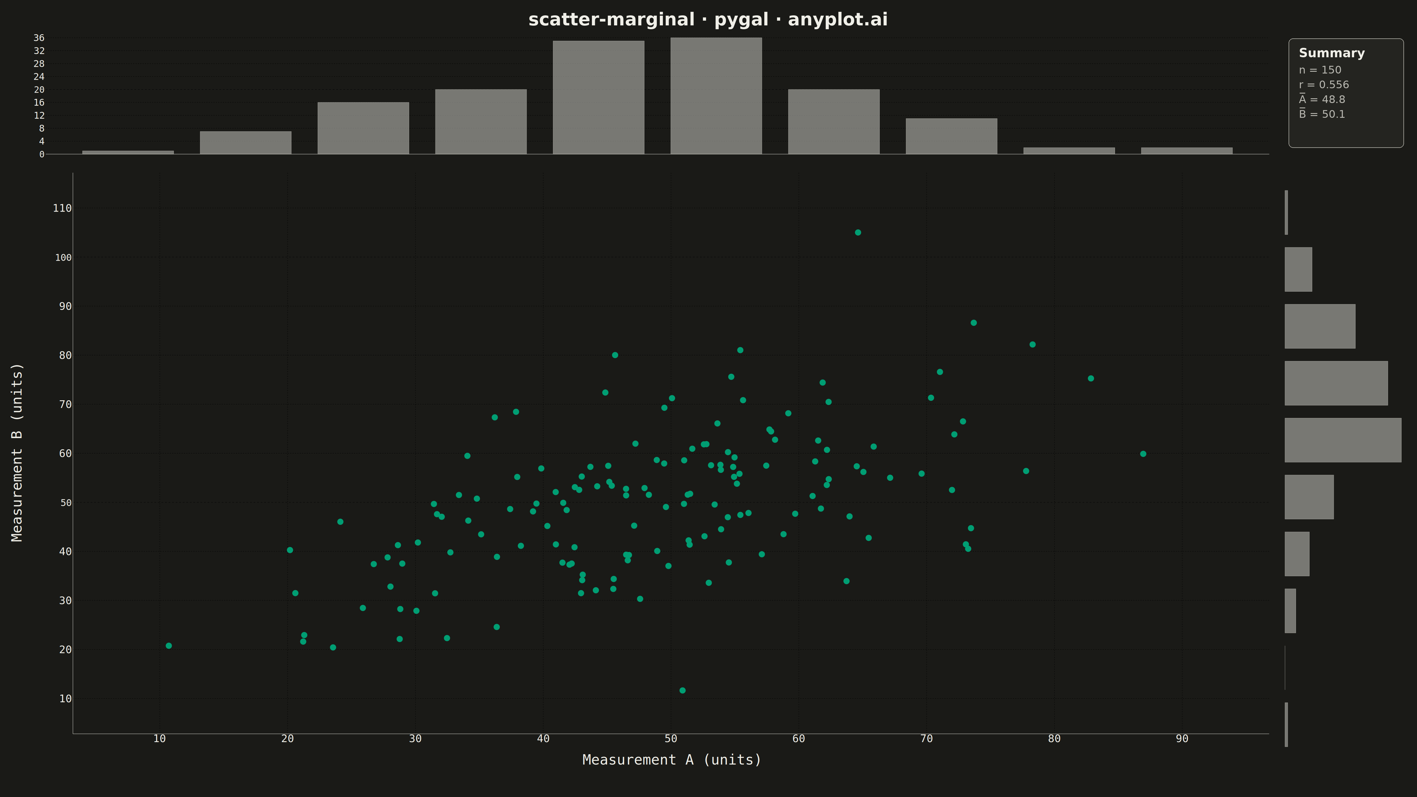
A scatter plot enhanced with marginal distribution plots (histograms or kernel density estimates) on the top and right axes. This composite visualization simultaneously shows the bivariate relationship between two variables in the central scatter plot while displaying each variable's univariate distribution along its respective axis. It provides a comprehensive view of both the joint and marginal distributions in a single figure.
""" anyplot.ai
scatter-marginal: Scatter Plot with Marginal Distributions
Library: pygal 3.1.0 | Python 3.13.13
Quality: 90/100 | Updated: 2026-05-09
"""

import io
import os

import numpy as np
import pygal
from PIL import Image, ImageDraw, ImageFont
from pygal.style import Style


THEME = os.getenv("ANYPLOT_THEME", "light")

# Theme-adaptive colors from default-style-guide.md
PAGE_BG = "#FAF8F1" if THEME == "light" else "#1A1A17"
INK = "#1A1A17" if THEME == "light" else "#F0EFE8"
INK_SOFT = "#4A4A44" if THEME == "light" else "#B8B7B0"
INK_MUTED = "#6B6A63" if THEME == "light" else "#A8A79F"

# Okabe-Ito palette
BRAND = "#009E73"  # First categorical series
SECONDARY = "#C475FD"  # For marginals if colored

# Data - correlated bivariate data with realistic measurement context
np.random.seed(42)
n_points = 150
x = np.random.randn(n_points) * 15 + 50  # Measurement A in range ~10-90
y = x * 0.6 + np.random.randn(n_points) * 12 + 20  # Measurement B correlated

# Calculate correlation for annotation
correlation = np.corrcoef(x, y)[0, 1]

# Calculate histogram data for marginals
n_bins = 10
x_min, x_max = np.floor(x.min() / 5) * 5, np.ceil(x.max() / 5) * 5
y_min, y_max = np.floor(y.min() / 5) * 5, np.ceil(y.max() / 5) * 5

x_hist, x_edges = np.histogram(x, bins=n_bins, range=(x_min, x_max))
y_hist, y_edges = np.histogram(y, bins=n_bins, range=(y_min, y_max))

# Dimensions for layout
total_width = 4800
total_height = 2700
margin_plot_size = 450
title_height = 100
gap = 15

scatter_width = total_width - margin_plot_size - gap * 3
scatter_height = total_height - margin_plot_size - title_height - gap * 3

left_margin = 100
bottom_margin = 80
top_margin = 20
right_margin = 20

# Custom style for main scatter - theme-adaptive
scatter_style = Style(
    background=PAGE_BG,
    plot_background=PAGE_BG,
    foreground=INK,
    foreground_strong=INK,
    foreground_subtle=INK_MUTED,
    colors=(BRAND,),  # Okabe-Ito first series
    title_font_size=48,
    label_font_size=36,
    major_label_font_size=32,
    legend_font_size=32,
    opacity=0.65,
    opacity_hover=0.9,
)

# Custom style for marginal histograms - theme-adaptive, subtle color
marginal_style = Style(
    background=PAGE_BG,
    plot_background=PAGE_BG,
    foreground=INK,
    foreground_strong=INK,
    foreground_subtle=INK_MUTED,
    colors=(INK_SOFT,),  # Subtle gray for marginals
    title_font_size=32,
    label_font_size=32,
    major_label_font_size=30,
    legend_font_size=28,
    opacity=0.6,
)

# Create main scatter plot
scatter = pygal.XY(
    width=scatter_width,
    height=scatter_height,
    style=scatter_style,
    x_title="Measurement A (units)",
    y_title="Measurement B (units)",
    show_legend=False,
    stroke=False,
    dots_size=10,
    show_x_guides=True,
    show_y_guides=True,
    x_label_rotation=0,
    truncate_label=-1,
    explicit_size=True,
    margin_top=top_margin,
    margin_right=right_margin,
    margin_bottom=bottom_margin,
    margin_left=left_margin,
    range=(y_min - 5, y_max + 5),
    xrange=(x_min - 5, x_max + 5),
)

scatter_points = [(float(xi), float(yi)) for xi, yi in zip(x, y, strict=True)]
scatter.add("Data", scatter_points)

# Create top marginal histogram (X distribution)
x_margin = pygal.Bar(
    width=scatter_width,
    height=margin_plot_size,
    style=marginal_style,
    show_legend=False,
    show_x_labels=False,
    show_y_labels=True,
    show_y_guides=True,
    show_x_guides=False,
    margin_top=top_margin,
    margin_right=right_margin,
    margin_bottom=20,
    margin_left=left_margin,
    explicit_size=True,
    spacing=2,
)
x_margin.add("X Distribution", [float(h) for h in x_hist])

# Create right marginal histogram (Y distribution)
y_margin = pygal.HorizontalBar(
    width=margin_plot_size,
    height=scatter_height,
    style=marginal_style,
    show_legend=False,
    show_x_labels=False,
    show_y_labels=False,
    show_y_guides=False,
    show_x_guides=False,
    margin_top=top_margin,
    margin_right=30,
    margin_bottom=bottom_margin,
    margin_left=10,
    explicit_size=True,
    spacing=2,
)
y_margin.add("Y Distribution", [float(h) for h in y_hist[::-1]])

# Render each chart to PNG in memory
scatter_png = scatter.render_to_png()
x_margin_png = x_margin.render_to_png()
y_margin_png = y_margin.render_to_png()

# Open images
scatter_img = Image.open(io.BytesIO(scatter_png))
x_margin_img = Image.open(io.BytesIO(x_margin_png))
y_margin_img = Image.open(io.BytesIO(y_margin_png))

# Create final composite image with theme-adaptive background
final_img = Image.new("RGB", (total_width, total_height), PAGE_BG)

# Calculate positions
scatter_x = gap
scatter_y = title_height + margin_plot_size + gap
x_margin_x = gap
x_margin_y = title_height
y_margin_x = gap + scatter_width + gap
y_margin_y = title_height + margin_plot_size + gap

# Paste images
final_img.paste(x_margin_img, (x_margin_x, x_margin_y))
final_img.paste(y_margin_img, (y_margin_x, y_margin_y))
final_img.paste(scatter_img, (scatter_x, scatter_y))

# Add title and corner annotation
draw = ImageDraw.Draw(final_img)
title_text = "scatter-marginal · pygal · anyplot.ai"
try:
    title_font = ImageFont.truetype("/usr/share/fonts/truetype/dejavu/DejaVuSans-Bold.ttf", 60)
    stats_font = ImageFont.truetype("/usr/share/fonts/truetype/dejavu/DejaVuSans.ttf", 36)
    stats_font_bold = ImageFont.truetype("/usr/share/fonts/truetype/dejavu/DejaVuSans-Bold.ttf", 42)
except OSError:
    title_font = ImageFont.load_default()
    stats_font = ImageFont.load_default()
    stats_font_bold = ImageFont.load_default()

# Get text bounding box for centering title
bbox = draw.textbbox((0, 0), title_text, font=title_font)
text_width = bbox[2] - bbox[0]
text_x = (total_width - text_width) // 2
text_y = 30
draw.text((text_x, text_y), title_text, fill=INK, font=title_font)

# Add statistics in the corner space (top-right empty area)
corner_x = y_margin_x + 30
corner_y = title_height + 30
corner_width = margin_plot_size - 60
corner_height = margin_plot_size - 80

# Draw subtle background for stats box with theme-adaptive colors
elevated_bg = "#FFFDF6" if THEME == "light" else "#242420"
box_border = INK_MUTED

stats_box = [(corner_x, corner_y), (corner_x + corner_width, corner_y + corner_height)]
draw.rounded_rectangle(stats_box, radius=15, fill=elevated_bg, outline=box_border, width=2)

# Add statistics text
stats_title = "Summary"
draw.text((corner_x + 35, corner_y + 25), stats_title, fill=INK, font=stats_font_bold)

stats_lines = [f"n = {n_points}", f"r = {correlation:.3f}", f"A̅ = {np.mean(x):.1f}", f"B̅ = {np.mean(y):.1f}"]
line_y = corner_y + 85
for line in stats_lines:
    draw.text((corner_x + 35, line_y), line, fill=INK_SOFT, font=stats_font)
    line_y += 50

# Save final image and HTML
final_img.save(f"plot-{THEME}.png", "PNG")

# Also save the scatter SVG as HTML for interactivity
scatter_svg_full = scatter.render().decode("utf-8")
with open(f"plot-{THEME}.html", "w", encoding="utf-8") as f:
    f.write(scatter_svg_full)
Runnable source as JSON, for any HTTP client: https://api.anyplot.ai/specs/scatter-marginal/pygal/code. Any spec id and library id listed in llms-full.txt fit the same URL shape; every URL below is complete and callable.
{
  "spec_id": "scatter-marginal",
  "language": "python",
  "library": "pygal",
  "page": "https://anyplot.ai/scatter-marginal/python/pygal",
  "hub": "https://anyplot.ai/scatter-marginal",
  "code_json": "https://api.anyplot.ai/specs/scatter-marginal/pygal/code",
  "spec_json": "https://api.anyplot.ai/specs/scatter-marginal",
  "render_light_png": "https://storage.googleapis.com/anyplot-images/plots/scatter-marginal/python/pygal/plot-light.png",
  "render_dark_png": "https://storage.googleapis.com/anyplot-images/plots/scatter-marginal/python/pygal/plot-dark.png",
  "interactive_light_html": "https://storage.googleapis.com/anyplot-images/plots/scatter-marginal/python/pygal/plot-light.html",
  "interactive_dark_html": "https://storage.googleapis.com/anyplot-images/plots/scatter-marginal/python/pygal/plot-dark.html",
  "quality_score": 90.0,
  "license": "MIT",
  "guide": "https://anyplot.ai/llms.txt"
}
Part of Scatter Plot with Marginal Distributions on anyplot.ai.