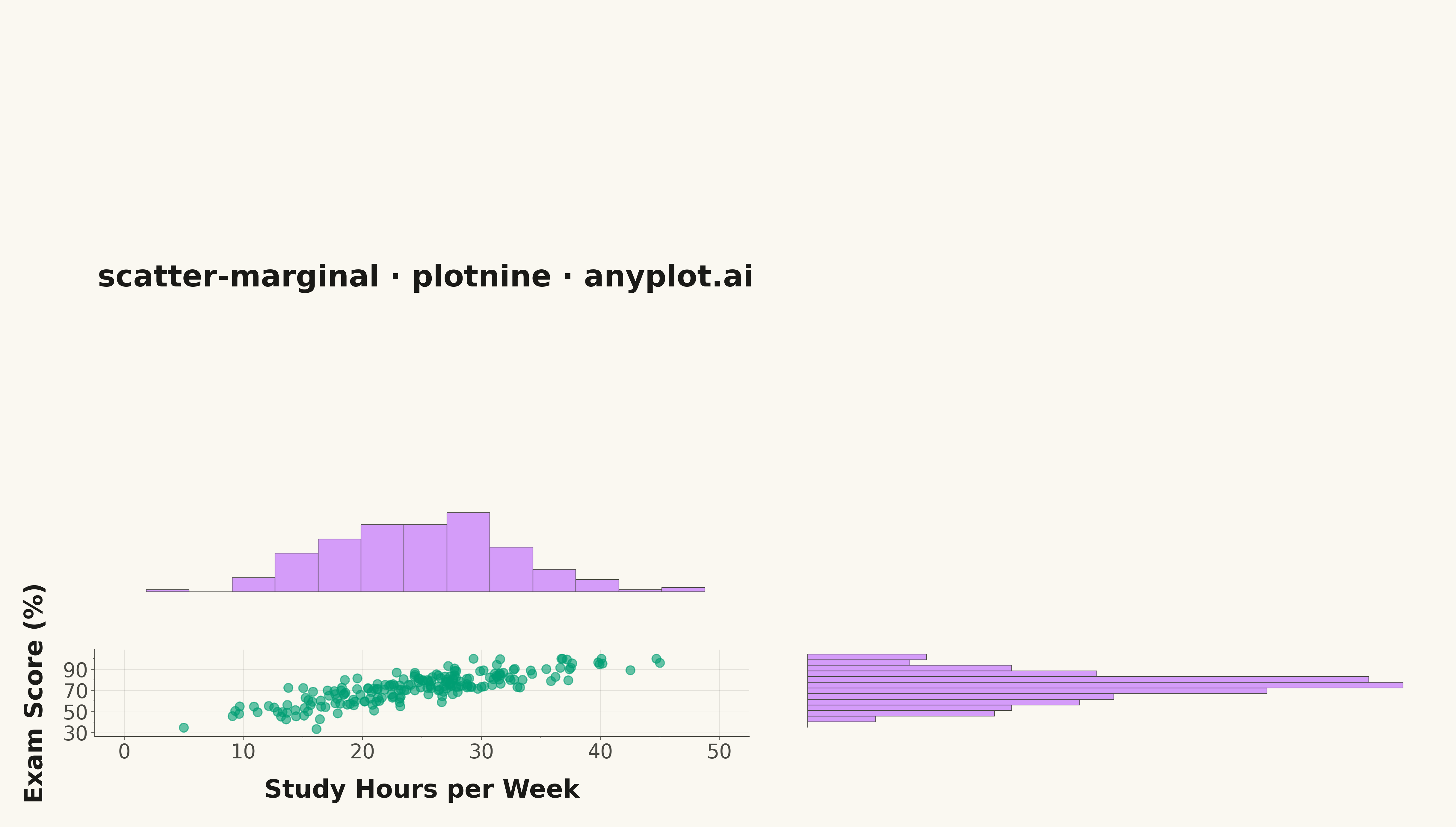
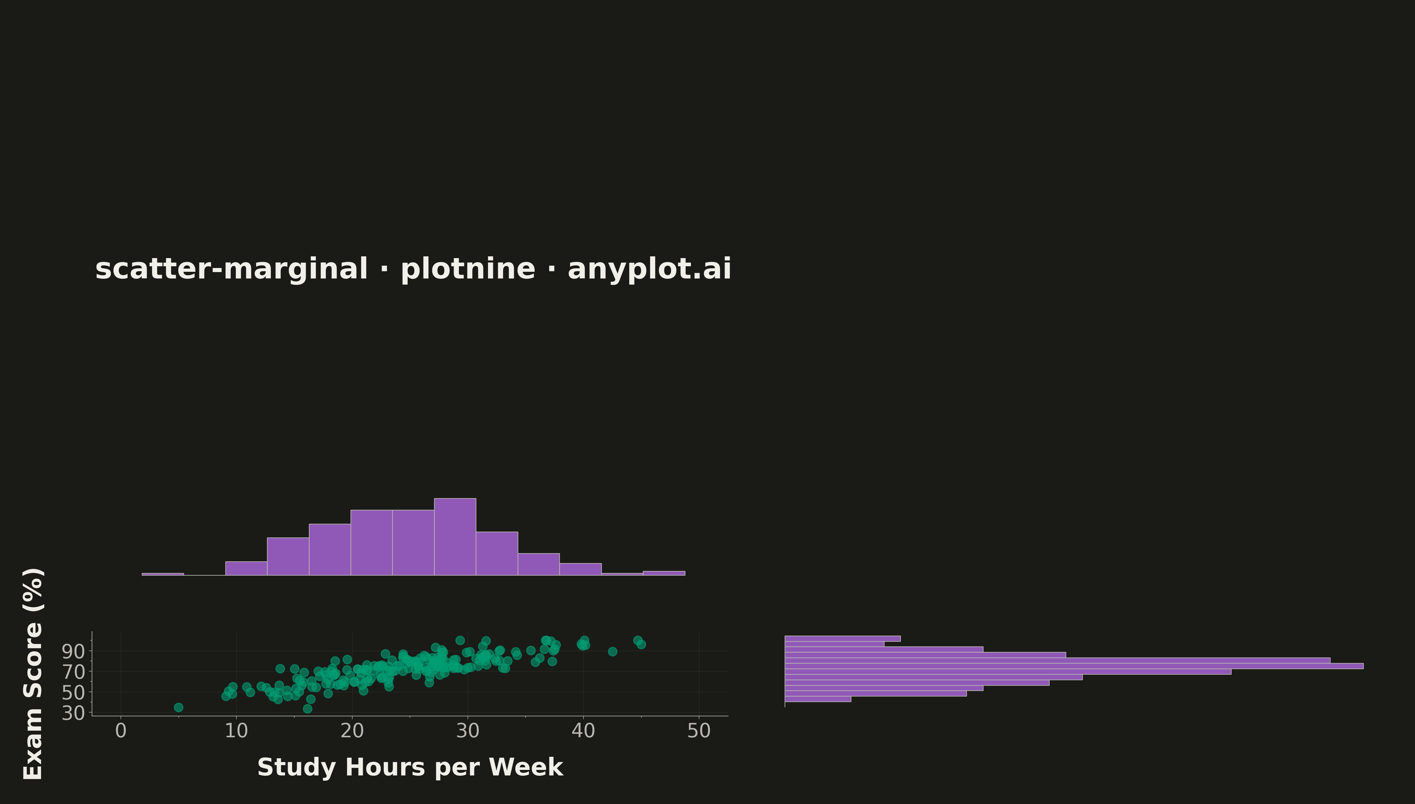
A scatter plot enhanced with marginal distribution plots (histograms or kernel density estimates) on the top and right axes. This composite visualization simultaneously shows the bivariate relationship between two variables in the central scatter plot while displaying each variable's univariate distribution along its respective axis. It provides a comprehensive view of both the joint and marginal distributions in a single figure.
""" anyplot.ai
scatter-marginal: Scatter Plot with Marginal Distributions
Library: plotnine 0.15.4 | Python 3.13.13
Quality: 93/100 | Updated: 2026-05-09
"""

import os

import numpy as np
import pandas as pd
from plotnine import (
    aes,
    coord_flip,
    element_blank,
    element_line,
    element_rect,
    element_text,
    geom_histogram,
    geom_point,
    ggplot,
    labs,
    scale_x_continuous,
    scale_y_continuous,
    theme,
    theme_minimal,
)
from plotnine.composition import plot_spacer


# Theme tokens
THEME = os.getenv("ANYPLOT_THEME", "light")
PAGE_BG = "#FAF8F1" if THEME == "light" else "#1A1A17"
INK = "#1A1A17" if THEME == "light" else "#F0EFE8"
INK_SOFT = "#4A4A44" if THEME == "light" else "#B8B7B0"

# Okabe-Ito palette
SCATTER_COLOR = "#009E73"  # Brand green (position 1)
MARGINAL_COLOR = "#C475FD"  # Vermillion (position 2)

# Data - Bivariate data with correlation
np.random.seed(42)
n = 200
study_hours = np.random.normal(25, 8, n)
study_hours = np.clip(study_hours, 5, 45)
exam_score = 35 + 1.5 * study_hours + np.random.normal(0, 8, n)
exam_score = np.clip(exam_score, 30, 100)
df = pd.DataFrame({"study_hours": study_hours, "exam_score": exam_score})

# Layout dimensions for 4800x2700 output
main_w, main_h = 12, 6.5
marg_w, marg_h = 4, 2.5

# Shared theme - L-shaped spine (left + bottom only)
base_theme = theme_minimal() + theme(
    plot_background=element_rect(fill=PAGE_BG, color=PAGE_BG),
    panel_background=element_rect(fill=PAGE_BG, color=PAGE_BG),
    panel_grid_major=element_line(color=INK, size=0.3, alpha=0.10),
    panel_grid_minor=element_blank(),
    panel_border=element_blank(),
    axis_title=element_text(color=INK, size=20, weight="bold"),
    axis_text=element_text(color=INK_SOFT, size=16),
    axis_line=element_line(color=INK_SOFT, size=0.5),
    axis_ticks=element_line(color=INK_SOFT, size=0.4),
    plot_title=element_text(color=INK, size=24, weight="bold", margin={"t": 10, "b": 10}),
)

# Top histogram (x distribution)
top_hist = (
    ggplot(df, aes(x="study_hours"))
    + geom_histogram(bins=15, fill=MARGINAL_COLOR, color=INK_SOFT, alpha=0.7, size=0.3)
    + scale_x_continuous(limits=(0, 50))
    + labs(x="", y="", title="scatter-marginal · plotnine · anyplot.ai")
    + base_theme
    + theme(
        figure_size=(main_w, marg_h),
        axis_text_x=element_blank(),
        axis_ticks_major_x=element_blank(),
        axis_ticks_minor_x=element_blank(),
        axis_line_x=element_blank(),
        axis_title_y=element_blank(),
        axis_text_y=element_blank(),
        axis_ticks_major_y=element_blank(),
        axis_ticks_minor_y=element_blank(),
        axis_line_y=element_blank(),
        panel_grid_major=element_blank(),
    )
)

# Right histogram (y distribution)
right_hist = (
    ggplot(df, aes(x="exam_score"))
    + geom_histogram(bins=15, fill=MARGINAL_COLOR, color=INK_SOFT, alpha=0.7, size=0.3)
    + coord_flip()
    + scale_x_continuous(limits=(30, 105))
    + labs(x="", y="")
    + base_theme
    + theme(
        figure_size=(marg_w, main_h),
        axis_text_y=element_blank(),
        axis_ticks_major_y=element_blank(),
        axis_ticks_minor_y=element_blank(),
        axis_line_y=element_blank(),
        axis_title_x=element_blank(),
        axis_text_x=element_blank(),
        axis_ticks_major_x=element_blank(),
        axis_ticks_minor_x=element_blank(),
        axis_line_x=element_blank(),
        panel_grid_major=element_blank(),
    )
)

# Main scatter plot
scatter_plot = (
    ggplot(df, aes(x="study_hours", y="exam_score"))
    + geom_point(size=3.5, alpha=0.6, color=SCATTER_COLOR)
    + scale_x_continuous(limits=(0, 50))
    + scale_y_continuous(limits=(30, 105))
    + labs(x="Study Hours per Week", y="Exam Score (%)")
    + base_theme
    + theme(figure_size=(main_w, main_h))
)

# Spacer
spacer = plot_spacer() + theme(figure_size=(marg_w, marg_h))

# Compose layout
composed = (top_hist | spacer) / (scatter_plot | right_hist)

# Save
fig = composed.draw()
fig.set_size_inches(16, 9)
fig.savefig(f"plot-{THEME}.png", dpi=300, bbox_inches="tight", facecolor=PAGE_BG)
Runnable source as JSON, for any HTTP client: https://api.anyplot.ai/specs/scatter-marginal/plotnine/code. Any spec id and library id listed in llms-full.txt fit the same URL shape; every URL below is complete and callable.
{
  "spec_id": "scatter-marginal",
  "language": "python",
  "library": "plotnine",
  "page": "https://anyplot.ai/scatter-marginal/python/plotnine",
  "hub": "https://anyplot.ai/scatter-marginal",
  "code_json": "https://api.anyplot.ai/specs/scatter-marginal/plotnine/code",
  "spec_json": "https://api.anyplot.ai/specs/scatter-marginal",
  "render_light_png": "https://storage.googleapis.com/anyplot-images/plots/scatter-marginal/python/plotnine/plot-light.png",
  "render_dark_png": "https://storage.googleapis.com/anyplot-images/plots/scatter-marginal/python/plotnine/plot-dark.png",
  "quality_score": 93.0,
  "license": "MIT",
  "guide": "https://anyplot.ai/llms.txt"
}
Part of Scatter Plot with Marginal Distributions on anyplot.ai.