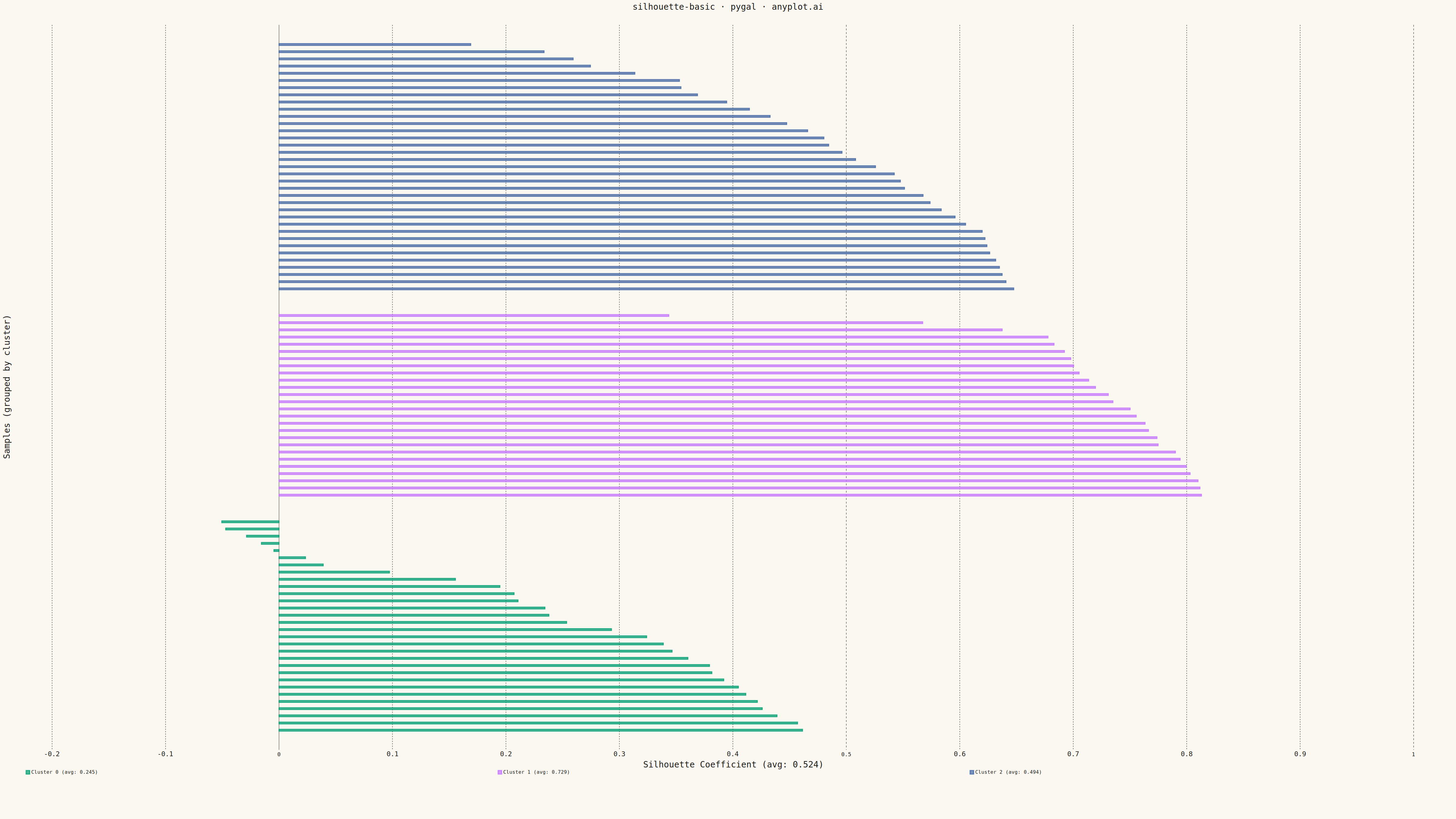
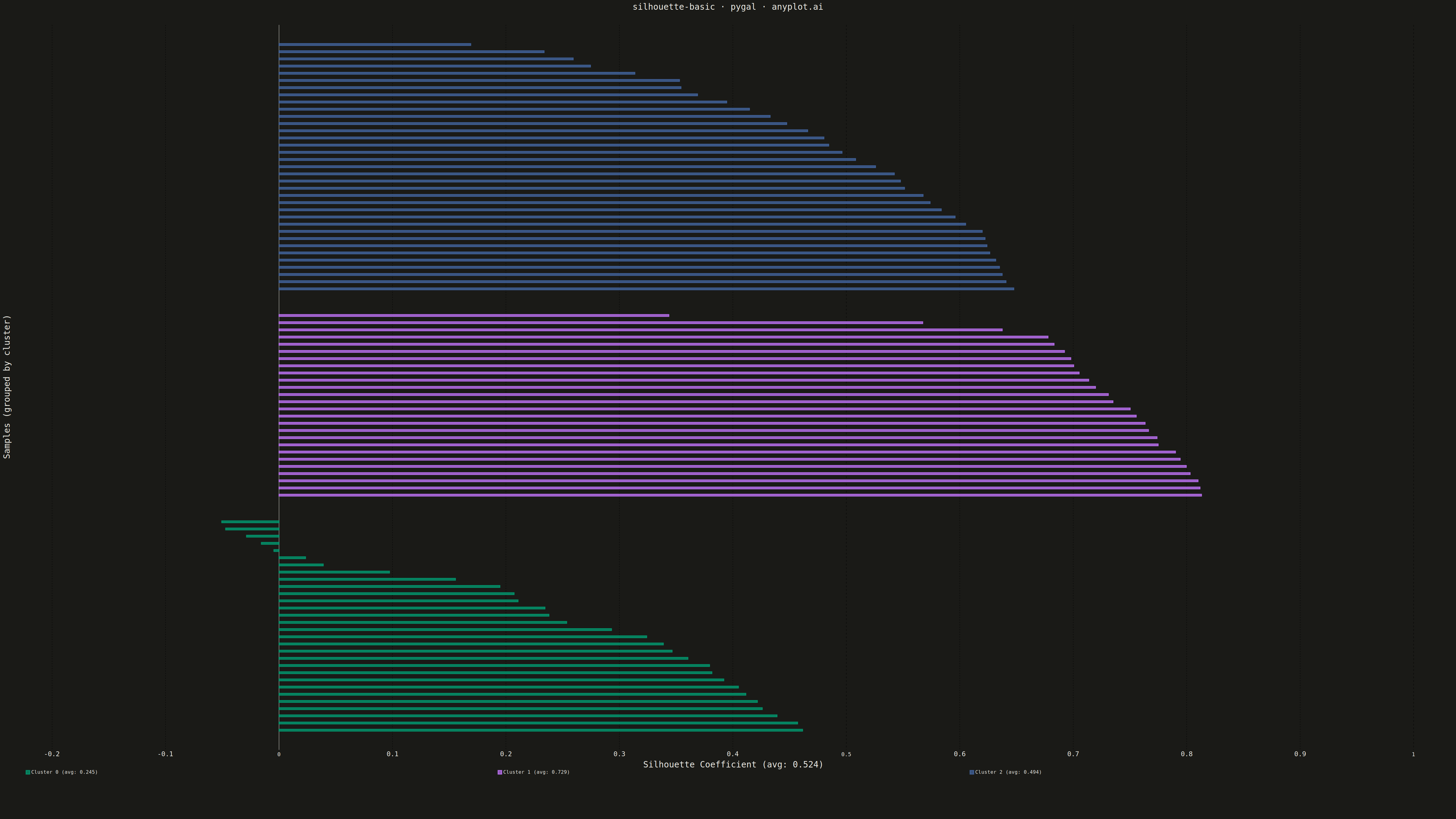
A silhouette plot visualizes the quality of clustering results by showing the silhouette coefficient for each sample, grouped by cluster assignment. Each horizontal bar represents a sample's silhouette score (-1 to 1), where positive values indicate good cluster membership and negative values suggest potential misclassification. This visualization helps evaluate cluster cohesion (how similar samples are to their own cluster) and separation (how distinct they are from neighboring clusters).
""" anyplot.ai
silhouette-basic: Silhouette Plot
Library: pygal 3.1.0 | Python 3.13.13
Quality: 87/100 | Updated: 2026-05-10
"""

import os
import sys


# Prevent importing local pygal.py file
sys.path = [p for p in sys.path if not p.endswith("/implementations/python")]

import numpy as np
import pygal
from pygal.style import Style
from sklearn.cluster import KMeans
from sklearn.metrics import silhouette_samples, silhouette_score


# Theme tokens
THEME = os.getenv("ANYPLOT_THEME", "light")
PAGE_BG = "#FAF8F1" if THEME == "light" else "#1A1A17"
INK = "#1A1A17" if THEME == "light" else "#F0EFE8"
INK_SOFT = "#4A4A44" if THEME == "light" else "#B8B7B0"
INK_MUTED = "#6B6A63" if THEME == "light" else "#A8A79F"

# Okabe-Ito palette (first series is always #009E73)
IMPRINT = ("#009E73", "#C475FD", "#4467A3", "#BD8233", "#AE3030", "#2ABCCD", "#954477")

# Data - Synthetic clustering data designed to show both positive and negative silhouettes
np.random.seed(42)

# Create 3 clusters with deliberate overlap to generate negative silhouette values
# Cluster 0: tight cluster at origin
# Cluster 1: well-separated cluster
# Cluster 2: overlaps significantly with cluster 0 to create misclassified samples
n_samples_per_cluster = 50
cluster0 = np.random.randn(n_samples_per_cluster, 2) * 0.6 + np.array([0, 0])
cluster1 = np.random.randn(n_samples_per_cluster, 2) * 0.7 + np.array([4, 4])
cluster2 = np.random.randn(n_samples_per_cluster, 2) * 1.0 + np.array([0.8, 0.3])
X = np.vstack([cluster0, cluster1, cluster2])

# Cluster the data
kmeans = KMeans(n_clusters=3, random_state=42, n_init=10)
cluster_labels = kmeans.fit_predict(X)

# Compute silhouette scores
silhouette_vals = silhouette_samples(X, cluster_labels)
avg_silhouette = silhouette_score(X, cluster_labels)
n_clusters = 3

# Custom style with theme-adaptive colors and prominent reference line
custom_style = Style(
    background=PAGE_BG,
    plot_background=PAGE_BG,
    foreground=INK,
    foreground_strong=INK,
    foreground_subtle=INK_MUTED,
    colors=IMPRINT,
    title_font_size=28,
    label_font_size=22,
    major_label_font_size=18,
    legend_font_size=16,
    value_font_size=14,
    stroke_width=3,
)

# Process and sort silhouette values within each cluster
original_cluster_avgs = {}
for i in range(n_clusters):
    cluster_silhouette_vals = silhouette_vals[cluster_labels == i]
    original_cluster_avgs[i] = np.mean(cluster_silhouette_vals)

# Build cluster data with sorted values (descending for visual appeal)
cluster_data = {}
sample_idx = 0
for i in range(n_clusters):
    cluster_silhouette_vals = silhouette_vals[cluster_labels == i]
    cluster_silhouette_vals = np.sort(cluster_silhouette_vals)[::-1]
    # Subsample for thicker bars while maintaining pattern
    reduced_vals = cluster_silhouette_vals[::2] if len(cluster_silhouette_vals) > 30 else cluster_silhouette_vals
    cluster_data[i] = {
        "values": reduced_vals,
        "avg": original_cluster_avgs[i],
        "start_idx": sample_idx,
        "size": len(reduced_vals),
    }
    sample_idx += len(reduced_vals)

total_samples = sample_idx

# Build all bars list for chart data with separator gaps between clusters
all_bars = []
separator_count = 3
for i in range(n_clusters):
    for val in cluster_data[i]["values"]:
        all_bars.append((i, val))
    if i < n_clusters - 1:
        for _ in range(separator_count):
            all_bars.append((-1, None))

# Create chart with prominent average silhouette line
chart = pygal.HorizontalBar(
    width=4800,
    height=2700,
    style=custom_style,
    title="silhouette-basic · pygal · anyplot.ai",
    x_title=f"Silhouette Coefficient (avg: {avg_silhouette:.3f})",
    y_title="Samples (grouped by cluster)",
    show_legend=True,
    legend_at_bottom=True,
    legend_at_bottom_columns=3,
    show_y_guides=False,
    show_x_guides=True,
    print_values=False,
    range=(-0.2, 1.0),
    spacing=4,
    margin=50,
    margin_bottom=150,
    show_y_labels=False,
    x_labels=[-0.2, 0.0, 0.2, round(avg_silhouette, 2), 0.4, 0.6, 0.8, 1.0],
    x_labels_major=[round(avg_silhouette, 2)],
)

# Build data series for each cluster
cluster_positions = {}
pos = 0
for i in range(n_clusters):
    cluster_positions[i] = {"start": pos, "size": cluster_data[i]["size"]}
    pos += cluster_data[i]["size"]
    if i < n_clusters - 1:
        pos += separator_count

for cluster_idx in range(n_clusters):
    cluster_avg = cluster_data[cluster_idx]["avg"]
    cluster_size = cluster_positions[cluster_idx]["size"]
    start_pos = cluster_positions[cluster_idx]["start"]
    mid_point = start_pos + cluster_size // 2

    series_data = []
    for bar_idx, (c, val) in enumerate(all_bars):
        if c == cluster_idx:
            if bar_idx == mid_point:
                series_data.append({"value": val, "label": f"Cluster {cluster_idx} avg: {cluster_avg:.3f}"})
            else:
                series_data.append(val)
        else:
            series_data.append(None)

    chart.add(f"Cluster {cluster_idx} (avg: {cluster_avg:.3f})", series_data)

# Save outputs
chart.render_to_file(f"plot-{THEME}.html")
chart.render_to_png(f"plot-{THEME}.png")
Runnable source as JSON, for any HTTP client: https://api.anyplot.ai/specs/silhouette-basic/pygal/code. Any spec id and library id listed in llms-full.txt fit the same URL shape; every URL below is complete and callable.
{
  "spec_id": "silhouette-basic",
  "language": "python",
  "library": "pygal",
  "page": "https://anyplot.ai/silhouette-basic/python/pygal",
  "hub": "https://anyplot.ai/silhouette-basic",
  "code_json": "https://api.anyplot.ai/specs/silhouette-basic/pygal/code",
  "spec_json": "https://api.anyplot.ai/specs/silhouette-basic",
  "render_light_png": "https://storage.googleapis.com/anyplot-images/plots/silhouette-basic/python/pygal/plot-light.png",
  "render_dark_png": "https://storage.googleapis.com/anyplot-images/plots/silhouette-basic/python/pygal/plot-dark.png",
  "interactive_light_html": "https://storage.googleapis.com/anyplot-images/plots/silhouette-basic/python/pygal/plot-light.html",
  "interactive_dark_html": "https://storage.googleapis.com/anyplot-images/plots/silhouette-basic/python/pygal/plot-dark.html",
  "quality_score": 87.0,
  "license": "MIT",
  "guide": "https://anyplot.ai/llms.txt"
}
Part of Silhouette Plot on anyplot.ai.