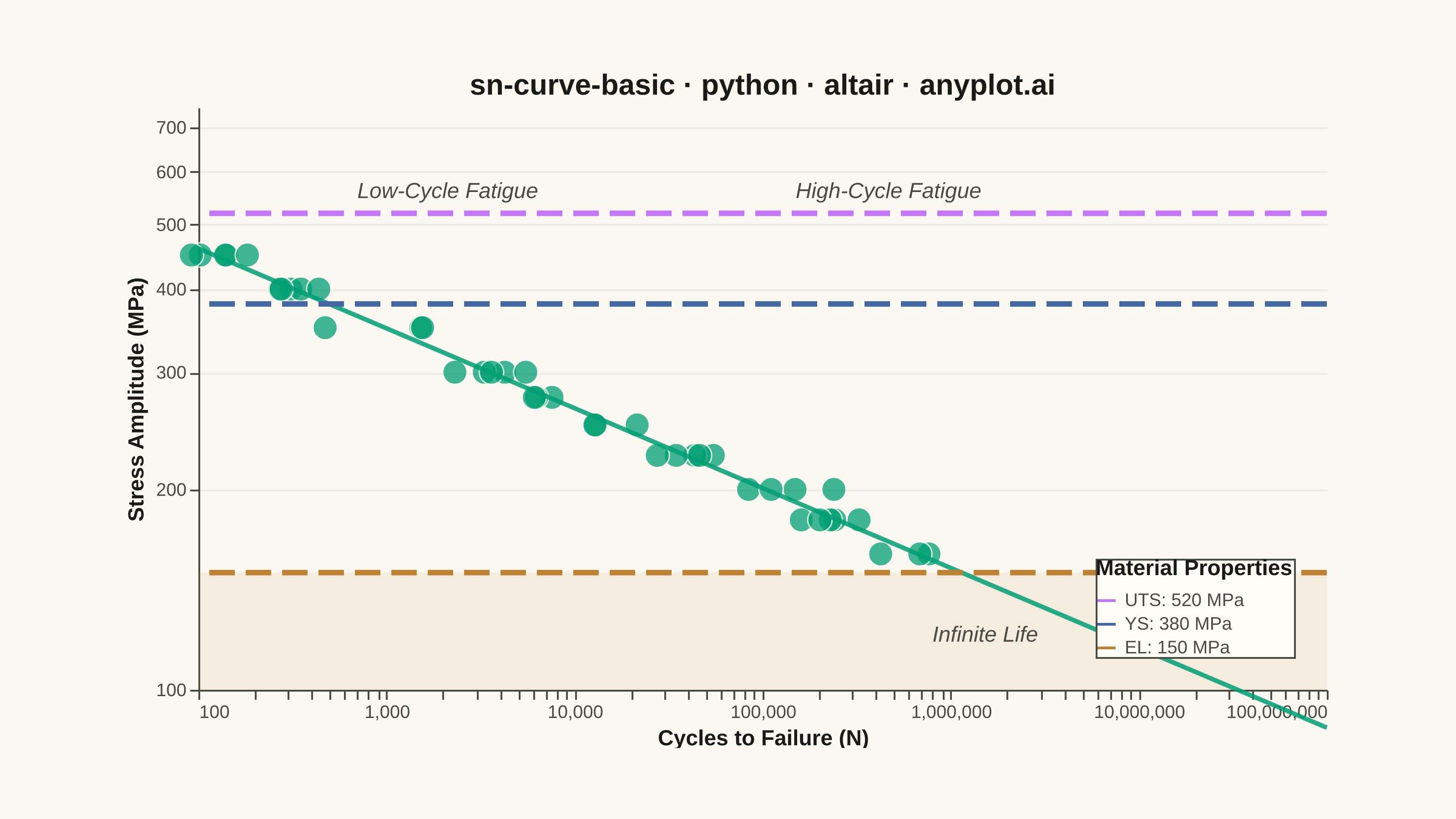
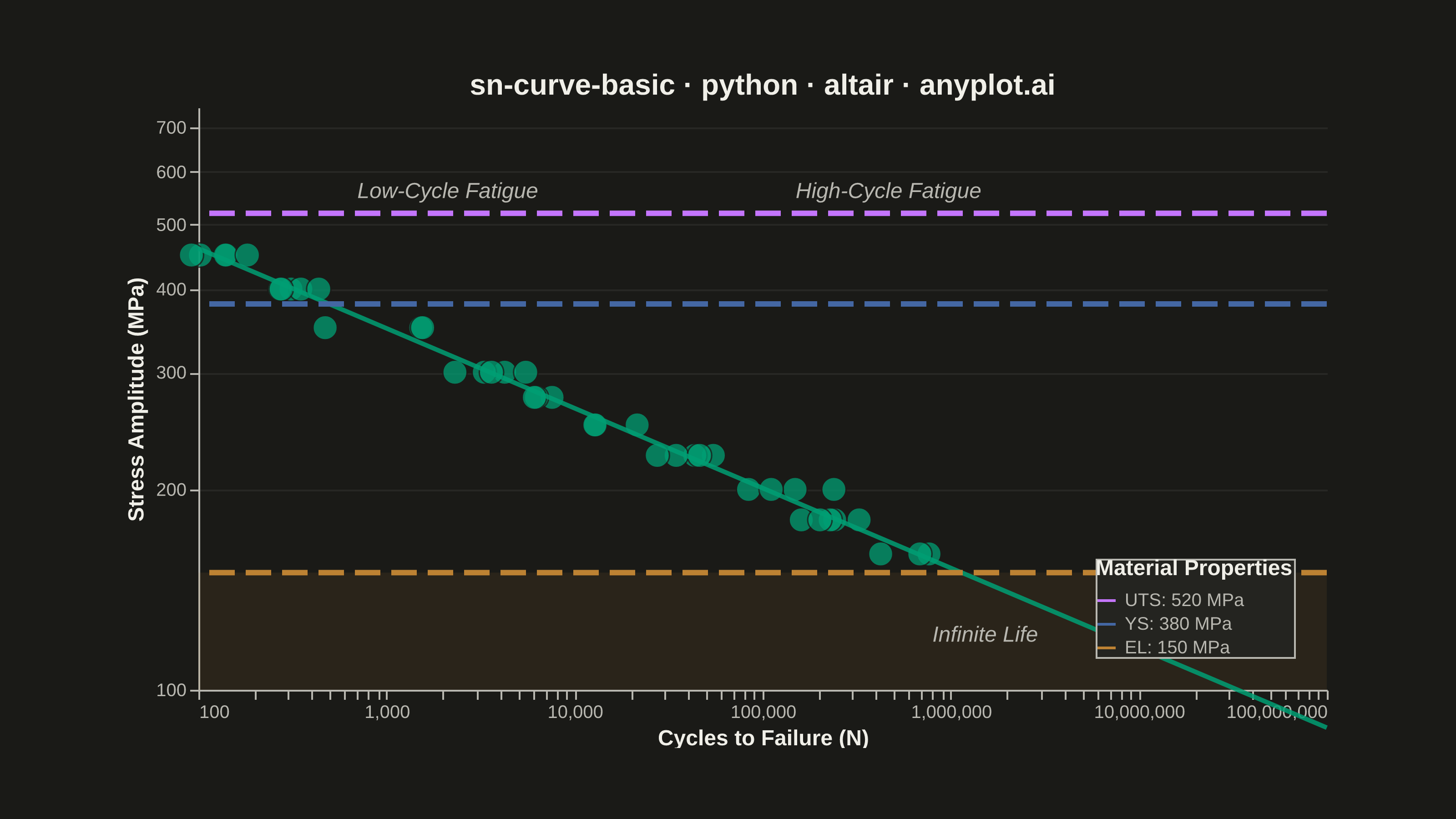
An S-N curve (also known as a Wöhler curve) visualizes the relationship between alternating stress amplitude and the number of cycles to failure for a material under fatigue loading. Both axes typically use logarithmic scales, with stress on the y-axis and cycle count on the x-axis. This plot is fundamental for predicting material fatigue life and identifying key material properties such as ultimate strength, yield strength, and endurance limit.
""" anyplot.ai
sn-curve-basic: S-N Curve (Wöhler Curve)
Library: altair 6.1.0 | Python 3.13.13
Quality: 87/100 | Updated: 2026-05-20
"""

import os

import altair as alt
import numpy as np
import pandas as pd
from PIL import Image


# Theme tokens
THEME = os.getenv("ANYPLOT_THEME", "light")
PAGE_BG = "#FAF8F1" if THEME == "light" else "#1A1A17"
ELEVATED_BG = "#FFFDF6" if THEME == "light" else "#242420"
INK = "#1A1A17" if THEME == "light" else "#F0EFE8"
INK_SOFT = "#4A4A44" if THEME == "light" else "#B8B7B0"

# Okabe-Ito palette
BRAND = "#009E73"  # pos 1 — fatigue test data & Basquin fit
C_UTS = "#C475FD"  # pos 2 — Ultimate Tensile Strength
C_YS = "#4467A3"  # pos 3 — Yield Strength
C_EL = "#BD8233"  # pos 4 — Endurance Limit

# Data — fatigue test results for medium-carbon steel specimens
np.random.seed(42)
A = 800  # Basquin coefficient (MPa)
b = -0.12  # Basquin exponent

stress_levels = np.array([450, 400, 350, 300, 275, 250, 225, 200, 180, 160])
cycles_list, stress_list = [], []

for stress in stress_levels:
    theoretical_cycles = (stress / A) ** (1 / b)
    n_samples = np.random.randint(3, 6)
    scatter = np.exp(np.random.normal(0, 0.3, n_samples))
    cycles_list.extend(theoretical_cycles * scatter)
    stress_list.extend([stress] * n_samples)

df = pd.DataFrame({"cycles": cycles_list, "stress": stress_list})

# Basquin fit line (smooth curve through full cycle range)
fit_cycles = np.logspace(2, 8, 100)
fit_stress = A * fit_cycles**b
fit_df = pd.DataFrame({"cycles": fit_cycles, "stress": fit_stress})

# Material property reference lines
ref_df = pd.DataFrame({"property": ["UTS: 520 MPa", "YS: 380 MPa", "EL: 150 MPa"], "stress": [520, 380, 150]})

# Infinite-life design zone — subtle band below endurance limit
band_df = pd.DataFrame({"y1": [100], "y2": [150]})

# Region text labels — annotate the three fatigue life zones
region_df = pd.DataFrame(
    {
        "cycles": [700.0, 150000.0, 800000.0],
        "stress": [580.0, 580.0, 125.0],
        "label": ["Low-Cycle Fatigue", "High-Cycle Fatigue", "Infinite Life"],
    }
)

# Shared log scales
x_scale = alt.Scale(type="log", domain=[100, 1e8])
y_scale = alt.Scale(type="log", domain=[100, 750])

TITLE = "sn-curve-basic · python · altair · anyplot.ai"

# Infinite-life zone fill (band below endurance limit)
band = alt.Chart(band_df).mark_rect(opacity=0.10, color=C_EL).encode(y=alt.Y("y1:Q", scale=y_scale), y2=alt.Y2("y2:Q"))

# Scatter: individual test specimens
points = (
    alt.Chart(df)
    .mark_point(size=180, filled=True, opacity=0.75, color=BRAND, stroke=PAGE_BG, strokeWidth=0.8)
    .encode(
        x=alt.X("cycles:Q", scale=x_scale, title="Cycles to Failure (N)"),
        y=alt.Y("stress:Q", scale=y_scale, title="Stress Amplitude (MPa)"),
        tooltip=["cycles:Q", "stress:Q"],
    )
)

# Basquin power-law fit line
fit_line = (
    alt.Chart(fit_df)
    .mark_line(strokeWidth=2.5, opacity=0.85, color=BRAND)
    .encode(x=alt.X("cycles:Q", scale=x_scale), y=alt.Y("stress:Q", scale=y_scale))
)

# Reference horizontal rules — longer dash pattern to distinguish from grid
ref_rules = (
    alt.Chart(ref_df)
    .mark_rule(strokeDash=[14, 6], strokeWidth=3)
    .encode(
        y=alt.Y("stress:Q", scale=y_scale),
        color=alt.Color(
            "property:N",
            scale=alt.Scale(domain=["UTS: 520 MPa", "YS: 380 MPa", "EL: 150 MPa"], range=[C_UTS, C_YS, C_EL]),
            legend=alt.Legend(
                title="Material Properties", titleFontSize=12, labelFontSize=10, labelLimit=200, orient="bottom-right"
            ),
        ),
    )
)

# Region text annotations — label the three fatigue life zones
region_labels = (
    alt.Chart(region_df)
    .mark_text(fontSize=12, fontStyle="italic", align="left", baseline="top", color=INK_SOFT)
    .encode(x=alt.X("cycles:Q", scale=x_scale), y=alt.Y("stress:Q", scale=y_scale), text="label:N")
)

# Compose all layers — inner view 620×320 so vl-convert padding fits within 3200×1800
chart = (
    (band + points + fit_line + ref_rules + region_labels)
    .properties(
        width=620,
        height=320,
        background=PAGE_BG,
        padding={"left": 0, "right": 0, "top": 0, "bottom": 0},
        title=alt.Title(TITLE, fontSize=16),
    )
    .configure_view(fill=PAGE_BG, strokeOpacity=0, continuousWidth=620, continuousHeight=320)
    .configure_axis(
        domainColor=INK_SOFT,
        domainOpacity=1,
        tickColor=INK_SOFT,
        gridColor=INK,
        gridOpacity=0.06,
        labelColor=INK_SOFT,
        titleColor=INK,
        labelFontSize=10,
        titleFontSize=12,
    )
    .configure_axisX(gridOpacity=0)
    .configure_title(color=INK, fontWeight="bold", fontSize=16)
    .configure_legend(
        fillColor=ELEVATED_BG,
        strokeColor=INK_SOFT,
        labelColor=INK_SOFT,
        titleColor=INK,
        titleFontSize=12,
        labelFontSize=10,
    )
)

# Save PNG and interactive HTML
chart.save(f"plot-{THEME}.png", scale_factor=4.0)

# PAD-only to exact 3200×1800 — raise if vl-convert overshoots (do NOT crop)
TW, TH = 3200, 1800
_img = Image.open(f"plot-{THEME}.png").convert("RGB")
_w, _h = _img.size
if _w > TW or _h > TH:
    raise SystemExit(
        f"altair vl-convert produced {_w}×{_h}, exceeds target {TW}×{TH}. "
        f"Shrink chart .properties(width=, height=) values and re-render."
    )
if _w < TW or _h < TH:
    _canvas = Image.new("RGB", (TW, TH), PAGE_BG)
    _canvas.paste(_img, ((TW - _w) // 2, (TH - _h) // 2))
    _canvas.save(f"plot-{THEME}.png")

chart.save(f"plot-{THEME}.html")
Runnable source as JSON, for any HTTP client: https://api.anyplot.ai/specs/sn-curve-basic/altair/code. Any spec id and library id listed in llms-full.txt fit the same URL shape; every URL below is complete and callable.
{
  "spec_id": "sn-curve-basic",
  "language": "python",
  "library": "altair",
  "page": "https://anyplot.ai/sn-curve-basic/python/altair",
  "hub": "https://anyplot.ai/sn-curve-basic",
  "code_json": "https://api.anyplot.ai/specs/sn-curve-basic/altair/code",
  "spec_json": "https://api.anyplot.ai/specs/sn-curve-basic",
  "render_light_png": "https://storage.googleapis.com/anyplot-images/plots/sn-curve-basic/python/altair/plot-light.png",
  "render_dark_png": "https://storage.googleapis.com/anyplot-images/plots/sn-curve-basic/python/altair/plot-dark.png",
  "interactive_light_html": "https://storage.googleapis.com/anyplot-images/plots/sn-curve-basic/python/altair/plot-light.html",
  "interactive_dark_html": "https://storage.googleapis.com/anyplot-images/plots/sn-curve-basic/python/altair/plot-dark.html",
  "quality_score": 87.0,
  "license": "MIT",
  "guide": "https://anyplot.ai/llms.txt"
}
Part of S-N Curve (Wöhler Curve) on anyplot.ai.