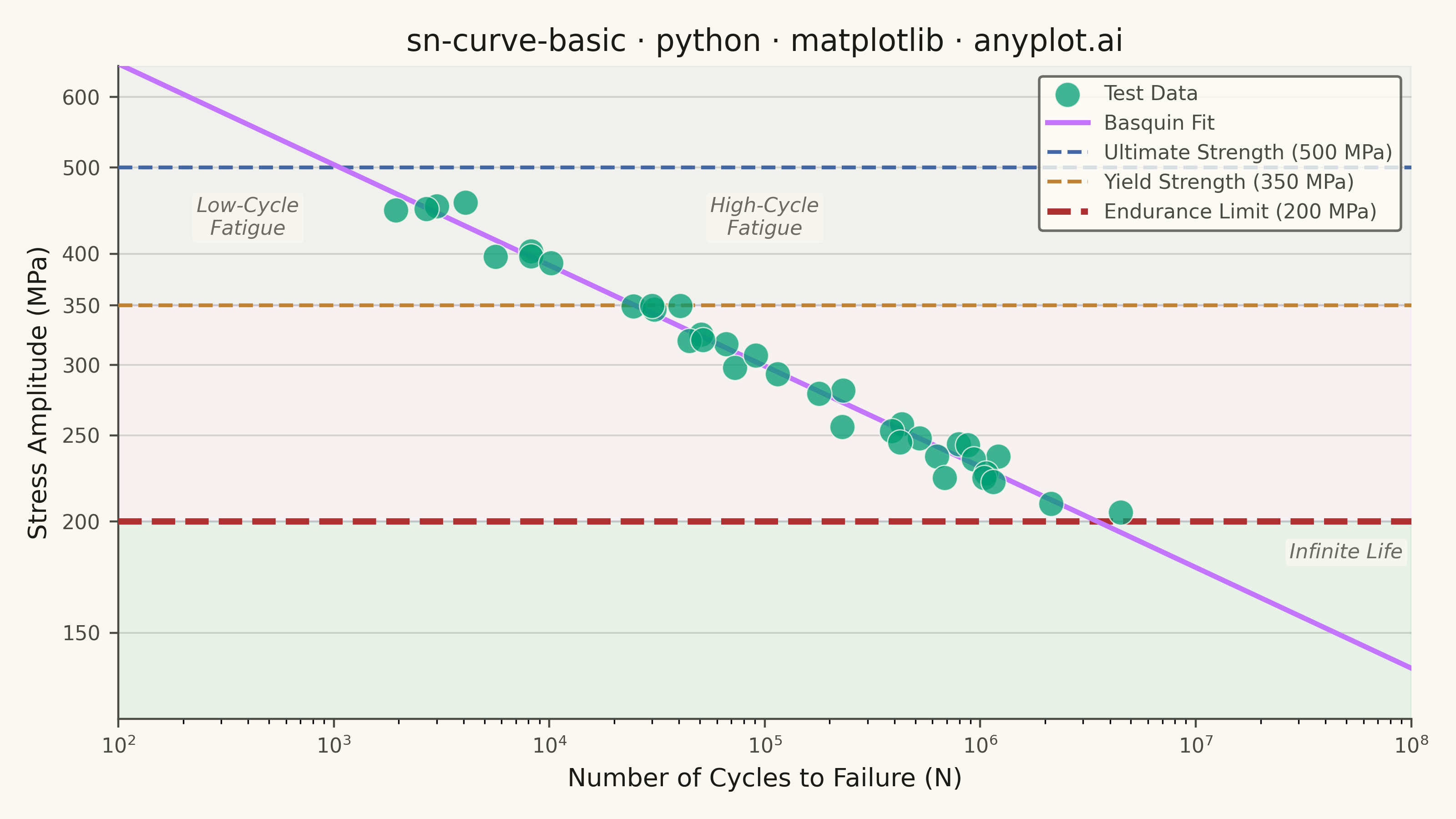
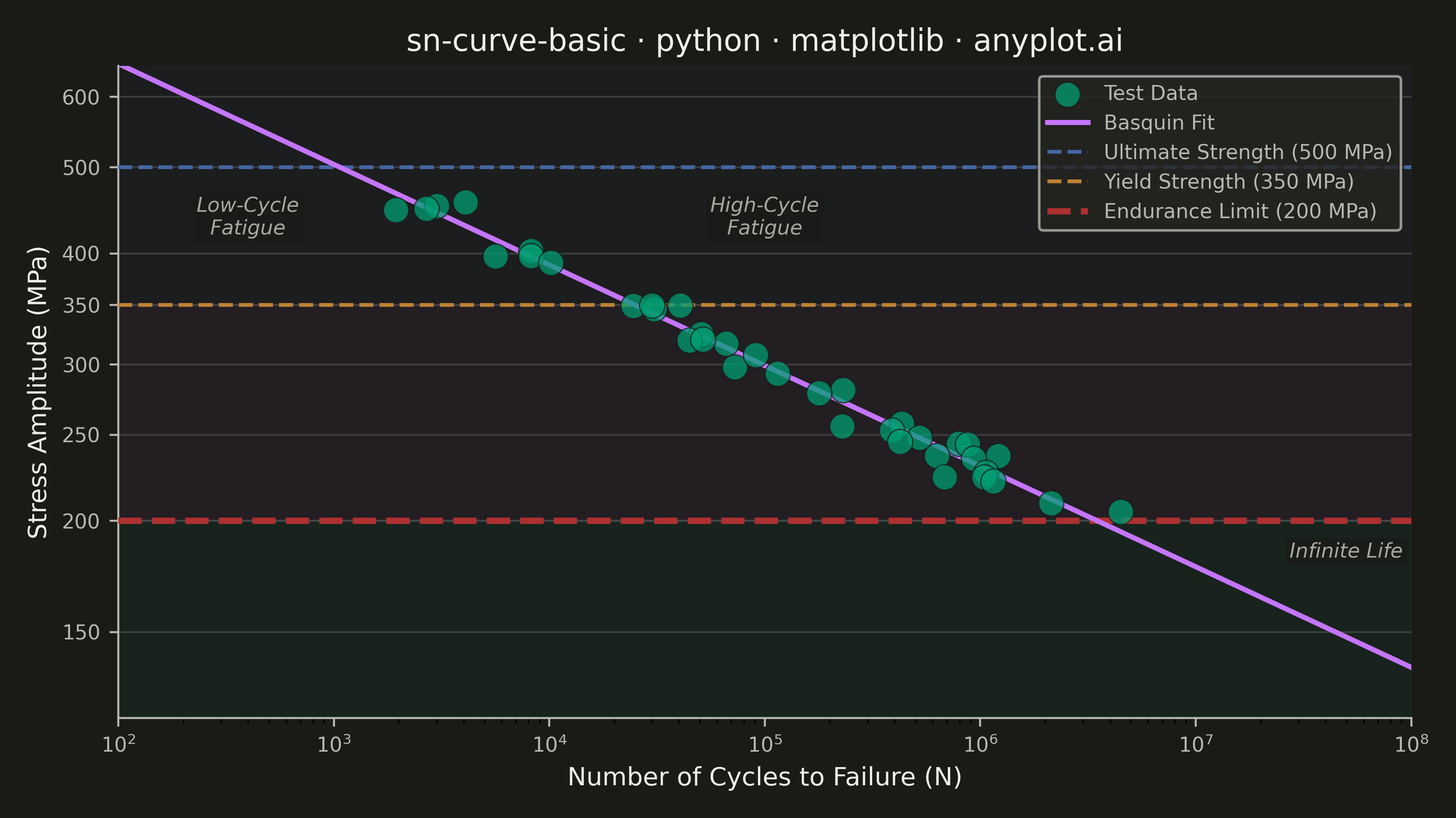
An S-N curve (also known as a Wöhler curve) visualizes the relationship between alternating stress amplitude and the number of cycles to failure for a material under fatigue loading. Both axes typically use logarithmic scales, with stress on the y-axis and cycle count on the x-axis. This plot is fundamental for predicting material fatigue life and identifying key material properties such as ultimate strength, yield strength, and endurance limit.
""" anyplot.ai
sn-curve-basic: S-N Curve (Wöhler Curve)
Library: matplotlib 3.10.9 | Python 3.13.13
Quality: 86/100 | Updated: 2026-05-20
"""

import os

import matplotlib.pyplot as plt
import numpy as np
from matplotlib.ticker import FixedLocator, FuncFormatter


# Theme tokens
THEME = os.getenv("ANYPLOT_THEME", "light")
PAGE_BG = "#FAF8F1" if THEME == "light" else "#1A1A17"
ELEVATED_BG = "#FFFDF6" if THEME == "light" else "#242420"
INK = "#1A1A17" if THEME == "light" else "#F0EFE8"
INK_SOFT = "#4A4A44" if THEME == "light" else "#B8B7B0"
INK_MUTED = "#6B6A63" if THEME == "light" else "#A8A79F"

BRAND = "#009E73"  # Okabe-Ito #1 — test data points
COLOR_FIT = "#C475FD"  # Okabe-Ito #2 — Basquin fit line
COLOR_ULT = "#4467A3"  # Okabe-Ito #3 — Ultimate Strength
COLOR_YLD = "#BD8233"  # Okabe-Ito #4 — Yield Strength
COLOR_END = "#AE3030"  # Okabe-Ito #5 — Endurance Limit

# Data: Simulated fatigue test results for structural steel specimens
np.random.seed(42)

stress_levels = np.array([450, 400, 350, 320, 300, 280, 260, 250, 240, 230, 220, 210])

cycles_data = []
stress_data = []

for s_level in stress_levels:
    # Basquin equation: N = (S/A)^(-1/b)
    A, b = 1200, 0.12
    N_mean = (s_level / A) ** (-1 / b)
    n_samples = np.random.randint(2, 5)
    for _ in range(n_samples):
        cycle_scatter = np.exp(np.random.normal(0, 0.3))
        cycles_data.append(N_mean * cycle_scatter)
        stress_data.append(s_level + np.random.normal(0, 5))

cycles = np.array(cycles_data)
stress = np.array(stress_data)

# Basquin log-linear fit
coeffs = np.polyfit(np.log10(cycles), np.log10(stress), 1)
fit_cycles = np.logspace(2, 8, 100)
fit_stress = 10 ** (coeffs[0] * np.log10(fit_cycles) + coeffs[1])

# Material property reference values (typical structural steel, MPa)
ultimate_strength = 500
yield_strength = 350
endurance_limit = 200

# Plot
fig, ax = plt.subplots(figsize=(8, 4.5), dpi=400, facecolor=PAGE_BG)
ax.set_facecolor(PAGE_BG)

# Fatigue region shading — axhspan highlights the three life regimes
ax.axhspan(120, endurance_limit, alpha=0.07, color=BRAND, zorder=0)
ax.axhspan(endurance_limit, yield_strength, alpha=0.05, color=COLOR_FIT, zorder=0)
ax.axhspan(yield_strength, 650, alpha=0.05, color=COLOR_ULT, zorder=0)

ax.scatter(
    cycles, stress, s=100, color=BRAND, alpha=0.75, edgecolors=PAGE_BG, linewidths=0.5, label="Test Data", zorder=5
)

ax.plot(fit_cycles, fit_stress, color=COLOR_FIT, linewidth=2.0, label="Basquin Fit", zorder=4)

ax.axhline(
    y=ultimate_strength,
    color=COLOR_ULT,
    linestyle="--",
    linewidth=1.5,
    label=f"Ultimate Strength ({ultimate_strength} MPa)",
    zorder=3,
)
ax.axhline(
    y=yield_strength,
    color=COLOR_YLD,
    linestyle="--",
    linewidth=1.5,
    label=f"Yield Strength ({yield_strength} MPa)",
    zorder=3,
)
ax.axhline(
    y=endurance_limit,
    color=COLOR_END,
    linestyle="--",
    linewidth=2.5,
    label=f"Endurance Limit ({endurance_limit} MPa)",
    zorder=3,
)

ax.set_xscale("log")
ax.set_yscale("log")
ax.xaxis.grid(False)
ax.set_xlim(1e2, 1e8)
ax.set_ylim(120, 650)

# Style
ax.set_xlabel("Number of Cycles to Failure (N)", fontsize=10, color=INK)
ax.set_ylabel("Stress Amplitude (MPa)", fontsize=10, color=INK)
ax.set_title("sn-curve-basic · python · matplotlib · anyplot.ai", fontsize=12, fontweight="medium", color=INK)
ax.tick_params(axis="both", labelsize=8, colors=INK_SOFT)
for spine in ("left", "bottom"):
    ax.spines[spine].set_color(INK_SOFT)
ax.spines["top"].set_visible(False)
ax.spines["right"].set_visible(False)

# Explicit MPa tick positions — more reliable than FuncFormatter on log scale
y_ticks = [150, 200, 250, 300, 350, 400, 500, 600]
ax.yaxis.set_major_locator(FixedLocator(y_ticks))
ax.yaxis.set_major_formatter(FuncFormatter(lambda x, _: str(int(x))))

ax.yaxis.grid(True, which="major", alpha=0.15, linewidth=0.7, color=INK)

leg = ax.legend(fontsize=8, loc="upper right")
if leg:
    leg.get_frame().set_facecolor(ELEVATED_BG)
    leg.get_frame().set_edgecolor(INK_SOFT)
    plt.setp(leg.get_texts(), color=INK_SOFT)

# Fatigue region labels
REGION_BBOX = {"boxstyle": "round,pad=0.2", "facecolor": PAGE_BG, "alpha": 0.75, "edgecolor": "none"}
ax.annotate(
    "Low-Cycle\nFatigue", xy=(4e2, 420), fontsize=8, ha="center", color=INK_MUTED, style="italic", bbox=REGION_BBOX
)
ax.annotate(
    "High-Cycle\nFatigue", xy=(1e5, 420), fontsize=8, ha="center", color=INK_MUTED, style="italic", bbox=REGION_BBOX
)
ax.annotate("Infinite Life", xy=(5e7, 182), fontsize=8, ha="center", color=INK_MUTED, style="italic", bbox=REGION_BBOX)

plt.tight_layout()

# Save — no bbox_inches="tight" to preserve exact 3200×1800 canvas
plt.savefig(f"plot-{THEME}.png", dpi=400, facecolor=PAGE_BG)
Runnable source as JSON, for any HTTP client: https://api.anyplot.ai/specs/sn-curve-basic/matplotlib/code. Any spec id and library id listed in llms-full.txt fit the same URL shape; every URL below is complete and callable.
{
  "spec_id": "sn-curve-basic",
  "language": "python",
  "library": "matplotlib",
  "page": "https://anyplot.ai/sn-curve-basic/python/matplotlib",
  "hub": "https://anyplot.ai/sn-curve-basic",
  "code_json": "https://api.anyplot.ai/specs/sn-curve-basic/matplotlib/code",
  "spec_json": "https://api.anyplot.ai/specs/sn-curve-basic",
  "render_light_png": "https://storage.googleapis.com/anyplot-images/plots/sn-curve-basic/python/matplotlib/plot-light.png",
  "render_dark_png": "https://storage.googleapis.com/anyplot-images/plots/sn-curve-basic/python/matplotlib/plot-dark.png",
  "quality_score": 86.0,
  "license": "MIT",
  "guide": "https://anyplot.ai/llms.txt"
}
Part of S-N Curve (Wöhler Curve) on anyplot.ai.