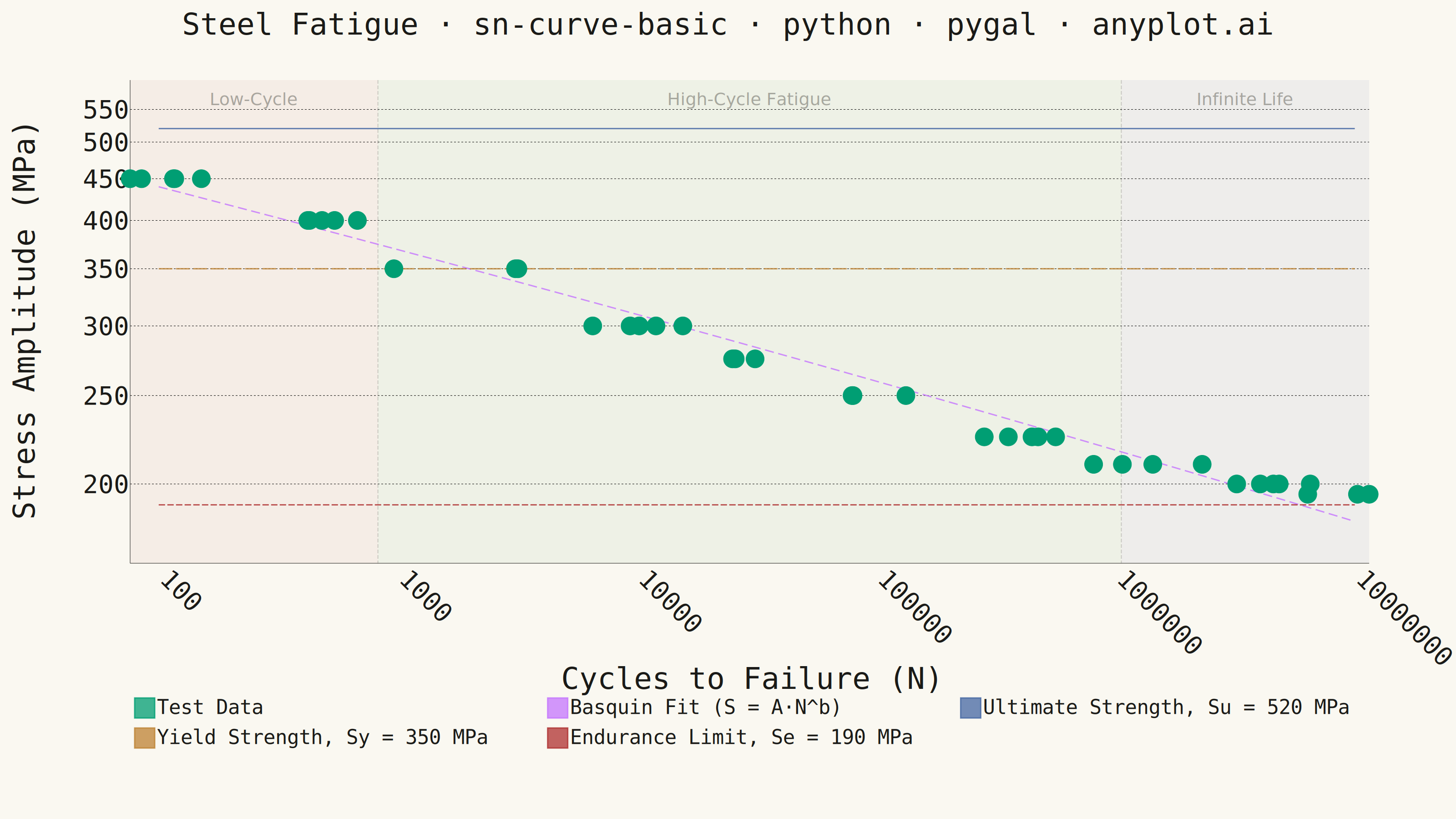
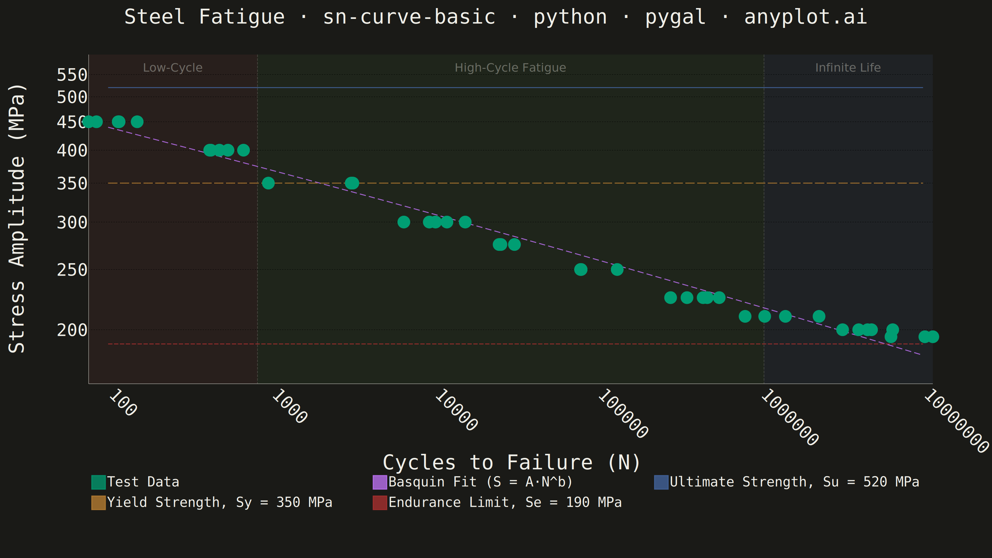
An S-N curve (also known as a Wöhler curve) visualizes the relationship between alternating stress amplitude and the number of cycles to failure for a material under fatigue loading. Both axes typically use logarithmic scales, with stress on the y-axis and cycle count on the x-axis. This plot is fundamental for predicting material fatigue life and identifying key material properties such as ultimate strength, yield strength, and endurance limit.
""" anyplot.ai
sn-curve-basic: S-N Curve (Wöhler Curve)
Library: pygal 3.1.0 | Python 3.13.13
Quality: 86/100 | Updated: 2026-05-20
"""

import math
import os
import re
import sys

import numpy as np


THEME = os.getenv("ANYPLOT_THEME", "light")
PAGE_BG = "#FAF8F1" if THEME == "light" else "#1A1A17"
INK = "#1A1A17" if THEME == "light" else "#F0EFE8"
INK_MUTED = "#6B6A63" if THEME == "light" else "#A8A79F"

IMPRINT = ("#009E73", "#C475FD", "#4467A3", "#BD8233", "#AE3030", "#2ABCCD", "#954477")

# Remove current dir from sys.path to avoid shadowing the pygal package
_cwd = sys.path[0] if sys.path[0] else "."
if _cwd in sys.path:
    sys.path.remove(_cwd)

import pygal
from cairosvg import svg2png as _svg2png
from pygal.style import Style


sys.path.insert(0, _cwd)

# ── Data ──────────────────────────────────────────────────────────────────────
np.random.seed(42)

stress_levels = np.array([450, 400, 350, 300, 275, 250, 225, 210, 200, 195])
base_cycles = np.array([1e2, 5e2, 2e3, 1e4, 3e4, 1e5, 4e5, 1e6, 5e6, 1e7])

cycles_data: list[float] = []
stress_data: list[float] = []

for stress, base_n in zip(stress_levels, base_cycles, strict=True):
    n_samples = np.random.randint(3, 6)
    scatter = np.exp(np.random.normal(0, 0.3, n_samples))
    cycles = base_n * scatter
    cycles_data.extend(cycles)
    stress_data.extend([stress] * n_samples)

cycles_arr = np.array(cycles_data)
stress_arr = np.array(stress_data)

# Basquin equation fit: S = A * N^b  (linear in log-log space)
log_cycles = np.log10(cycles_arr)
log_stress = np.log10(stress_arr)
coeffs = np.polyfit(log_cycles, log_stress, 1)
b = coeffs[0]
A = 10 ** coeffs[1]

fit_cycles = np.logspace(2, 7, 100)
fit_stress = A * (fit_cycles**b)

# Material reference values (MPa)
ultimate_strength = 520
yield_strength = 350
endurance_limit = 190

# pygal's logarithmic=True only applies to the x-axis in XY mode.
# Log10-transform all stress (y) values for a true log-log plot,
# then map explicit y_labels back to human-readable MPa values.
_zone = lambda c: (
    "Low-Cycle Fatigue" if c < 1e3 else ("High-Cycle Fatigue" if c < 1e6 else "Near Endurance Limit")
)

xy_points = [
    {
        "value": (float(c), math.log10(float(s))),
        "label": f"{_zone(float(c))}: {float(c):.2e} cycles @ {float(s):.0f} MPa",
    }
    for c, s in zip(cycles_arr, stress_arr, strict=True)
]
fit_points = [
    {"value": (float(c), math.log10(float(s))), "label": f"Fit: {float(c):.2e} → {float(s):.0f} MPa"}
    for c, s in zip(fit_cycles, fit_stress, strict=True)
]

ult_log = math.log10(ultimate_strength)
yld_log = math.log10(yield_strength)
end_log = math.log10(endurance_limit)

# ── Style ─────────────────────────────────────────────────────────────────────
custom_style = Style(
    background=PAGE_BG,
    plot_background=PAGE_BG,
    foreground=INK,
    foreground_strong=INK,
    foreground_subtle=INK_MUTED,
    colors=IMPRINT,
    title_font_size=66,
    label_font_size=56,
    major_label_font_size=44,
    legend_font_size=44,
    value_font_size=36,
    stroke_width=3,
    opacity=0.75,
    opacity_hover=1.0,
)

# ── Chart ─────────────────────────────────────────────────────────────────────
chart = pygal.XY(
    width=3200,
    height=1800,
    style=custom_style,
    title="Steel Fatigue · sn-curve-basic · python · pygal · anyplot.ai",
    x_title="Cycles to Failure (N)",
    y_title="Stress Amplitude (MPa)",
    logarithmic=True,
    show_dots=True,
    dots_size=12,
    stroke=True,
    show_x_guides=False,
    show_y_guides=True,
    x_label_rotation=45,
    legend_at_bottom=True,
    legend_box_size=44,
    margin=100,
    # Tighter y-range: start just below endurance limit to reduce empty bottom space
    range=(math.log10(165), math.log10(600)),
    value_formatter=lambda xy: f"{xy[0]:.2e} cycles, {10 ** xy[1]:.0f} MPa" if isinstance(xy, tuple) else str(xy),
)

# X-axis: major log decades
chart.x_labels = [100, 1_000, 10_000, 100_000, 1_000_000, 10_000_000]

# Y-axis: stress labels within the tightened range
y_tick_vals = [200, 250, 300, 350, 400, 450, 500, 550]
chart.y_labels = [{"value": math.log10(v), "label": str(v)} for v in y_tick_vals]

# Series: Test Data first (most prominent), then derived/reference
chart.add("Test Data", xy_points, dots_size=20, stroke=False, show_dots=True)
chart.add(
    "Basquin Fit (S = A·N^b)",
    fit_points,
    stroke=True,
    show_dots=False,
    stroke_style={"width": 9, "dasharray": "20, 10"},
)
# Distinct stroke styles per reference line: solid / long-dash / short-dash
chart.add(
    f"Ultimate Strength, Su = {ultimate_strength} MPa",
    [(100, ult_log), (1e7, ult_log)],
    stroke=True,
    show_dots=False,
    stroke_style={"width": 5, "opacity": 0.80},
)
chart.add(
    f"Yield Strength, Sy = {yield_strength} MPa",
    [(100, yld_log), (1e7, yld_log)],
    stroke=True,
    show_dots=False,
    stroke_style={"width": 5, "dasharray": "30, 8", "opacity": 0.80},
)
# Endurance limit: thicker + shorter dashes for better visibility on light bg
chart.add(
    f"Endurance Limit, Se = {endurance_limit} MPa",
    [(100, end_log), (1e7, end_log)],
    stroke=True,
    show_dots=False,
    stroke_style={"width": 12, "dasharray": "14, 5", "opacity": 0.90},
)


# ── SVG injection: fatigue region bands ───────────────────────────────────────


def _get_plot_dims(svg: str) -> tuple[float, float]:
    """Return (width, height) of plot area from the inner background rect in pygal SVG.

    pygal renders <g class="plot" transform="translate(tx,ty)"> containing the inner
    background <rect x=0 y=0 width=W height=H/>.  Coordinates inside that group are
    relative; we only need W and H to map log-scale x positions.
    """
    # Find the opening tag of <g class="plot"> (exact class, not "plot overlay")
    plot_tag = re.search(r'<g[^>]*\bclass="plot"[^>]*>', svg)
    if plot_tag:
        # Find the first <rect> after the plot group tag (that's the background rect)
        rect_m = re.search(r"<rect\b[^>]+>", svg[plot_tag.end() :])
        if rect_m:
            attrs: dict[str, float] = {}
            for attr in ("width", "height"):
                am = re.search(rf'\b{attr}="([0-9.]+)"', rect_m.group(0))
                if am:
                    attrs[attr] = float(am.group(1))
            if "width" in attrs and "height" in attrs:
                return attrs["width"], attrs["height"]
    # Fallback for width=3200, height=1800, margin=100 with our font sizes
    return 2760.0, 1290.0


def _inject_region_bands(svg: str, theme: str) -> str:
    """Inject colored fatigue-region background bands and labels into pygal SVG.

    Elements are placed in the plot group's local coordinate space (origin = top-left
    of the inner plot area), so no absolute pixel offset calculation is needed.
    """
    pw, ph = _get_plot_dims(svg)

    # X-axis: log10(100)=2 → log10(1e7)=7, five decades mapped to [0, pw]
    def log_to_x(log_n: float) -> float:
        return (log_n - 2.0) / 5.0 * pw

    x_lcf = log_to_x(3.0)  # LCF | HCF boundary at N = 1 000
    x_hcf = log_to_x(6.0)  # HCF | Infinite Life boundary at N = 1 000 000

    # Semi-transparent fills (fill + fill-opacity for cairosvg compatibility)
    if theme == "light":
        region_fills = [("#CC8888", "0.10"), ("#88AA88", "0.10"), ("#8888BB", "0.10")]
        div_stroke = "#6B6A63"
        lbl_fill = "#6B6A63"
    else:
        region_fills = [("#BB5555", "0.09"), ("#55994A", "0.09"), ("#5577BB", "0.09")]
        div_stroke = "#A8A79F"
        lbl_fill = "#A8A79F"

    # Labels near the top of the plot area (above all data points)
    lbl_y = 55.0
    lbl_sz = 38

    parts = ['<g class="fatigue-regions">']

    # Three region fills
    for rx, rw, (rfill, rop) in [
        (0.0, x_lcf, region_fills[0]),
        (x_lcf, x_hcf - x_lcf, region_fills[1]),
        (x_hcf, pw - x_hcf, region_fills[2]),
    ]:
        parts.append(
            f'<rect x="{rx:.1f}" y="0" width="{rw:.1f}" height="{ph:.1f}" '
            f'fill="{rfill}" fill-opacity="{rop}" stroke="none"/>'
        )

    # Subtle vertical dividers at region boundaries
    for xd in (x_lcf, x_hcf):
        parts.append(
            f'<line x1="{xd:.1f}" y1="0" x2="{xd:.1f}" y2="{ph:.1f}" '
            f'stroke="{div_stroke}" stroke-width="2" stroke-dasharray="8,4" opacity="0.30"/>'
        )

    # Region labels centered in each band
    for lx, lbl in [
        (x_lcf / 2, "Low-Cycle"),
        ((x_lcf + x_hcf) / 2, "High-Cycle Fatigue"),
        ((x_hcf + pw) / 2, "Infinite Life"),
    ]:
        parts.append(
            f'<text x="{lx:.1f}" y="{lbl_y:.1f}" text-anchor="middle" '
            f'fill="{lbl_fill}" font-size="{lbl_sz}" font-family="sans-serif" '
            f'opacity="0.55">{lbl}</text>'
        )

    parts.append("</g>")
    region_block = "".join(parts)

    # Insert immediately after the plot background rect so bands appear above bg,
    # but behind grid guides and data series.
    plot_tag = re.search(r'<g[^>]*\bclass="plot"[^>]*>', svg)
    if plot_tag:
        after_tag = svg[plot_tag.end() :]
        bg_rect = re.search(r"<rect\b[^>]+>", after_tag)
        if bg_rect:
            insert_pos = plot_tag.end() + bg_rect.end()
            return svg[:insert_pos] + region_block + svg[insert_pos:]

    # Fallback: insert just before </svg>
    return svg.replace("</svg>", region_block + "</svg>")


# ── Render & save ─────────────────────────────────────────────────────────────
svg_raw = chart.render()

# Inject region bands into a copy of the SVG, then convert to PNG via cairosvg
svg_enhanced = _inject_region_bands(svg_raw.decode("utf-8"), THEME).encode("utf-8")
_svg2png(bytestring=svg_enhanced, write_to=f"plot-{THEME}.png")

# HTML export uses the original SVG (preserves full pygal interactivity)
with open(f"plot-{THEME}.html", "wb") as f:
    f.write(svg_raw)
Runnable source as JSON, for any HTTP client: https://api.anyplot.ai/specs/sn-curve-basic/pygal/code. Any spec id and library id listed in llms-full.txt fit the same URL shape; every URL below is complete and callable.
{
  "spec_id": "sn-curve-basic",
  "language": "python",
  "library": "pygal",
  "page": "https://anyplot.ai/sn-curve-basic/python/pygal",
  "hub": "https://anyplot.ai/sn-curve-basic",
  "code_json": "https://api.anyplot.ai/specs/sn-curve-basic/pygal/code",
  "spec_json": "https://api.anyplot.ai/specs/sn-curve-basic",
  "render_light_png": "https://storage.googleapis.com/anyplot-images/plots/sn-curve-basic/python/pygal/plot-light.png",
  "render_dark_png": "https://storage.googleapis.com/anyplot-images/plots/sn-curve-basic/python/pygal/plot-dark.png",
  "interactive_light_html": "https://storage.googleapis.com/anyplot-images/plots/sn-curve-basic/python/pygal/plot-light.html",
  "interactive_dark_html": "https://storage.googleapis.com/anyplot-images/plots/sn-curve-basic/python/pygal/plot-dark.html",
  "quality_score": 86.0,
  "license": "MIT",
  "guide": "https://anyplot.ai/llms.txt"
}
Part of S-N Curve (Wöhler Curve) on anyplot.ai.