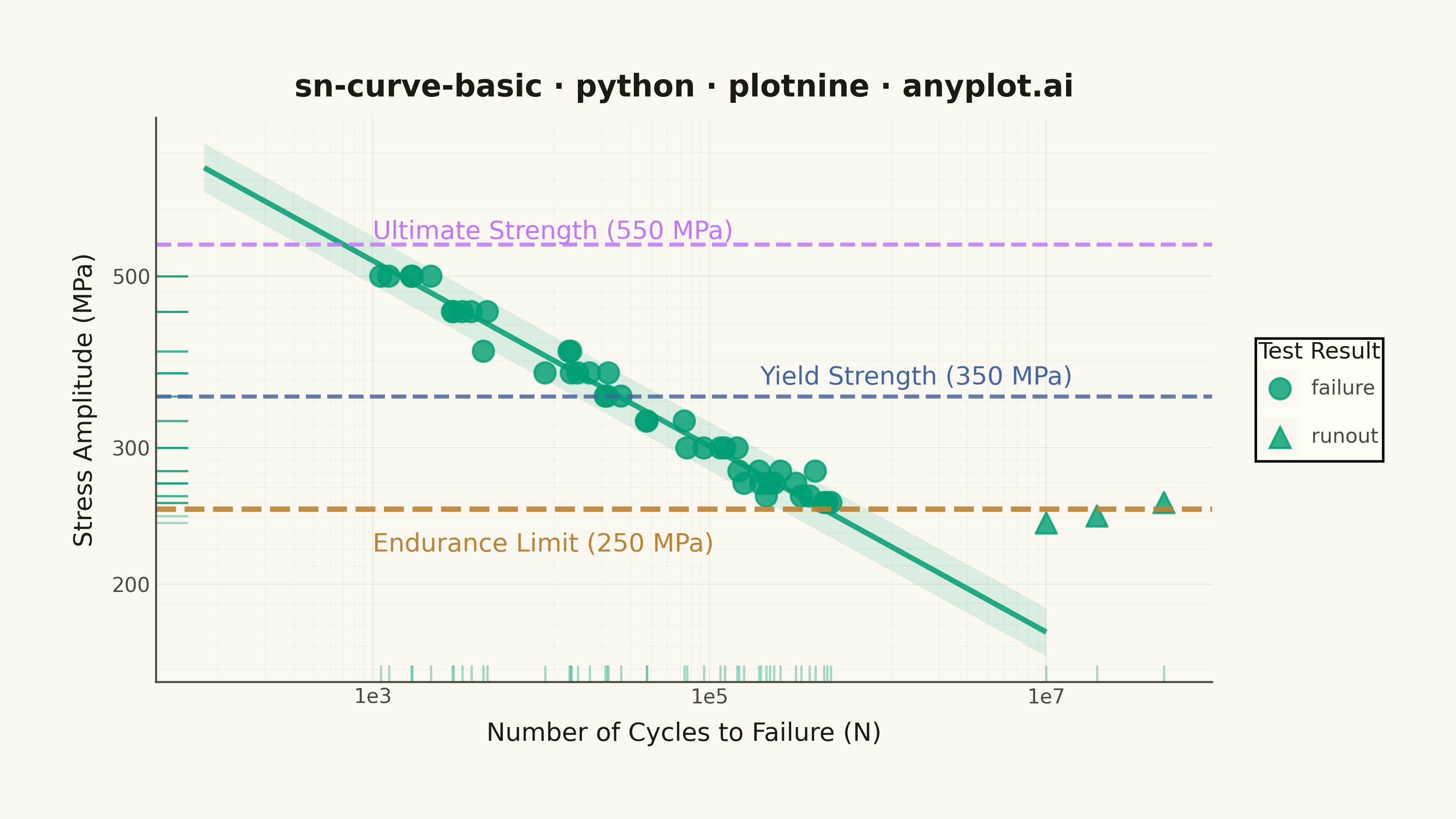
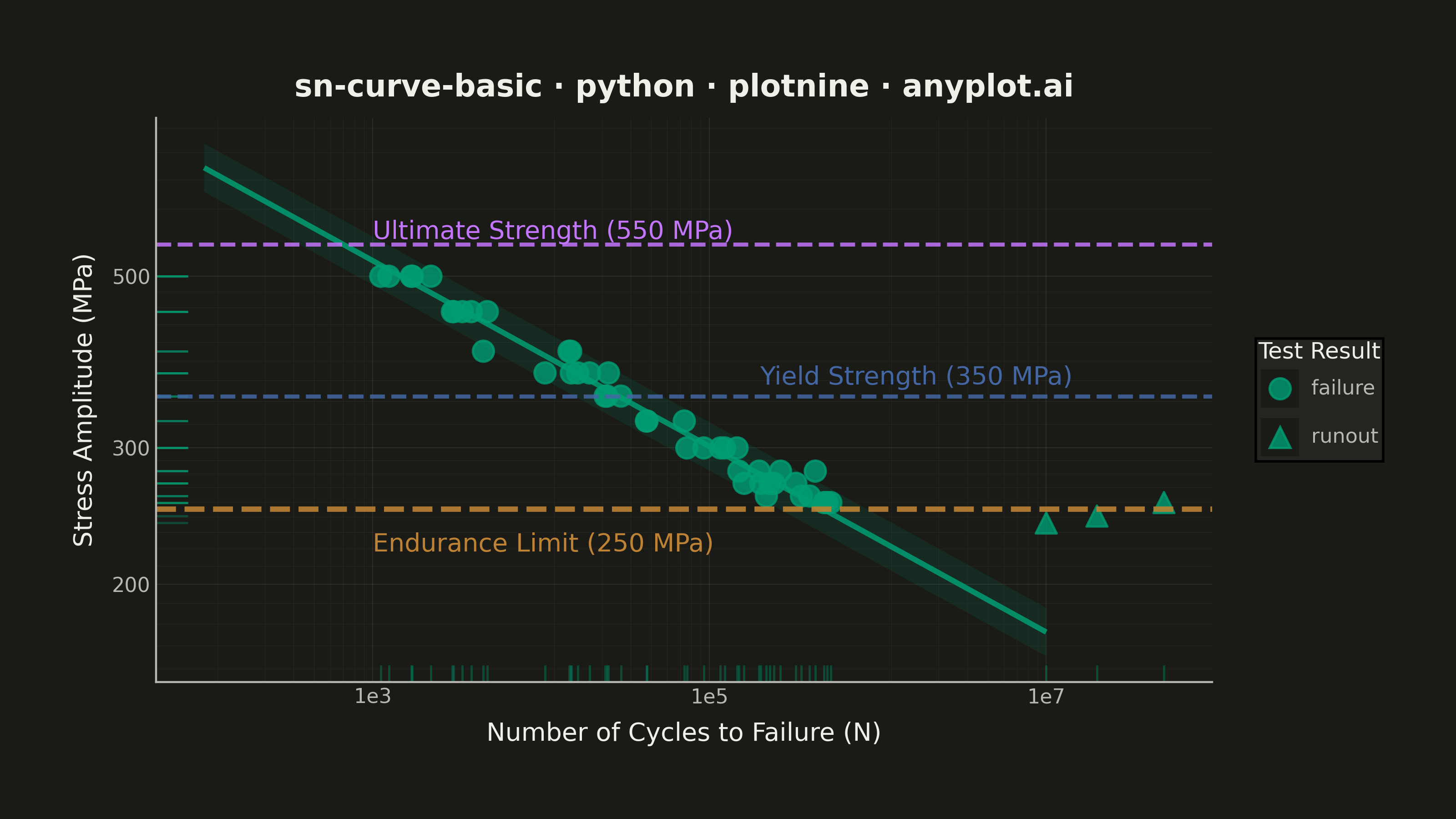
An S-N curve (also known as a Wöhler curve) visualizes the relationship between alternating stress amplitude and the number of cycles to failure for a material under fatigue loading. Both axes typically use logarithmic scales, with stress on the y-axis and cycle count on the x-axis. This plot is fundamental for predicting material fatigue life and identifying key material properties such as ultimate strength, yield strength, and endurance limit.
""" anyplot.ai
sn-curve-basic: S-N Curve (Wöhler Curve)
Library: plotnine 0.15.4 | Python 3.13.13
Quality: 91/100 | Updated: 2026-05-20
"""

import os

import numpy as np
import pandas as pd
from plotnine import (
    aes,
    annotate,
    element_blank,
    element_line,
    element_rect,
    element_text,
    geom_hline,
    geom_line,
    geom_point,
    geom_ribbon,
    geom_rug,
    ggplot,
    labs,
    scale_shape_manual,
    scale_x_log10,
    scale_y_log10,
    theme,
    theme_minimal,
)


THEME = os.getenv("ANYPLOT_THEME", "light")
PAGE_BG = "#FAF8F1" if THEME == "light" else "#1A1A17"
ELEVATED_BG = "#FFFDF6" if THEME == "light" else "#242420"
INK = "#1A1A17" if THEME == "light" else "#F0EFE8"
INK_SOFT = "#4A4A44" if THEME == "light" else "#B8B7B0"

IMPRINT = ["#009E73", "#C475FD", "#4467A3", "#BD8233", "#AE3030", "#2ABCCD", "#954477"]

# Data - S-N curve for steel specimen fatigue testing
np.random.seed(42)

# Material properties (MPa)
ultimate_strength = 550
yield_strength = 350
endurance_limit = 250

# Using Basquin equation: S = A * N^b
A = 1200
b = -0.12
sigma_logN = 0.3  # Log-normal scatter in cycles

stress_levels = np.array([500, 450, 400, 375, 350, 325, 300, 280, 270, 260, 255])

cycles = []
stress = []
point_type = []

for s in stress_levels:
    n_expected = (s / A) ** (1 / b)
    n_tests = np.random.randint(3, 6)
    scatter = np.random.lognormal(0, sigma_logN, n_tests)
    n_values = n_expected * scatter
    cycles.extend(n_values)
    stress.extend([s] * n_tests)
    point_type.extend(["failure"] * n_tests)

# Runout data points (did not fail) — marked with distinct marker shape
runout_cycles = [1e7, 2e7, 5e7]
runout_stress = [endurance_limit - 10, endurance_limit - 5, endurance_limit + 5]
cycles.extend(runout_cycles)
stress.extend(runout_stress)
point_type.extend(["runout"] * 3)

df = pd.DataFrame({"cycles": cycles, "stress": stress, "type": point_type})

# Basquin fit line with ±2σ scatter band (converts log-N scatter to stress bounds)
fit_cycles = np.logspace(2, 7, 100)
fit_stress = A * fit_cycles**b
fit_stress_upper = fit_stress * np.exp(2 * sigma_logN * abs(b))
fit_stress_lower = fit_stress * np.exp(-2 * sigma_logN * abs(b))
df_fit = pd.DataFrame(
    {"cycles": fit_cycles, "stress": fit_stress, "stress_upper": fit_stress_upper, "stress_lower": fit_stress_lower}
)

anyplot_theme = theme(
    figure_size=(8, 4.5),
    plot_background=element_rect(fill=PAGE_BG, color=PAGE_BG),
    panel_background=element_rect(fill=PAGE_BG),
    panel_grid_major=element_line(color=INK, size=0.3, alpha=0.10),
    panel_grid_minor=element_line(color=INK, size=0.2, alpha=0.05),
    panel_border=element_blank(),
    axis_line_x=element_line(color=INK_SOFT, size=0.8),
    axis_line_y=element_line(color=INK_SOFT, size=0.8),
    axis_title=element_text(color=INK, size=10),
    axis_text=element_text(color=INK_SOFT, size=8),
    plot_title=element_text(color=INK, size=12, weight="bold"),
    legend_background=element_rect(fill=ELEVATED_BG, color=None),
    legend_text=element_text(color=INK_SOFT, size=8),
    legend_title=element_text(color=INK, size=9),
    plot_margin=0.05,
)

plot = (
    ggplot()
    # ±2σ scatter band via geom_ribbon — idiomatic plotnine uncertainty visualization
    + geom_ribbon(df_fit, aes(x="cycles", ymin="stress_lower", ymax="stress_upper"), fill=IMPRINT[0], alpha=0.12)
    # Basquin fit line
    + geom_line(df_fit, aes(x="cycles", y="stress"), color=IMPRINT[0], size=1.2, alpha=0.85)
    # Data points — shape mapped to type for runout vs failure distinction
    + geom_point(df, aes(x="cycles", y="stress", shape="type"), color=IMPRINT[0], size=4.2, alpha=0.80)
    # geom_rug exposes marginal data density along both axes — distinctive plotnine feature
    + geom_rug(df, aes(x="cycles", y="stress"), color=IMPRINT[0], alpha=0.35, size=0.5)
    # Reference lines with Okabe-Ito colors; endurance limit slightly thicker as focal point
    + geom_hline(yintercept=ultimate_strength, linetype="dashed", color=IMPRINT[1], size=0.9, alpha=0.85)
    + geom_hline(yintercept=yield_strength, linetype="dashed", color=IMPRINT[2], size=0.9, alpha=0.85)
    + geom_hline(yintercept=endurance_limit, linetype="dashed", color=IMPRINT[3], size=1.2, alpha=0.90)
    + annotate(
        "text",
        x=1e3,
        y=ultimate_strength + 20,
        label="Ultimate Strength (550 MPa)",
        size=10,
        color=IMPRINT[1],
        ha="left",
    )
    + annotate(
        "text", x=2e5, y=yield_strength + 20, label="Yield Strength (350 MPa)", size=10, color=IMPRINT[2], ha="left"
    )
    + annotate(
        "text", x=1e3, y=endurance_limit - 25, label="Endurance Limit (250 MPa)", size=10, color=IMPRINT[3], ha="left"
    )
    # Logarithmic scales
    + scale_x_log10()
    + scale_y_log10()
    # Shape scale distinguishes runout (triangle) from failure (circle)
    + scale_shape_manual(values={"failure": "o", "runout": "^"}, name="Test Result")
    # Labels
    + labs(
        x="Number of Cycles to Failure (N)",
        y="Stress Amplitude (MPa)",
        title="sn-curve-basic · python · plotnine · anyplot.ai",
    )
    + theme_minimal()
    + anyplot_theme
)

plot.save(f"plot-{THEME}.png", dpi=400, width=8, height=4.5, units="in")
Runnable source as JSON, for any HTTP client: https://api.anyplot.ai/specs/sn-curve-basic/plotnine/code. Any spec id and library id listed in llms-full.txt fit the same URL shape; every URL below is complete and callable.
{
  "spec_id": "sn-curve-basic",
  "language": "python",
  "library": "plotnine",
  "page": "https://anyplot.ai/sn-curve-basic/python/plotnine",
  "hub": "https://anyplot.ai/sn-curve-basic",
  "code_json": "https://api.anyplot.ai/specs/sn-curve-basic/plotnine/code",
  "spec_json": "https://api.anyplot.ai/specs/sn-curve-basic",
  "render_light_png": "https://storage.googleapis.com/anyplot-images/plots/sn-curve-basic/python/plotnine/plot-light.png",
  "render_dark_png": "https://storage.googleapis.com/anyplot-images/plots/sn-curve-basic/python/plotnine/plot-dark.png",
  "quality_score": 91.0,
  "license": "MIT",
  "guide": "https://anyplot.ai/llms.txt"
}
Part of S-N Curve (Wöhler Curve) on anyplot.ai.