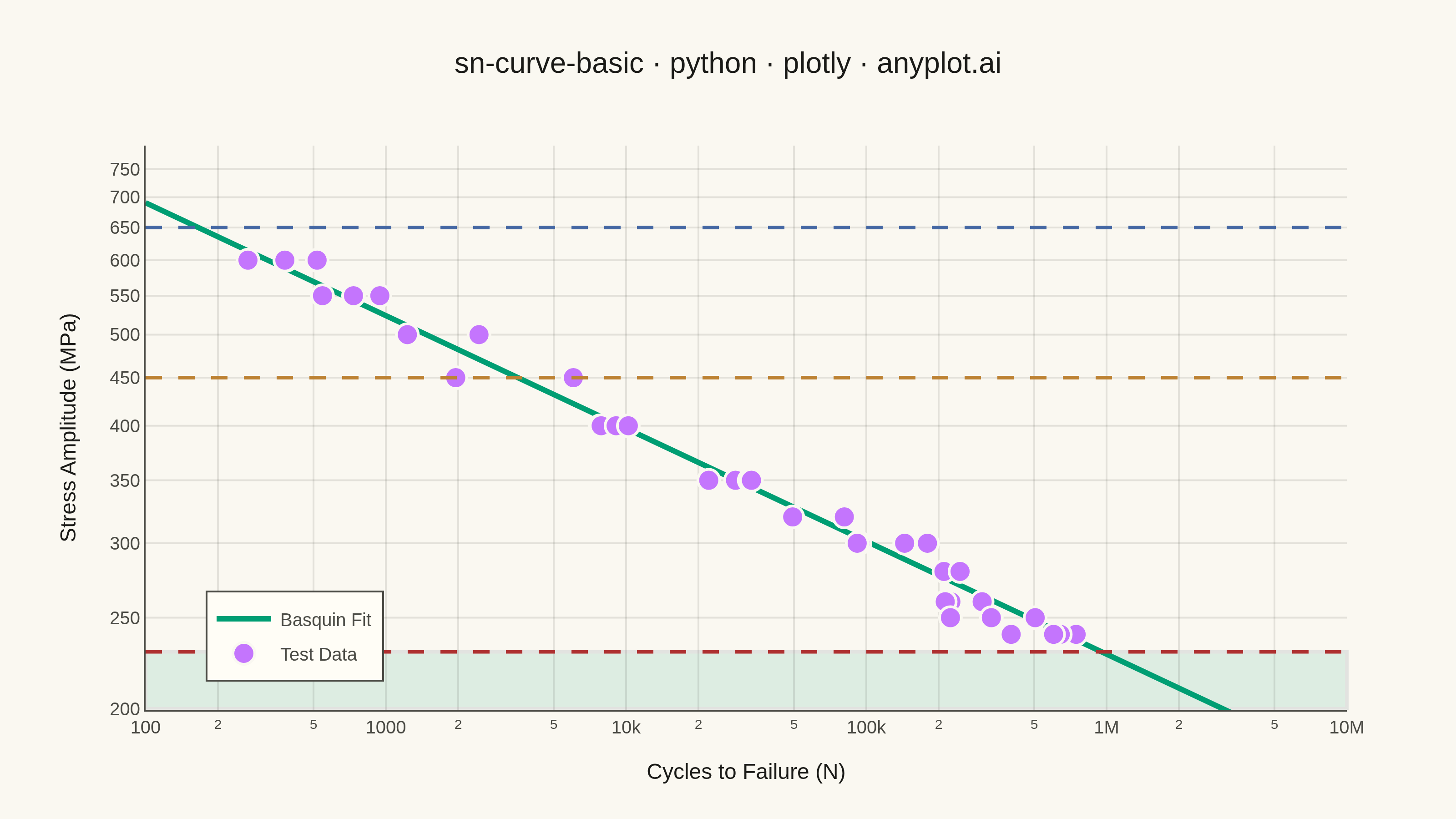
An S-N curve (also known as a Wöhler curve) visualizes the relationship between alternating stress amplitude and the number of cycles to failure for a material under fatigue loading. Both axes typically use logarithmic scales, with stress on the y-axis and cycle count on the x-axis. This plot is fundamental for predicting material fatigue life and identifying key material properties such as ultimate strength, yield strength, and endurance limit.
""" anyplot.ai
sn-curve-basic: S-N Curve (Wöhler Curve)
Library: plotly 6.7.0 | Python 3.13.13
Quality: 87/100 | Updated: 2026-05-20
"""

import os

import numpy as np
import plotly.graph_objects as go


# Theme
THEME = os.getenv("ANYPLOT_THEME", "light")
PAGE_BG = "#FAF8F1" if THEME == "light" else "#1A1A17"
ELEVATED_BG = "#FFFDF6" if THEME == "light" else "#242420"
INK = "#1A1A17" if THEME == "light" else "#F0EFE8"
INK_SOFT = "#4A4A44" if THEME == "light" else "#B8B7B0"
GRID = "rgba(26,26,23,0.10)" if THEME == "light" else "rgba(240,239,232,0.10)"

# Okabe-Ito palette
BRAND = "#009E73"  # position 1 — Basquin fit line
C2 = "#C475FD"  # position 2 — test data markers
C3 = "#4467A3"  # position 3 — ultimate strength
C4 = "#BD8233"  # position 4 — yield strength
C5 = "#AE3030"  # position 5 — endurance limit

# Data: Steel fatigue test data (Basquin model)
np.random.seed(42)

A = 1200  # Fatigue coefficient (MPa)
b = -0.12  # Fatigue strength exponent

stress_levels = np.array([600, 550, 500, 450, 400, 350, 320, 300, 280, 260, 250, 240])
cycles_base = (stress_levels / A) ** (1 / b)

cycles = []
stress = []
for s, n_base in zip(stress_levels, cycles_base, strict=False):
    n_samples = np.random.randint(2, 5)
    scatter = 10 ** (np.random.normal(0, 0.15, n_samples))
    for factor in scatter:
        cycles.append(n_base * factor)
        stress.append(s)

cycles = np.array(cycles)
stress = np.array(stress)

# Material properties
ultimate_strength = 650  # MPa
yield_strength = 450  # MPa
endurance_limit = 230  # MPa

# Basquin fit line
fit_cycles = np.logspace(2, 7, 100)
fit_stress = A * fit_cycles**b
n_knee = (endurance_limit / A) ** (1 / b)  # transition point to infinite life

# Plot
fig = go.Figure()

fig.add_trace(
    go.Scatter(
        x=fit_cycles,
        y=fit_stress,
        mode="lines",
        name="Basquin Fit",
        line={"color": BRAND, "width": 3},
        hovertemplate="Cycles: %{x:.2e}<br>Stress: %{y:.0f} MPa<extra>Basquin Fit</extra>",
    )
)

fig.add_trace(
    go.Scatter(
        x=cycles,
        y=stress,
        mode="markers",
        name="Test Data",
        marker={"color": C2, "size": 12, "line": {"color": PAGE_BG, "width": 1.5}},
        hovertemplate="Cycles: %{x:.2e}<br>Stress: %{y:.0f} MPa<extra>Test Data</extra>",
    )
)

x_range = [100, 1e7]

# Infinite-life zone fill — opacity raised so the region registers as a meaningful cue
fig.add_hrect(y0=200, y1=endurance_limit, opacity=0.11, fillcolor=BRAND, layer="below")

# Reference lines — excluded from legend; annotated directly at right edge instead
fig.add_trace(
    go.Scatter(
        x=x_range,
        y=[ultimate_strength, ultimate_strength],
        mode="lines",
        name=f"Ultimate Strength ({ultimate_strength} MPa)",
        line={"color": C3, "width": 2, "dash": "dash"},
        showlegend=False,
        hovertemplate=f"Ultimate Strength: {ultimate_strength} MPa<extra></extra>",
    )
)

fig.add_trace(
    go.Scatter(
        x=x_range,
        y=[yield_strength, yield_strength],
        mode="lines",
        name=f"Yield Strength ({yield_strength} MPa)",
        line={"color": C4, "width": 2, "dash": "dash"},
        showlegend=False,
        hovertemplate=f"Yield Strength: {yield_strength} MPa<extra></extra>",
    )
)

fig.add_trace(
    go.Scatter(
        x=x_range,
        y=[endurance_limit, endurance_limit],
        mode="lines",
        name=f"Endurance Limit ({endurance_limit} MPa)",
        line={"color": C5, "width": 2, "dash": "dash"},
        showlegend=False,
        hovertemplate=f"Endurance Limit: {endurance_limit} MPa<extra></extra>",
    )
)

# Direct line labels via add_annotation — plotly-native, cleaner than legend entries
for y_val, label, color, anchor in [
    (ultimate_strength, f"Ult. Strength<br>{ultimate_strength} MPa", C3, "top"),
    (yield_strength, f"Yield Strength<br>{yield_strength} MPa", C4, "bottom"),
    (endurance_limit, f"End. Limit<br>{endurance_limit} MPa", C5, "top"),
]:
    fig.add_annotation(
        x=8e6,
        y=y_val,
        text=label,
        xanchor="right",
        yanchor=anchor,
        showarrow=False,
        font={"color": color, "size": 12},
        bgcolor=ELEVATED_BG,
        bordercolor=color,
        borderwidth=1,
        borderpad=3,
    )

# Fatigue knee annotation — where Basquin fit intersects endurance limit
fig.add_annotation(
    x=n_knee,
    y=endurance_limit,
    text="Fatigue Knee<br>(~10⁶ cycles)",
    showarrow=True,
    arrowhead=2,
    arrowcolor=INK_SOFT,
    arrowsize=1.2,
    ax=-70,
    ay=-70,
    font={"size": 10, "color": INK_SOFT},
    bgcolor=ELEVATED_BG,
    bordercolor=INK_SOFT,
    borderwidth=1,
    borderpad=3,
    xanchor="center",
)

# Infinite-life zone label inside the green fill region
fig.add_annotation(
    x=5e5,
    y=218,
    text="Infinite Life Zone",
    showarrow=False,
    font={"size": 10, "color": BRAND},
    xanchor="center",
    yanchor="middle",
)

# Style
fig.update_layout(
    autosize=False,
    paper_bgcolor=PAGE_BG,
    plot_bgcolor=PAGE_BG,
    hovermode="closest",
    title={
        "text": "sn-curve-basic · python · plotly · anyplot.ai",
        "font": {"size": 16, "color": INK},
        "x": 0.5,
        "xanchor": "center",
    },
    xaxis={
        "title": {"text": "Cycles to Failure (N)", "font": {"size": 12, "color": INK}},
        "tickfont": {"size": 10, "color": INK_SOFT},
        "type": "log",
        "showgrid": True,
        "gridwidth": 1,
        "gridcolor": GRID,
        "showline": True,
        "linewidth": 1,
        "linecolor": INK_SOFT,
        "mirror": False,
        "range": [2, 7],
        "zerolinecolor": GRID,
    },
    yaxis={
        "title": {"text": "Stress Amplitude (MPa)", "font": {"size": 12, "color": INK}},
        "tickfont": {"size": 10, "color": INK_SOFT},
        "type": "log",
        "showgrid": True,
        "gridwidth": 1,
        "gridcolor": GRID,
        "showline": True,
        "linewidth": 1,
        "linecolor": INK_SOFT,
        "mirror": False,
        "range": [2.3, 2.9],
        "zerolinecolor": GRID,
    },
    legend={
        "font": {"size": 10, "color": INK_SOFT},
        "x": 0.05,
        "y": 0.05,
        "xanchor": "left",
        "yanchor": "bottom",
        "bgcolor": ELEVATED_BG,
        "bordercolor": INK_SOFT,
        "borderwidth": 1,
    },
    margin={"l": 80, "r": 60, "t": 80, "b": 60},
)

# Save
fig.write_image(f"plot-{THEME}.png", width=800, height=450, scale=4)
fig.write_html(f"plot-{THEME}.html", include_plotlyjs="cdn")
Runnable source as JSON, for any HTTP client: https://api.anyplot.ai/specs/sn-curve-basic/plotly/code. Any spec id and library id listed in llms-full.txt fit the same URL shape; every URL below is complete and callable.
{
  "spec_id": "sn-curve-basic",
  "language": "python",
  "library": "plotly",
  "page": "https://anyplot.ai/sn-curve-basic/python/plotly",
  "hub": "https://anyplot.ai/sn-curve-basic",
  "code_json": "https://api.anyplot.ai/specs/sn-curve-basic/plotly/code",
  "spec_json": "https://api.anyplot.ai/specs/sn-curve-basic",
  "render_light_png": "https://storage.googleapis.com/anyplot-images/plots/sn-curve-basic/python/plotly/plot-light.png",
  "render_dark_png": "https://storage.googleapis.com/anyplot-images/plots/sn-curve-basic/python/plotly/plot-dark.png",
  "interactive_light_html": "https://storage.googleapis.com/anyplot-images/plots/sn-curve-basic/python/plotly/plot-light.html",
  "interactive_dark_html": "https://storage.googleapis.com/anyplot-images/plots/sn-curve-basic/python/plotly/plot-dark.html",
  "quality_score": 87.0,
  "license": "MIT",
  "guide": "https://anyplot.ai/llms.txt"
}
Part of S-N Curve (Wöhler Curve) on anyplot.ai.