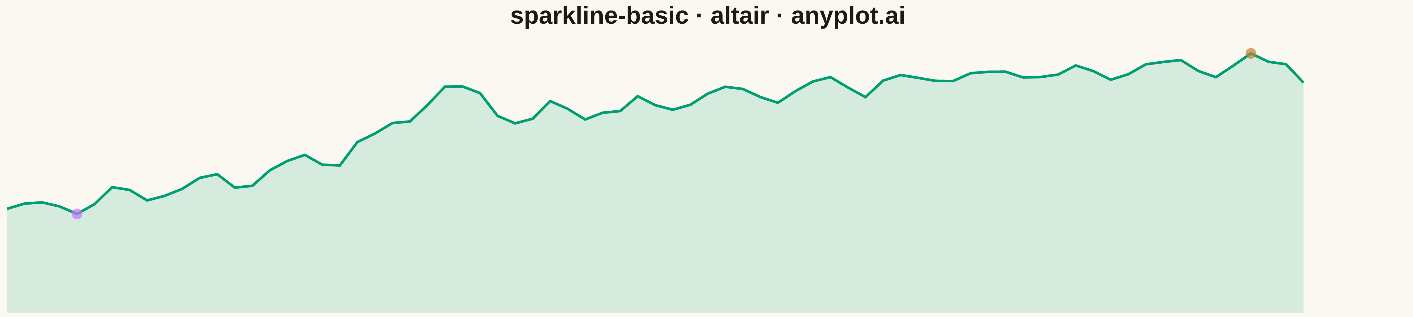
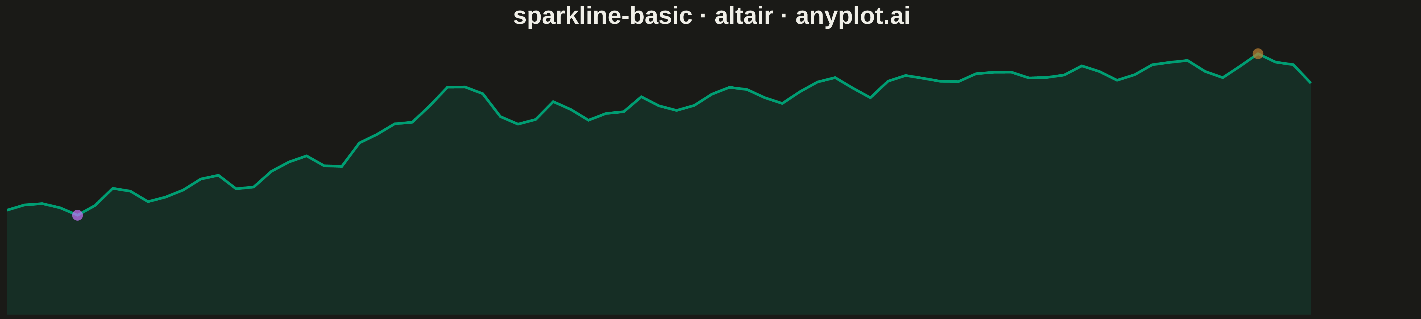
A sparkline is a small, condensed line chart designed to be embedded inline with text or in dashboard cells. It shows trends at a glance without axes, labels, or detailed scales - pure data visualization in minimal space. The defining characteristic is extreme minimalism: a single continuous line that conveys the shape of data without any chart chrome.
"""anyplot.ai
sparkline-basic: Basic Sparkline
Library: altair 6.0.0 | Python 3.13.11
Quality: 78/100 | Updated: 2026-05-03
"""

import os

import altair as alt
import numpy as np
import pandas as pd


# Theme tokens
THEME = os.getenv("ANYPLOT_THEME", "light")
PAGE_BG = "#FAF8F1" if THEME == "light" else "#1A1A17"
INK = "#1A1A17" if THEME == "light" else "#F0EFE8"
INK_SOFT = "#4A4A44" if THEME == "light" else "#B8B7B0"

# Okabe-Ito palette
IMPRINT = ["#009E73", "#C475FD", "#4467A3", "#BD8233",
             "#AE3030", "#2ABCCD", "#954477"]

# Data - 75 consecutive business days: a product's launch-to-maturity user trend
# with viral spike, long-tail stabilization, and recovery — a classic adoption curve
np.random.seed(42)
n_points = 75
day = np.arange(n_points)

# S-shaped adoption curve: slow start → acceleration → saturation
adoption = 40 + 60 * (1 - np.exp(-day / 20)) ** 2
# Viral launch-week spike
spike = 18 * np.exp(-((day - 25) ** 2) / 8)
# Weekly engagement pattern
weekly = 3 * np.sin(2 * np.pi * day / 5)
noise = np.random.randn(n_points) * 1.5
users = adoption + spike + weekly + noise

df = pd.DataFrame({"day": day, "users": users})

# Min/max highlights
min_idx = df["users"].idxmin()
max_idx = df["users"].idxmax()
highlights = df.iloc[[min_idx, max_idx]].copy()
highlights["type"] = ["min", "max"]

# Semi-transparent area fill — Altair's layered chart pattern
fill = (
    alt.Chart(df)
    .mark_area(color=IMPRINT[0], opacity=0.15)
    .encode(
        x=alt.X("day:Q", axis=None),
        y=alt.Y("users:Q", axis=None, scale=alt.Scale(zero=False)),
    )
)

# Main line
line = (
    alt.Chart(df)
    .mark_line(color=IMPRINT[0], strokeWidth=3)
    .encode(
        x=alt.X("day:Q", axis=None),
        y=alt.Y("users:Q", axis=None, scale=alt.Scale(zero=False)),
    )
)

# Highlight min (orange) and max (violet)
points = (
    alt.Chart(highlights)
    .mark_circle(size=150)
    .encode(
        x=alt.X("day:Q", axis=None),
        y=alt.Y("users:Q", axis=None, scale=alt.Scale(zero=False)),
        color=alt.Color(
            "type:N",
            scale=alt.Scale(domain=["min", "max"],
                            range=[IMPRINT[1], IMPRINT[3]]),
            legend=None,
        ),
    )
)

# Combine layers
chart = (
    (fill + line + points)
    .properties(
        width=1600,
        height=320,  # ~5:1 aspect ratio
        background=PAGE_BG,
        title=alt.Title("sparkline-basic · altair · anyplot.ai",
                        fontSize=28, color=INK),
    )
    .configure_axis(domainColor=INK_SOFT, tickColor=INK_SOFT,
                    labelColor=INK_SOFT, titleColor=INK)
    .configure_view(strokeWidth=0)
)

# Save as PNG and HTML
chart.save(f"plot-{THEME}.png", scale_factor=3.0)
chart.save(f"plot-{THEME}.html")
Runnable source as JSON, for any HTTP client: https://api.anyplot.ai/specs/sparkline-basic/altair/code. Any spec id and library id listed in llms-full.txt fit the same URL shape; every URL below is complete and callable.
{
  "spec_id": "sparkline-basic",
  "language": "python",
  "library": "altair",
  "page": "https://anyplot.ai/sparkline-basic/python/altair",
  "hub": "https://anyplot.ai/sparkline-basic",
  "code_json": "https://api.anyplot.ai/specs/sparkline-basic/altair/code",
  "spec_json": "https://api.anyplot.ai/specs/sparkline-basic",
  "render_light_png": "https://storage.googleapis.com/anyplot-images/plots/sparkline-basic/python/altair/plot-light.png",
  "render_dark_png": "https://storage.googleapis.com/anyplot-images/plots/sparkline-basic/python/altair/plot-dark.png",
  "interactive_light_html": "https://storage.googleapis.com/anyplot-images/plots/sparkline-basic/python/altair/plot-light.html",
  "interactive_dark_html": "https://storage.googleapis.com/anyplot-images/plots/sparkline-basic/python/altair/plot-dark.html",
  "quality_score": 78.0,
  "license": "MIT",
  "guide": "https://anyplot.ai/llms.txt"
}
Part of Basic Sparkline on anyplot.ai.