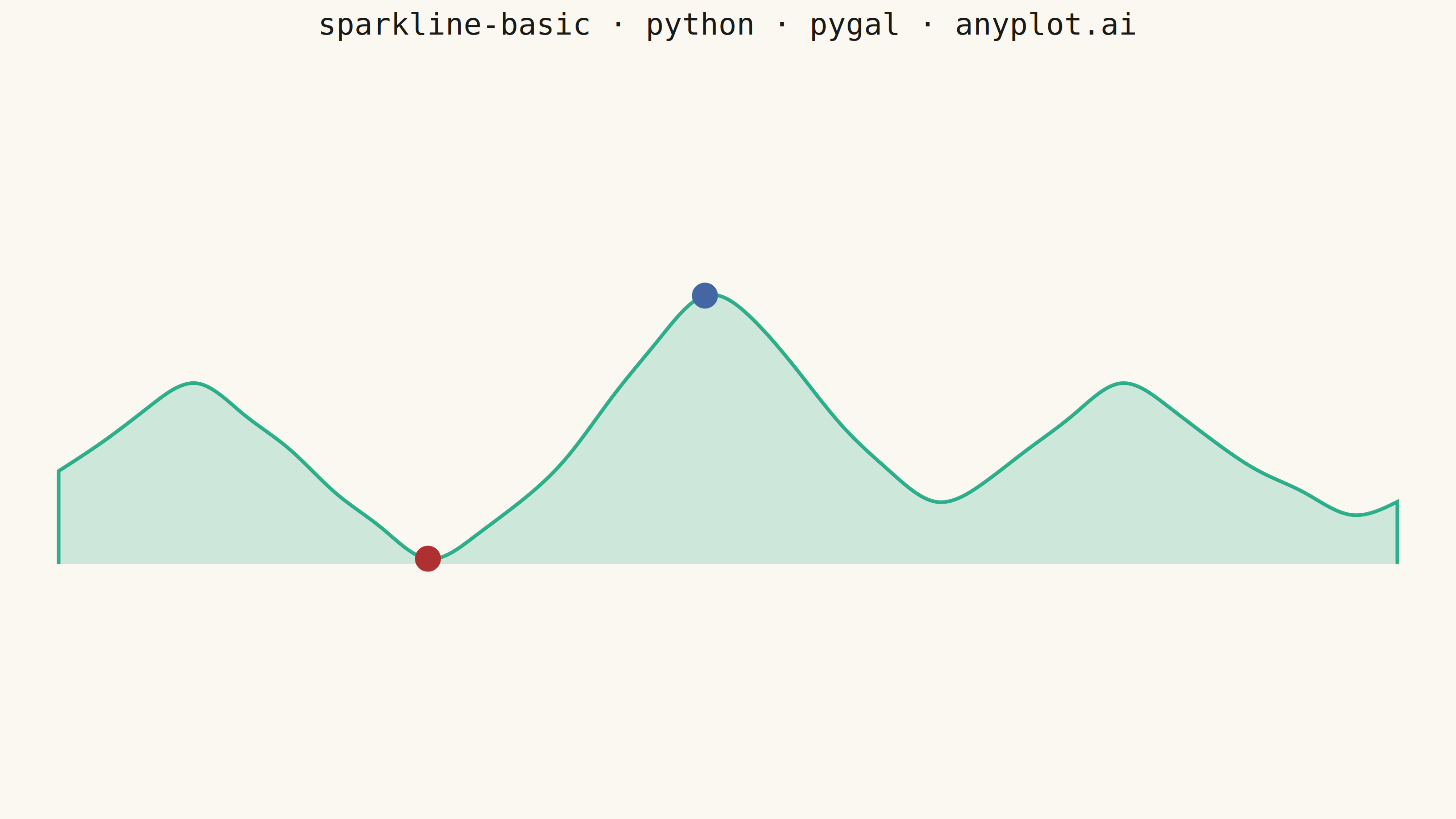
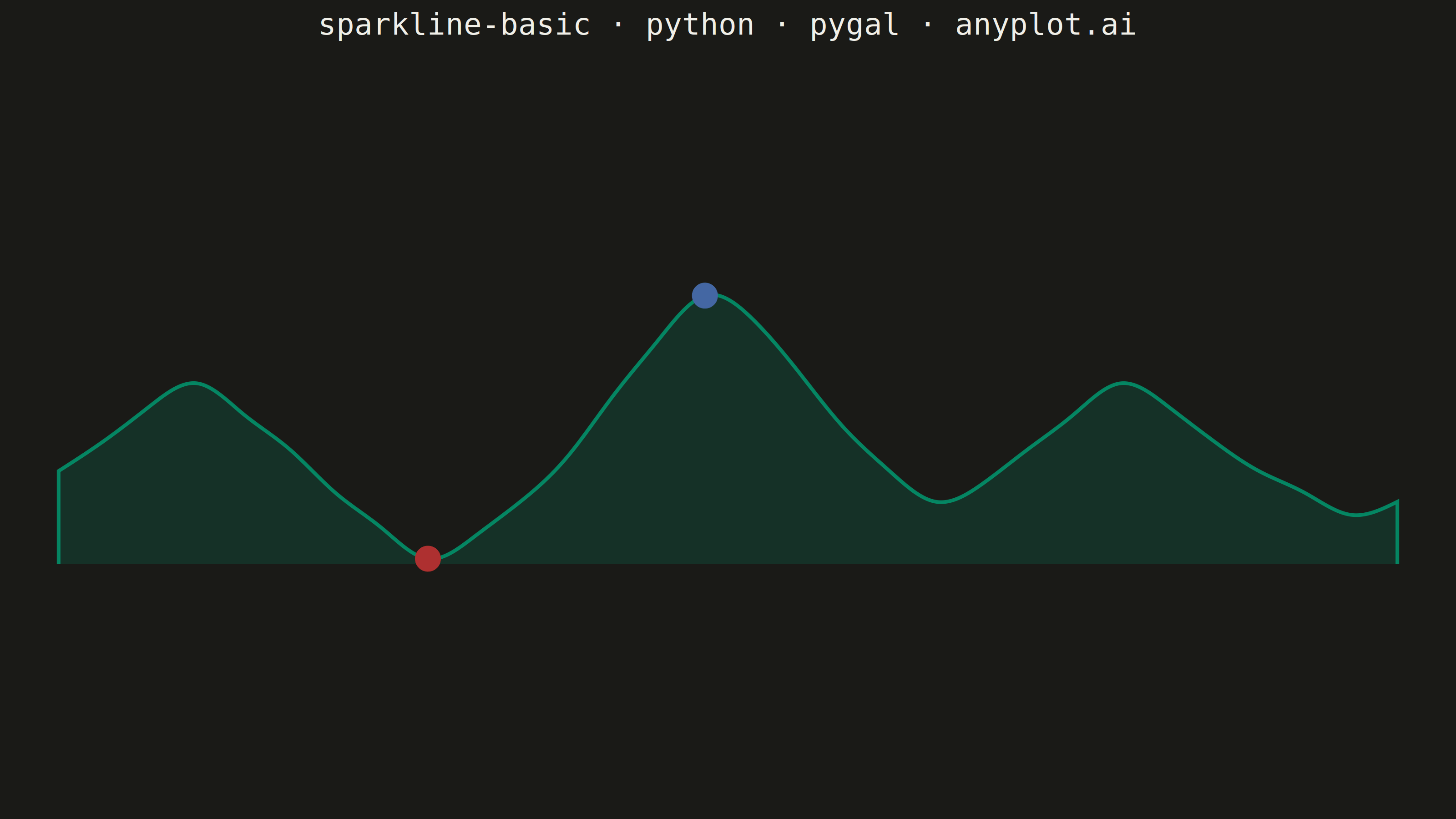
A sparkline is a small, condensed line chart designed to be embedded inline with text or in dashboard cells. It shows trends at a glance without axes, labels, or detailed scales - pure data visualization in minimal space. The defining characteristic is extreme minimalism: a single continuous line that conveys the shape of data without any chart chrome.
""" anyplot.ai
sparkline-basic: Basic Sparkline
Library: pygal 3.1.0 | Python 3.13.13
Quality: 90/100 | Updated: 2026-06-16
"""

import os

import pygal
from pygal.style import Style


# Theme tokens (see prompts/default-style-guide.md "Theme-adaptive Chrome")
THEME = os.getenv("ANYPLOT_THEME", "light")
PAGE_BG = "#FAF8F1" if THEME == "light" else "#1A1A17"
INK = "#1A1A17" if THEME == "light" else "#F0EFE8"
INK_MUTED = "#6B6A63" if THEME == "light" else "#A8A79F"

# Imprint palette — data colors stay constant across themes
BRAND = "#009E73"  # position 1 — sparkline trend line
PEAK = "#4467A3"  # position 3 — blue dot marks the high point
TROUGH = "#AE3030"  # position 5 — matte red dot marks the low point

# Data — simulated daily sales trend with balanced ups and downs (no dominant drift)
values = [
    65,
    72,
    80,
    85,
    78,
    70,
    60,
    52,
    45,
    50,
    58,
    68,
    82,
    95,
    105,
    100,
    88,
    75,
    65,
    58,
    62,
    70,
    78,
    85,
    80,
    72,
    65,
    60,
    55,
    58,
]

# Locate extrema to highlight with colored dots
max_val = max(values)
min_val = min(values)
max_idx = values.index(max_val)
min_idx = values.index(min_val)

# Sparkline style — pure visualization: no axes, ticks, guides or legend.
# foreground_strong drives the title, so it must carry the theme ink (the
# previous version set it transparent, which hid the title entirely).
custom_style = Style(
    background=PAGE_BG,
    plot_background=PAGE_BG,
    foreground=INK,
    foreground_strong=INK,
    foreground_subtle=INK_MUTED,
    colors=(BRAND, PEAK, TROUGH),
    title_font_size=66,
    label_font_size=1,
    major_label_font_size=1,
    legend_font_size=1,
    value_font_size=1,
    tooltip_font_size=1,
    stroke_width=8,
    opacity=0.18,  # soft area fill under the trend line
    opacity_hover=0.30,
)

# Compress the line into a wide, short band centered in the 3200×1800 canvas so
# it reads as a true sparkline (~4.5:1) while honoring the fixed output size.
chart = pygal.Line(
    width=3200,
    height=1800,
    style=custom_style,
    show_x_labels=False,
    show_y_labels=False,
    show_x_guides=False,
    show_y_guides=False,
    show_legend=False,
    show_dots=False,
    print_values=False,
    fill=True,
    interpolate="cubic",
    margin_top=560,
    margin_bottom=560,
    margin_left=70,
    margin_right=70,
    dots_size=28,
    title="sparkline-basic · python · pygal · anyplot.ai",
)

# Trend line (filled area)
chart.add("", values)

# High point — single blue dot, no line, no fill
peak_series = [None] * len(values)
peak_series[max_idx] = max_val
chart.add("", peak_series, stroke=False, show_dots=True, fill=False)

# Low point — single red dot, no line, no fill
trough_series = [None] * len(values)
trough_series[min_idx] = min_val
chart.add("", trough_series, stroke=False, show_dots=True, fill=False)

# Save
chart.render_to_png(f"plot-{THEME}.png")
with open(f"plot-{THEME}.html", "wb") as f:
    f.write(chart.render())
Runnable source as JSON, for any HTTP client: https://api.anyplot.ai/specs/sparkline-basic/pygal/code. Any spec id and library id listed in llms-full.txt fit the same URL shape; every URL below is complete and callable.
{
  "spec_id": "sparkline-basic",
  "language": "python",
  "library": "pygal",
  "page": "https://anyplot.ai/sparkline-basic/python/pygal",
  "hub": "https://anyplot.ai/sparkline-basic",
  "code_json": "https://api.anyplot.ai/specs/sparkline-basic/pygal/code",
  "spec_json": "https://api.anyplot.ai/specs/sparkline-basic",
  "render_light_png": "https://storage.googleapis.com/anyplot-images/plots/sparkline-basic/python/pygal/plot-light.png",
  "render_dark_png": "https://storage.googleapis.com/anyplot-images/plots/sparkline-basic/python/pygal/plot-dark.png",
  "interactive_light_html": "https://storage.googleapis.com/anyplot-images/plots/sparkline-basic/python/pygal/plot-light.html",
  "interactive_dark_html": "https://storage.googleapis.com/anyplot-images/plots/sparkline-basic/python/pygal/plot-dark.html",
  "quality_score": 90.0,
  "license": "MIT",
  "guide": "https://anyplot.ai/llms.txt"
}
Part of Basic Sparkline on anyplot.ai.