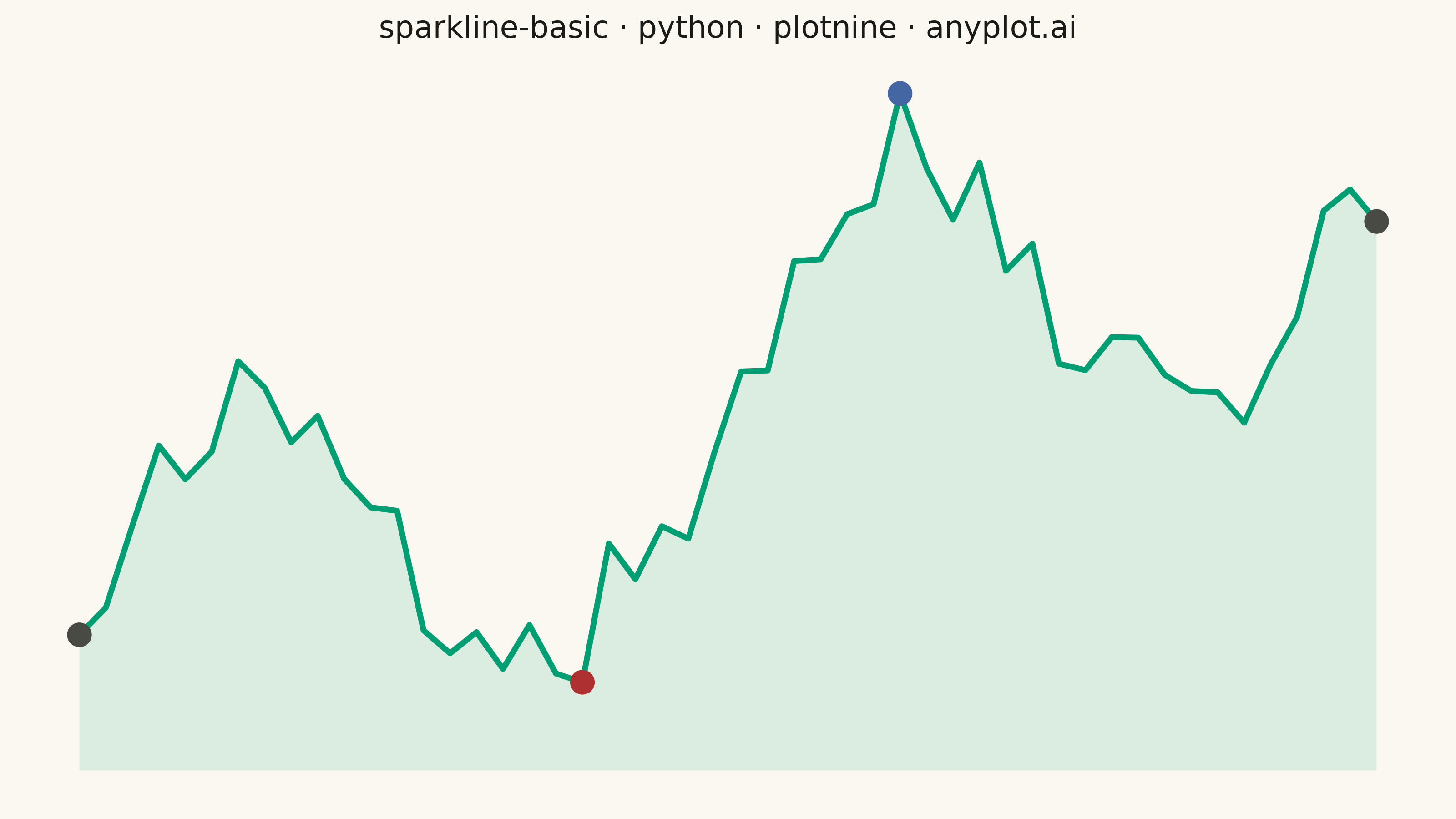
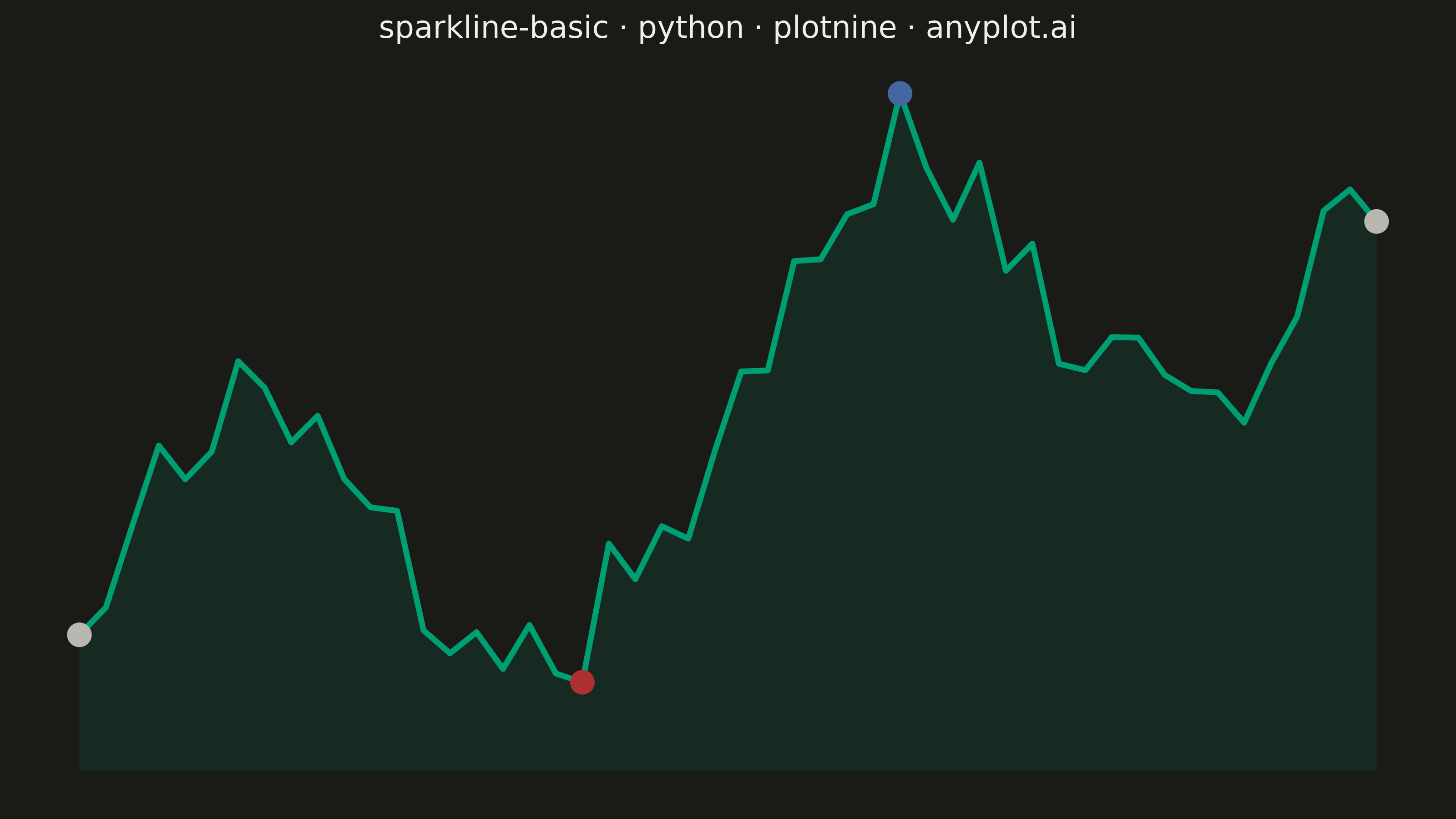
A sparkline is a small, condensed line chart designed to be embedded inline with text or in dashboard cells. It shows trends at a glance without axes, labels, or detailed scales - pure data visualization in minimal space. The defining characteristic is extreme minimalism: a single continuous line that conveys the shape of data without any chart chrome.
""" anyplot.ai
sparkline-basic: Basic Sparkline
Library: plotnine 0.15.7 | Python 3.13.13
Quality: 89/100 | Updated: 2026-06-16
"""

import os

import numpy as np
import pandas as pd
from plotnine import (
    aes,
    element_blank,
    element_rect,
    element_text,
    geom_line,
    geom_point,
    geom_ribbon,
    ggplot,
    labs,
    scale_color_manual,
    theme,
)


# Theme tokens (see prompts/default-style-guide.md "Theme-adaptive Chrome")
THEME = os.getenv("ANYPLOT_THEME", "light")
PAGE_BG = "#FAF8F1" if THEME == "light" else "#1A1A17"
INK = "#1A1A17" if THEME == "light" else "#F0EFE8"
INK_MUTED = "#4A4A44" if THEME == "light" else "#B8B7B0"

# Imprint palette — brand green is the single data series; the two extremes
# read as a red/blue divergence (low extreme → matte red, high extreme → blue).
BRAND = "#009E73"  # Imprint position 1 — always the first series
LOW = "#AE3030"  # Imprint position 5 — semantic anchor for the minimum
HIGH = "#4467A3"  # Imprint position 3 — the maximum (high extreme)

# Data — simulated daily sales trend with seasonality and noise
np.random.seed(42)
n_points = 50

trend = np.linspace(0, 3, n_points)
seasonal = 2 * np.sin(np.linspace(0, 4 * np.pi, n_points))
noise = np.random.randn(n_points) * 0.8
sales = 100 + trend * 10 + seasonal * 5 + noise * 3

df = pd.DataFrame({"day": range(n_points), "sales": sales})

# Baseline for the subtle area fill — sits just below the lowest value so the
# tinted band hugs the line rather than swelling from a zero baseline.
fill_base = df["sales"].min() - (df["sales"].max() - df["sales"].min()) * 0.15

# Highlight the min, max, and the two endpoints for reference
min_idx = int(df["sales"].idxmin())
max_idx = int(df["sales"].idxmax())

highlight_df = pd.DataFrame(
    {
        "day": [min_idx, max_idx, 0, n_points - 1],
        "sales": [
            df.loc[min_idx, "sales"],
            df.loc[max_idx, "sales"],
            df.loc[0, "sales"],
            df.loc[n_points - 1, "sales"],
        ],
        "type": ["min", "max", "endpoint", "endpoint"],
    }
)

# Plot — minimal sparkline: subtle area fill, thin brand line, highlighted
# extremes/endpoints. The ribbon adds quiet storytelling without chrome.
plot = (
    ggplot(df, aes(x="day", y="sales"))
    + geom_ribbon(aes(ymin=fill_base, ymax="sales"), fill=BRAND, alpha=0.12)
    + geom_line(color=BRAND, size=1.3)
    + geom_point(data=highlight_df, mapping=aes(x="day", y="sales", color="type"), size=4.5)
    + scale_color_manual(values={"min": LOW, "max": HIGH, "endpoint": INK_MUTED})
    + labs(title="sparkline-basic · python · plotnine · anyplot.ai")
    + theme(
        figure_size=(8, 4.5),
        # Strip all chart chrome for the pure sparkline aesthetic
        axis_title=element_blank(),
        axis_text=element_blank(),
        axis_ticks=element_blank(),
        axis_line=element_blank(),
        panel_grid_major=element_blank(),
        panel_grid_minor=element_blank(),
        panel_background=element_rect(fill=PAGE_BG),
        plot_background=element_rect(fill=PAGE_BG, color=PAGE_BG),
        plot_title=element_text(size=12, ha="center", color=INK),
        legend_position="none",
    )
)

# Save
plot.save(f"plot-{THEME}.png", dpi=400, width=8, height=4.5, units="in", verbose=False)
Runnable source as JSON, for any HTTP client: https://api.anyplot.ai/specs/sparkline-basic/plotnine/code. Any spec id and library id listed in llms-full.txt fit the same URL shape; every URL below is complete and callable.
{
  "spec_id": "sparkline-basic",
  "language": "python",
  "library": "plotnine",
  "page": "https://anyplot.ai/sparkline-basic/python/plotnine",
  "hub": "https://anyplot.ai/sparkline-basic",
  "code_json": "https://api.anyplot.ai/specs/sparkline-basic/plotnine/code",
  "spec_json": "https://api.anyplot.ai/specs/sparkline-basic",
  "render_light_png": "https://storage.googleapis.com/anyplot-images/plots/sparkline-basic/python/plotnine/plot-light.png",
  "render_dark_png": "https://storage.googleapis.com/anyplot-images/plots/sparkline-basic/python/plotnine/plot-dark.png",
  "quality_score": 89.0,
  "license": "MIT",
  "guide": "https://anyplot.ai/llms.txt"
}
Part of Basic Sparkline on anyplot.ai.