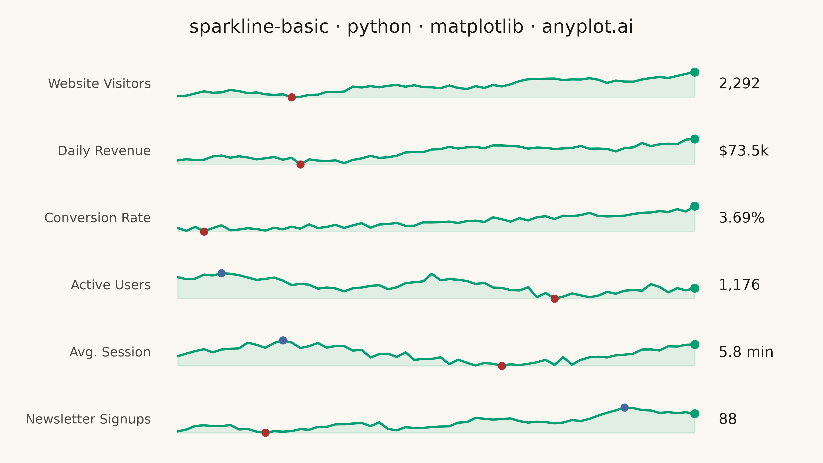
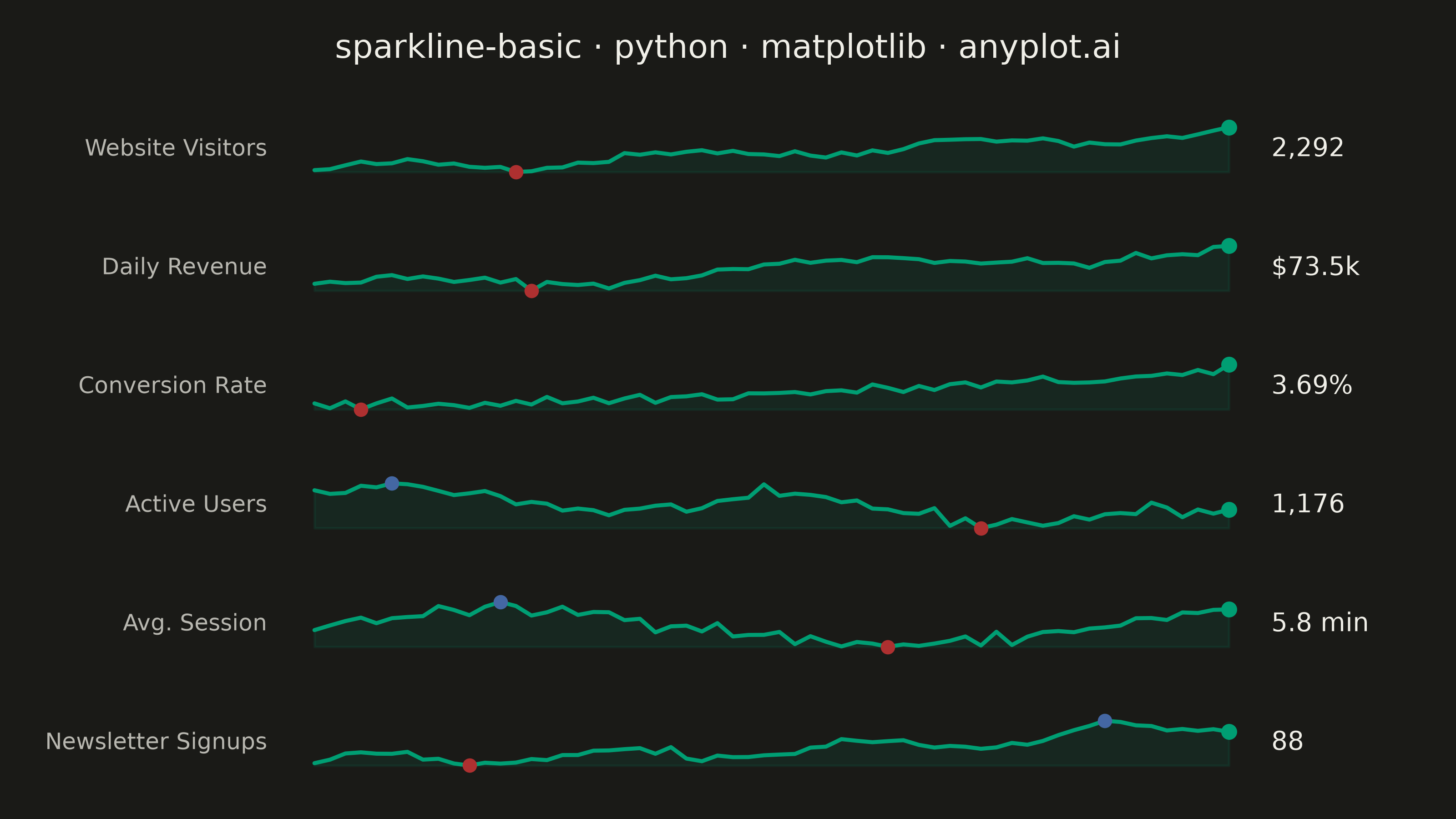
A sparkline is a small, condensed line chart designed to be embedded inline with text or in dashboard cells. It shows trends at a glance without axes, labels, or detailed scales - pure data visualization in minimal space. The defining characteristic is extreme minimalism: a single continuous line that conveys the shape of data without any chart chrome.
""" anyplot.ai
sparkline-basic: Basic Sparkline
Library: matplotlib 3.11.0 | Python 3.13.13
Quality: 91/100 | Updated: 2026-06-16
"""

import os

import matplotlib.pyplot as plt
import numpy as np


# Theme tokens (see prompts/default-style-guide.md "Theme-adaptive Chrome")
THEME = os.getenv("ANYPLOT_THEME", "light")
PAGE_BG = "#FAF8F1" if THEME == "light" else "#1A1A17"
INK = "#1A1A17" if THEME == "light" else "#F0EFE8"
INK_SOFT = "#4A4A44" if THEME == "light" else "#B8B7B0"

# Imprint palette — single hue for every sparkline (one metric "family")
BRAND = "#009E73"  # Imprint position 1 — the line, ALWAYS first series
LOW = "#AE3030"  # Imprint position 5 — marks each series minimum
HIGH = "#4467A3"  # Imprint position 3 — marks each series maximum

# Data — a KPI dashboard of small-multiple sparklines (60-day trends).
# Sparklines shine as small multiples in table/dashboard cells (see spec
# "Applications"): each row is one metric, drawn axis-free and compact.
np.random.seed(42)
n_points = 60
x = np.arange(n_points)

# Each metric: a distinct trend shape, its current-value format, and unit.
visitors = 1200 + 16 * x + 130 * np.sin(x / 3.0) + np.random.randn(n_points) * 55
revenue = 38 + 0.55 * x + 6 * np.sin(x / 5.0 + 1) + np.random.randn(n_points) * 2.2
conversion = 2.0 + 1.4 * (x / n_points) ** 1.5 + np.random.randn(n_points) * 0.12
active = 1500 - 9 * x + 180 * np.sin(x / 4.0) + np.random.randn(n_points) * 70
session = 4.6 + 1.2 * np.sin(x / 8.0) + np.random.randn(n_points) * 0.25
signups = 30 + 80 * (x / n_points) ** 2 + 14 * np.sin(x / 2.5) + np.random.randn(n_points) * 6

metrics = [
    ("Website Visitors", visitors, "{:,.0f}"),
    ("Daily Revenue", revenue, "${:.1f}k"),
    ("Conversion Rate", conversion, "{:.2f}%"),
    ("Active Users", active, "{:,.0f}"),
    ("Avg. Session", session, "{:.1f} min"),
    ("Newsletter Signups", signups, "{:,.0f}"),
]

# Plot — one slim, chrome-free axes per metric, stacked vertically
fig, axes = plt.subplots(len(metrics), 1, figsize=(8, 4.5), dpi=400, facecolor=PAGE_BG)
fig.subplots_adjust(left=0.20, right=0.86, top=0.86, bottom=0.05, hspace=0.7)

for ax, (name, values, fmt) in zip(axes, metrics, strict=True):
    ax.set_facecolor(PAGE_BG)

    # Thin line + faint area fill — the defining sparkline look
    ax.plot(x, values, color=BRAND, linewidth=1.6, solid_capstyle="round")
    ax.fill_between(x, values, values.min(), color=BRAND, alpha=0.10)

    # Highlight the extremes and the latest point
    i_min, i_max = int(values.argmin()), int(values.argmax())
    ax.scatter(i_min, values[i_min], s=22, color=LOW, zorder=5)
    ax.scatter(i_max, values[i_max], s=22, color=HIGH, zorder=5)
    ax.scatter(x[-1], values[-1], s=28, color=BRAND, zorder=6)

    # Strip all chart chrome — pure sparkline
    ax.set_xticks([])
    ax.set_yticks([])
    for spine in ax.spines.values():
        spine.set_visible(False)

    # Breathing room so the line never touches the cell edges
    pad = (values.max() - values.min()) * 0.28
    ax.set_ylim(values.min() - pad, values.max() + pad)
    ax.set_xlim(-1.5, n_points + 0.5)

    # Metric name (left) and current value (right), table-cell style
    ax.text(-0.025, 0.5, name, transform=ax.transAxes, ha="right", va="center", fontsize=9, color=INK_SOFT)
    ax.text(
        1.02,
        0.5,
        fmt.format(values[-1]),
        transform=ax.transAxes,
        ha="left",
        va="center",
        fontsize=10,
        fontweight="medium",
        color=INK,
    )

# Title (mandated format)
fig.suptitle("sparkline-basic · python · matplotlib · anyplot.ai", fontsize=13, fontweight="medium", color=INK, y=0.96)

# Save (figsize 8x4.5 @ dpi 400 → 3200x1800; no bbox_inches — see library prompt)
plt.savefig(f"plot-{THEME}.png", dpi=400, facecolor=PAGE_BG)
Runnable source as JSON, for any HTTP client: https://api.anyplot.ai/specs/sparkline-basic/matplotlib/code. Any spec id and library id listed in llms-full.txt fit the same URL shape; every URL below is complete and callable.
{
  "spec_id": "sparkline-basic",
  "language": "python",
  "library": "matplotlib",
  "page": "https://anyplot.ai/sparkline-basic/python/matplotlib",
  "hub": "https://anyplot.ai/sparkline-basic",
  "code_json": "https://api.anyplot.ai/specs/sparkline-basic/matplotlib/code",
  "spec_json": "https://api.anyplot.ai/specs/sparkline-basic",
  "render_light_png": "https://storage.googleapis.com/anyplot-images/plots/sparkline-basic/python/matplotlib/plot-light.png",
  "render_dark_png": "https://storage.googleapis.com/anyplot-images/plots/sparkline-basic/python/matplotlib/plot-dark.png",
  "quality_score": 91.0,
  "license": "MIT",
  "guide": "https://anyplot.ai/llms.txt"
}
Part of Basic Sparkline on anyplot.ai.