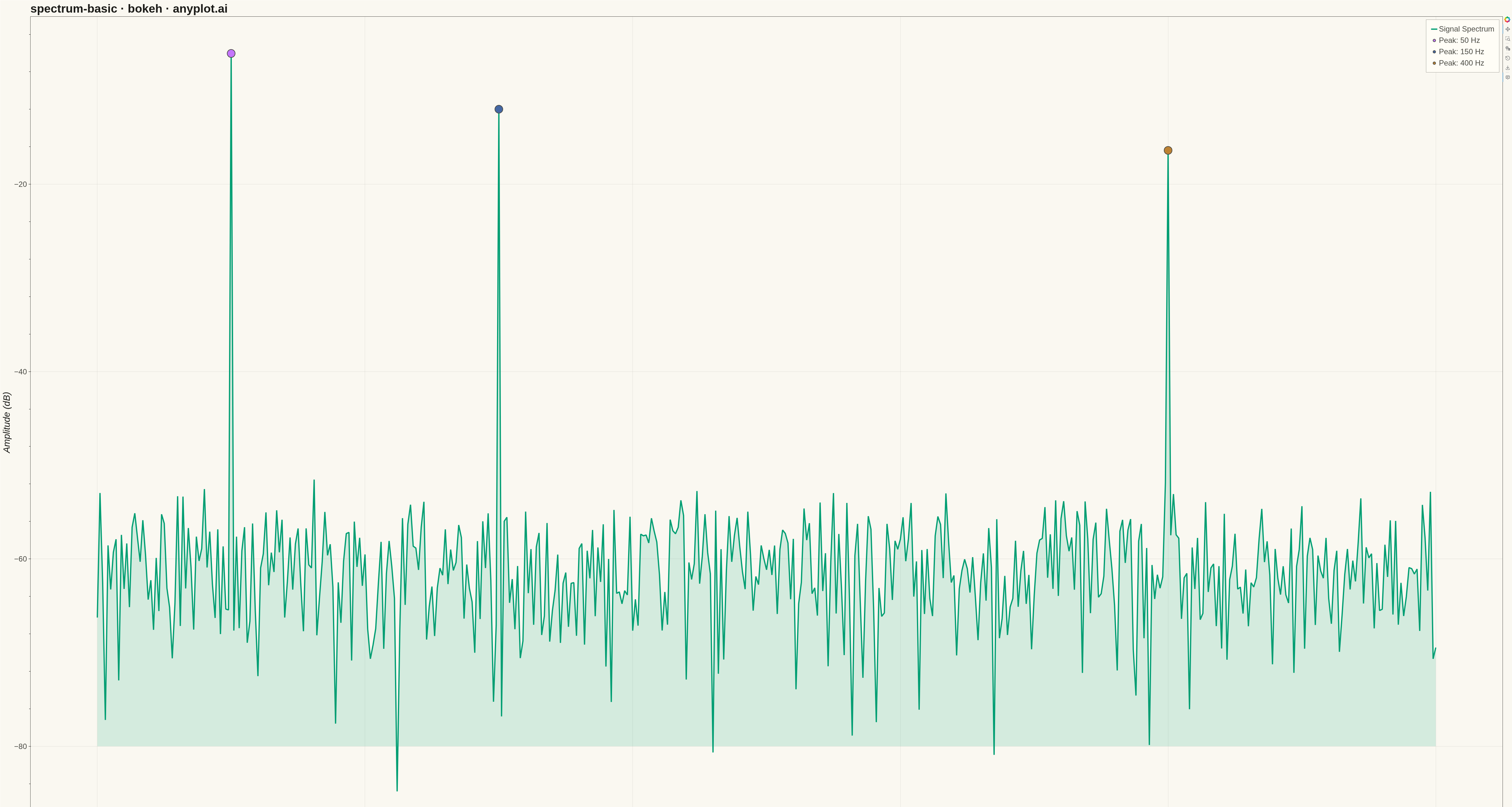
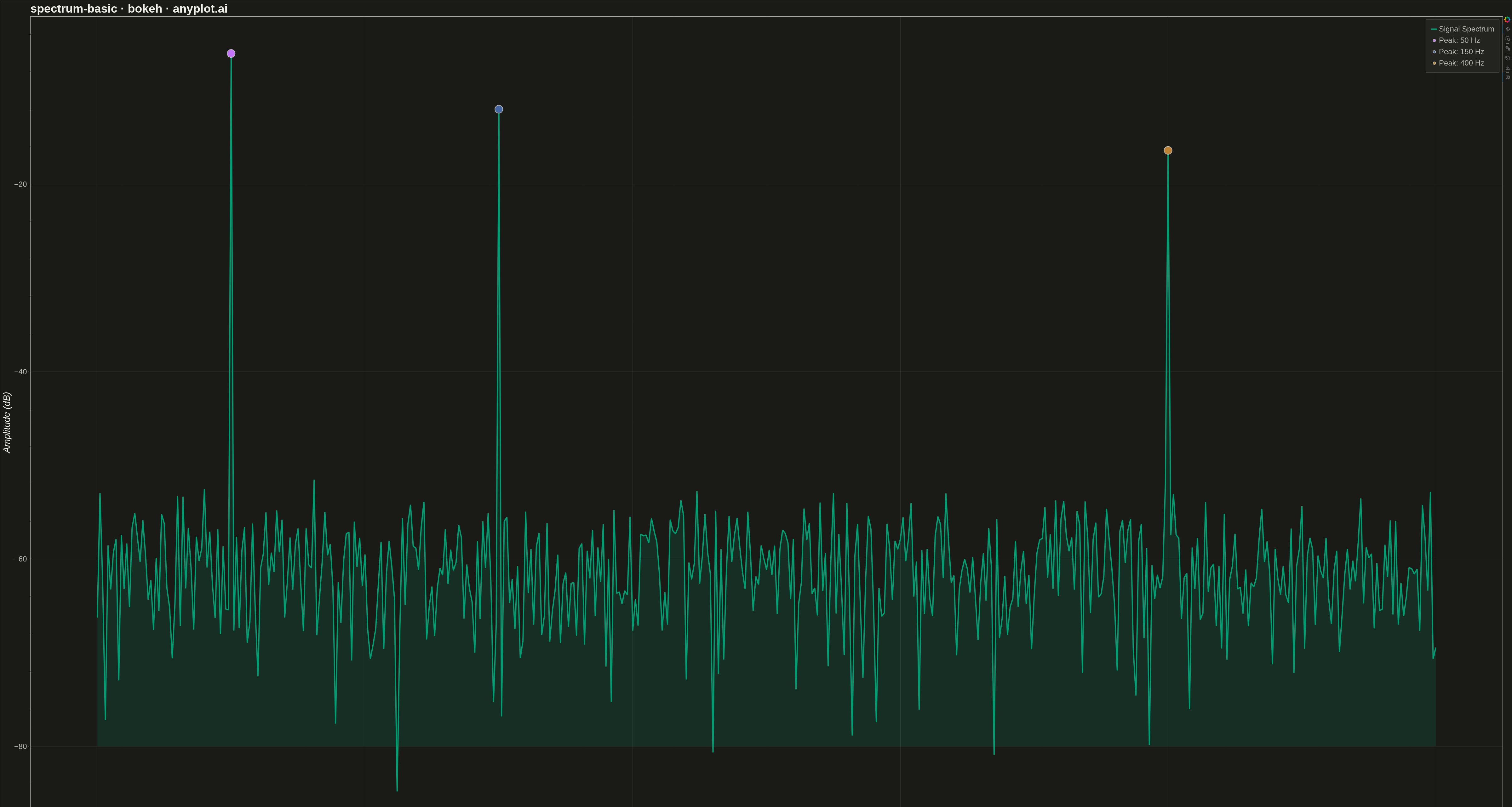
A frequency spectrum plot displays signal amplitude or power across a range of frequencies, showing the frequency domain representation of time-series data. This visualization reveals the frequency components present in a signal, making it essential for identifying dominant frequencies, harmonics, and noise characteristics. It is fundamental in signal processing, audio engineering, and vibration analysis.
""" anyplot.ai
spectrum-basic: Frequency Spectrum Plot
Library: bokeh 3.9.0 | Python 3.13.13
Quality: 92/100 | Updated: 2026-05-14
"""

import os
import time
from pathlib import Path

import numpy as np
from bokeh.io import output_file, save
from bokeh.models import ColumnDataSource, HoverTool
from bokeh.plotting import figure
from selenium import webdriver
from selenium.webdriver.chrome.options import Options


# Theme tokens (see prompts/default-style-guide.md)
THEME = os.getenv("ANYPLOT_THEME", "light")
PAGE_BG = "#FAF8F1" if THEME == "light" else "#1A1A17"
ELEVATED_BG = "#FFFDF6" if THEME == "light" else "#242420"
INK = "#1A1A17" if THEME == "light" else "#F0EFE8"
INK_SOFT = "#4A4A44" if THEME == "light" else "#B8B7B0"
BRAND = "#009E73"  # Okabe-Ito position 1

# Data: Generate synthetic signal with multiple frequency components
np.random.seed(42)
sample_rate = 8192  # Hz
duration = 1.0  # seconds
n_samples = int(sample_rate * duration)
t = np.linspace(0, duration, n_samples, endpoint=False)

# Create composite signal: 50 Hz base, 150 Hz harmonic, 400 Hz component, plus noise
signal = (
    1.0 * np.sin(2 * np.pi * 50 * t)  # Fundamental at 50 Hz
    + 0.5 * np.sin(2 * np.pi * 150 * t)  # Harmonic at 150 Hz
    + 0.3 * np.sin(2 * np.pi * 400 * t)  # Component at 400 Hz
    + 0.1 * np.random.randn(n_samples)  # Noise
)

# Compute FFT
fft_result = np.fft.rfft(signal)
frequencies = np.fft.rfftfreq(n_samples, 1 / sample_rate)
amplitude = np.abs(fft_result) / n_samples

# Convert to dB scale (with floor to avoid log(0))
amplitude_db = 20 * np.log10(np.maximum(amplitude, 1e-10))

# Limit to 500 Hz for better visualization
mask = frequencies <= 500
frequencies = frequencies[mask]
amplitude_db = amplitude_db[mask]

# Create data source with formatted strings for hover
source = ColumnDataSource(
    data={
        "frequency": frequencies,
        "amplitude": amplitude_db,
        "freq_str": [f"{f:.1f} Hz" for f in frequencies],
        "amp_str": [f"{a:.1f} dB" for a in amplitude_db],
    }
)

# Create figure (4800 x 2700 px for 16:9)
p = figure(
    width=4800,
    height=2700,
    title="spectrum-basic · bokeh · anyplot.ai",
    x_axis_label="Frequency (Hz)",
    y_axis_label="Amplitude (dB)",
    tools="pan,wheel_zoom,box_zoom,reset,save",
)

# Plot spectrum as line
p.line(x="frequency", y="amplitude", source=source, line_width=4, line_color=BRAND, legend_label="Signal Spectrum")

# Add subtle fill under the curve
p.varea(x="frequency", y1="amplitude", y2=-80, source=source, fill_color=BRAND, fill_alpha=0.15)

# Add HoverTool for interactivity
hover = HoverTool(tooltips=[("Frequency", "@freq_str"), ("Amplitude", "@amp_str")])
p.add_tools(hover)

# Mark peak frequencies with circles
peak_freqs = [50, 150, 400]
peak_colors = ["#C475FD", "#4467A3", "#BD8233"]  # Okabe-Ito positions 2, 3, 4
for freq, color in zip(peak_freqs, peak_colors, strict=True):
    freq_idx = np.argmin(np.abs(frequencies - freq))
    peak_amp = amplitude_db[freq_idx]

    p.scatter(
        x=[freq], y=[peak_amp], size=25, color=color, line_color=INK_SOFT, line_width=2, legend_label=f"Peak: {freq} Hz"
    )

# Styling - text sizes for large canvas (4800x2700)
p.title.text_font_size = "28pt"
p.title.text_color = INK
p.xaxis.axis_label_text_font_size = "22pt"
p.yaxis.axis_label_text_font_size = "22pt"
p.xaxis.major_label_text_font_size = "18pt"
p.yaxis.major_label_text_font_size = "18pt"
p.xaxis.axis_label_text_color = INK
p.yaxis.axis_label_text_color = INK
p.xaxis.major_label_text_color = INK_SOFT
p.yaxis.major_label_text_color = INK_SOFT

# Axis lines and ticks
p.xaxis.axis_line_color = INK_SOFT
p.yaxis.axis_line_color = INK_SOFT
p.xaxis.major_tick_line_color = INK_SOFT
p.yaxis.major_tick_line_color = INK_SOFT

# Grid styling - subtle
p.xgrid.grid_line_color = INK
p.ygrid.grid_line_color = INK
p.xgrid.grid_line_alpha = 0.10
p.ygrid.grid_line_alpha = 0.10

# Legend styling with larger text
if p.legend:
    p.legend.label_text_font_size = "18pt"
    p.legend.label_text_color = INK_SOFT
    p.legend.location = "top_right"
    p.legend.background_fill_color = ELEVATED_BG
    p.legend.border_line_color = INK_SOFT
    p.legend.padding = 15
    p.legend.spacing = 8

# Background and border
p.background_fill_color = PAGE_BG
p.border_fill_color = PAGE_BG
p.outline_line_color = INK_SOFT

# Save the interactive HTML
output_file(f"plot-{THEME}.html")
save(p)

# Screenshot with headless Chrome — Selenium 4 / Selenium Manager
W, H = 4800, 2700
opts = Options()
for arg in (
    "--headless=new",
    "--no-sandbox",
    "--disable-dev-shm-usage",
    "--disable-gpu",
    f"--window-size={W},{H}",
    "--hide-scrollbars",
):
    opts.add_argument(arg)
driver = webdriver.Chrome(options=opts)
driver.set_window_size(W, H)
driver.get(f"file://{Path(f'plot-{THEME}.html').resolve()}")
time.sleep(3)
driver.save_screenshot(f"plot-{THEME}.png")
driver.quit()
Runnable source as JSON, for any HTTP client: https://api.anyplot.ai/specs/spectrum-basic/bokeh/code. Any spec id and library id listed in llms-full.txt fit the same URL shape; every URL below is complete and callable.
{
  "spec_id": "spectrum-basic",
  "language": "python",
  "library": "bokeh",
  "page": "https://anyplot.ai/spectrum-basic/python/bokeh",
  "hub": "https://anyplot.ai/spectrum-basic",
  "code_json": "https://api.anyplot.ai/specs/spectrum-basic/bokeh/code",
  "spec_json": "https://api.anyplot.ai/specs/spectrum-basic",
  "render_light_png": "https://storage.googleapis.com/anyplot-images/plots/spectrum-basic/python/bokeh/plot-light.png",
  "render_dark_png": "https://storage.googleapis.com/anyplot-images/plots/spectrum-basic/python/bokeh/plot-dark.png",
  "interactive_light_html": "https://storage.googleapis.com/anyplot-images/plots/spectrum-basic/python/bokeh/plot-light.html",
  "interactive_dark_html": "https://storage.googleapis.com/anyplot-images/plots/spectrum-basic/python/bokeh/plot-dark.html",
  "quality_score": 92.0,
  "license": "MIT",
  "guide": "https://anyplot.ai/llms.txt"
}
Part of Frequency Spectrum Plot on anyplot.ai.