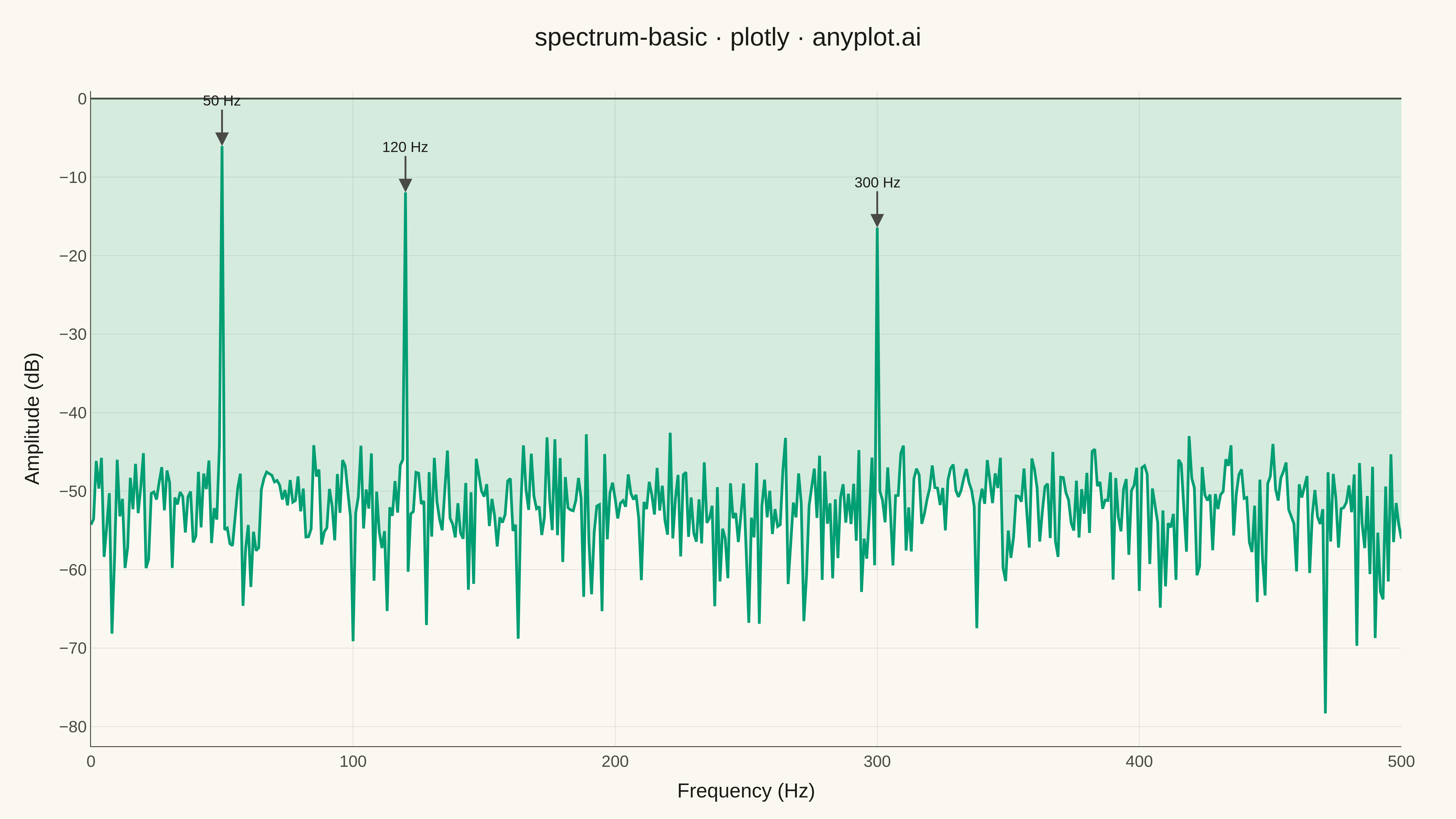
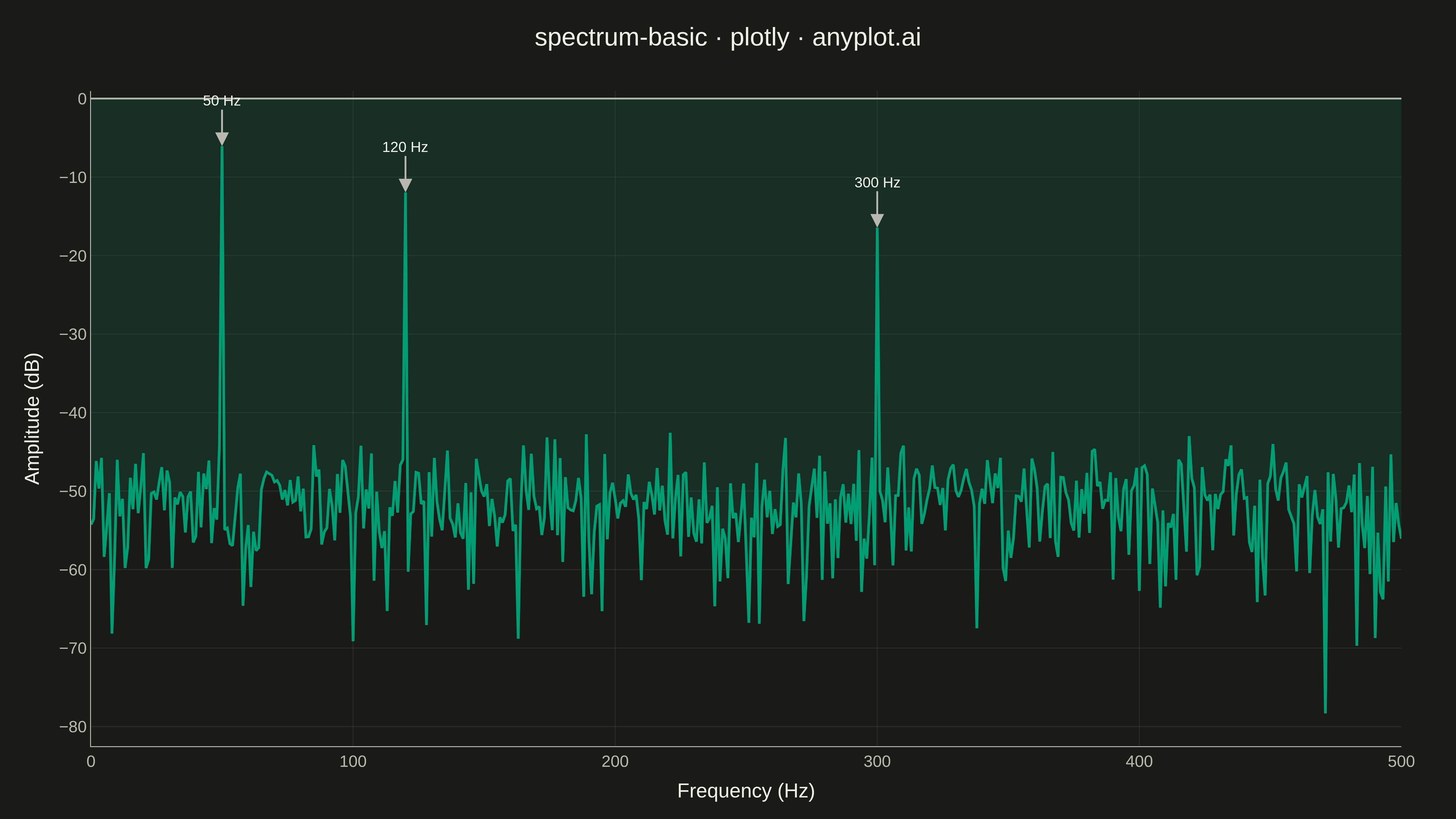
A frequency spectrum plot displays signal amplitude or power across a range of frequencies, showing the frequency domain representation of time-series data. This visualization reveals the frequency components present in a signal, making it essential for identifying dominant frequencies, harmonics, and noise characteristics. It is fundamental in signal processing, audio engineering, and vibration analysis.
""" anyplot.ai
spectrum-basic: Frequency Spectrum Plot
Library: plotly 6.7.0 | Python 3.13.13
Quality: 93/100 | Updated: 2026-05-14
"""

import os

import numpy as np
import plotly.graph_objects as go


# Theme tokens
THEME = os.getenv("ANYPLOT_THEME", "light")
PAGE_BG = "#FAF8F1" if THEME == "light" else "#1A1A17"
ELEVATED_BG = "#FFFDF6" if THEME == "light" else "#242420"
INK = "#1A1A17" if THEME == "light" else "#F0EFE8"
INK_SOFT = "#4A4A44" if THEME == "light" else "#B8B7B0"
GRID = "rgba(26,26,23,0.10)" if THEME == "light" else "rgba(240,239,232,0.10)"
BRAND = "#009E73"

# Data - Generate synthetic signal with multiple frequency components
np.random.seed(42)

# Signal parameters
sample_rate = 1000  # Hz
duration = 1.0  # seconds
n_samples = int(sample_rate * duration)
t = np.linspace(0, duration, n_samples, endpoint=False)

# Create synthetic signal: sum of sinusoids at 50, 120, and 300 Hz
signal = (
    1.0 * np.sin(2 * np.pi * 50 * t)  # 50 Hz fundamental
    + 0.5 * np.sin(2 * np.pi * 120 * t)  # 120 Hz component
    + 0.3 * np.sin(2 * np.pi * 300 * t)  # 300 Hz component
    + 0.1 * np.random.randn(n_samples)  # Noise
)

# Compute FFT
fft_result = np.fft.rfft(signal)
frequency = np.fft.rfftfreq(n_samples, 1 / sample_rate)
amplitude_db = 20 * np.log10(np.abs(fft_result) / n_samples + 1e-10)

# Plot
fig = go.Figure()

fig.add_trace(
    go.Scatter(
        x=frequency,
        y=amplitude_db,
        mode="lines",
        line=dict(color=BRAND, width=3),
        fill="tozeroy",
        fillcolor="rgba(0, 158, 115, 0.15)",
        name="Spectrum",
        hovertemplate="<b>Frequency:</b> %{x:.1f} Hz<br><b>Amplitude:</b> %{y:.1f} dB<extra></extra>",
    )
)

# Layout with theme-adaptive colors
fig.update_layout(
    title=dict(text="spectrum-basic · plotly · anyplot.ai", font=dict(size=28, color=INK), x=0.5, xanchor="center"),
    xaxis=dict(
        title=dict(text="Frequency (Hz)", font=dict(size=22, color=INK)),
        tickfont=dict(size=18, color=INK_SOFT),
        range=[0, 500],
        gridcolor=GRID,
        gridwidth=0.8,
        linecolor=INK_SOFT,
        zerolinecolor=INK_SOFT,
    ),
    yaxis=dict(
        title=dict(text="Amplitude (dB)", font=dict(size=22, color=INK)),
        tickfont=dict(size=18, color=INK_SOFT),
        gridcolor=GRID,
        gridwidth=0.8,
        linecolor=INK_SOFT,
        zerolinecolor=INK_SOFT,
    ),
    paper_bgcolor=PAGE_BG,
    plot_bgcolor=PAGE_BG,
    font=dict(color=INK),
    showlegend=False,
    hovermode="x unified",
    margin=dict(l=100, r=60, t=100, b=80),
)

# Add annotations for peak frequencies
peak_freqs = [50, 120, 300]
for freq in peak_freqs:
    idx = np.argmin(np.abs(frequency - freq))
    fig.add_annotation(
        x=frequency[idx],
        y=amplitude_db[idx],
        text=f"{freq} Hz",
        showarrow=True,
        arrowhead=2,
        arrowsize=1.5,
        arrowwidth=2,
        arrowcolor=INK_SOFT,
        font=dict(size=16, color=INK),
        ax=0,
        ay=-50,
    )

# Save
fig.write_image(f"plot-{THEME}.png", width=1600, height=900, scale=3)
fig.write_html(f"plot-{THEME}.html", include_plotlyjs="cdn")
Runnable source as JSON, for any HTTP client: https://api.anyplot.ai/specs/spectrum-basic/plotly/code. Any spec id and library id listed in llms-full.txt fit the same URL shape; every URL below is complete and callable.
{
  "spec_id": "spectrum-basic",
  "language": "python",
  "library": "plotly",
  "page": "https://anyplot.ai/spectrum-basic/python/plotly",
  "hub": "https://anyplot.ai/spectrum-basic",
  "code_json": "https://api.anyplot.ai/specs/spectrum-basic/plotly/code",
  "spec_json": "https://api.anyplot.ai/specs/spectrum-basic",
  "render_light_png": "https://storage.googleapis.com/anyplot-images/plots/spectrum-basic/python/plotly/plot-light.png",
  "render_dark_png": "https://storage.googleapis.com/anyplot-images/plots/spectrum-basic/python/plotly/plot-dark.png",
  "interactive_light_html": "https://storage.googleapis.com/anyplot-images/plots/spectrum-basic/python/plotly/plot-light.html",
  "interactive_dark_html": "https://storage.googleapis.com/anyplot-images/plots/spectrum-basic/python/plotly/plot-dark.html",
  "quality_score": 93.0,
  "license": "MIT",
  "guide": "https://anyplot.ai/llms.txt"
}
Part of Frequency Spectrum Plot on anyplot.ai.