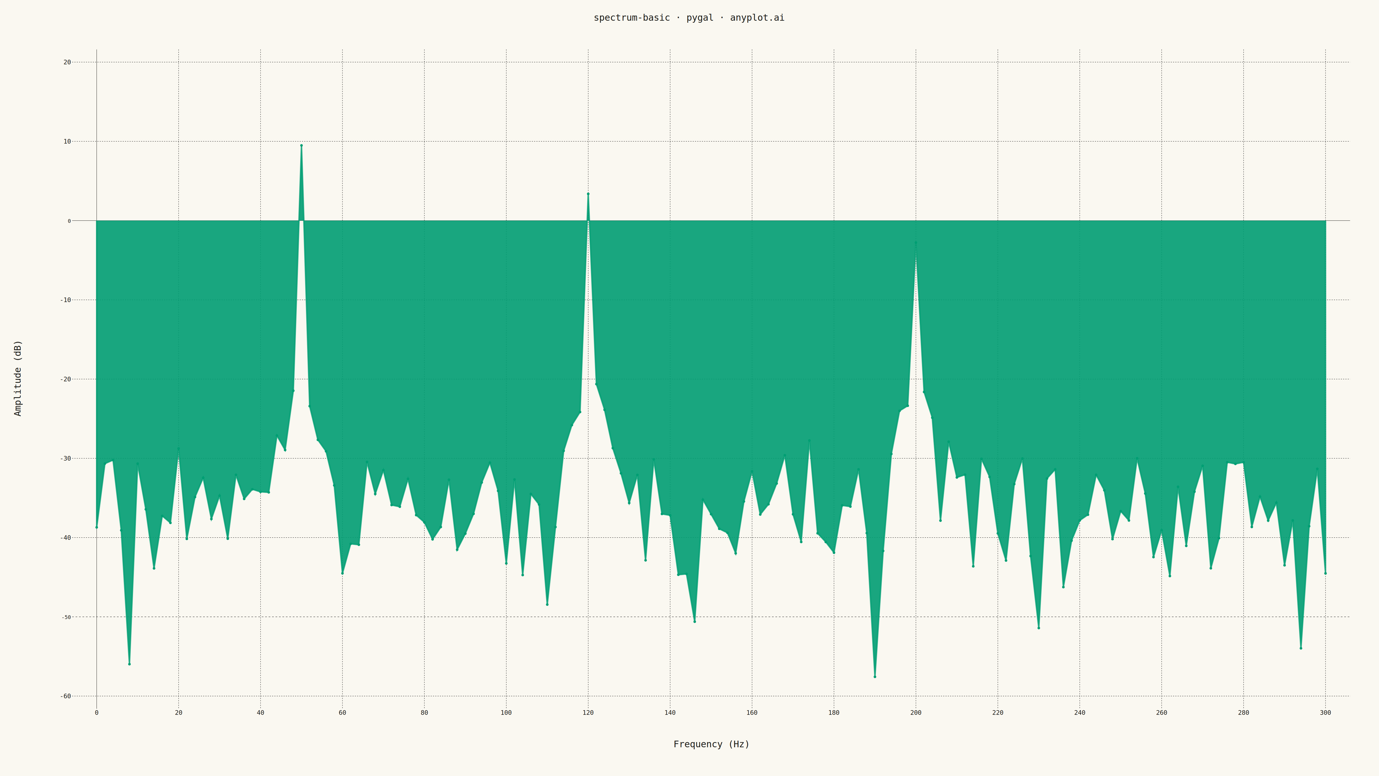
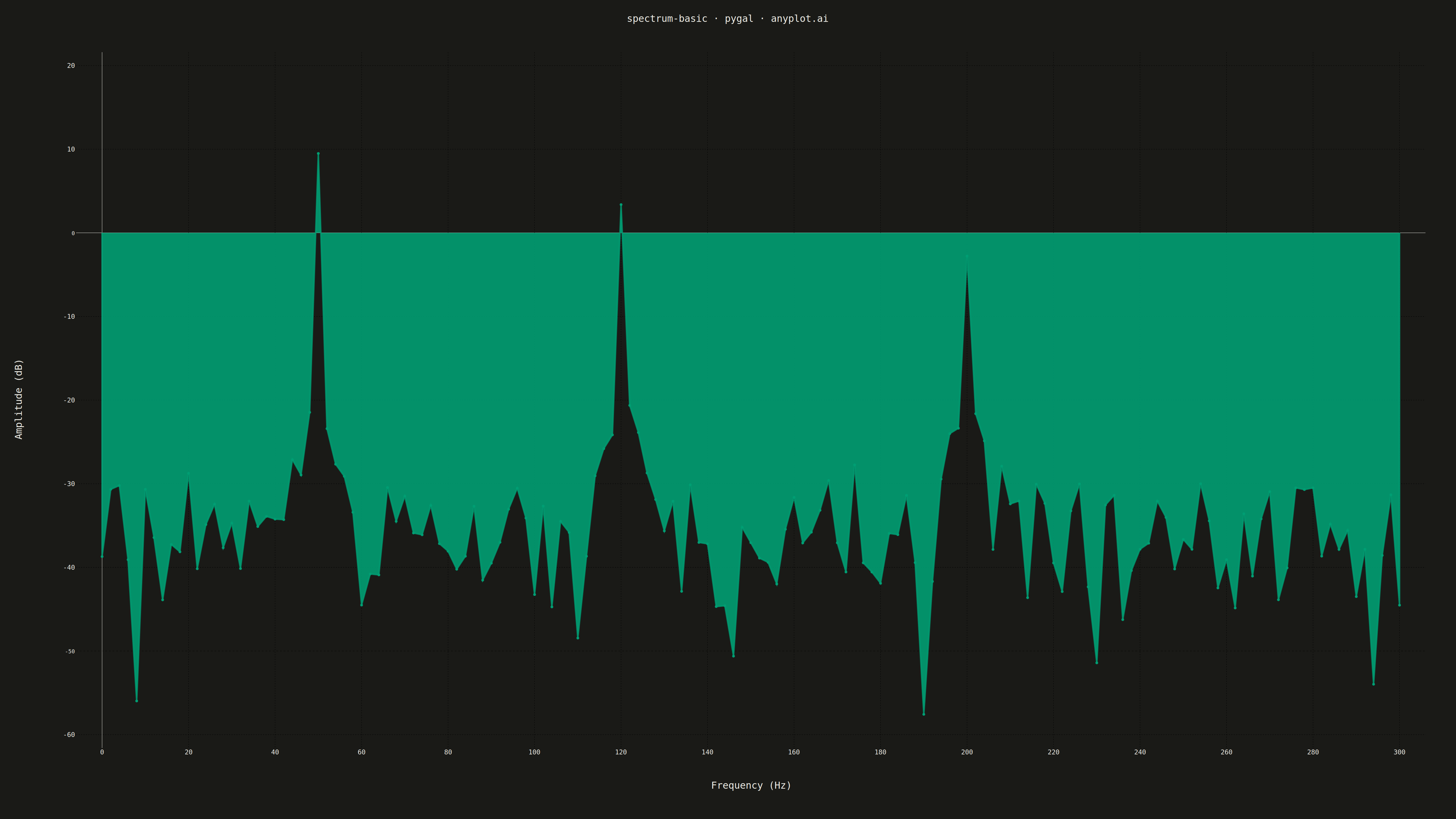
A frequency spectrum plot displays signal amplitude or power across a range of frequencies, showing the frequency domain representation of time-series data. This visualization reveals the frequency components present in a signal, making it essential for identifying dominant frequencies, harmonics, and noise characteristics. It is fundamental in signal processing, audio engineering, and vibration analysis.
""" anyplot.ai
spectrum-basic: Frequency Spectrum Plot
Library: pygal 3.1.0 | Python 3.13.13
Quality: 88/100 | Updated: 2026-05-14
"""

import os
import sys

import numpy as np


sys.path.pop(0)
import pygal
from pygal.style import Style


# Theme tokens
THEME = os.getenv("ANYPLOT_THEME", "light")
PAGE_BG = "#FAF8F1" if THEME == "light" else "#1A1A17"
INK = "#1A1A17" if THEME == "light" else "#F0EFE8"
INK_MUTED = "#6B6A63" if THEME == "light" else "#A8A79F"
BRAND = "#009E73"  # Okabe-Ito position 1

# Data - Generate synthetic signal with multiple frequency components
np.random.seed(42)

# Create a synthetic time-domain signal with known frequency components
fs = 1000  # Sampling frequency (Hz)
t = np.linspace(0, 1, fs)  # 1 second of data

# Signal with 3 frequency components: 50 Hz (strong), 120 Hz (medium), 200 Hz (weak)
signal = (
    3.0 * np.sin(2 * np.pi * 50 * t)  # 50 Hz - dominant frequency
    + 1.5 * np.sin(2 * np.pi * 120 * t)  # 120 Hz - secondary
    + 0.8 * np.sin(2 * np.pi * 200 * t)  # 200 Hz - tertiary
    + 0.3 * np.random.randn(len(t))  # Noise floor
)

# Compute FFT
n = len(signal)
fft_result = np.fft.fft(signal)
frequencies = np.fft.fftfreq(n, 1 / fs)

# Take only positive frequencies
positive_mask = frequencies >= 0
frequencies = frequencies[positive_mask]
amplitude = np.abs(fft_result[positive_mask]) / n * 2  # Normalize

# Convert to dB scale for better visualization
amplitude_db = 20 * np.log10(amplitude + 1e-10)

# Limit to 0-300 Hz for clarity (where our signal components are)
freq_limit_mask = frequencies <= 300
frequencies = frequencies[freq_limit_mask]
amplitude_db = amplitude_db[freq_limit_mask]

# Downsample for pygal (it works better with fewer points)
step = 2
frequencies = frequencies[::step]
amplitude_db = amplitude_db[::step]

# Create custom style for large canvas with theme-adaptive colors
custom_style = Style(
    background=PAGE_BG,
    plot_background=PAGE_BG,
    foreground=INK,
    foreground_strong=INK,
    foreground_subtle=INK_MUTED,
    colors=(BRAND,),
    title_font_size=28,
    label_font_size=22,
    major_label_font_size=18,
    legend_font_size=16,
    value_font_size=14,
    stroke_width=3,
    opacity=0.85,
    opacity_hover=1.0,
)

# Create XY chart (line chart with custom x values)
chart = pygal.XY(
    width=4800,
    height=2700,
    style=custom_style,
    title="spectrum-basic · pygal · anyplot.ai",
    x_title="Frequency (Hz)",
    y_title="Amplitude (dB)",
    show_dots=False,
    fill=True,
    stroke_style={"width": 3},
    show_x_guides=True,
    show_y_guides=True,
    x_label_rotation=0,
    show_legend=False,
    range=(-60, 20),  # dB range
    dots_size=0,
    margin=80,
    spacing=40,
)

# Add data as XY points
xy_data = [(float(f), float(a)) for f, a in zip(frequencies, amplitude_db, strict=True)]
chart.add("Amplitude", xy_data)

# Save as PNG and HTML with theme suffix
chart.render_to_png(f"plot-{THEME}.png")
with open(f"plot-{THEME}.html", "wb") as f:
    f.write(chart.render())
Runnable source as JSON, for any HTTP client: https://api.anyplot.ai/specs/spectrum-basic/pygal/code. Any spec id and library id listed in llms-full.txt fit the same URL shape; every URL below is complete and callable.
{
  "spec_id": "spectrum-basic",
  "language": "python",
  "library": "pygal",
  "page": "https://anyplot.ai/spectrum-basic/python/pygal",
  "hub": "https://anyplot.ai/spectrum-basic",
  "code_json": "https://api.anyplot.ai/specs/spectrum-basic/pygal/code",
  "spec_json": "https://api.anyplot.ai/specs/spectrum-basic",
  "render_light_png": "https://storage.googleapis.com/anyplot-images/plots/spectrum-basic/python/pygal/plot-light.png",
  "render_dark_png": "https://storage.googleapis.com/anyplot-images/plots/spectrum-basic/python/pygal/plot-dark.png",
  "interactive_light_html": "https://storage.googleapis.com/anyplot-images/plots/spectrum-basic/python/pygal/plot-light.html",
  "interactive_dark_html": "https://storage.googleapis.com/anyplot-images/plots/spectrum-basic/python/pygal/plot-dark.html",
  "quality_score": 88.0,
  "license": "MIT",
  "guide": "https://anyplot.ai/llms.txt"
}
Part of Frequency Spectrum Plot on anyplot.ai.