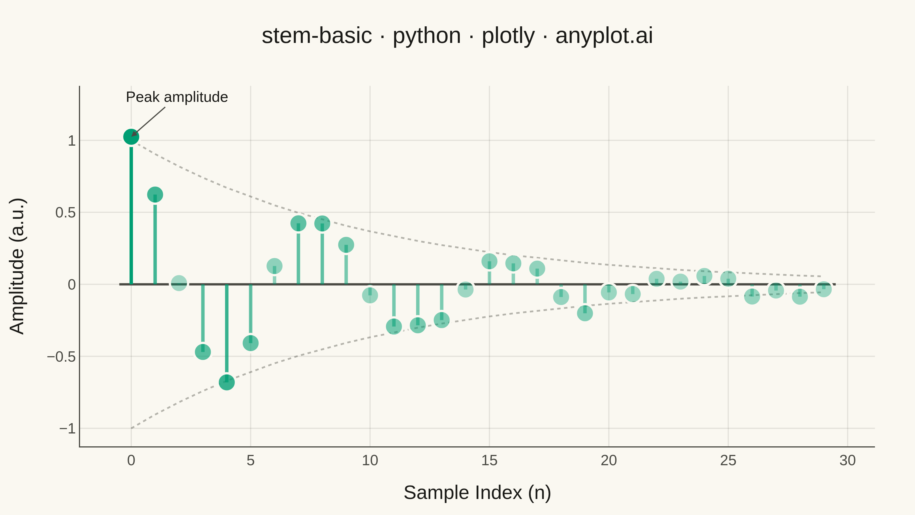
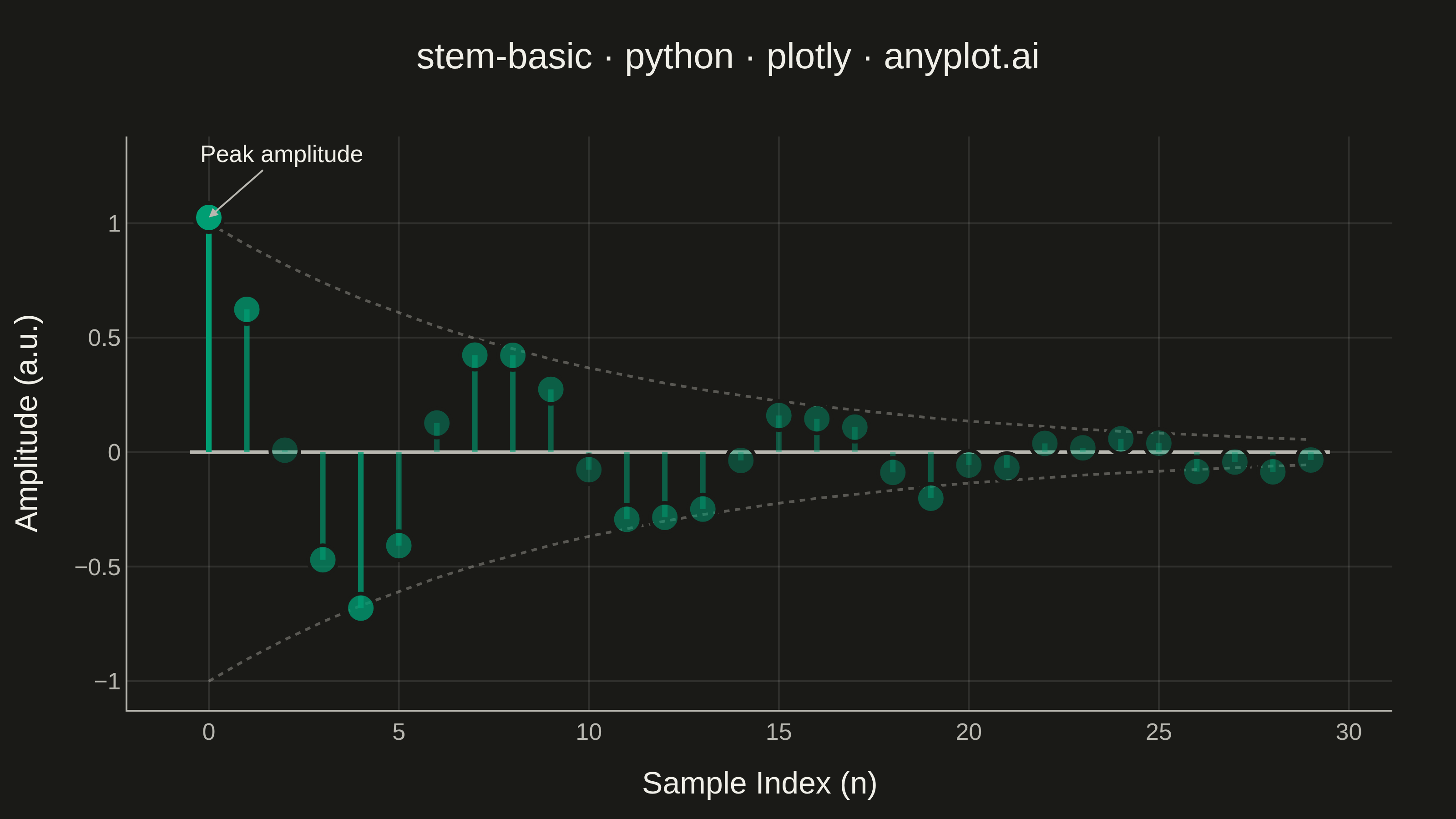
A stem plot displays data points as markers connected to a baseline by vertical lines (stems). Each data point is represented by a marker at the data value with a thin line extending down to a baseline, making it ideal for visualizing discrete or sequential data where individual values matter. This plot type is particularly useful in signal processing and scientific applications where the discrete nature of measurements needs emphasis.
""" anyplot.ai
stem-basic: Basic Stem Plot
Library: plotly 6.9.0 | Python 3.13.14
Quality: 92/100 | Updated: 2026-07-25
"""

import os

import numpy as np
import plotly.graph_objects as go


# Theme tokens (Imprint palette)
THEME = os.getenv("ANYPLOT_THEME", "light")
PAGE_BG = "#FAF8F1" if THEME == "light" else "#1A1A17"
INK = "#1A1A17" if THEME == "light" else "#F0EFE8"
INK_SOFT = "#4A4A44" if THEME == "light" else "#B8B7B0"
GRID = "rgba(26,26,23,0.10)" if THEME == "light" else "rgba(240,239,232,0.10)"
BRAND = "#009E73"  # Imprint palette position 1
BRAND_RGB = tuple(int(BRAND[i : i + 2], 16) for i in (1, 3, 5))

# Data - Discrete signal samples (damped oscillation)
np.random.seed(42)
x = np.arange(0, 30)
y = np.exp(-x / 10) * np.cos(x * 0.8) + np.random.randn(30) * 0.05

# Alpha gradient - fades each stem/marker by its own amplitude magnitude, so the
# decaying tail recedes visually without drawing separate envelope curves.
magnitude = np.abs(y)
alpha = 0.35 + 0.65 * (magnitude / magnitude.max())
peak_idx = int(np.argmax(magnitude))

# Decay envelope - the exp(-x/10) bound that shapes the oscillation, drawn as a
# faint dotted band to reinforce the damped-signal story (Plotly shape overlay).
envelope = np.exp(-x / 10)

# Plot
fig = go.Figure()

# Baseline at y=0
fig.add_trace(
    go.Scatter(
        x=[x.min() - 0.5, x.max() + 0.5],
        y=[0, 0],
        mode="lines",
        line={"color": INK_SOFT, "width": 2},
        showlegend=False,
        hoverinfo="skip",
    )
)

# Envelope band tracing the damped-oscillation bound
for sign in (1, -1):
    fig.add_trace(
        go.Scatter(
            x=x,
            y=sign * envelope,
            mode="lines",
            line={"color": INK_SOFT, "width": 1.5, "dash": "dot"},
            opacity=0.4,
            showlegend=False,
            hoverinfo="skip",
        )
    )

# Stems (vertical lines from baseline to data points), alpha-faded by magnitude
for xi, yi, ai in zip(x, y, alpha, strict=True):
    fig.add_trace(
        go.Scatter(
            x=[xi, xi],
            y=[0, yi],
            mode="lines",
            line={"color": f"rgba({BRAND_RGB[0]},{BRAND_RGB[1]},{BRAND_RGB[2]},{ai:.3f})", "width": 3},
            showlegend=False,
            hoverinfo="skip",
        )
    )

# Markers at the top of each stem, same alpha gradient
marker_colors = [f"rgba({BRAND_RGB[0]},{BRAND_RGB[1]},{BRAND_RGB[2]},{ai:.3f})" for ai in alpha]
fig.add_trace(
    go.Scatter(
        x=x,
        y=y,
        mode="markers",
        marker={"color": marker_colors, "size": 16, "line": {"color": PAGE_BG, "width": 2}},
        showlegend=False,
        hovertemplate="Sample: %{x}<br>Amplitude: %{y:.3f}<extra></extra>",
    )
)

# Style
fig.update_layout(
    autosize=False,
    width=800,
    height=450,
    paper_bgcolor=PAGE_BG,
    plot_bgcolor=PAGE_BG,
    font={"color": INK},
    title={
        "text": "stem-basic · python · plotly · anyplot.ai",
        "font": {"size": 20, "color": INK},
        "x": 0.5,
        "xanchor": "center",
    },
    xaxis={
        "title": {"text": "Sample Index (n)", "font": {"size": 17, "color": INK}},
        "tickfont": {"size": 13, "color": INK_SOFT},
        "gridcolor": GRID,
        "gridwidth": 1,
        "zeroline": False,
        "linecolor": INK_SOFT,
    },
    yaxis={
        "title": {"text": "Amplitude (a.u.)", "font": {"size": 17, "color": INK}},
        "tickfont": {"size": 13, "color": INK_SOFT},
        "gridcolor": GRID,
        "gridwidth": 1,
        "zeroline": False,
        "linecolor": INK_SOFT,
    },
    margin={"l": 70, "r": 35, "t": 75, "b": 60},
    showlegend=False,
)

# Annotation calling out the dominant peak sample
fig.add_annotation(
    x=x[peak_idx],
    y=y[peak_idx],
    text="Peak amplitude",
    showarrow=True,
    arrowhead=2,
    arrowcolor=INK_SOFT,
    ax=40,
    ay=-35,
    font={"size": 13, "color": INK},
)

# Save
fig.write_image(f"plot-{THEME}.png", width=800, height=450, scale=4)
fig.write_html(f"plot-{THEME}.html", include_plotlyjs="cdn")
Runnable source as JSON, for any HTTP client: https://api.anyplot.ai/specs/stem-basic/plotly/code. Any spec id and library id listed in llms-full.txt fit the same URL shape; every URL below is complete and callable.
{
  "spec_id": "stem-basic",
  "language": "python",
  "library": "plotly",
  "page": "https://anyplot.ai/stem-basic/python/plotly",
  "hub": "https://anyplot.ai/stem-basic",
  "code_json": "https://api.anyplot.ai/specs/stem-basic/plotly/code",
  "spec_json": "https://api.anyplot.ai/specs/stem-basic",
  "render_light_png": "https://storage.googleapis.com/anyplot-images/plots/stem-basic/python/plotly/plot-light.png",
  "render_dark_png": "https://storage.googleapis.com/anyplot-images/plots/stem-basic/python/plotly/plot-dark.png",
  "interactive_light_html": "https://storage.googleapis.com/anyplot-images/plots/stem-basic/python/plotly/plot-light.html",
  "interactive_dark_html": "https://storage.googleapis.com/anyplot-images/plots/stem-basic/python/plotly/plot-dark.html",
  "quality_score": 92.0,
  "license": "MIT",
  "guide": "https://anyplot.ai/llms.txt"
}
Part of Basic Stem Plot on anyplot.ai.