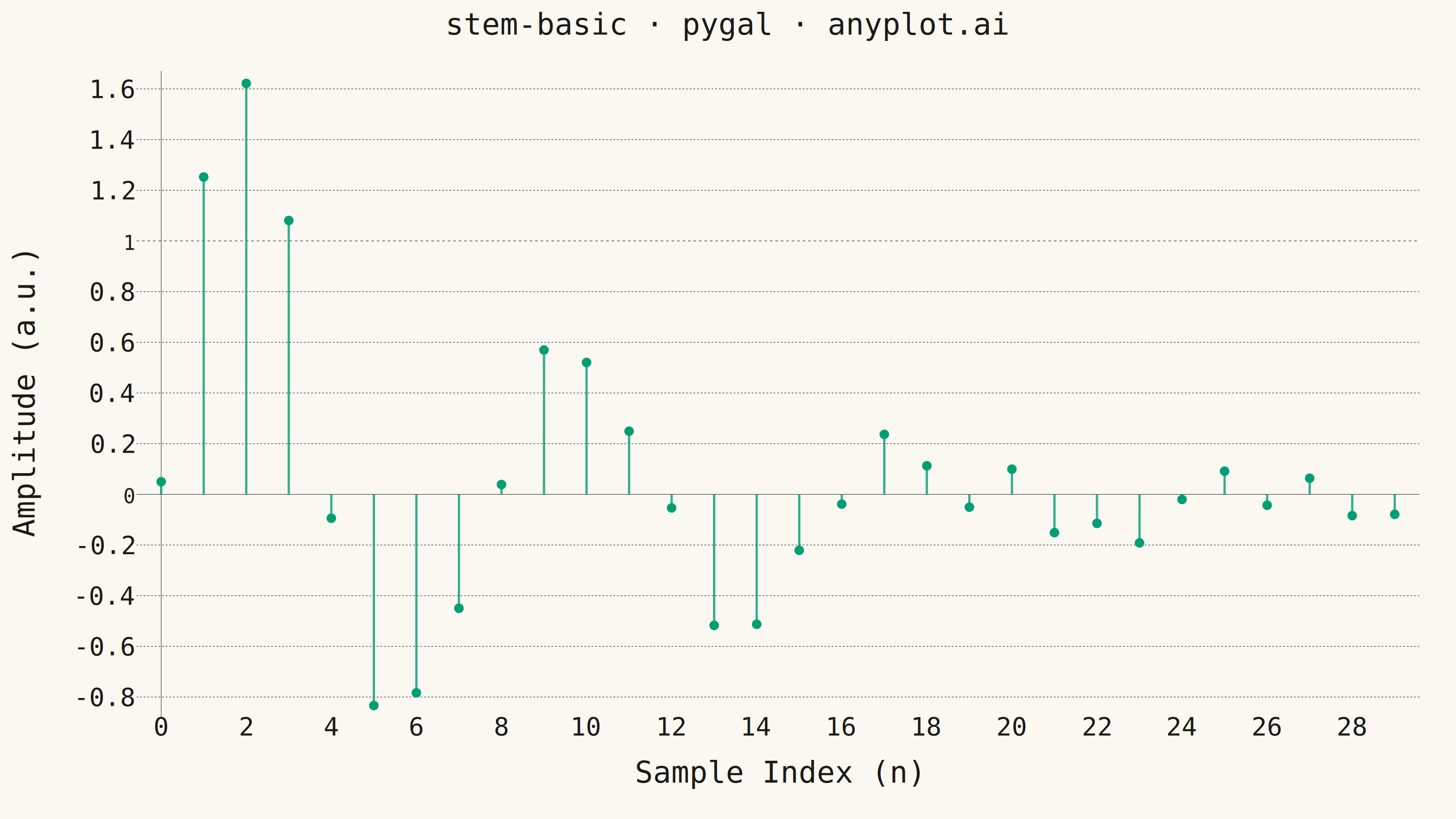
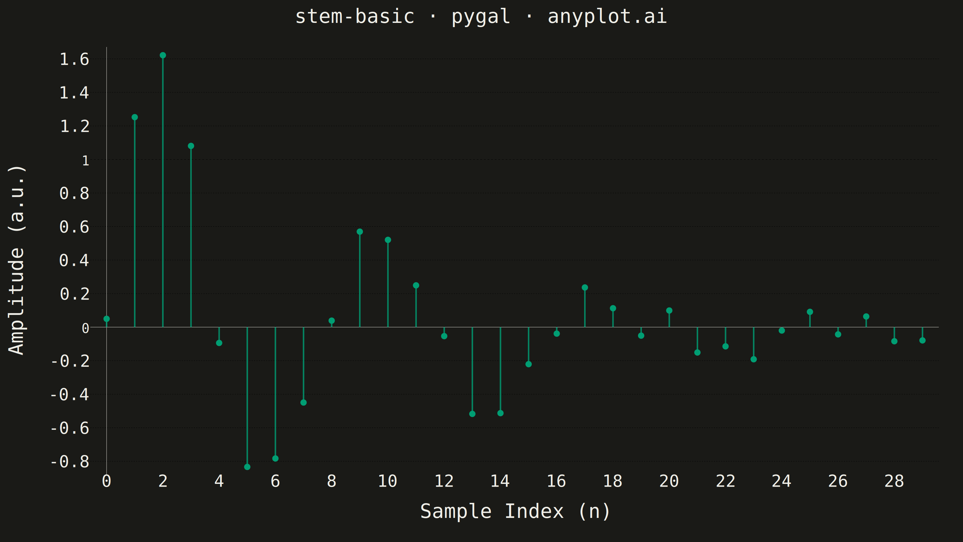
A stem plot displays data points as markers connected to a baseline by vertical lines (stems). Each data point is represented by a marker at the data value with a thin line extending down to a baseline, making it ideal for visualizing discrete or sequential data where individual values matter. This plot type is particularly useful in signal processing and scientific applications where the discrete nature of measurements needs emphasis.
""" anyplot.ai
stem-basic: Basic Stem Plot
Library: pygal 3.1.3 | Python 3.13.14
Quality: 84/100 | Updated: 2026-07-25
"""

import os
import sys

import numpy as np


# Pop script dir so this file (pygal.py) doesn't shadow the installed pygal package
_script_dir = sys.path.pop(0)
import pygal
from pygal.style import Style


sys.path.insert(0, _script_dir)

# Theme tokens
THEME = os.getenv("ANYPLOT_THEME", "light")
PAGE_BG = "#FAF8F1" if THEME == "light" else "#1A1A17"
INK = "#1A1A17" if THEME == "light" else "#F0EFE8"
INK_MUTED = "#6B6A63" if THEME == "light" else "#A8A79F"

IMPRINT_GREEN = "#009E73"

# Data - discrete impulse response (decaying oscillation)
np.random.seed(42)
n_points = 30
sample_index = np.arange(n_points)
amplitude = np.exp(-sample_index / 8) * np.sin(sample_index * 0.8) * 2 + np.random.randn(n_points) * 0.1

# Custom style. Each stem is added as its own XY series (pygal's `None`
# sentinel does not reliably break XY line strokes - it renders one
# continuous connected path instead), so `colors` repeats the brand green
# once per stem to keep every series the same color.
custom_style = Style(
    background=PAGE_BG,
    plot_background=PAGE_BG,
    foreground=INK,
    foreground_strong=INK,
    foreground_subtle=INK_MUTED,
    colors=(IMPRINT_GREEN,) * n_points,
    title_font_size=66,
    label_font_size=56,
    major_label_font_size=44,
    legend_font_size=44,
    value_font_size=36,
    stroke_width=5,
)

# Chart
chart = pygal.XY(
    width=3200,
    height=1800,
    title="stem-basic · pygal · anyplot.ai",
    x_title="Sample Index (n)",
    y_title="Amplitude (a.u.)",
    style=custom_style,
    show_dots=True,
    dots_size=10,
    stroke=True,
    stroke_style={"width": 5},
    show_x_guides=False,
    show_y_guides=True,
    show_legend=False,
    margin=80,
)

# Each stem is its own series: baseline anchor (dot suppressed) -> peak
# marker. Independent series (rather than one XY series broken by `None`)
# guarantee no connector line is drawn between stems, and a plain peak node
# (no per-point radius override) keeps every marker the same constant size.
for i in range(n_points):
    xi = float(sample_index[i])
    yi = float(amplitude[i])
    chart.add(f"n={i}", [{"value": (xi, 0.0), "node": {"r": 0}}, {"value": (xi, yi), "label": f"n={i}, a={yi:.3f}"}])

# Save
chart.render_to_png(f"plot-{THEME}.png")
with open(f"plot-{THEME}.html", "wb") as f:
    f.write(chart.render())
Runnable source as JSON, for any HTTP client: https://api.anyplot.ai/specs/stem-basic/pygal/code. Any spec id and library id listed in llms-full.txt fit the same URL shape; every URL below is complete and callable.
{
  "spec_id": "stem-basic",
  "language": "python",
  "library": "pygal",
  "page": "https://anyplot.ai/stem-basic/python/pygal",
  "hub": "https://anyplot.ai/stem-basic",
  "code_json": "https://api.anyplot.ai/specs/stem-basic/pygal/code",
  "spec_json": "https://api.anyplot.ai/specs/stem-basic",
  "render_light_png": "https://storage.googleapis.com/anyplot-images/plots/stem-basic/python/pygal/plot-light.png",
  "render_dark_png": "https://storage.googleapis.com/anyplot-images/plots/stem-basic/python/pygal/plot-dark.png",
  "interactive_light_html": "https://storage.googleapis.com/anyplot-images/plots/stem-basic/python/pygal/plot-light.html",
  "interactive_dark_html": "https://storage.googleapis.com/anyplot-images/plots/stem-basic/python/pygal/plot-dark.html",
  "quality_score": 84.0,
  "license": "MIT",
  "guide": "https://anyplot.ai/llms.txt"
}
Part of Basic Stem Plot on anyplot.ai.