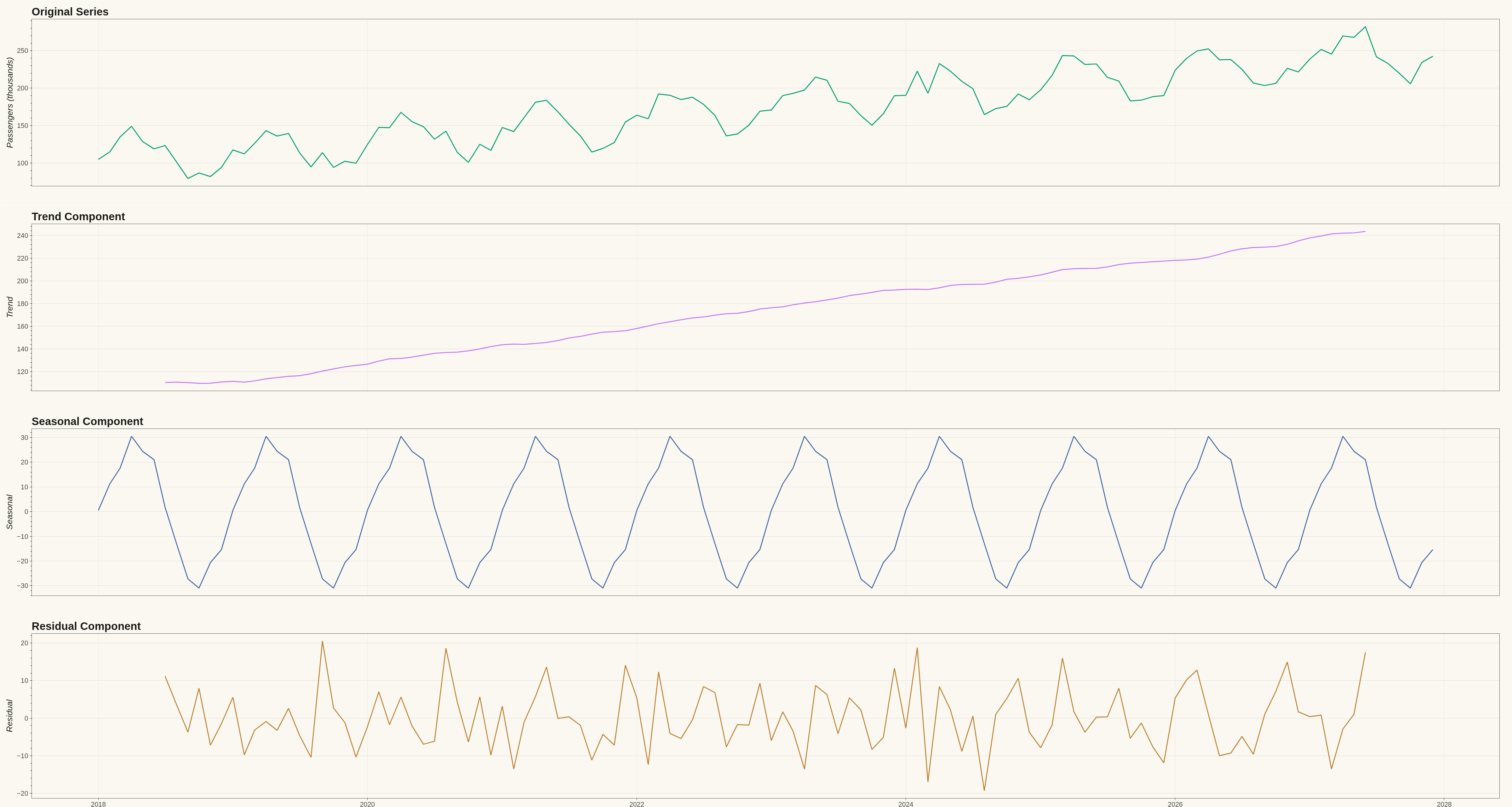
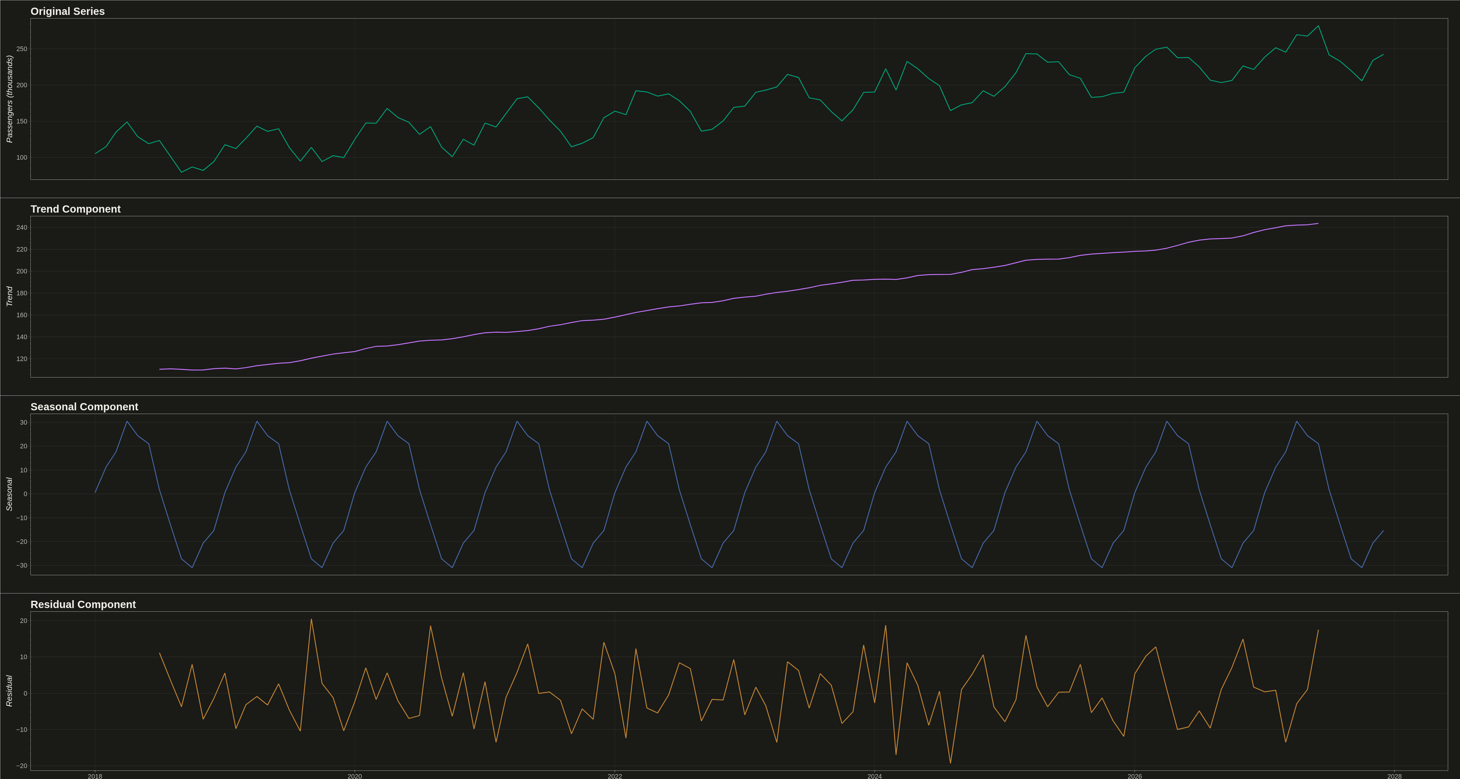
A time series decomposition plot displays a time series broken down into its constituent components: the original series, trend, seasonal pattern, and residual noise. Each component is shown as a separate subplot stacked vertically, sharing a common time axis. This visualization is essential for understanding the underlying structure of time series data and identifying patterns that may not be visible in the raw series.
""" anyplot.ai
timeseries-decomposition: Time Series Decomposition Plot
Library: bokeh 3.9.0 | Python 3.13.13
Quality: 86/100 | Updated: 2026-05-14
"""

import os
import time
from pathlib import Path

import numpy as np
import pandas as pd
from bokeh.io import output_file, save
from bokeh.layouts import column
from bokeh.models import ColumnDataSource
from bokeh.plotting import figure
from selenium import webdriver
from selenium.webdriver.chrome.options import Options
from statsmodels.tsa.seasonal import seasonal_decompose


# Theme tokens
THEME = os.getenv("ANYPLOT_THEME", "light")
PAGE_BG = "#FAF8F1" if THEME == "light" else "#1A1A17"
ELEVATED_BG = "#FFFDF6" if THEME == "light" else "#242420"
INK = "#1A1A17" if THEME == "light" else "#F0EFE8"
INK_SOFT = "#4A4A44" if THEME == "light" else "#B8B7B0"

# Okabe-Ito palette for visual distinction of components
IMPRINT = ["#009E73", "#C475FD", "#4467A3", "#BD8233"]  # Positions 1-4

# Data - Monthly airline passengers (classic time series dataset)
np.random.seed(42)
date_range = pd.date_range(start="2018-01-01", periods=120, freq="MS")  # 10 years monthly

# Generate realistic airline passenger data with trend, seasonality, and noise
trend = np.linspace(100, 250, 120)  # Upward trend in thousands of passengers
seasonal_pattern = 30 * np.sin(2 * np.pi * np.arange(120) / 12)  # Annual seasonality
noise = np.random.normal(0, 10, 120)
passengers = trend + seasonal_pattern + noise

# Create DataFrame and perform decomposition
df = pd.DataFrame({"date": date_range, "passengers": passengers})
df.set_index("date", inplace=True)
decomposition = seasonal_decompose(df["passengers"], model="additive", period=12)

# Extract components
dates = df.index.to_list()
original = df["passengers"].values
trend_component = decomposition.trend.values
seasonal_component = decomposition.seasonal.values
residual_component = decomposition.resid.values

# Panel dimensions (4 panels in vertical layout)
panel_height = 650
total_width = 4800


# Helper function to create themed figure
def create_themed_figure(width, height, title_text, y_label, show_x_axis=False, x_range=None):
    kwargs = {
        "width": width,
        "height": height,
        "x_axis_type": "datetime",
        "title": title_text,
        "toolbar_location": None,  # Hide toolbar for cleaner look
    }
    if x_range is not None:
        kwargs["x_range"] = x_range

    p = figure(**kwargs)

    # Theme-adaptive styling
    p.background_fill_color = PAGE_BG
    p.border_fill_color = PAGE_BG
    p.outline_line_color = INK_SOFT

    p.title.text_color = INK
    p.title.text_font_size = "26pt"
    p.title.text_font_style = "bold"

    p.xaxis.axis_label_text_color = INK
    p.yaxis.axis_label_text_color = INK
    p.xaxis.axis_label_text_font_size = "20pt"
    p.yaxis.axis_label_text_font_size = "20pt"

    p.xaxis.major_label_text_color = INK_SOFT
    p.yaxis.major_label_text_color = INK_SOFT
    p.xaxis.major_label_text_font_size = "16pt"
    p.yaxis.major_label_text_font_size = "16pt"

    p.xaxis.axis_line_color = INK_SOFT
    p.yaxis.axis_line_color = INK_SOFT
    p.xaxis.major_tick_line_color = INK_SOFT
    p.yaxis.major_tick_line_color = INK_SOFT

    p.ygrid.grid_line_color = INK
    p.ygrid.grid_line_alpha = 0.12
    p.xgrid.grid_line_color = INK
    p.xgrid.grid_line_alpha = 0.08

    p.yaxis.axis_label = y_label
    if not show_x_axis:
        p.xaxis.visible = False
    else:
        p.xaxis.axis_label = "Date"

    p.min_border_left = 100
    p.min_border_right = 40
    p.min_border_top = 60
    p.min_border_bottom = 60

    return p


# Create subplots with theme-aware styling and distinct colors
p1 = create_themed_figure(total_width, panel_height, "Original Series", "Passengers (thousands)")
source1 = ColumnDataSource(data={"date": dates, "value": original})
p1.line("date", "value", source=source1, line_width=3, color=IMPRINT[0])

p2 = create_themed_figure(total_width, panel_height, "Trend Component", "Trend", x_range=p1.x_range)
source2 = ColumnDataSource(data={"date": dates, "value": trend_component})
p2.line("date", "value", source=source2, line_width=3, color=IMPRINT[1])

p3 = create_themed_figure(total_width, panel_height, "Seasonal Component", "Seasonal", x_range=p1.x_range)
source3 = ColumnDataSource(data={"date": dates, "value": seasonal_component})
p3.line("date", "value", source=source3, line_width=3, color=IMPRINT[2])

p4 = create_themed_figure(
    total_width, panel_height, "Residual Component", "Residual", show_x_axis=True, x_range=p1.x_range
)
source4 = ColumnDataSource(data={"date": dates, "value": residual_component})
p4.line("date", "value", source=source4, line_width=3, color=IMPRINT[3])

# Combine all panels into vertical layout
layout = column(p1, p2, p3, p4)

# Save interactive HTML
output_file(f"plot-{THEME}.html")
save(layout)

# Screenshot with headless Chrome using Selenium
W, H = 4800, 2700
opts = Options()
for arg in (
    "--headless=new",
    "--no-sandbox",
    "--disable-dev-shm-usage",
    "--disable-gpu",
    f"--window-size={W},{H}",
    "--hide-scrollbars",
):
    opts.add_argument(arg)

driver = webdriver.Chrome(options=opts)
driver.set_window_size(W, H)
driver.get(f"file://{Path(f'plot-{THEME}.html').resolve()}")
time.sleep(3)  # Let bokeh's JS render the canvas
driver.save_screenshot(f"plot-{THEME}.png")
driver.quit()
Runnable source as JSON, for any HTTP client: https://api.anyplot.ai/specs/timeseries-decomposition/bokeh/code. Any spec id and library id listed in llms-full.txt fit the same URL shape; every URL below is complete and callable.
{
  "spec_id": "timeseries-decomposition",
  "language": "python",
  "library": "bokeh",
  "page": "https://anyplot.ai/timeseries-decomposition/python/bokeh",
  "hub": "https://anyplot.ai/timeseries-decomposition",
  "code_json": "https://api.anyplot.ai/specs/timeseries-decomposition/bokeh/code",
  "spec_json": "https://api.anyplot.ai/specs/timeseries-decomposition",
  "render_light_png": "https://storage.googleapis.com/anyplot-images/plots/timeseries-decomposition/python/bokeh/plot-light.png",
  "render_dark_png": "https://storage.googleapis.com/anyplot-images/plots/timeseries-decomposition/python/bokeh/plot-dark.png",
  "interactive_light_html": "https://storage.googleapis.com/anyplot-images/plots/timeseries-decomposition/python/bokeh/plot-light.html",
  "interactive_dark_html": "https://storage.googleapis.com/anyplot-images/plots/timeseries-decomposition/python/bokeh/plot-dark.html",
  "quality_score": 86.0,
  "license": "MIT",
  "guide": "https://anyplot.ai/llms.txt"
}
Part of Time Series Decomposition Plot on anyplot.ai.