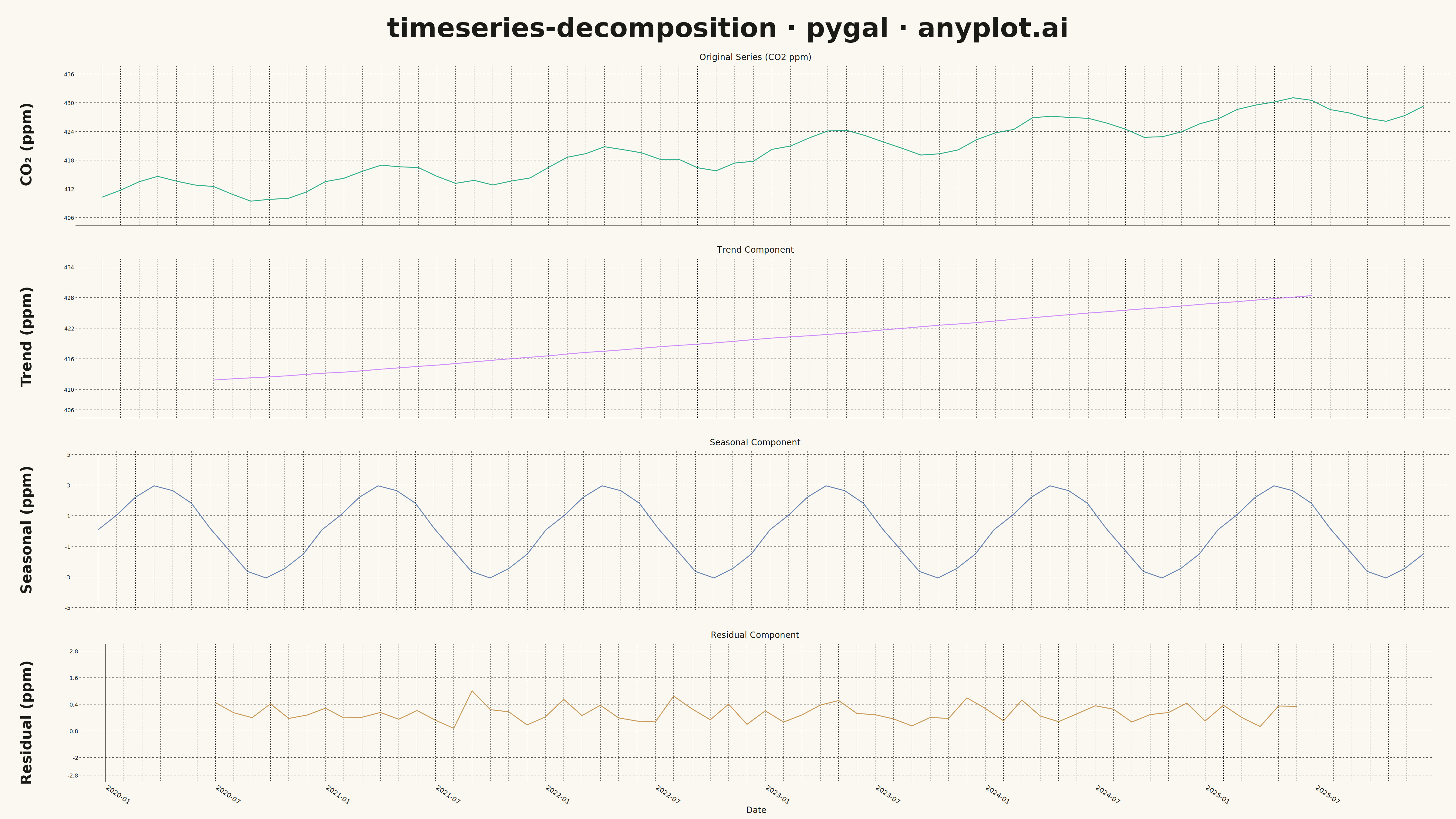
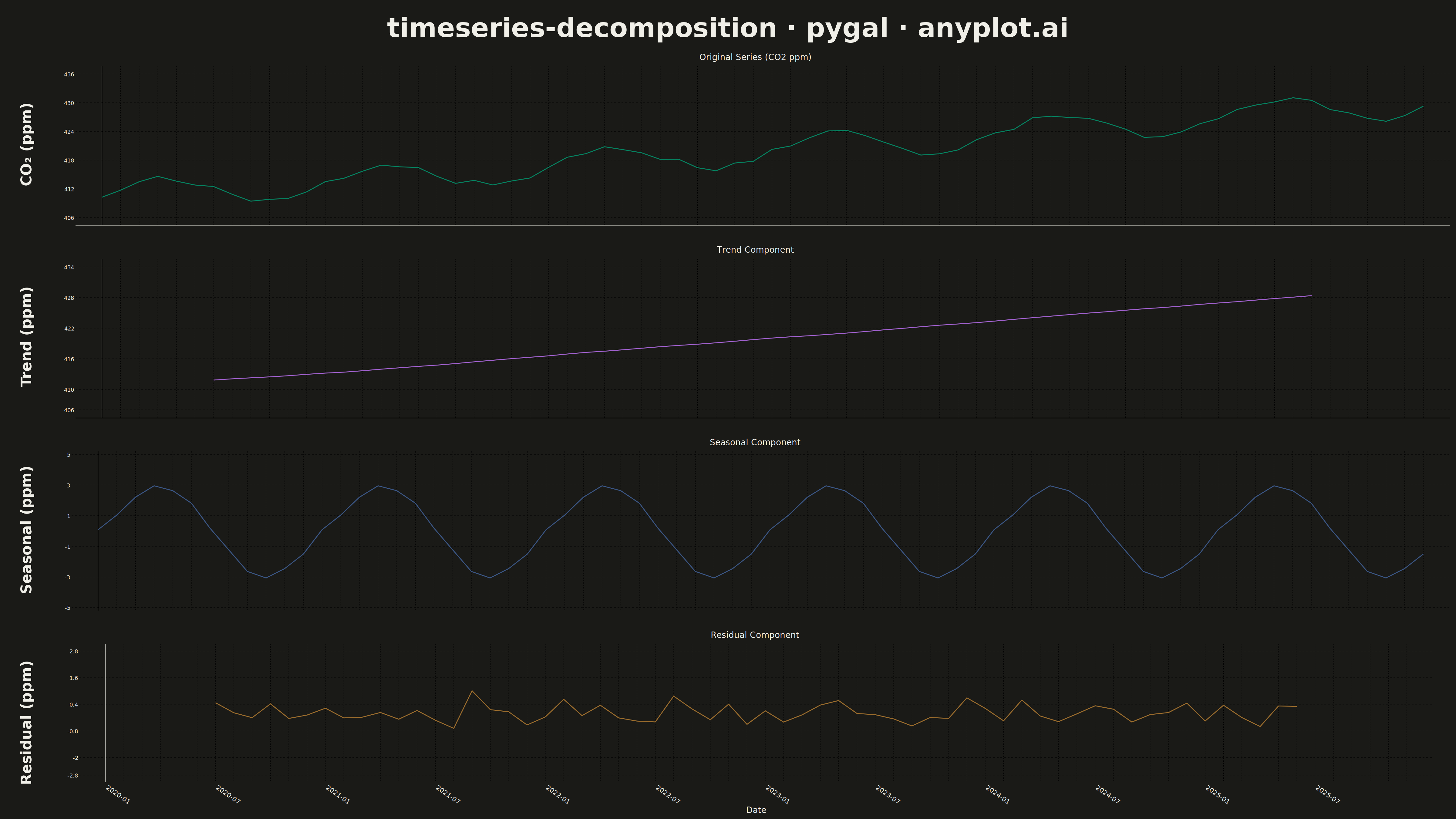
A time series decomposition plot displays a time series broken down into its constituent components: the original series, trend, seasonal pattern, and residual noise. Each component is shown as a separate subplot stacked vertically, sharing a common time axis. This visualization is essential for understanding the underlying structure of time series data and identifying patterns that may not be visible in the raw series.
""" anyplot.ai
timeseries-decomposition: Time Series Decomposition Plot
Library: pygal 3.1.0 | Python 3.13.13
Quality: 91/100 | Updated: 2026-05-14
"""

import os
import sys
from io import BytesIO
from pathlib import Path


# Remove current directory from sys.path to avoid collision with this file
script_dir = str(Path(__file__).parent)
sys.path = [p for p in sys.path if p != script_dir and p != ""]

import cairosvg
import numpy as np
import pandas as pd
import pygal
from PIL import Image, ImageDraw, ImageFont
from pygal.style import Style
from statsmodels.tsa.seasonal import seasonal_decompose


THEME = os.getenv("ANYPLOT_THEME", "light")
PAGE_BG = "#FAF8F1" if THEME == "light" else "#1A1A17"
INK = "#1A1A17" if THEME == "light" else "#F0EFE8"
INK_MUTED = "#6B6A63" if THEME == "light" else "#A8A79F"

# Okabe-Ito palette for components
IMPRINT = ("#009E73", "#C475FD", "#4467A3", "#BD8233")

# Data - Monthly CO2 measurements with clear trend and seasonality
np.random.seed(42)
dates = pd.date_range("2020-01-01", periods=72, freq="ME")

# Create realistic CO2-like data with trend, seasonality, and noise
trend = np.linspace(410, 430, 72)
seasonal_pattern = 3 * np.sin(2 * np.pi * np.arange(72) / 12)
noise = np.random.normal(0, 0.5, 72)
values = trend + seasonal_pattern + noise

# Create time series and decompose
ts = pd.Series(values, index=dates)
decomposition = seasonal_decompose(ts, model="additive", period=12)

# Extract components
observed = decomposition.observed.values
trend_component = decomposition.trend.values
seasonal_component = decomposition.seasonal.values
residual_component = decomposition.resid.values

# Create x-axis labels
x_labels = [d.strftime("%Y-%m") if i % 6 == 0 else "" for i, d in enumerate(dates)]

# Define components with their data, titles, colors, y-ranges, and y-axis labels
components = [
    ("Original Series (CO2 ppm)", observed, IMPRINT[0], (405, 437), "CO₂ (ppm)"),
    ("Trend Component", trend_component, IMPRINT[1], (405, 435), "Trend (ppm)"),
    ("Seasonal Component", seasonal_component, IMPRINT[2], (-5, 5), "Seasonal (ppm)"),
    ("Residual Component", residual_component, IMPRINT[3], (-3, 3), "Residual (ppm)"),
]

# Target: 4800 x 2700 px total (4 vertically stacked charts)
title_height = 160
y_label_width = 180
chart_width = 4800 - y_label_width
chart_height = (2700 - title_height) // 4

charts = []
y_labels_list = []
for idx, (label, data, color, y_range, y_label) in enumerate(components):
    # Replace NaN with None for pygal
    clean_data = [None if np.isnan(v) else float(v) for v in data]
    y_labels_list.append(y_label)

    # Create custom style with component color and larger fonts
    component_style = Style(
        background=PAGE_BG,
        plot_background=PAGE_BG,
        foreground=INK,
        foreground_strong=INK,
        foreground_subtle=INK_MUTED,
        colors=(color,),
        font_family="sans-serif",
        title_font_size=28,
        label_font_size=22,
        major_label_font_size=18,
        legend_font_size=16,
        value_font_size=14,
        stroke_width=3,
    )

    chart = pygal.Line(
        width=chart_width,
        height=chart_height,
        style=component_style,
        title=label,
        x_title="Date" if idx == 3 else "",
        show_legend=False,
        show_y_guides=True,
        show_x_guides=True,
        show_dots=False,
        stroke_style={"width": 3},
        range=y_range,
        truncate_label=-1,
        x_label_rotation=35 if idx == 3 else 0,
        margin_left=20,
        y_labels_major_count=6,
        show_minor_y_labels=False,
        dots_size=2,
    )

    # Only show x-labels on the bottom chart
    if idx == 3:
        chart.x_labels = x_labels
    else:
        chart.x_labels = [""] * len(dates)

    chart.add(label, clean_data)
    charts.append(chart)

# Render each chart to PNG and combine them vertically
images = []
for chart in charts:
    svg_bytes = chart.render()
    png_bytes = cairosvg.svg2png(bytestring=svg_bytes, output_width=chart_width, output_height=chart_height)
    img = Image.open(BytesIO(png_bytes))
    images.append(img)

# Create combined image
total_width = 4800
total_height = 2700

combined = Image.new("RGB", (total_width, total_height), PAGE_BG)

# Load fonts with increased sizes
try:
    title_font = ImageFont.truetype("/usr/share/fonts/truetype/dejavu/DejaVuSans-Bold.ttf", 88)
    y_label_font = ImageFont.truetype("/usr/share/fonts/truetype/dejavu/DejaVuSans-Bold.ttf", 48)
except OSError:
    title_font = ImageFont.load_default()
    y_label_font = ImageFont.load_default()

# Add main title
draw = ImageDraw.Draw(combined)
title_text = "timeseries-decomposition · pygal · anyplot.ai"
bbox = draw.textbbox((0, 0), title_text, font=title_font)
title_width = bbox[2] - bbox[0]
title_x = (total_width - title_width) // 2
draw.text((title_x, 40), title_text, fill=INK, font=title_font)

# Paste charts vertically with space for y-axis labels
for idx, img in enumerate(images):
    y_position = title_height + idx * chart_height
    combined.paste(img, (y_label_width, y_position))

    # Draw rotated y-axis label on the left side
    y_label_text = y_labels_list[idx]
    label_img = Image.new("RGBA", (500, 120), (255, 255, 255, 0))
    label_draw = ImageDraw.Draw(label_img)
    label_draw.text((0, 0), y_label_text, fill=INK, font=y_label_font)

    # Crop to text bounds and rotate
    label_bbox = label_img.getbbox()
    if label_bbox:
        label_img = label_img.crop(label_bbox)
    label_img = label_img.rotate(90, expand=True)

    # Center the rotated label vertically in the chart area
    label_x = (y_label_width - label_img.width) // 2
    label_y = y_position + (chart_height - label_img.height) // 2
    combined.paste(label_img, (label_x, label_y), label_img)

# Save final image
combined.save(f"plot-{THEME}.png", dpi=(300, 300))

# Also save as HTML (interactive SVG)
html_content = (
    """<!DOCTYPE html>
<html>
<head>
    <title>timeseries-decomposition · pygal · anyplot.ai</title>
    <style>
        body {
            font-family: sans-serif;
            background: """
    + PAGE_BG
    + """;
            margin: 20px;
            color: """
    + INK
    + """;
        }
        h1 {
            text-align: center;
            color: """
    + INK
    + """;
            font-size: 28px;
            margin-bottom: 20px;
        }
        .charts {
            display: flex;
            flex-direction: column;
            max-width: 1200px;
            margin: 0 auto;
        }
        .chart {
            width: 100%;
            margin-bottom: 10px;
        }
        .chart svg {
            width: 100%;
            height: auto;
        }
    </style>
</head>
<body>
    <h1>timeseries-decomposition · pygal · anyplot.ai</h1>
    <div class="charts">
"""
)

for chart in charts:
    svg_data = chart.render(is_unicode=True)
    svg_data = svg_data.replace('<?xml version="1.0" encoding="utf-8"?>', "")
    html_content += f'        <div class="chart">{svg_data}</div>\n'

html_content += """    </div>
</body>
</html>"""

with open(f"plot-{THEME}.html", "w") as f:
    f.write(html_content)
Runnable source as JSON, for any HTTP client: https://api.anyplot.ai/specs/timeseries-decomposition/pygal/code. Any spec id and library id listed in llms-full.txt fit the same URL shape; every URL below is complete and callable.
{
  "spec_id": "timeseries-decomposition",
  "language": "python",
  "library": "pygal",
  "page": "https://anyplot.ai/timeseries-decomposition/python/pygal",
  "hub": "https://anyplot.ai/timeseries-decomposition",
  "code_json": "https://api.anyplot.ai/specs/timeseries-decomposition/pygal/code",
  "spec_json": "https://api.anyplot.ai/specs/timeseries-decomposition",
  "render_light_png": "https://storage.googleapis.com/anyplot-images/plots/timeseries-decomposition/python/pygal/plot-light.png",
  "render_dark_png": "https://storage.googleapis.com/anyplot-images/plots/timeseries-decomposition/python/pygal/plot-dark.png",
  "interactive_light_html": "https://storage.googleapis.com/anyplot-images/plots/timeseries-decomposition/python/pygal/plot-light.html",
  "interactive_dark_html": "https://storage.googleapis.com/anyplot-images/plots/timeseries-decomposition/python/pygal/plot-dark.html",
  "quality_score": 91.0,
  "license": "MIT",
  "guide": "https://anyplot.ai/llms.txt"
}
Part of Time Series Decomposition Plot on anyplot.ai.